目录
1. Container容器组件
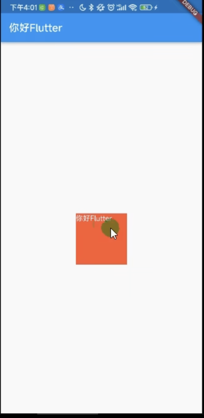
1.1 Container使用
1.2 Container alignment使用
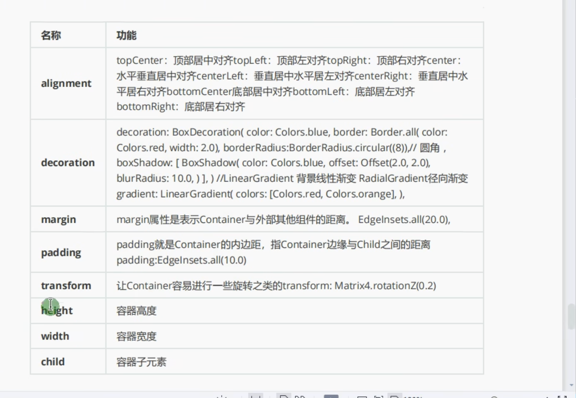
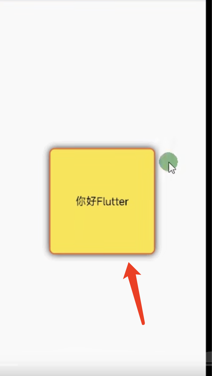
1.3 Container border边框使用
1.4 Container borderRadius圆角的使用
1.5 Container boxShadow阴影的使用
1.6 Container gradient背景颜色渐变
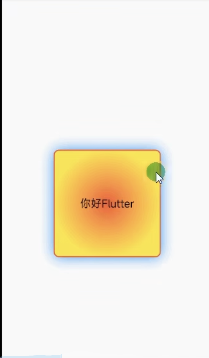
1.7 Container gradient RadialGradient 背景颜色渐变
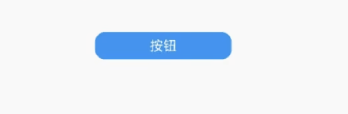
1.8 Container 实现圆角按钮
1.9 Container transform的使用
2. Text组件详解
2.1 TextStyle组件详解
2.2 Text textAlign/maxLines/overflow 的使用
2.2 Text 字符间距/倾斜字体的使用
1. Container容器组件
1.1 Container使用
import 'package:flutter/material.dart';

main() {
  runApp(
    MaterialApp(
      home: Scaffold(appBar: AppBar(title: Text("Home")), body: MyApp()),
    ),
  );
}

class MyApp extends StatelessWidget {
  @override
  Widget build(BuildContext context) {
    return Center(
      child: Container(
        alignment: Alignment.topLeft, //配置Container容器内的方位
        width: 100,
        height: 100,
        decoration: BoxDecoration(color: Colors.yellow),
        child: Text("你好", style: TextStyle(color: Colors.blue)),
      ),
    );
  }
}
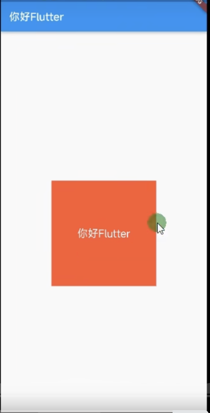
1.2 Container alignment使用
class MyApp extends StatelessWidget {
  @override
  Widget build(BuildContext context) {
    return Center(
      child: Container(
        alignment: Alignment.center, //配置Container容器内的方位
        width: 100,
        height: 100,
        decoration: BoxDecoration(color: Colors.yellow),
        child: Text("你好", style: TextStyle(color: Colors.blue)),
      ),
    );
  }
}
1.3 Container border边框使用
import 'package:flutter/material.dart';

main() {
  runApp(
    MaterialApp(
      home: Scaffold(appBar: AppBar(title: Text("Home")), body: MyApp()),
    ),
  );
}

class MyApp extends StatelessWidget {
  @override
  Widget build(BuildContext context) {
    return Center(
      child: Container(
        alignment: Alignment.center,
        //配置Container容器内的方位
        width: 100,
        height: 100,
        decoration: BoxDecoration(
          color: Colors.yellow,
          border: Border.all(color: Colors.red), //边框
        ),
        child: Text("你好", style: TextStyle(color: Colors.blue)),
      ),
    );
  }
}
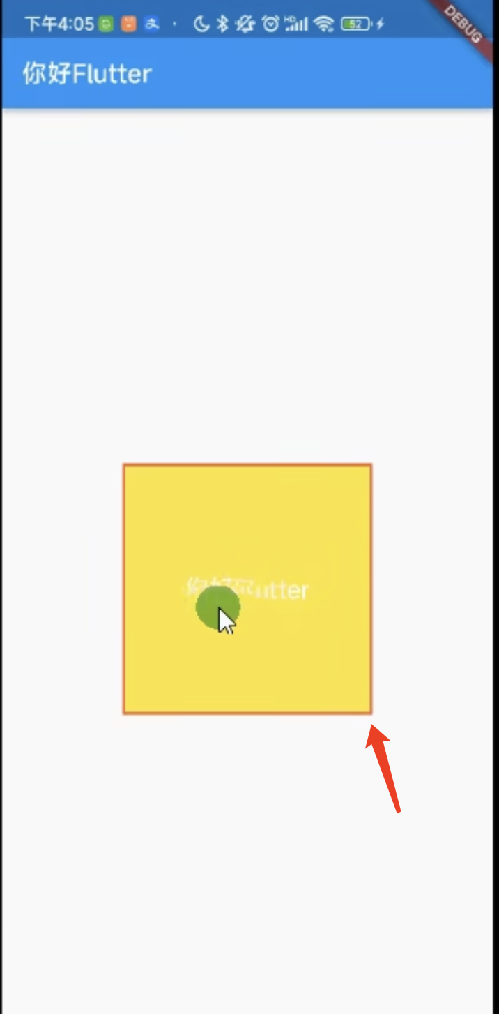
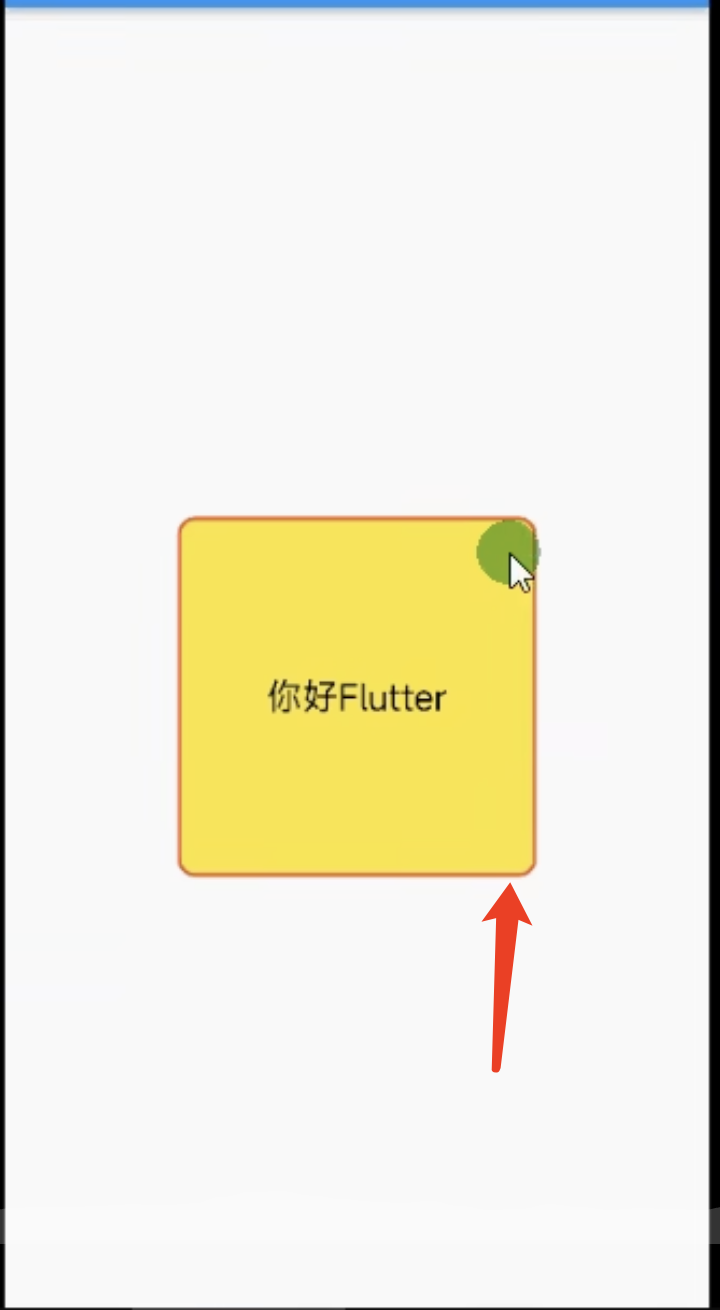
1.4 Container borderRadius圆角的使用
class MyApp extends StatelessWidget {
  @override
  Widget build(BuildContext context) {
    return Center(
      child: Container(
        alignment: Alignment.center,
        //配置Container容器内的方位
        width: 100,
        height: 100,
        decoration: BoxDecoration(
          color: Colors.yellow,
          border: Border.all(color: Colors.red),//边框
          borderRadius: BorderRadius.circular(10),//配置圆角
        ),
        child: Text("你好", style: TextStyle(color: Colors.blue)),
      ),
    );
  }
}
1.5 Container boxShadow阴影的使用
class MyApp extends StatelessWidget {
  @override
  Widget build(BuildContext context) {
    return Center(
      child: Container(
        alignment: Alignment.center,
        //配置Container容器内的方位
        width: 100,
        height: 100,
        decoration: BoxDecoration(
          color: Colors.yellow,
          border: Border.all(color: Colors.red),//边框
          borderRadius: BorderRadius.circular(10),//配置圆角
          boxShadow:[ //阴影
            BoxShadow(
              color: Colors.black,
              blurRadius: 10
            )
          ]
        ),
        child: Text("你好", style: TextStyle(color: Colors.blue)),
      ),
    );
  }
}
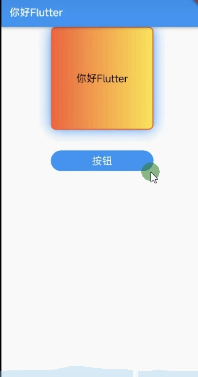
1.6 Container gradient背景颜色渐变
import 'package:flutter/material.dart';

main() {
  runApp(
    MaterialApp(
      home: Scaffold(appBar: AppBar(title: Text("Home")), body: MyApp()),
    ),
  );
}

class MyApp extends StatelessWidget {
  @override
  Widget build(BuildContext context) {
    return Center(
      child: Container(
        alignment: Alignment.center,
        //配置Container容器内的方位
        width: 100,
        height: 100,
        decoration: BoxDecoration(
          color: Colors.yellow,
          border: Border.all(color: Colors.red),//边框
          borderRadius: BorderRadius.circular(10),//配置圆角
          boxShadow:[ //阴影
            BoxShadow(
              color: Colors.black,
              blurRadius: 2
            )
          ],
          gradient:LinearGradient(colors: [Colors.red,Colors.yellow,]) //背景颜色渐变 LinearGradient=线性渐变 RadialGradient= 径性渐变
        ),
        child: Text("你好", style: TextStyle(color: Colors.blue)),
      ),
    );
  }
}
1.7 Container gradient RadialGradient 背景颜色渐变
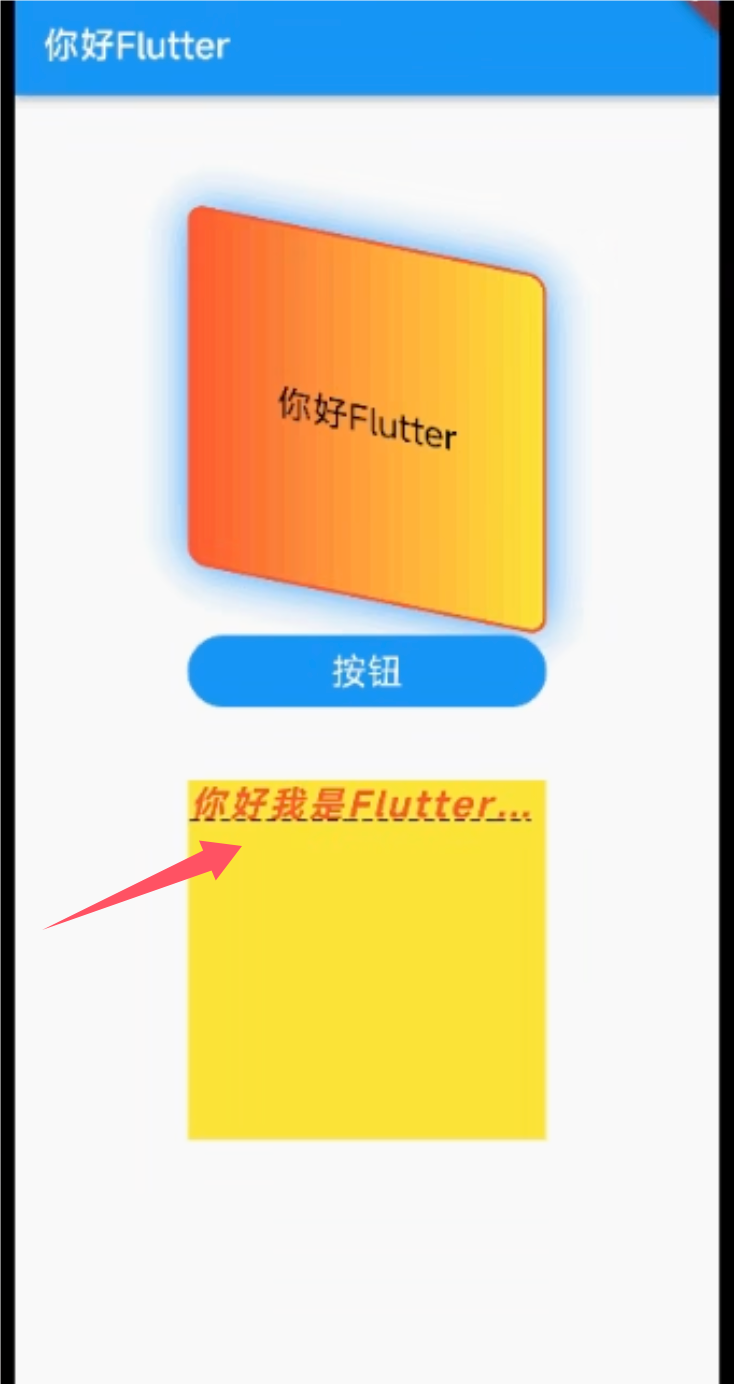
1.8 Container 实现圆角按钮
import 'package:flutter/material.dart';

main() {
  runApp(
    MaterialApp(
      home: Scaffold(
        appBar: AppBar(title: Text("Home")),
        body: Column(children: [MyApp(), MyButton()]),
      ),
    ),
  );
}

class MyApp extends StatelessWidget {
  @override
  Widget build(BuildContext context) {
    return Center(
      child: Container(
        alignment: Alignment.center,
        //配置Container容器内的方位
        width: 100,
        height: 100,
        decoration: BoxDecoration(
          color: Colors.yellow,
          border: Border.all(color: Colors.red),
          //边框
          borderRadius: BorderRadius.circular(10),
          //配置圆角
          boxShadow: [
            //阴影
            BoxShadow(color: Colors.black, blurRadius: 2),
          ],
          gradient: LinearGradient(
            colors: [Colors.red, Colors.yellow],
          ), //背景颜色渐变 LinearGradient=线性渐变 RadialGradient= 径性渐变
        ),
        child: Text("你好", style: TextStyle(color: Colors.blue)),
      ),
    );
  }
}

class MyButton extends StatelessWidget {
  @override
  Widget build(BuildContext context) {
    return Container(
      alignment: Alignment.center,
      // margin: EdgeInsets.all(10), //边距
      // margin: EdgeInsets.all(10), //边距
      margin: EdgeInsets.fromLTRB(0,20,0,0), //边距
      height: 48,
      width: 150,
      decoration: BoxDecoration(
        color: Colors.blue,
        borderRadius: BorderRadius.circular(30),
      ),
      child: Text("按钮", style: TextStyle(color: Colors.white)),
    );
  }
}
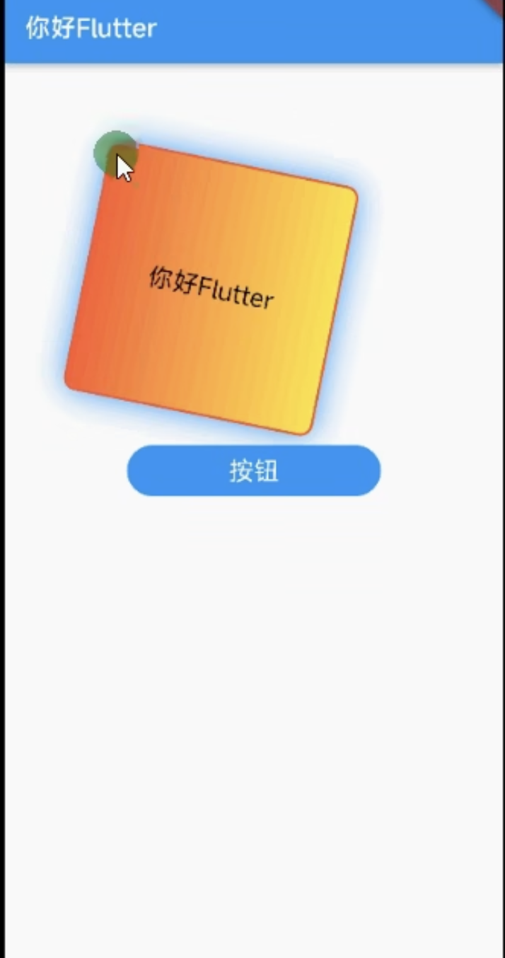
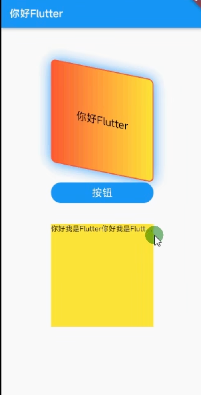
1.9 Container transform的使用
class MyApp extends StatelessWidget {
  @override
  Widget build(BuildContext context) {
    return Center(
      child: Container(
        alignment: Alignment.center,
        //配置Container容器内的方位
        width: 100,
        height: 100,
        // transform: Matrix4.translationValues(10, 0, 0),//位移
        // transform: Matrix4.rotationZ(1),//选择
        transform: Matrix4.skewY(3),//倾斜
        decoration: BoxDecoration(
          color: Colors.yellow,
          border: Border.all(color: Colors.red),
          //边框
          borderRadius: BorderRadius.circular(10),
          //配置圆角
          boxShadow: [
            //阴影
            BoxShadow(color: Colors.black, blurRadius: 2),
          ],
          gradient: LinearGradient(
            colors: [Colors.red, Colors.yellow],
          ), //背景颜色渐变 LinearGradient=线性渐变 RadialGradient= 径性渐变
        ),
        child: Text("你好", style: TextStyle(color: Colors.blue)),
      ),
    );
  }
}
2. Text组件详解
2.1 TextStyle组件详解
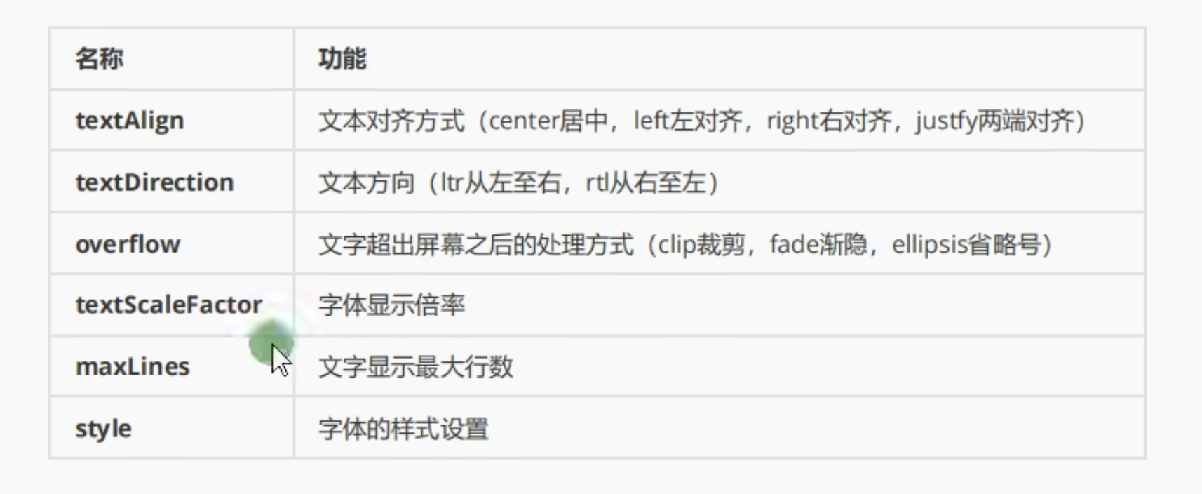
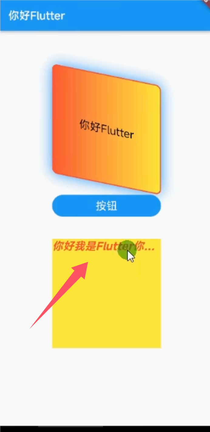
2.2 Text textAlign/maxLines/overflow 的使用
child: Text(
        "HowHowHowHowHowHowHowHowHowHowHowHowHowHowHowHow",
        textAlign: TextAlign.center,
        maxLines: 1,
        overflow: TextOverflow.ellipsis,
      )
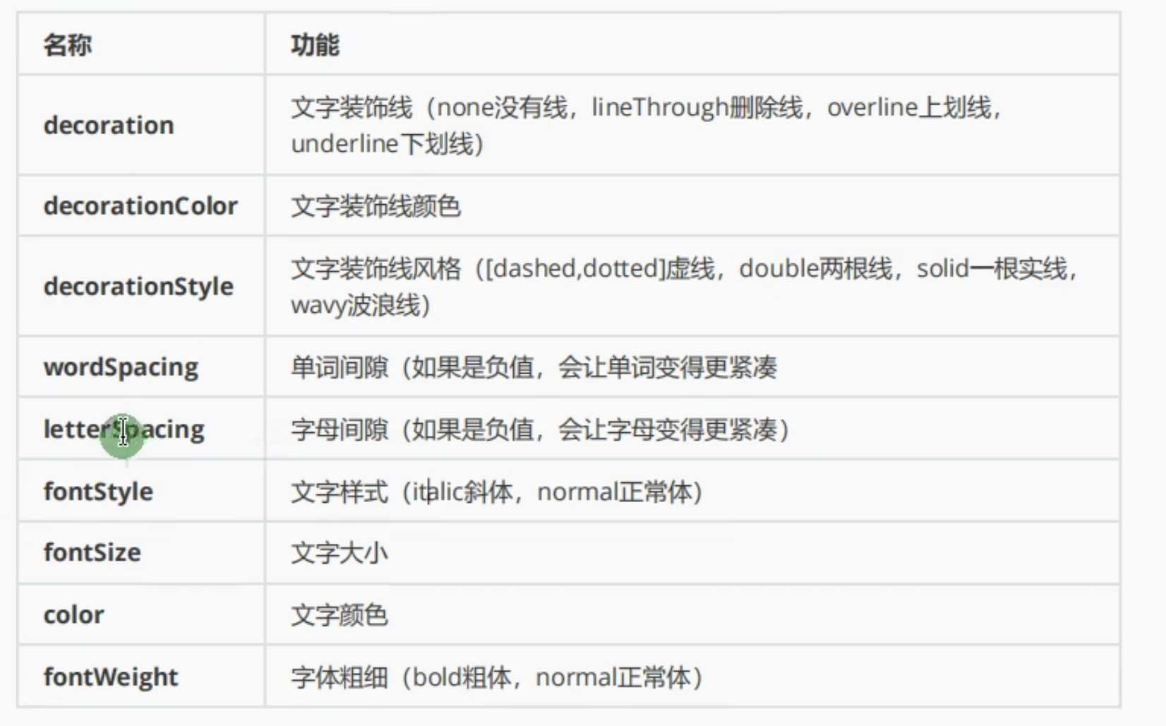
2.2 Text 字符间距/倾斜字体的使用
  child: Text(
        "HowHowHowHowHowHowHowHowHowHowHowHowHowHowHowHow",
        textAlign: TextAlign.center,
        maxLines: 1,
        overflow: TextOverflow.ellipsis,
         style: TextStyle(
           fontSize: 20,
           fontWeight: FontWeight.w800,//字体大小
           color: Colors.red,
           fontStyle: FontStyle.italic,//倾斜字体
           letterSpacing: 7 //字符间距
         ),
      ),
2.3 Text 底部下划线/底部虚线的使用
 child: Text(
        "HowHowHowHowHowHowHowHowHowHowHowHowHowHowHowHow",
        textAlign: TextAlign.center,
        maxLines: 1,
        overflow: TextOverflow.ellipsis,
        style: TextStyle(
          fontSize: 20,
          fontWeight: FontWeight.w800,
          //字体大小
          color: Colors.red,
          fontStyle: FontStyle.italic,
          //倾斜字体
          letterSpacing: 1,
          //字符间距
          decoration: TextDecoration.underline,
          decorationColor: Colors.black //底部下划线
          ,decorationStyle: TextDecorationStyle.dashed //底部虚线
        ),
      ),