文章目录
- 前言
- 一、程序结构
- 1. 菜单数据结构
- 2. XMenu.vue
- 3. XSubMenu.vue
- 4. XSubMenuSlot.vue
- 5. XMenuItem.vue
- 二、调用流程
- 总结
前言
菜单用于组织程序功能,为用户提供导航。是用户与程序交互非常重要的接口。
开源组件库像Element Plus和Ant Design中都提供了功能强大,使用方便的菜单组件 。
本章提供一个自定义菜单组件,核心思想是调用者提供菜单数据和显示位置,就能在指定位置显示出菜单组件。
效果如下:

一、程序结构
一共四个组件:
XMenu.vue 主菜单
XSubMenu.vue 递归子菜单
XSubMenuSlot.vue 子菜单与菜单项插槽
XMenuItem.vue 菜单项
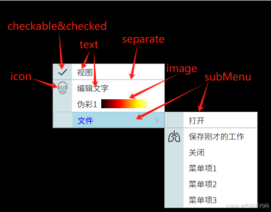
1. 菜单数据结构
id: String,必填
text: String,菜单项文字,必填
icon: String,菜单项最左边图标,选填
checkable: Boolean,菜单项最左边是否显示选中图标 ✓ 与check共同作用, 选填
check: Boolean,是否选中,选填
image: String,菜单项文字区图片url,选填
separate: String,菜单项分割线,值:bottom/up/both,选填
subMenu: Array,子菜单数据,选填
示例:
let menuList = ref([
	{
		id: "view",
		text: "视图",
		icon: "",
		checkable: true,
		checked: true,
		separate: "bottom"
	},
	{
		id: "edit",
		text: "编辑文字",
		icon: "icon-jawbone",
	},
	{
		id: "pseudo",
		text: "伪彩1",
		icon: "",
		image: require("@/assets/images/hot_h1.png"),
	},
	{
		id: "file",
		text: "文件",
		icon: "",
		subMenu: [
			{
				id: "open",
				text: "打开",
				icon: "",
				separate: "bottom",
			},
			{
				id: "save",
				text: "保存刚才的工作",
				icon: "icon-lungs-line",
			},
			{
				id: "close",
				text: "关闭",
				icon: "",
			},
			{
				id: "menuitem1",
				text: "菜单项1",
				icon: "",
			},
			{
				id: "menuitem2",
				text: "菜单项2",
				icon: "",
			},
			{
				id: "menuitem3",
				text: "菜单项3",
				icon: "",
			},
		],
	},

]);
显示效果:
2. XMenu.vue
用户入口
- 接受菜单数据和菜单位置
- 发送菜单项点击事件menuclick
- 自动计算菜单高度和宽度
- 菜单展开/收缩动画
<script lang="js" setup name="XMenu">
import { ref, computed, onMounted, reactive, h } from "vue";
import XSubMenu from "./XSubMenu.vue";
import XMenuItem from "./XMenuItem.vue";

const emit = defineEmits(["menuclick"]);
let menuList = ref([]);

const xMenu = ref(null);
const menuPos = reactive({ left: 0, top: 0 });
const ItemH = 32;
const fontSize = ref(14);
const showMenu = ref(false);

const show = (menu, pos) => {
    menuList.value = menu;
    calcMenuPos(pos);
    showMenu.value = true;
}

const calcMenuPos = (pos) => {
    const maxHeight = document.body.clientHeight;
    const maxWidth = document.body.clientWidth;

    if (pos.left + menuWidth.value > maxWidth) {
        menuPos.left = maxWidth - menuWidth.value;
    } else {
        menuPos.left = pos.left;
    }

    if (pos.top + menuHeight.value > maxHeight) {
        menuPos.top = pos.top2 - menuHeight.value;
    } else {
        menuPos.top = pos.top;
    }

}

const hide = () => {
    showMenu.value = false;
}

const getRect = () => {
    return xMenu.value.getBoundingClientRect();
}

const menuWidth = computed(() => {
    let w = 80;
    menuList.value.forEach((menu) => {
        const menuW = getMenuWidth(menu, fontSize.value);
        w = menuW > w ? menuW : w;
    });

    const maxW = document.body.clientWidth / 2;

    w += 40;
    const ret = w > maxW ? maxW : w;

    return ret;
});

const menuHeight = computed(() => {
    let h = ItemH * menuList.value.length;
    return h;
});

const menuStyle = computed(() => {
    return {
        width: menuWidth.value + "px",
        left: menuPos.left + "px",
        top: menuPos.top + "px",
    };
});

const getMenuWidth = (menu, fontSize) => {
    const el = document.createElement("span");
    const text = menu.text;
    el.innerText = text;
    el.style.fontSize = fontSize + "px";
    el.style.position = "absolute";
    document.body.appendChild(el);
    let w = el.offsetWidth + 50;

    if (menu.image) {
        w += 100;
    }
    document.body.removeChild(el);
    return w;
}

const hasChild = (menu) => {
    return menu.subMenu && menu.subMenu.length > 0;
}

const onMenuClick = (menu) => {
    if (menu.checkable && menu.checked !== undefined) {
        menu.checked = !menu.checked;
    }
    hide();
    emit("menuclick", menu);
}

const transBeforeEnter = (el) => {
	el.style.height = "0px";
    el.style.overflow = "hidden";
}
const transEnter = (el) => {
	el.style.height = "auto";
    const h = el.offsetHeight;
	el.style.height = "0px";
	requestAnimationFrame(() => {
		el.style.height = h + "px";
		el.style.transition = ".4s";
	});
}

const transAfterEnter = (el) => {
	el.style.transition = "initial";
     el.style.overflow = null;
}

const transBeforeLeave = (el) => {
    el.style.overflow = "hidden";
	el.style.transition = ".2s";
}
const transLeave = (el) => {
	el.style.height = "0px";
}
const transAfterLeave = (el) => {
}

defineExpose({
    show,
    hide,
    getRect
});

</script>

<template>
	<!-- <Teleport to="body"> -->
	<Transition
		@beforeEnter="transBeforeEnter"
		@enter="transEnter"
		@afterEnter="transAfterEnter"
		@before-leave="transBeforeLeave"
		@leave="transLeave"
	>
		<ul class="x-menu" ref="xMenu" v-show="showMenu" :style="menuStyle">
			<template v-for="(item, index) in menuList">
				<XSubMenu v-if="hasChild(item)" :key="item.id" :menu="item" :index="index" @menuclick="onMenuClick" />
				<XMenuItem v-else :menu="item" @click="onMenuClick(item)" />
			</template>
		</ul>
	</Transition>
	<!-- </Teleport> -->
</template>

<style lang="scss" scoped>
.x-menu {
	position: absolute;
	background-color: var(--color-theme-bg);
	color: var(--color-theme-text);
	border: 1px solid #aaa;
	z-index: 9999;
}
</style>
3. XSubMenu.vue
<script lang="js" setup name="XSubMenu">
import { ref, computed, onMounted } from "vue";
import XSubMenuSlot from "./XSubMenuSlot.vue";
import XMenuItem from "./XMenuItem.vue";

const emit = defineEmits(["menuclick"]);

const props = defineProps({
	menu: {
		type: Object,
		required: true
	},
	index: {
		type: Number,
		required: true
	}
});


const hasChild = (menu) => {
	return menu.subMenu && menu.subMenu.length > 0;
};


const onMenuClick = (menu) => {
	emit("menuclick", menu);
};
</script>

<template>
	<XSubMenuSlot :menu="menu" :index="index">
		<template #title>{{ menu.text }}</template>
		<ul>
			<template v-for="(item, index) in menu.subMenu">
				<XSubMenu v-if="hasChild(item)" :key="item.id" :menu="item" @menuclick="onMenuClick" />
				<XMenuItem v-else :key="item.id" :menu="item" @click="onMenuClick(item)" />
			</template>
		</ul>
	</XSubMenuSlot>
</template>

<style lang="scss" scoped></style>
4. XSubMenuSlot.vue
两个插槽,分别显示XMenuItem、XSubMenu
与XMenu类似:
- 计算子菜单宽度和高度
- 计算子菜单显示位置
- 子菜单展开/收缩动画
<script lang="js" setup name="XSubMenuSlot">
import { ref, computed, onMounted, reactive } from "vue";

const props = defineProps({
	menu: {
		type: Object,
		required: true
	},
	index: {
		type: Number,
		required: true
	}
});

const ItemH = 32;
const showMenu = ref(false);
const subMenuPos = reactive({
	left: 0,
	top: 0
});

const fontSize = ref(14);
const subMenuWidth = computed(() => {
	let w = 80;
    props.menu.subMenu.forEach((item) => {
        const menuW = getMenuWidth(item, fontSize.value);
        w = menuW > w ? menuW : w;
    });

    const maxW = document.body.clientWidth / 2;

    // menu sidebar-icon width: 40px
    w += 40;
    const ret = w > maxW ? maxW : w;

	console.log('menuWidth', ret);

    return ret;
});

const subMenuHeight = computed(() => {
	const height = ItemH * props.menu.subMenu.length;
	return height;
});


const getMenuWidth = (menu, fontSize) => {
    const el = document.createElement("span");
    const text = menu.text;
    el.innerText = text;
    el.style.fontSize = fontSize + "px";
    el.style.position = "absolute";
    document.body.appendChild(el);
    let w = el.offsetWidth + 50;

    if (menu.image) {
        w += 100;
    }
    document.body.removeChild(el);
    return w;
}

const subitemStyle = computed(() => {
	if (props.menu.separate) {
		const border = {};
		switch (props.menu.separate) {
			case "top":
				border.borderTop = "1px solid #aaa";
				break;
			case "bottom":
				border.borderBottom = "1px solid #aaa";
				break;
			case "both":
				border.borderTop = "1px solid #aaa";
				border.borderBottom = "1px solid #aaa";
				break;
		}
		return border;
	}
});

const subMenuStyle = computed(() => {
	return {
		left: subMenuPos.left + "px",
		top: subMenuPos.top + "px",
		width: subMenuWidth.value + "px"
	}
});

const show = (e) => {
	showMenu.value = true;
	const el = e.currentTarget;
	calcSubMenuPos(el);
}

const calcSubMenuPos = (el) => {
	const maxWidth = document.body.clientWidth;
	const maxHeight = document.body.clientHeight;

    const rect = el.getBoundingClientRect();

	const xEnd = rect.right + subMenuWidth.value;
	const yEnd = rect.y + props.index*ItemH + subMenuHeight.value;

	if (xEnd > maxWidth) {
		subMenuPos.left = 0 - subMenuWidth.value;
	} else {
		subMenuPos.left = rect.width;
	}

	if (yEnd > maxHeight) {
		subMenuPos.top = ItemH - subMenuHeight.value;
	} else {
		subMenuPos.top = 0;
	}

}

const hide = (e) => {
	showMenu.value = false;
}

const transBeforeEnter = (el) => {
	el.style.height = "0px";
    el.style.overflow = "hidden";
}
const transEnter = (el) => {
	el.style.height = "auto";
	const h = el.offsetHeight;
	el.style.height = "0px";
	requestAnimationFrame(() => {
		el.style.height = h + "px";
		el.style.transition = ".4s";
	});
}

const transAfterEnter = (el) => {
	el.style.transition = "initial";
     el.style.overflow = null;
}

const transBeforeLeave = (el) => {
    el.style.overflow = "hidden";
	el.style.transition = ".2s";
}
const transLeave = (el) => {
	el.style.height = "0px";
}
const transAfterLeave = (el) => {
}
</script>

<template>
	<div class="container" @mouseenter="show" @mouseleave="hide">
		<li class="subitem" :style="subitemStyle">
			<span class="subitem-bar"></span>
			<span class="subitem-text">
				<slot name="title"></slot>
			</span>
			<div class="subitem-right">
				<span class="subitem-right-icon"></span>
			</div>
		</li>
		<Transition
			@beforeEnter="transBeforeEnter"
			@enter="transEnter"
			@afterEnter="transAfterEnter"
			@before-leave="transBeforeLeave"
			@leave="transLeave"
		>
			<div class="submenu" v-show="showMenu" :style="subMenuStyle">
				<slot></slot>
			</div>
		</Transition>
	</div>
</template>

<style lang="scss" scoped>
.container {
	position: relative;
}
.submenu {
	position: absolute;
	border: 1px solid #aaa;
}

.subitem {
	display: flex;
	flex-direction: row;
	width: 100%;
	height: 32px;
	background-color: #fdfdfd;
	background-color: var(--color-menu-bg);
	z-index: 9999;
	overflow: hidden;
}

.subitem-bar {
	width: 38px;
	height: 100%;
	background-color: var(--color-menu-bar);
	fill: var(--color-theme-text);
}

.subitem-text {
	flex: 1;
	height: 32px;
	line-height: 32px;
	font-size: 16px;
	padding-left: 10px;
	cursor: default;
	user-select: none;
	-webkit-user-select: none; /* Safari */
	-moz-user-select: none; /* Firefox */
	-ms-user-select: none; /* IE 10 and IE 11 */
}

.subitem-right {
	width: 30px;
	height: 100%;
	padding-right: 6px;
}

.subitem-right-icon {
	float: right;
	width: 16px;
	height: 32px;
	background: url(../../assets/images/arrow_right.png) no-repeat center center;
	background-size: 16px auto;
}

.subitem:hover {
	background-color: lightblue;
	color: blue;
	border: 1px solid lightskyblue;
}
</style>
5. XMenuItem.vue
菜单项,显示icon, text, image, separate
<script lang="js" setup name="XMenuItem">
import { ref, computed, onMounted } from "vue";
import SvgIcon from "../SvgIcon.vue";

const props = defineProps({
	menu: {
		type: Object,
		required: true
	}
});

const emit = defineEmits(["menuclick"]);

const menuItemStyle = computed(() => {
	if (props.menu.separate) {
		const border = {};
		switch (props.menu.separate) {
			case "top":
				border.borderTop = "1px solid #aaa";
				break;
			case "bottom":
				border.borderBottom = "1px solid #aaa";
				break;
			case "both":
				border.borderTop = "1px solid #aaa";
				border.borderBottom = "1px solid #aaa";
				break;
		}
		return border;
	}
});

const iconStyle = computed(() => {
	if (props.menu.checkable) {
		return {
			backgroundImage: props.menu.checked
				? `url("src/assets/images/choose.png")`
				: "",
		};
	} else {
		return {
			backgroundImage: props.menu.icon,
		};
	}
});
</script>

<template>
	<li class="menuitem" :style="menuItemStyle">
		<div class="menuitem-bar">
			<svg-icon v-if="menu.icon" class="menuitem-bar__icon" :icon="menu.icon" size="28px" />
			<div v-else class="menuitem-bar__icon" :style="iconStyle"></div>
		</div>
		<div class="menuitem-text">{{ menu.text }}</div>
		<img v-if="menu.image" class="menuitem-image" :src="menu.image" />
	</li>
</template>

<style lang="scss" scoped>
.menuitem {
	display: flex;
	flex-direction: row;
	align-items: center;
	height: 32px;
	background-color: var(--color-menu-bg);
	z-index: 9999;
	overflow: hidden;
}

.menuitem-bar {
	display: flex;
	flex-direction: row;
	align-items: center;
	justify-content: center;
	width: 38px;
	height: 100%;
	background-color: var(--color-menu-bar);
}

.menuitem-bar__icon {
	width: 38px;
	height: 100%;
	background-repeat: no-repeat;
	background-position: center center;
	background-size: 24px auto;
	fill: var(--color-theme-text);
}

.menuitem-text {
	line-height: 32px;
	font-size: 16px;
	padding-left: 10px;
	cursor: default;
	user-select: none;
	-webkit-user-select: none; /* Safari */
	-moz-user-select: none; /* Firefox */
	-ms-user-select: none; /* IE 10 and IE 11 */
}

.menuitem-image {
	margin-left: 8px;
}

.menuitem:hover {
	background-color: lightblue;
	color: blue;
	border: 1px solid lightskyblue;
}
</style>
二、调用流程
- 导入XMenu.vue
- 在模板中添加XMenu
- 绑定变量
- 定义菜单数据
- 调用show函数
import XMenu from "./XMenu/XMenu.vue";

const xMenu = ref(null);

const menuList = ref([
	{
		id: "view",
		text: "视图",
		icon: "",
		checkable: true,
		checked: true,
		separate: "bottom"
	},
	{
		id: "edit",
		text: "编辑文字",
		icon: "icon-jawbone",
	},
	{
		id: "pseudo",
		text: "伪彩1",
		icon: "",
		image: require("@/assets/images/hot_h1.png"),
	},
	{
		id: "file",
		text: "文件",
		icon: "",
		subMenu: [
			{
				id: "open",
				text: "打开",
				icon: "",
				separate: "bottom",
			},
			{
				id: "save",
				text: "保存刚才的工作",
				icon: "icon-lungs-line",
			},
			{
				id: "close",
				text: "关闭",
				icon: "",
			},
			{
				id: "menuitem1",
				text: "菜单项1",
				icon: "",
			},
			{
				id: "menuitem2",
				text: "菜单项2",
				icon: "",
			},
			{
				id: "menuitem3",
				text: "菜单项3",
				icon: "",
			},
		],
	},

]);

const showMenu = (e) => {
	xMenu.value.show(menuList.value, { left: e.clientX, top: e.clientY})
}

const hideMenu = () => {
	xMenu.value.hide();
}

<template>
     <div class="toolbar">
        <XMenu ref="xMenu" @mouseleave="hideMenu" />
        ...
		<div class="toolbar-row">
			<el-button @click="showMenu">菜单2</el-button>
			<el-button @click="dcmtag">DICOM标签</el-button>
			<el-button @click="mprvr">MPR+VR</el-button>
			<el-button @click="showMenu">菜单3</el-button>
		</div>
     	...
     </div>
</template>
总结
本章实现自定义菜单组件,支持图标、分隔线、选中图标、文字区图片、子菜单、展开/收缩动画。如需要显示更复杂内容,可自行扩展XMenuItem.vue
调用方便,只需要提供菜单数据和菜单显示位置。