前言
什么是移动端适配?
让页面的元素在屏幕尺寸变化时, 同比放大或缩小
移动适配的方案
- rem:目前多数企业在用的解决方案
- vw/vh:未来的解决方案
rem
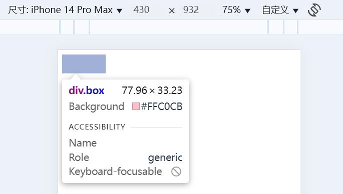
体验rem适配
目标: 能够使用rem单位设置网页元素的尺寸
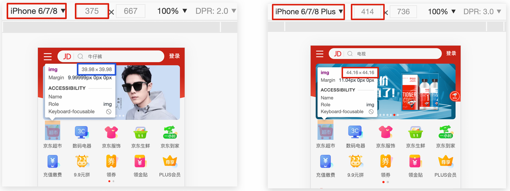
- 网页效果: 屏幕宽度不同,网页元素尺寸不同(等比缩放)
- px单位或百分比布局可以实现吗 ?
- px单位是绝对单位, 不管屏幕大小都是固定的尺寸
- 百分比布局特点宽度自适应,高度固定, 不能满足现在的企业要求
什么是rem?
- rem是css3新增的尺寸单位
- 是一种相对单位
- rem单位是相对于HTML标签的字号计算结果
- 1rem =1HTML字号大小
<!DOCTYPE html>
<html lang="en">

<head>
    <meta charset="UTF-8">
    <meta http-equiv="X-UA-Compatible" content="IE=edge">
    <meta name="viewport" content="width=device-width, initial-scale=1.0">
    <title>rem是多大</title>
    <style>
        * {
            margin: 0;
            padding: 0;
        }

        /* 1rem = 1html标签字号大小 */
        /* 经过换算后, 本质还是px */
        html {
            font-size: 20px;
        }

        .box {
           /* 实际尺寸: 5 * 20px = 100px */
            width: 5rem;
           /* 实际尺寸: 3 * 20px = 60px */
            height: 3rem;
            background-color: pink;
        }
    </style>
</head>

<body>
    <div class="box"></div>
</body>

</html>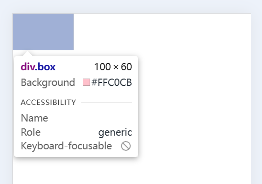
体验rem适配: 只要根据屏幕的大小, 设置HTML设置根字号, rem单位就能完成移动适配
<!DOCTYPE html>
<html lang="en">

<head>
    <meta charset="UTF-8">
    <meta http-equiv="X-UA-Compatible" content="IE=edge">
    <meta name="viewport" content="width=device-width, initial-scale=1.0">
    <title>体验rem适配</title>
    <style>
        * {
            margin: 0;
            padding: 0;
        }

        .box {
            /* 固定单位 */
            /* width: 10px; */
            /* height: 10px; */

            /* 相对单位 */
            /* 相对于HTML标签的字号计算尺寸 */
            width: 5rem;
            height: 5rem;
            background-color: pink;
        }
    </style>
</head>

<body>
    <div class="box"></div>

    /* 识别屏幕大小, 设置HTML的根字号 */
    <script src="./js/flexible.js"></script>
</body>

</html>
- 运行代码: 不同设备, 元素的尺寸等比缩放
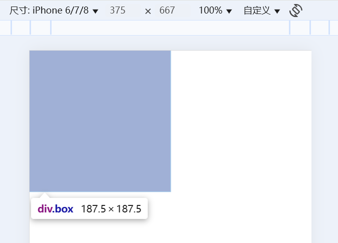
媒体查询
先给htnl设置字号,才能使用rem单位
- 手机屏幕大小不同,分辨率不同,如何设置不同的HTML标签字号 ?
- 设备宽度不同,HTML标签字号设置多少合适?
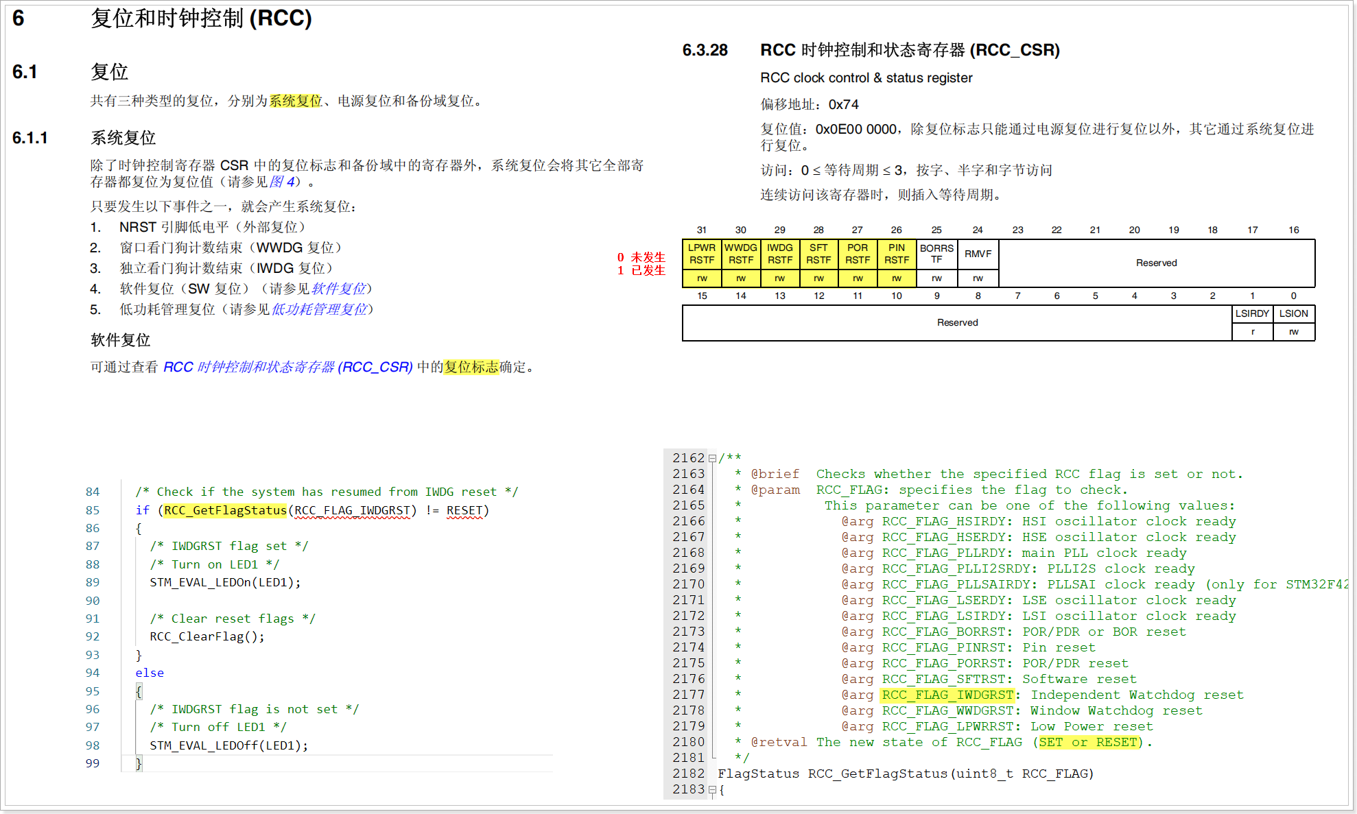
媒体查询能够检测视口的宽度,然后编写差异化的 CSS 样式
- 语法
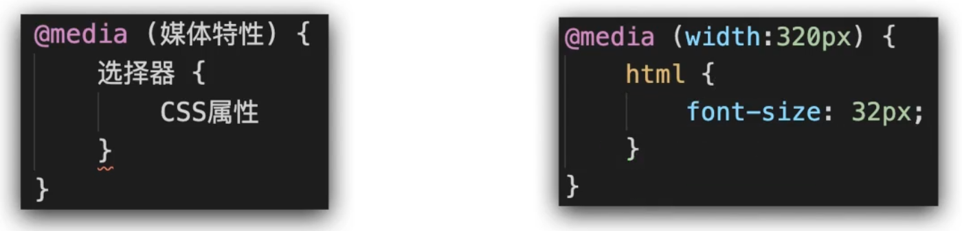
- 用媒体查询设置根字号:
<!DOCTYPE html>
<html lang="en">

<head>
    <meta charset="UTF-8">
    <meta http-equiv="X-UA-Compatible" content="IE=edge">
    <meta name="viewport" content="width=device-width, initial-scale=1.0">
    <title>Document</title>
    <style>
        /* 使用媒体查询, 根据不同的视口宽度, 设置不同的根字号 */
        @media (width:375px) {
            html {
                font-size: 40px;
            }
        }

        @media (width:320px) {
            html {
                font-size: 30px;
            }
        }
    </style>
</head>

<body>

</body>

</html>- 运行代码, 当适口宽度是375px时, html的根字高被设置为40px
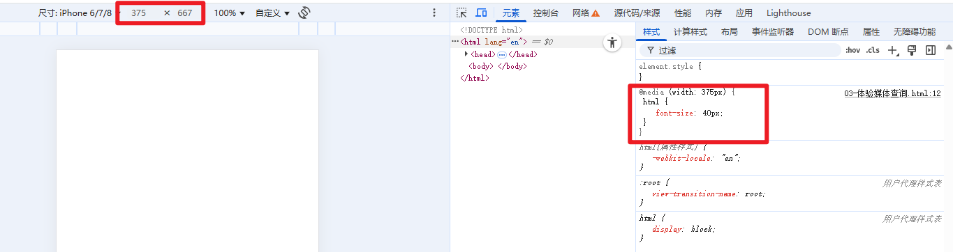
- 为了保证模拟器iPhone6/7/8的html适口宽度等于375, 需要设置一下屏幕的缩放
设备宽度不同,HTML标签字号设置多少合适?
- 原则: 设备宽度大 ,元素尺寸大, 设备宽度小,元素尺寸小
- 规范: 目前rem布局方案中,将网页等分成10份,HTML标签的字号为视口宽度的 1/10
学会了设置根字号, 也知道了根字号应该设置多大, 就可以使用rem进行布局了
<!DOCTYPE html>
<html lang="en">
<head>
<meta charset="UTF-8">
<meta http-equiv="X-UA-Compatible" content="IE=edge">
<meta name="viewport" content="width=device-width, initial-scale=1.0">
<title>rem适配</title>
<style>
* {
margin: 0;
padding: 0;
}
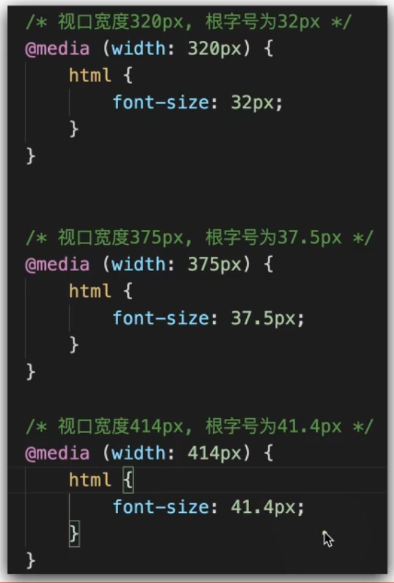
/* 1. 不同的视口, HTML标签字号不同, 字号是视口宽度的1/10 */
@media (width:320px) {
html {
font-size: 32px;
}
}
@media (width:375px) {
html {
font-size: 37.5px;
}
}
@media (width:414px) {
html {
font-size: 41.4px;
}
}
/* 2. 书写盒子尺寸, 单位rem */
.box {
width: 5rem;
height: 3rem;
background-color: pink;
}
</style>
</head>
<body>
<div class="box"></div>
</body>
</html>- 可以自己验算一下, 最终尺寸对不对
单位换算
如何确定rem的数值?
- 怎么使用rem已经知道了
- 工作中,书写代码的尺寸要参照设计稿尺寸,设计稿中是px还是rem?
- 显然设计稿单位是px, 我们要写rem单位, 那么如何换算呢?
计算rem单位尺寸
- 确定设计稿对应的设备的HTML标签字号
- 查看设计稿宽度 → 确定参考设备宽度(视口宽度) → 确定基准根字号 (1/10视口宽度)
- rem单位的尺寸
- rem单位的尺寸 = px单位数值 / 基准根字号
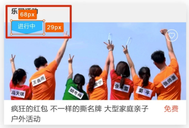
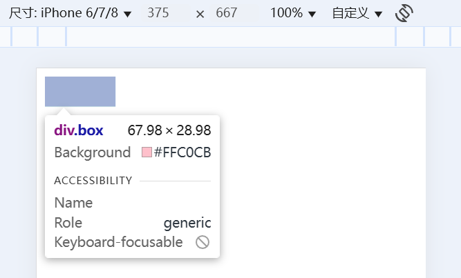
- 练习: 计算68px是多少个rem? (假定设计稿适配375px视口)
- 68px / 37.5 = 1.813rem
使用rem单位开发移动设配的流程
- 通过媒体查询, 给HTML标签加根字号 (1/10适口宽度)
- 把设计稿中的px单位 换算成 rem单位使用
<!DOCTYPE html>
<html lang="en">
<head>
    <meta charset="UTF-8">
    <meta http-equiv="X-UA-Compatible" content="IE=edge">
    <meta name="viewport" content="width=device-width, initial-scale=1.0">
    <title>rem开发流程</title>
    <link rel="stylesheet" href="./demo.css">
</head>
<body>
    <div class="box"></div>
</body>
</html>
/*
1. HTML标签加字号 (1/10适口宽度)
2. 写rem单位的尺寸
*/
@media (width: 320px) {
html {
font-size: 32px;
}
}
@media (width:375px) {
html {
font-size: 37.5px;
}
}
@media (width: 414px) {
html {
font-size: 41.4px;
}
}
.box {
/* 设计稿宽度是375, 根字号就是37.5px */
/* 套用公式计算rem单位 */
/* 68px / 37.5 = 1.813rem */
width: 1.813rem;
height: 0.773rem;
background-color: pink;
}- 执行代码
- 因为设计稿是375的宽度, 所以当屏幕宽度是375时, 元素尺寸贴合设计稿
- 屏幕变大后, 元素尺寸就等比例变大了, 达到了屏幕适配的效果
完整使用
使用flexible js配合rem实现在不同宽度的设备中,网页元素尺寸等比缩放效果
- flexible.js是手淘开发出的一个用来适配移动端的js框架
- 核心原理就是根据不同的视口宽度给网页中html根节点设置不同的font-size
- 有了这个小框架就不用我们手写媒体查询了
成熟的开发流程
- 引入 flexible.js 文件, 实现自动设置根字号
- 确定设计稿的根字号
- 查看设计稿宽度---确定视口宽度---确定根字号(1/10视口宽度)(行业经验)
- 比如: 设计稿宽度375px->视口宽度就是375px->根字号就是37.5px
- rem单位换算:
- rem单位 = px单位 / 基准根字号 (如果有小数取到3位)
- 比如: 32px / 37.5 = 0.853rem
- 配和less简化计算 (后面学)
- width: (32 / 37.5rem);
- 示例代码
<!DOCTYPE html>
<html lang="en">
<head>
    <meta charset="UTF-8">
    <meta http-equiv="X-UA-Compatible" content="IE=edge">
    <meta name="viewport" content="width=device-width, initial-scale=1.0">
    <title>rem开发流程</title>
    <link rel="stylesheet" href="./demo.css">
</head>
<body>
    <div class="box"></div>

    <script src="../js/flexible.js"></script>
</body>
</html>
.box {
/* 设计稿375, 根字号37.5 */
/* 68px / 37.5 = 1.813rem */
width: 1.813rem;
/* 29px / 37.5 = 0.773rem */
height: 0.773rem;
background-color: pink;
}less
目标: 使用Less运算写法完成px单位到rem单位的转换
- 思考: 在px单位转换到rem单位过程中,哪项工作是最麻烦的 ?
- 答: 除法运算。CSS不支持计算写法
- 解决方案: 可以通过Less实现。
使用Less语法快速编译生成CSS代码
- Less是一个CSS预处理器,
- Less文件后缀是.less扩充了 CSS 语言,使 CSS 具备一定的逻辑性、计算能力。
- 注意:浏览器不识别Less代码,目前阶段,网页要引入对应的CSS文件
- 所以实际使用流程是编写less文件->导出css文件->使用css文件
编译插件: Easy Less
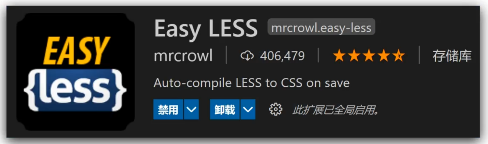
- 添加vscode插件
- 作用: less文件保存自动生成css文件
- 体验less
/* 在index.less文件中编写less代码 */
.father {
    color: red;
    width: (68 / 37.5rem);

    .son {
        background-color: pink;
    }
}
/* 插件会编译index.less文件, 自动生成index.css文件 */
.father {
color: red;
width: 1.81333333rem;
}
.father .son {
background-color: pink;
}
注释语法
- 单行注释
- 语法: //内容
- 快捷键: ctrl+/
- 单行注释的内容不会出现在编译后的css文件中
- 多行注释
- 语法: /* 内容 */
- 快捷键 shift+alt+A
- 代码示例:
// 单行注释

/*
    块注释
    第二行
    第三行
*/
/*
块注释
第二行
第三行
*/
运算语法
- 加减乘正常写, 除法需要加小括号
.box {
width: 100 + 10px;
width: 100 - 20px;
width: 100 * 2px;
// 除法, 推荐的写法
width: (68 / 37.5rem);
// 可以运行, 但是vscode会报红
height: 29 ./ 37.5rem;
// less4之前的写法, 新版不识别, 转译失败后会照搬到css文件中
// 由于css不支持运算, 会导致css报错
height: 29 / 37.5rem;
}.box {
width: 110px;
width: 80px;
width: 200px;
width: 1.81333333rem;
height: 29 / 37.5rem;
}
能够使用Less嵌套写法生成后代选择器
- 思考: 书写CSS选择器时,如何避免样式冲突?
- 答案: 使用后代选择器限定选择器生效的范围
- less的嵌套语法可以快速生成后代选择器。
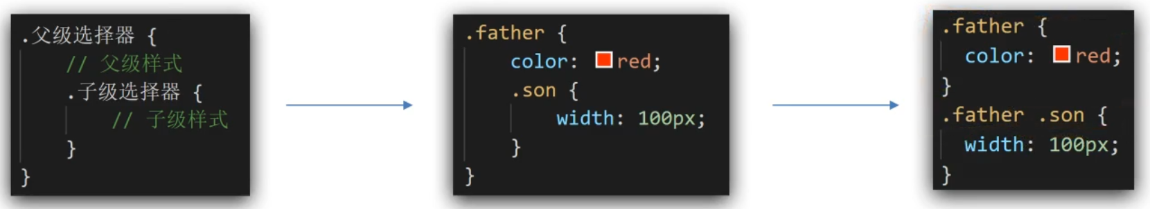
- &符号不生成后代选择器, 表示当前选择器, 配合伪元素使用
- 示例代码
.father {
width: 100px;
.son {
color: pink;
// & 表示当前选择器
// 等价于.son:hover
&:hover {
color: green;
}
}
&:hover {
color: orange;
}
}
/* &符可以提高代码的封装性, 提高css代码的迁移效率 */
/* 有&符就可以避免下面的代码 */
// .father:hover {}.father {
width: 100px;
}
.father .son {
color: pink;
}
.father .son:hover {
color: green;
}
.father:hover {
color: orange;
}
能够使用Less变量设置属性值
- 思考: 网页中,文字文字颜色基本都是统一的,如果网站改版,变换文字颜色,如何修改代码?
- 在css中, 可以把颜色属性提取到一个类名中, 哪个标签需要就添加类名
- 在less中, 可以使用变量, 把颜色提前存储到一个容器,设置属性值为这个容器名
- 定义变量: @变量名: 值;
- 使用变量: CSS属性: @变量名;
- 示例代码
// 1. 定义. 2.使用
@colora: green;
// 3. 根字号可以存起来多次调用
@rootSize: 37.5rem;
.box {
color: @colora;
// 调用时打出@会有提示
width: (68 / @rootSize);
}
.father {
background-color: @colora;
}
.aa {
color: @colora;
}.box {
color: green;
width: 1.81333333rem;
}
.father {
background-color: green;
}
.aa {
color: green;
}能够使用Less导入写法引用其他Less文件
- 思考: 开发网站时,网页如何引入公共样式 ?
- CSS: 书写link标签
- Less: 导入文件
- 导入语法: @import "文件路径";
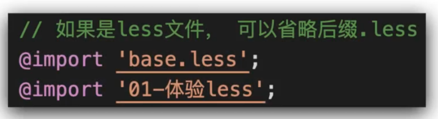
- 代码示例
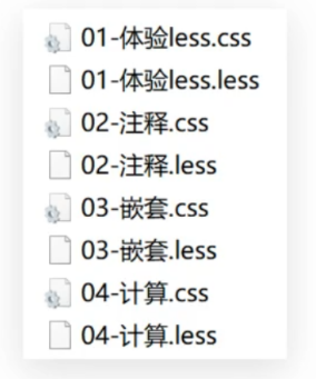
// 导入语句书写在文件头部
@import './01-体验less.less'; // 注意空格和分号不能省
@import './02-注释'; // .less的后缀名可以省略// 生成的css中就存在导入文件的内容了
.father {
color: red;
width: 1.81333333rem;
}
.father .son {
background-color: pink;
}
/*
    块注释
    第二行
    第三行
*/
目前,Less文件导出的CSS文件位置是哪里?
- 默认 Easy LESS 插件会把css文件导出在同级目录中, 并沿用文件名
- 实际开发中, less文件和css文件都是分开存放的
- 统一导出, 配置插件即可
- 配置EasyLess插件,实现所有Less有相同的导出路径
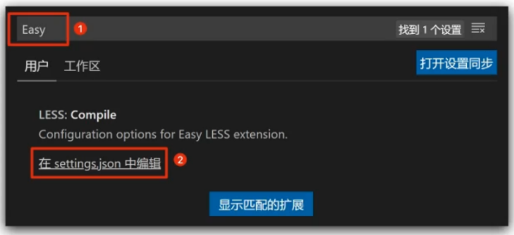
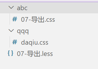
- 设置 → 搜索EasyLess → 在settingjson中编辑 →添加代码(注意,必须是双引号)
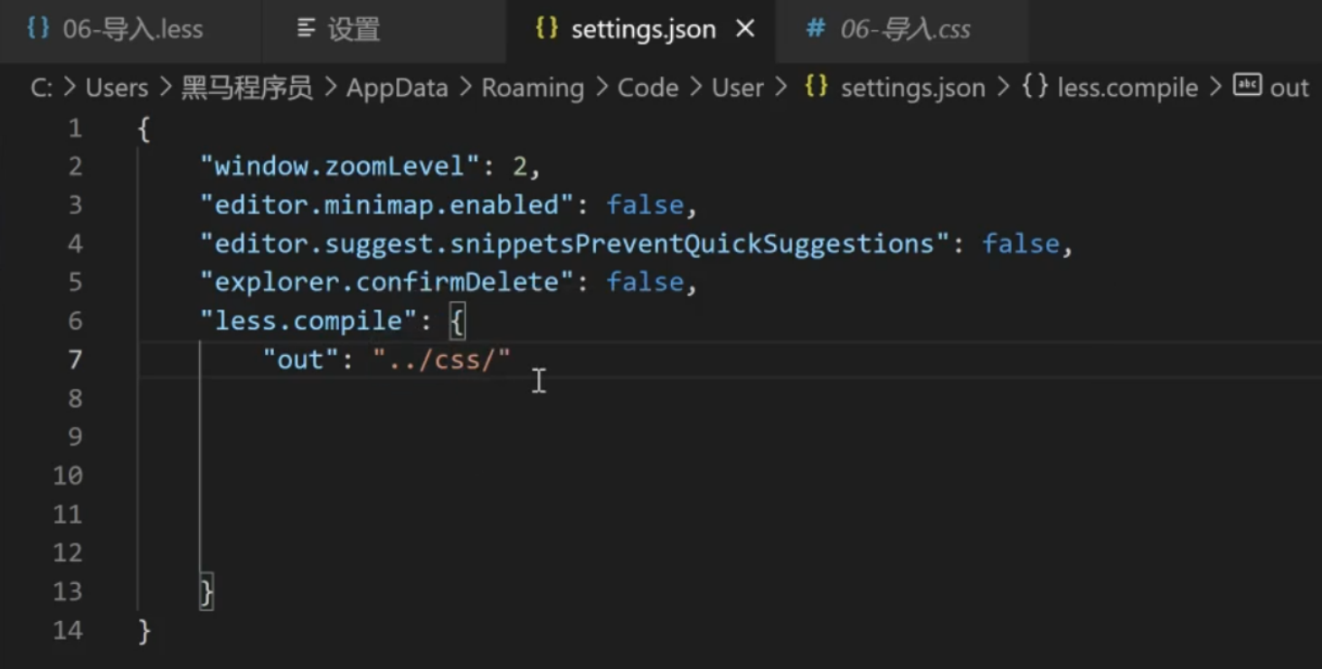
- 分别导出
- 语法: // out: ../css/
- 导出语法必须写在第一行才会生效
// out: ./qqq/daqiu.css

// out: ./abc/

.box {
    color: red;
}
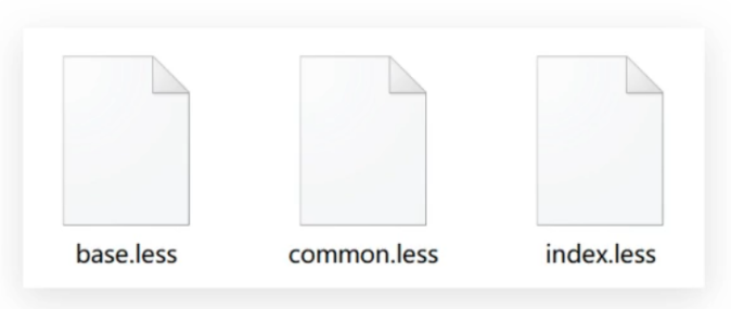
所有的Less文件都需要导出CSS文件吗?
- base.less和common.less是给index.less导入使用的, 不需要导出css文件
- 禁止导出:
- 在less文件第一行添加: // out: false
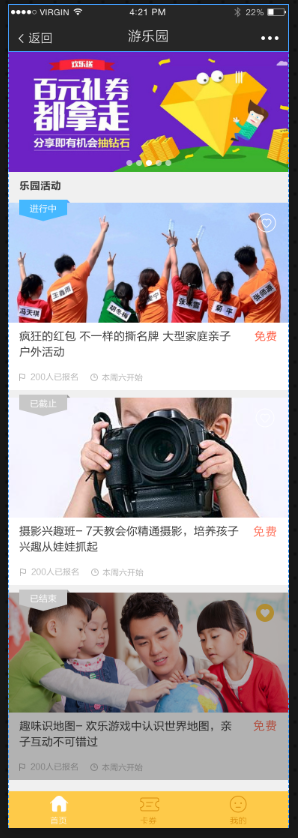
// out: false游乐园项目
项目准备
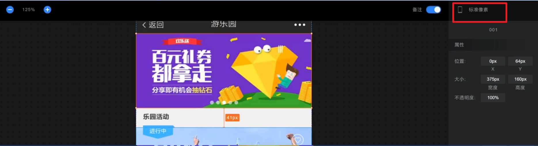
资料中的 [定稿] 是项目的设计图, 打开index.html页面, 可以查看设计稿
- 打开设计稿, 默认设备时@2x, 切换到标准像素(@1x), 确保画布宽度是375px, 测量的元素尺寸才是争取的
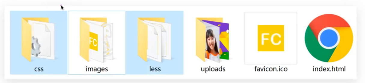
- 资料中的FC目录是项目的工程目录, 基于这个目录进行开发
新建index.less, 引入base.less和normalize.less
@import './base';
@import './normalize';
在index.html中引入字体图标, ico图标 和 index.css
<!DOCTYPE html>
<html lang="en">
<head>
    <meta charset="UTF-8">
    <meta http-equiv="X-UA-Compatible" content="IE=edge">
    <meta name="viewport" content="width=device-width, initial-scale=1.0">
    <title>FC游乐园</title>
    <link rel="shortcut icon" href="favicon.ico" type="image/x-icon">
    <link rel="stylesheet" href="./lib/iconfont/iconfont.css">
    <link rel="stylesheet" href="./css/index.css">
</head>
<body>

</body>
</html>
整体布局
头部的导航是浏览器自动生成的,中间的列表可以上下滑动, 底部tabbar固定定位
<!DOCTYPE html>
<html lang="en">
<head>
    <meta charset="UTF-8">
    <meta http-equiv="X-UA-Compatible" content="IE=edge">
    <meta name="viewport" content="width=device-width, initial-scale=1.0">
    <title>FC游乐园</title>
    <link rel="shortcut icon" href="favicon.ico" type="image/x-icon">
    <link rel="stylesheet" href="./lib/iconfont/iconfont.css">
    <link rel="stylesheet" href="./css/index.css">
</head>
<body>
    <!-- 主体内容 -->
    <div class="main">1</div>
    <!-- 主体内容 -->

    <!-- 底部工具栏 -->
    <footer>2</footer>
    <!-- 底部工具栏 -->

    <script src="./js/flexible.js"></script>
</body>
</html>
@import './base';
@import './normalize';
// 变量: 存储37.5根字号
@rootSize: 37.5rem;
body {
background-color: #F0F0F0;
}
// 主体内容
.main {
// padding-bottom: (50 / 37.5rem);
padding-bottom: (50 / @rootSize);
}
// 底部工具栏
footer {
position: fixed;
left: 0;
bottom: 0;
width: 100%;
// height: (50 / 37.5rem);
height: (50 / @rootSize);
background-color: #FECA49;
}
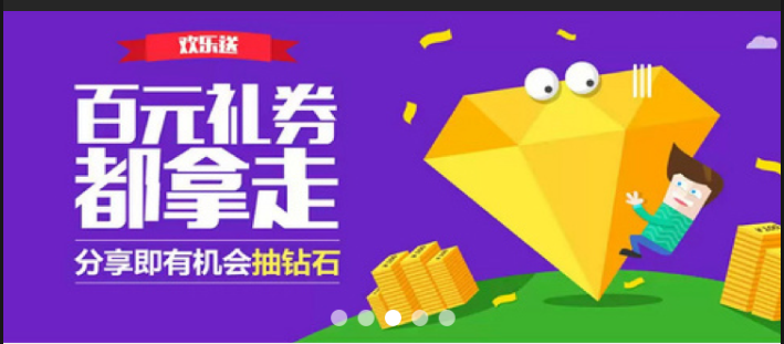
banner
banner的效果是几张图片可以切换, 这里就放一张图片
<!DOCTYPE html>
<html lang="en">
<head>
    <meta charset="UTF-8">
    <meta http-equiv="X-UA-Compatible" content="IE=edge">
    <meta name="viewport" content="width=device-width, initial-scale=1.0">
    <title>FC游乐园</title>
    <link rel="shortcut icon" href="favicon.ico" type="image/x-icon">
    <link rel="stylesheet" href="./lib/iconfont/iconfont.css">
    <link rel="stylesheet" href="./css/index.css">
</head>
<body>
    <!-- 主体内容 -->
    <div class="main">
        <!-- banner -->
        <div class="banner">
            <ul>
                <li><a href="#"><img src="./uploads/banner_1.png" alt=""></a></li>
            </ul>
        </div>
    </div>
    <!-- 主体内容 -->

    <script src="./js/flexible.js"></script>
</body>
</html>
@import './base';
@import './normalize';
// 变量: 存储37.5
@rootSize: 37.5rem;
body {
background-color: #F0F0F0;
}
// 主体内容
.main {
padding-bottom: (50 / @rootSize);
// banner
.banner {
height: (160 / @rootSize);
}
}
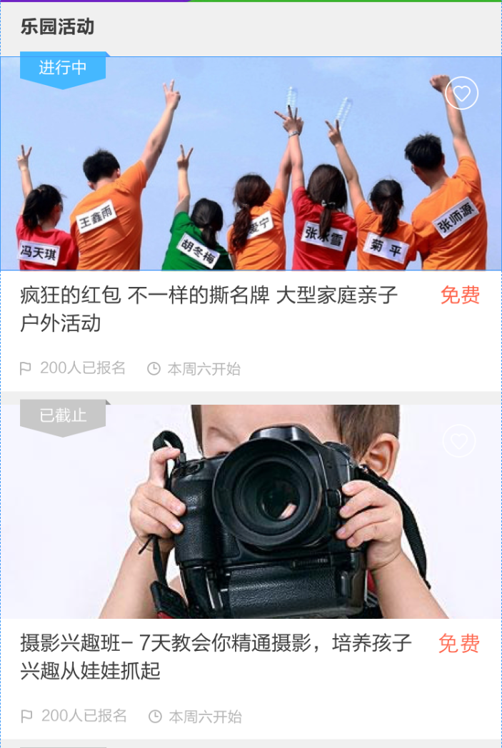
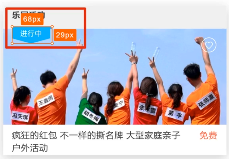
活动区域
活动卡片由上边的背景和下边的文字组成
<!DOCTYPE html>
<html lang="en">
<head>
    <meta charset="UTF-8">
    <meta http-equiv="X-UA-Compatible" content="IE=edge">
    <meta name="viewport" content="width=device-width, initial-scale=1.0">
    <title>FC游乐园</title>
    <link rel="shortcut icon" href="favicon.ico" type="image/x-icon">
    <link rel="stylesheet" href="./lib/iconfont/iconfont.css">
    <link rel="stylesheet" href="./css/index.css">
</head>
<body>
    <!-- 主体内容 -->
    <div class="main">

        <!-- 活动标题 -->
        <div class="title">
            <h4>乐园活动</h4>
        </div>

        <!-- 活动 -->
        <section class="item">
            <div class="pic">
                <a href="#"><img src="./uploads/item_2.png" alt=""></a>
                <!-- 收藏图标 -->
                <i class="iconfont icon-shoucang1"></i>

                <!-- 活动状态 -->
                <div class="active off">进行中</div>
            </div>
            <div class="txt">
                <div class="top">
                    <h5>疯狂的红包 不一样的撕名牌 大型家庭亲子户外活动</h5>
                    <p>免费</p>
                </div>
                <div class="bottom">
                    <p>
                        <i class="iconfont icon-qizhi"></i>
                        <span>200</span>人已报名
                    </p>
                    <p>
                        <i class="iconfont icon-shizhong"></i>
                        <span>本周六</span>开始
                    </p>
                </div>
            </div>
        </section>

    </div>
    <!-- 主体内容 -->

    <script src="./js/flexible.js"></script>
</body>
</html>
// 主体内容
.main {
padding-bottom: (50 / @rootSize);
// 活动标题
.title {
height: (40 / @rootSize);
line-height: (40 / @rootSize);
padding-left: (15 / @rootSize);
h4 {
font-size: (14 / @rootSize);
color: #3C3C3C;
}
}
// 活动
.item {
margin-bottom: (10 / @rootSize);
// 图
.pic {
position: relative;
height: (160 / @rootSize);
// 收藏图标
i {
position: absolute;
top: (15 / @rootSize);
right: (18 / @rootSize);
font-size: (24 / @rootSize);
color: #fff;
}
// 活动状态
.active {
position: absolute;
left: (15 / @rootSize);
top: (-4 / @rootSize);
width: (68 / @rootSize);
height: (29 / @rootSize);
background-image: url(./../images/status_active.png);
background-size: contain;
font-size: (12 / @rootSize);
color: #fff;
text-align: center;
line-height: (25 / @rootSize);
// 灰色图片样式
// .active.off {} 必须是active类同时应用了off类
// div.off {} 交集选择器
&.off {
background-image: url(../images/status_default.png);
}
}
// .off {
// // 灰色图片
// }
}
// 文字
.txt {
padding: (10 / @rootSize) (15 / @rootSize);
background-color: #fff;
.top {
display: flex;
justify-content: space-between;
h5 {
width: (290 / @rootSize);
font-size: (15 / @rootSize);
color: #3C3C3C;
font-weight: 400;
}
p {
font-size: (15 / @rootSize);
color: #FE6249;
}
}
.bottom {
display: flex;
margin-top: (10 / @rootSize);
p {
margin-right: (15 / @rootSize);
font-size: (11 / @rootSize);
i {
font-size: (11 / @rootSize);
}
color: #B4B4B4;
}
}
}
}
}
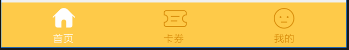
底部按钮
完成底部按钮的布局
<!DOCTYPE html>
<html lang="en">
<head>
    <meta charset="UTF-8">
    <meta http-equiv="X-UA-Compatible" content="IE=edge">
    <meta name="viewport" content="width=device-width, initial-scale=1.0">
    <title>FC游乐园</title>
    <link rel="shortcut icon" href="favicon.ico" type="image/x-icon">
    <link rel="stylesheet" href="./lib/iconfont/iconfont.css">
    <link rel="stylesheet" href="./css/index.css">
</head>
<body>

    <!-- 底部工具栏 -->
    <footer>
        <a href="#" class="current">
            <i class="iconfont icon-index-copy"></i>
            <p>首页</p>
        </a>
        <a href="#">
            <i class="iconfont icon-index-copy"></i>
            <p>首页</p>
        </a>
        <a href="#">
            <i class="iconfont icon-index-copy"></i>
            <p>首页</p>
        </a>
    </footer>
    <!-- 底部工具栏 -->

    <script src="./js/flexible.js"></script>
</body>
</html>
// 底部工具栏
footer {
position: fixed;
left: 0;
bottom: 0;
display: flex;
justify-content: space-around;
align-items: center;
width: 100%;
// height: (50 / 37.5rem);
height: (50 / @rootSize);
background-color: #FECA49;
text-align: center;
a {
font-size: (11 / @rootSize);
color: #D78B09;
.iconfont {
font-size: (24 / @rootSize);
}
// a.current {}
&.current {
color: #fff;
}
}
}
vw/vh
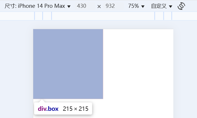
目标: 能够使用vw单位设置网页元素的尺寸
- 相对单位
- 相对视口的尺寸计算结果.
- vw全称viewport width;
- 1vw=1/100视口宽度
- vh全称viewport height;
- 1vh=1/100视口高度
体验vw和vh单位
<!DOCTYPE html>
<html lang="en">
<head>
<meta charset="UTF-8">
<meta http-equiv="X-UA-Compatible" content="IE=edge">
<meta name="viewport" content="width=device-width, initial-scale=1.0">
<title>体验vw和vh</title>
<style>
* {
margin: 0;
padding: 0;
}
/* 1. vw = 1/100视口宽度 */
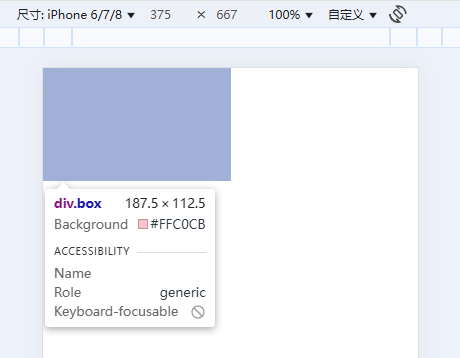
/* 375 / 100 * 50 = 187.5 */
/* 375 / 100 * 30 = 112.5 */
.box {
width: 50vw;
height: 30vw;
background-color: pink;
}
/* 2. vh = 1/100视口高度 */
/* 667 / 100 * 50 = 333.5 */
/* 667 / 100 * 30 = 200.1 */
.box {
width: 50vh;
height: 30vh;
background-color: pink;
}
</style>
</head>
<body>
<div class="box"></div>
</body>
</html>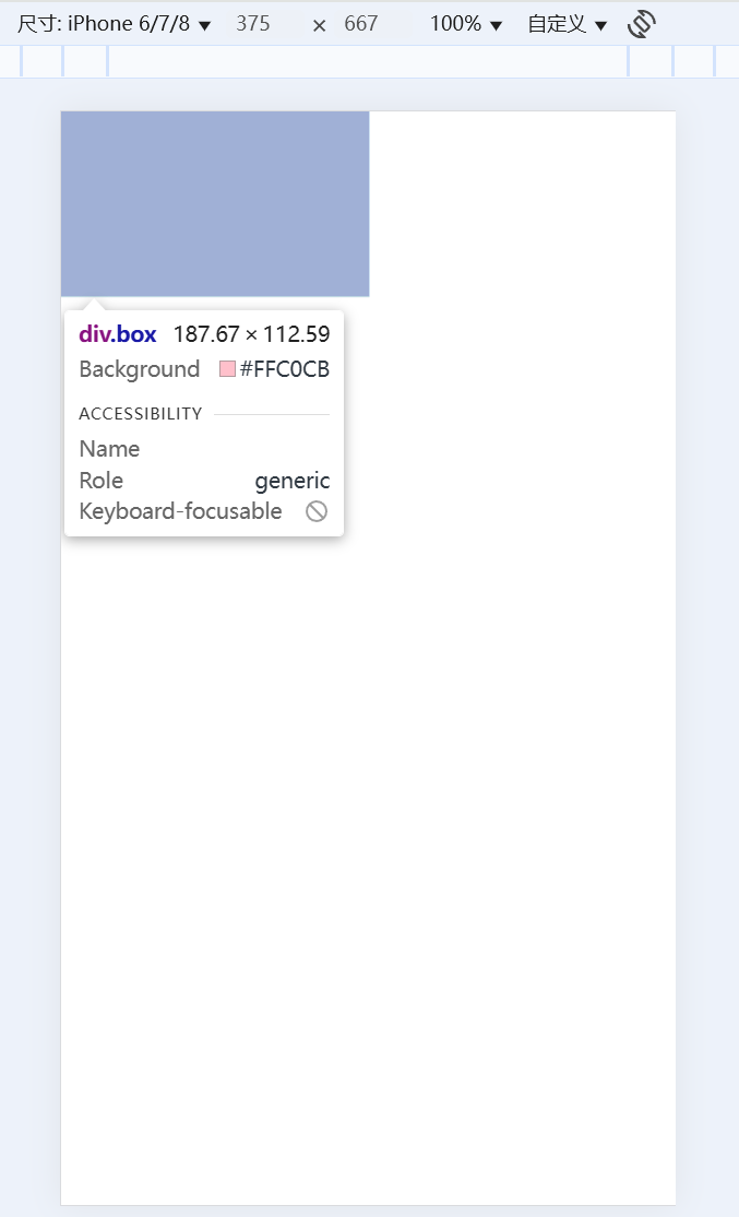
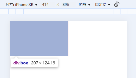
- vw/vh方案的优势就是不再依赖媒体查询
- 这里盒子的尺寸和计算值有误差是因我的屏幕分辨率是2k, 逻辑分辨率不同
vw单位换算: 设计稿中的单位一定是px单位, 写代码要写vw单位, 怎么换算呢?
- 确定设计稿对应的vw尺寸(1/100视口宽度)
- 查看设计稿宽度 → 确定参考设备宽度 (视口宽度) → 确定ww尺寸 (1/100)视口宽度
- vw单位的尺寸 = px单位数值 / (1/100 视口宽度)
- vh单位的尺寸 = px单位数值 / (1/100 视口高度)
- 设计稿如下图, 设计稿宽度是375px, 完成尺寸换算
<!DOCTYPE html>
<html lang="en">
<head>
    <meta charset="UTF-8">
    <meta http-equiv="X-UA-Compatible" content="IE=edge">
    <meta name="viewport" content="width=device-width, initial-scale=1.0">
    <title>vw适配</title>
    <link rel="stylesheet" href="./demo.css">
</head>
<body>
    <div class="box"></div>

    <div class="box2"></div>
</body>
</html>
// out: ./
* {
margin: 0;
padding: 0;
}
// vw单位的尺寸 = px单位数值 / (1/100 视口宽度)
.box {
// vw
width: (68 / 3.75vw);
height: (29 / 3.75vw);
background-color: pink;
}
// vh单位的尺寸 = px单位数值 / (1/100 视口高度)
.box2 {
// vh
width: (68 / 6.67vh);
height: (29 / 6.67vh);
background-color: green;
}
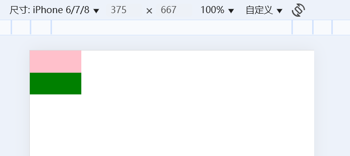
- 使用vw和vh两种单位设置盒子尺寸, 最终盒子的大小是一致的
- 所以开发中使用vw和vh都行
- 全面屏手机的高度变大, 所以vw和vh单位不能混用, 元素会变形
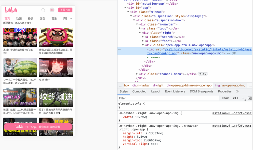
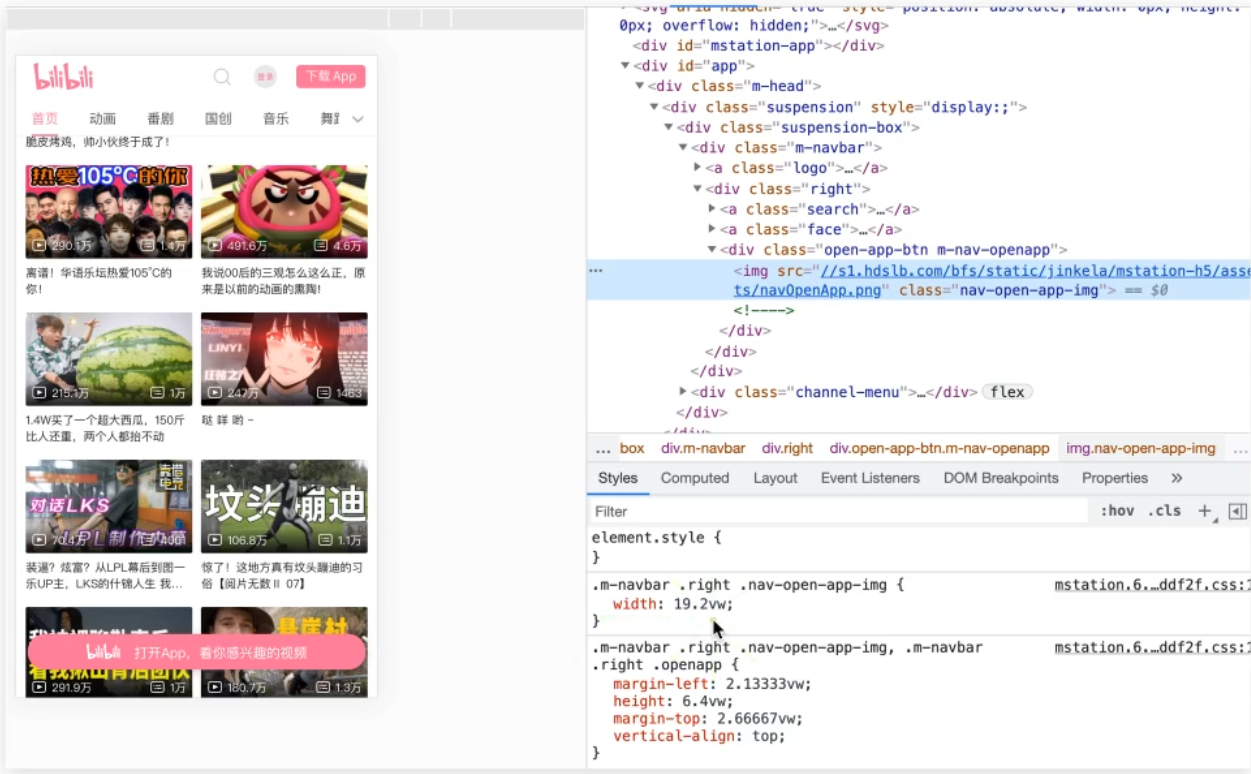
仿b站首页
准备工作
素材获取: 图片直接右键另存为, 字体图标的下载如下
- 检查元素, 找到iconfont类名, 点击iconfont样式表
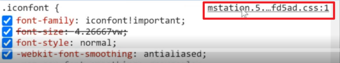
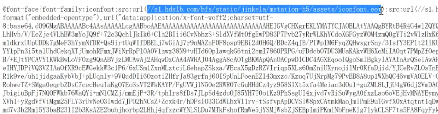
- 复制字体URL到浏览器地址栏, 回车就能下载字体文件
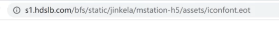
- 新建iconfont.css文件, 把样式表的代码复制下来
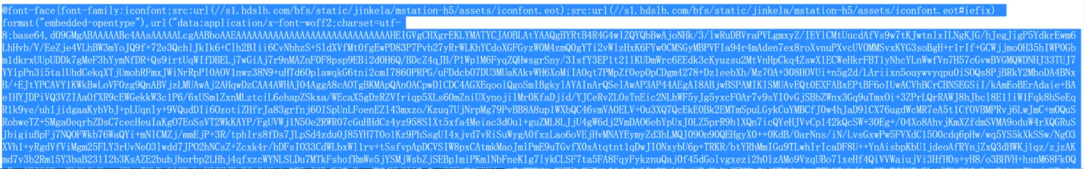
- 在原站中复制图标类名使用就行了
新建index.html文件, 新建index.less文件
<!DOCTYPE html>
<html lang="en">
<head>
    <meta charset="UTF-8">
    <meta http-equiv="X-UA-Compatible" content="IE=edge">
    <meta name="viewport" content="width=device-width, initial-scale=1.0">
    <title>B站</title>
    <link rel="stylesheet" href="./fonts/iconfont.css">
    <link rel="stylesheet" href="./css/index.css">
</head>
<body>
</body>
</html>
@import 'base';
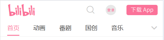
头部区域
<!DOCTYPE html>
<html lang="en">
<head>
    <meta charset="UTF-8">
    <meta http-equiv="X-UA-Compatible" content="IE=edge">
    <meta name="viewport" content="width=device-width, initial-scale=1.0">
    <title>B站</title>
    <link rel="stylesheet" href="./fonts/iconfont.css">
    <link rel="stylesheet" href="./css/index.css">
</head>
<body>
    <!-- 1. 头部固定 -->
    <header>
        <div class="top">
            <div class="left">
                <a href="#">
                    <i class="iconfont Navbar_logo"></i>
                </a>
            </div>
            <div class="right">
                <a href="#">
                    <i class="iconfont ic_search_tab"></i>
                </a>
                <a href="#" class="login"><img src="./images/login.png" alt=""></a>
                <a href="#" class="download"><img src="./images/download.png" alt=""></a>
            </div>
        </div>
        <div class="bottom">
            <div class="tab">
                <ul>
                    <li><a href="#" class="current">首页</a></li>
                    <li><a href="#">动画</a></li>
                    <li><a href="#">番剧</a></li>
                    <li><a href="#">国创</a></li>
                    <li><a href="#">音乐</a></li>
                </ul>
            </div>
            <div class="more">
                <a href="#">
                    <i class="iconfont general_pulldown_s"></i>
                </a>
            </div>
        </div>
    </header>

    <!-- 2. 视频区域 -->


    <!-- 3. 按钮固定 -->
</body>
</html>
@import 'base';
@vw: 3.75vw;
@color: #fb7299;
// 头部 固定
header {
position: fixed;
left: 0;
top: 0;
z-index: 1;
width: 100%;
// width: 100vw;
height: (84 / @vw);
background-color: #fff;
// top
.top {
display: flex;
justify-content: space-between;
align-items: center;
height: (44 / @vw);
padding-left: (18 / @vw);
padding-right: (12 / @vw);
.left {
.iconfont {
font-size: (28 / @vw);
color: @color;
}
}
.right {
display: flex;
.iconfont {
font-size: (22 / @vw);
color: #ccc;
}
.login {
width: (24 / @vw);
height: (24 / @vw);
margin-left: (24 / @vw);
}
.download {
width: (72 / @vw);
height: (24 / @vw);
margin-left: (24 / @vw);
}
}
}
// bottom
.bottom {
display: flex;
justify-content: space-between;
height: (40 / @vw);
border-bottom: 1px solid #eee;
.more {
a {
display: block;
width: (40 / @vw);
height: (40 / @vw);
// background-color: pink;
text-align: center;
line-height: (40 / @vw);
// font-size: (22 / @vw);
color: #ccc;
.iconfont {
font-size: (22 / @vw);
}
}
}
.tab {
ul {
display: flex;
li {
padding: 0 (16 / @vw);
a {
display: block;
height: (38 / @vw);
line-height: (38 / @vw);
font-size: (14 / @vw);
&.current {
color: @color;
border-bottom: 2px solid @color;
}
}
}
}
}
}
}
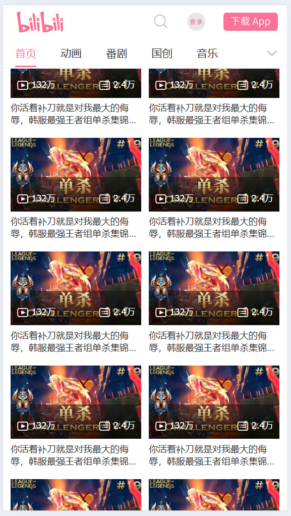
视频区域
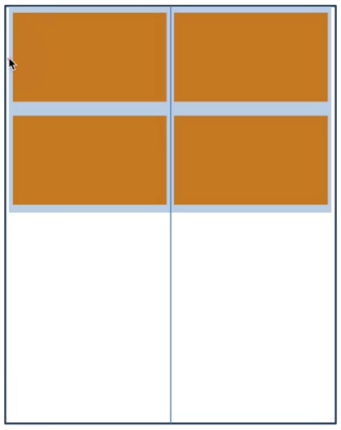
视频区域布局分析:
- 父级设置左右padding
- 每个视频盒子宽度为50%左右padding(拉开内容的距离)
- 完成两列盒子三距等宽的视觉效果
<!DOCTYPE html>
<html lang="en">
<head>
    <meta charset="UTF-8">
    <meta http-equiv="X-UA-Compatible" content="IE=edge">
    <meta name="viewport" content="width=device-width, initial-scale=1.0">
    <title>B站</title>
    <link rel="stylesheet" href="./fonts/iconfont.css">
    <link rel="stylesheet" href="./css/index.css">
</head>
<body>
    <!-- 1. 头部固定 -->

    <!-- 2. 视频 -->
    <!-- 视频区域布局 -->
    <section class="video_content">
        <!-- 一份视频, 共计有5个菜单, 应该有5份视频的div -->
        <div class="video_list">
            <a href="#">
                <div class="pic">
                    <img src="./images/1.jpg" alt="">
                    <div class="count">
                        <p>
                            <i class="iconfont icon_shipin_bofangshu"></i>
                            <span>132</span>万
                        </p>
                        <p>
                            <i class="iconfont icon_shipin_danmushu"></i>
                            <span>2.4</span>万
                        </p>
                    </div>
                </div>
                <div class="txt ellipsis-2">你活着补刀就是对我最大的侮辱,韩服最强王者组单杀集锦#19</div>
            </a>

        </div>
    </section>
    <!-- 3. 按钮固定 -->
</body>
</html>
@import 'base';
@vw: 3.75vw;
@color: #fb7299;
// 视频
.video_content {
padding: (84 / @vw) (5 / @vw) 0;
.video_list {
display: flex;
// 弹性盒子换行
flex-wrap: wrap;
a {
width: 50%;
padding: (8 / @vw) (5 / @vw);
// background-color: pink;
font-size: (12 / @vw);
.txt {
margin-top: (5 / @vw);
}
.pic {
position: relative;
.count {
position: absolute;
left: 0;
bottom: 0;
display: flex;
justify-content: space-between;
width: 100%;
padding: (8 / @vw);
background-image: linear-gradient(to top, rgba(0, 0, 0, 0.6), rgba(0, 0, 0, 0));
color: #fff;
i {
vertical-align: middle;
}
}
}
}
}
}


![[crxjs]自己创建一个浏览器插件](https://i-blog.csdnimg.cn/direct/fcfef7d78be544228e9a751146990731.png)