实现方法
- 实现方法:
- 定位 position + 偏移值 left + margin-left 回退
- 定位 position + 偏移值 left + CSS-2d transform
- 文字居中:text-align:center; + 行内块元素
- 弹性布局: display:flex; [推荐]
实现方法:
1、添加 margin 值 auto
2、定位 position(子绝父相) + 偏移值 left + margin-left 回退 [ 需要计算,有点 麻烦 ]
3、定位 position(子绝父相) + 偏移值 left + CSS-2d transform
4、文字居中 text-align:center; + 行内块元素
5、弹性盒子布局 [ 推荐 ]
代码实现:
<div class="box">
	<div class="box1"></div>
</div>
.box{
	width: 500px;
	height: 300px;
	background-color: aquamarine;
}
.box1{
	width: 200px;
	height: 100px;
	background-color: lightpink;
}
接下来,将使用这个例子来测试上面提到的几种实现水平居中的方法以及记录解决测试过程中出现的一些小问题…
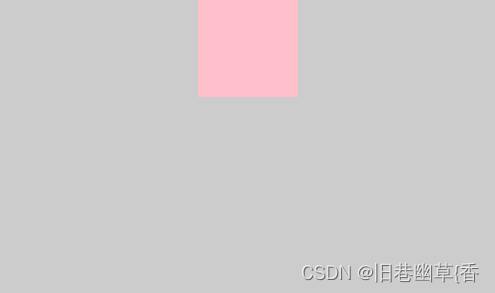
添加margin值(外边距):margin:auto;
.box1{
 	width: 200px;
 	height: 100px;
 	background-color: lightpink;
 	margin: auto;
}

拓展注意点:
如果需要小盒子上下也有一定边距,可以修改margin设置:margin:100px auto;
效果图:

从上面效果图可以发现:两个盒子同时向下移动
这种情况的出现是由 margin塌陷 导致的
那么,该如何解决这种问题呢?
这里,可以将父元素box变为BFC:overflow: hidden; [ 注意不是超出隐藏的作用 ]
效果图:

定位 position + 偏移值 left + margin-left 回退
.box{
 		width: 500px;
 		height: 300px;
 		background-color: aquamarine;
 		position: relative;
}
.box1{
 		width: 200px;
 		height: 100px;
 		background-color: lightpink;
 		position: absolute;
 		/* 相对父级宽度50% */
 		left: 50%;
 		margin-left: -100px;
}
注意点:
只设置left: 50%;并不能实现水平居中的效果:
如果想让小盒子水平居中 ,需要向左移动小盒子本身的宽度一半的距离:margin-left: -100px;
定位 position + 偏移值 left + CSS-2d transform
.box{
 	width: 500px;
 	height: 300px;
 	background-color: aquamarine;
 	position: relative;
}
.box1{
 	width: 200px;
 	height: 100px;
 	background-color: lightpink;
 	position: absolute;
 	left: 50%;
 	transform: translateX(-50%);
}
注意点:
left: 50%; 与 transform: translateX(-50%); 中的 50% 代表的意义不一样:
left: 50%; :相对于父元素box的宽度
transform: translateX(-50%); :相对于自己box1的宽度
效果图:

文字居中:text-align:center; + 行内块元素
.box{
 	width: 500px;
 	height: 300px;
 	background-color: aquamarine;
 	text-align: center;
}
.box1{
 	width: 200px;
 	height: 100px;
 	background-color: lightpink;
 	display: inline-block;
}
注意点:
如果仅使用 text-align:center; 是无法达到水平居中的效果的,为什么?
text-align:center; 需要在行内块元素上使用的,而盒子是块级元素,所以,需要将盒子转换为行内块元素 text-align:center; 才能生效。
效果图:

弹性布局: display:flex; [推荐]
.box{
 	width: 500px;
 	height: 300px;
 	background-color: aquamarine;
 	display: flex;
 	/*主轴-x轴:居中*/
 	justify-content: center;
}
.box1{
 	width: 200px;
 	height: 100px;
 	background-color: lightpink;
}
效果图:

![[附源码]计算机毕业设计JAVA电影影评网](https://img-blog.csdnimg.cn/384d725aec4442fca4450b2e9d3cf535.png)


![[附源码]java毕业设计基于的花店后台管理系统](https://img-blog.csdnimg.cn/f9c1f7825319415c9a02d0a3d4757bb1.png)