这里给大家分享我在网上总结出来的一些知识,希望对大家有所帮助

本篇文章记录仿写一个
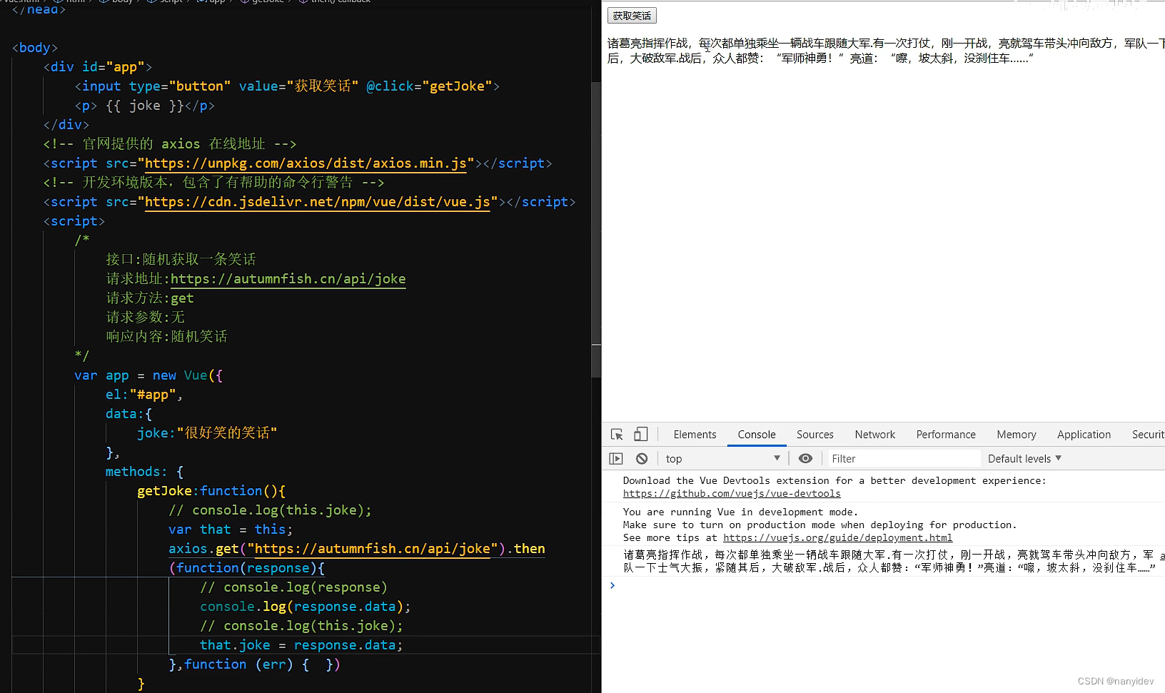
el-button组件细节,从而有助于大家更好理解饿了么ui对应组件具体工作细节。本文是elementui源码学习仿写系列的又一篇文章,后续空闲了会不断更新并仿写其他组件。源码在github上,大家可以拉下来,npm start运行跑起来,结合注释有助于更好的理解
网站效果演示:ashuai.work:8888/#/myButton
GitHub仓库地址:github.com/shuirongshu…
什么是Button组件
按钮用于点击,一般是做事件的响应。
按钮封装效果图

按钮分类
- 单一按钮
- 默认按钮
- 主题按钮(primary、success、warning、error)
- 按钮大小(small、middle、big)
- 按钮禁用(disabled)
- 按钮加载(loading)
- 按钮的图标位置(默认图标在按钮文字左侧)
- 图标按钮(没有按钮文字)
- 单一文字按钮
- 按钮组(按钮组中有多个按钮)
默认按钮
默认按钮很简单,只是写一个最普通的样式即可
<button :class="[ 'myButton' ]" />
.myButton {
  display: inline-flex;
  align-items: center;
  justify-content: center;
  white-space: nowrap;
  box-sizing: border-box;
  padding: 12px 16px;
  background-color: rgba(0, 0, 0, 0.1);
  color: #222;
  border: none;
  cursor: pointer;
  user-select: none; // 不让选中文字
  transition: all 0.3s;
  font-size: 14px;
}
// 悬浮效果
.myButton:hover {
  background-color: rgba(0, 0, 0, 0.2);
}
// 按中效果
.myButton:active {
  background-color: rgba(0, 0, 0, 0.3);
}
笔者这里是将悬浮的效果和按中的效果,设置背景色越来越深。这样的话,看着效果比较明显
主题按钮
所谓按钮的主题,就是添加不同的类名,比如primary主题的按钮,就加上.primary类名、success主题的按钮,就加上.success类名。然后使用动态class去添加即可(这里使用动态class的数组用法)。如:
<button :class="[ 'myButton', type ]" />
变量type的值源自于使用按钮组件时,传递进来的type参数
const typeArr = [
  "",
  "primary",
  "success",
  "warning",
  "error",
  "text",
  "dangerText",
];

props:{
    type: { // 按钮主题类型
      type: String,
      validator(val) {
        return typeArr.includes(val); // 这里可以加一个校验函数,其实不加也行
      },
    },
}
然后给不同type值加上对应的样式即可。如下:
// primary样式
.primary {
  background-color: #1867c0;
  color: #fff;
}
.primary:hover {
  background-color: #0854ac;
}
.primary:active {
  background-color: #033d7f;
}

// success样式
.success {
  background-color: #19be6b;
  color: #fff;
}
.success:hover {
  background-color: #0ea459;
}
.success:active {
  background-color: #008140;
}

// warning样式
.warning {
  background-color: #ffc163;
  color: #fff;
}
.warning:hover {
  background-color: #db952d;
}
.warning:active {
  background-color: #b97b1d;
}

// 等等type值样式...
按钮大小
按钮大小可以使用padding值的大小去控制,也可以直接使用zoom缩放做控制
这里使用动态style搭配计算属性的方式去控制,如下代码:
// 不同的大小指定不同的缩放程度
const sizeObj = {
  small: 0.85,
  middle: 1,
  big: 1.2,
};

props:{ size: String }

<button :style="styleCal" />

computed: {
    styleCal() {
        return {
            zoom: sizeObj[this.size] // zoom缩放的值大小取决于传递进来的size值
        }
    }
}
按钮禁用
按钮禁用disable没啥好说的,主要是要注意loading的时候,也要禁用掉,loading加载的时候,不允许用户再点击。
<button :disabled="disabled || loading" />
props:{
    loading:Boolean
}
这里注意一下,按钮禁用的样式也是通过动态class加上的,请往下看
按钮加载
注意加载时样式和加载按钮图标出来的时候,将其他的图标给隐藏起来。(同一时刻,只能有一个按钮图标,这样保证按钮加载时简洁一些)
  <button
    :class="[
      'myButton', // 默认样式
      disabled ? 'disabledBtn' : '', // 动态加上禁用按钮样式
      loading ? 'loadingBtn' : '', // 动态加上loading加载中按钮样式
      type, // 主题样式
    ]"
    :disabled="disabled || loading" // 禁用时禁用,加载时也禁用
  >
    <i class="el-icon-loading" v-if="loading"></i>
    <!-- 使用传进来的图标,通过动态style控制图标和文字见的间隔,同一时刻下,
    只能有一个图标出现,所以有loading图标了,就不能有别的图标了 -->
    <i :class="icon" :style="styleGap" v-if="icon && !loading"></i>
    <slot></slot>
  </button>
按钮的图标位置
默认从左往右排列(图标在左侧、文字在右侧),这里我们可以使用弹性盒的方向flexDirection属性,来控制从左往右还是从右往左排列
<button :style="styleCal"/>

styleCal() {
  // 控制缩放和指定默认圆角以及设置图标在文字左侧还是右侧
  let styleObj = {
    zoom: sizeObj[this.size],
    borderRadius: "5px",
    flexDirection: this.rightIcon ? "row-reverse" : "row",
  };
  return styleObj;
},
图标按钮和单一文字按钮
这两个也很简单,
- 图标按钮注意加圆角的时机
- 单一文字按钮的样式要预留设置一份即可
然后动态控制一下即可
按钮组
按钮组注意事项:
- 首先将所有的按钮的圆角全部去掉(这样的话,所有的按钮都是方方正正的按钮了)
- 然后单独给第一个按钮
:first-of-type的左上角和左下角的圆角设置一下 - 然后再给最后一个按钮
last-of-type的右上角和右下角的圆角设置一下 - 最后,按钮组之间需要有间隔,这里使用
border-right做分割线 - 最最后,再把最后一个按钮的右边框去掉即可,如下css代码
// 附上按钮组样式
.myButtonGroup > .myButton {
  border-radius: unset !important; // 给所有的按钮都去掉圆角
  border-right: 1px solid #fff; // 给按钮加上分隔线条
}
// 第一个按钮左侧圆角
.myButtonGroup > .myButton:first-of-type {
  border-top-left-radius: 5px !important;
  border-bottom-left-radius: 5px !important;
}
// 最后一个按钮的右侧圆角
.myButtonGroup > .myButton:last-of-type {
  border-top-right-radius: 5px !important;
  border-bottom-right-radius: 5px !important;
  border-right: none; // 同时,清除最后一个按钮的右侧边框
}
代码
复制粘贴即可使用,如果道友觉得代码帮忙到了您,欢迎给咱github仓库一个star哈😄
myButton组件
<template>
  <button
    :style="styleCal"
    :class="[
      'myButton',
      disabled ? 'disabledBtn' : '',
      loading ? 'loadingBtn' : '',
      type,
    ]"
    :disabled="disabled || loading"
    @click="clickButton"
  >
    <i class="el-icon-loading iii" v-if="loading"></i>
    <!-- 使用传进来的图标,通过动态style控制图标和文字见的间隔,同一时刻下,
    只能有一个图标出现,所以有loading图标了,就不能有别的图标了 -->
    <i :class="icon" :style="styleGap" v-if="icon && !loading"></i>
    <!-- 普通插槽有东西才去渲染 -->
    <span v-if="$slots.default"><slot></slot></span>
  </button>
</template>

<script>
// 类型校验
const typeArr = [
  "",
  "primary",
  "success",
  "warning",
  "error",
  "text",
  "dangerText",
];
const sizeArr = ["", "small", "middle", "big"]; // 大小检验
const sizeObj = {
  // 不同的大小指定不同的缩放程度
  small: 0.85,
  middle: 1,
  big: 1.2,
};
export default {
  name: "myButton",
  props: {
    disabled: Boolean,
    loading: Boolean, // loading时,不可继续点击(继续点击不生效)
    rightIcon: Boolean, // 通过弹性盒的方向控制图标的位置
    type: {
      type: String,
      validator(val) {
        return typeArr.includes(val);
      },
    },
    size: {
      type: String,
      validator(val) {
        return sizeArr.includes(val);
      },
    },
    icon: String,
  },
  computed: {
    styleCal() {
      // 控制缩放和指定默认圆角以及设置图标在文字左侧还是右侧
      let styleObj = {
        zoom: sizeObj[this.size],
        borderRadius: "5px",
        flexDirection: this.rightIcon ? "row-reverse" : "row",
      };
      // 当有图标,且没有文字的时候(或默认插槽没传),就让按钮变成圆形按钮
      if ((this.icon && !this.$slots.default) || !this.$slots.default[0].text) {
        styleObj["borderRadius"] = "50%";
        styleObj["padding"] = "12px";
      }
      return styleObj;
    },
    styleGap() {
      // 有图标,有文字,图标在左侧
      if (
        (this.icon && !this.$slots.default) ||
        (this.$slots.default[0].text && !this.rightIcon)
      ) {
        return {
          paddingRight: "1px",
        };
      }
      // 有图标,有文字,图标在右侧
      if (
        (this.icon && !this.$slots.default) ||
        (this.$slots.default[0].text && this.rightIcon)
      ) {
        return {
          paddingLeft: "1px",
        };
      }
    },
  },
  methods: {
    clickButton(e) {
      if (this.disabled) return;
      this.$emit("click", e); // 传出去,便于使用
    },
  },
};
</script>

<style lang='less' scoped>
/* 关于按钮的样式即写好几套样式,然后通过类型等各种参数去控制样式,最终实现对应效果 */

// 基础样式
.myButton {
  display: inline-flex;
  align-items: center;
  justify-content: center;
  white-space: nowrap;
  box-sizing: border-box;
  padding: 12px 16px;
  background-color: rgba(0, 0, 0, 0.1);
  color: #222;
  border: none;
  cursor: pointer;
  user-select: none;
  transition: all 0.3s;
  font-size: 14px;
  .iii {
    margin-right: 4px;
  }
}
.myButton:hover {
  background-color: rgba(0, 0, 0, 0.2);
}
.myButton:active {
  background-color: rgba(0, 0, 0, 0.3);
}

// primary样式
.primary {
  background-color: #1867c0;
  color: #fff;
}
.primary:hover {
  background-color: #0854ac;
}
.primary:active {
  background-color: #033d7f;
}

// success样式
.success {
  background-color: #19be6b;
  color: #fff;
}
.success:hover {
  background-color: #0ea459;
}
.success:active {
  background-color: #008140;
}

// warning样式
.warning {
  background-color: #ffc163;
  color: #fff;
}
.warning:hover {
  background-color: #db952d;
}
.warning:active {
  background-color: #b97b1d;
}

// error样式
.error {
  background-color: #ff5252;
  color: #fff;
}
.error:hover {
  background-color: #fd3030;
}
.error:active {
  background-color: #d50000;
}

// text样式
.text {
  background-color: unset;
  color: #409eff;
  padding: 2px 4px;
}
.text:hover {
  background-color: unset;
  opacity: 0.9;
}
.text:active {
  background-color: unset;
  opacity: 1;
  color: #1a7ada;
}

// dangerText样式
.dangerText {
  background-color: unset;
  color: #ff5252;
  padding: 2px 4px;
}
.dangerText:hover {
  background-color: unset;
  opacity: 0.9;
}
.dangerText:active {
  background-color: unset;
  opacity: 1;
  color: #d50000;
}

// 加载按钮样式
.loadingBtn {
  opacity: 0.6;
  pointer-events: none; // 值为none就没有hover和active效果了
}

// disabled样式(注意样式的顺序)
.disabledBtn {
  background-color: rgba(0, 0, 0, 0.12);
  color: #bbb;
}
.disabledBtn:hover {
  opacity: 1;
  cursor: not-allowed;
  background-color: rgba(0, 0, 0, 0.12);
}
.disabledBtn:active {
  color: #bbb;
  opacity: 1;
  background-color: rgba(0, 0, 0, 0.12);
}

// 附上按钮组样式
.myButtonGroup > .myButton {
  border-radius: unset !important;
  border-right: 1px solid #fff;
}
.myButtonGroup > .myButton:first-of-type {
  border-top-left-radius: 5px !important;
  border-bottom-left-radius: 5px !important;
}
.myButtonGroup > .myButton:last-of-type {
  border-top-right-radius: 5px !important;
  border-bottom-right-radius: 5px !important;
  border-right: none;
}
</style>
myButtonGroup组件
<template>
  <div class="myButtonGroup">
    <slot></slot>
  </div>
</template>
<script>
export default {
  name: "myButtonGroup",
};
</script>
<style>
.myButtonGroup {
  display: inline-flex !important;
  align-items: center;
}
</style>
使用的时候
<template>
  <div>
    <h5>单个按钮</h5>
    <br />
    <button @click="clickLoad">加载切换</button>
    <div class="btnBox">
      <span class="btn" v-for="(item, index) of btnArr">
        <my-button
          style="margin-right: 16px"
          :key="index"
          :type="item.type"
          :size="item.size"
          :disabled="item.disabled"
          :loading="item.loading"
          :icon="item.icon"
          :rightIcon="item.rightIcon"
          @click="
            (e) => {
              clickBtn(item, e);
            }
          "
          >{{ item.name }}</my-button
        >
      </span>
    </div>
    <br />
    <h5>按钮组</h5>
    <br />
    <my-button-group>
      <my-button type="success" icon="el-icon-arrow-left">上一页</my-button>
      <my-button type="success" icon="el-icon-arrow-right" :rightIcon="true"
        >下一页</my-button
      >
    </my-button-group>
    <br />
    <br />
    <my-button-group>
      <my-button type="primary" icon="el-icon-user"></my-button>
      <my-button type="primary" icon="el-icon-view"></my-button>
      <my-button type="primary" icon="el-icon-star-off"></my-button>
      <my-button type="primary" icon="el-icon-chat-dot-square"></my-button>
      <my-button type="primary" icon="el-icon-share"></my-button>
    </my-button-group>
  </div>
</template>

<script>
export default {
  name: "myButtonName",
  data() {
    return {
      loadingF: false,
      btnArr: [
        {
          type: "",
          name: "默认按钮",
        },
        {
          type: "primary",
          name: "primary",
        },
        {
          type: "success",
          name: "success",
        },
        {
          type: "warning",
          name: "warning",
        },
        {
          type: "error",
          name: "error",
        },
        {
          type: "primary",
          name: "size=small",
          size: "small",
        },
        {
          type: "primary",
          name: "size=middle",
          size: "middle",
        },
        {
          type: "primary",
          name: "size=big",
          size: "big",
        },
        {
          type: "success", // 不管type什么类型,只要禁用全部置灰
          name: "disabled",
          disabled: true,
        },
        {
          type: "primary",
          name: "等待加载",
          loading: false,
        },
        {
          type: "success",
          name: "等待加载",
          loading: false,
        },
        {
          type: "success",
          name: "icon",
          icon: "el-icon-star-on",
        },
        {
          type: "success",
          name: "icon",
          icon: "el-icon-star-on",
          rightIcon: true,
        },
        {
          type: "success",
          name: "",
          icon: "el-icon-edit",
        },
        {
          type: "error",
          name: "",
          icon: "el-icon-delete",
        },
        {
          type: "text",
          name: "纯text按钮",
          // loading: true,
        },
        {
          type: "dangerText",
          name: "dangerText按钮",
          icon: "el-icon-delete-solid",
        },
        {
          type: "text",
          name: "text禁用",
          disabled: true,
        },
      ],
    };
  },
  methods: {
    clickLoad() {
      let lebel = this.btnArr[9].name;
      let newItem9 = {
        type: "primary",
        name: lebel == "等待加载" ? "加载中" : "等待加载",
        loading: lebel == "等待加载" ? true : false,
      };
      this.$set(this.btnArr, 9, newItem9);
      let newItem10 = {
        type: "success",
        name: lebel == "等待加载" ? "加载中" : "等待加载",
        loading: lebel == "等待加载" ? true : false,
      };
      this.$set(this.btnArr, 10, newItem10);
    },
    // 注意这种写法,可接收多个参数
    clickBtn(item, e) {
      console.log("clickBtn", item, e);
    },
  },
};
</script>

<style>
.btnBox {
  width: 100%;
  box-sizing: border-box;
  padding: 24px 0;
  display: flex;
  align-items: flex-end;
  flex-wrap: wrap;
}
.btn {
  margin-bottom: 24px;
}
</style>
本文转载于:
https://juejin.cn/post/7182113902539309112
如果对您有所帮助,欢迎您点个关注,我会定时更新技术文档,大家一起讨论学习,一起进步。


