
心理健康涵盖情感、心理与社会福祉,影响认知、情绪和行为模式,决定压力应对、人际交往及健康决策,且在生命各阶段(从童年至成年)均至关重要。心理健康与身体健康同为整体健康的核心要素:抑郁会增加糖尿病、心脏病等慢性病风险,而慢性疾病也可能诱发精神疾病。本笔记本将先用 Plotly 库全面分析多组数据,再以回归算法选定目标变量建模,聚类分析则留待下一笔记完成,现正式开启分析。
1- Import Libraries
#import important libraries
import numpy as np
import pandas as pd
import matplotlib.pyplot as plt
import seaborn as sns
from sklearn.linear_model import LinearRegression
from sklearn.model_selection import train_test_split
from sklearn.model_selection import KFold
from sklearn.model_selection import cross_val_score
from sklearn import preprocessing
from sklearn import metrics
import plotly.graph_objects as go
import plotly.express as px
from plotly.subplots import make_subplots
from plotly.offline import init_notebook_mode
init_notebook_mode(connected=True)
import warnings
warnings.filterwarnings("ignore")
2- Call Datasets
Data1 = pd.read_csv("/kaggle/input/mental-health/1- mental-illnesses-prevalence.csv")
Data2 = pd.read_csv("/kaggle/input/mental-health/4- adult-population-covered-in-primary-data-on-the-prevalence-of-mental-illnesses.csv")
Data3 = pd.read_csv("/kaggle/input/mental-health/6- depressive-symptoms-across-us-population.csv")
Data4 = pd.read_csv("/kaggle/input/mental-health/7- number-of-countries-with-primary-data-on-prevalence-of-mental-illnesses-in-the-global-burden-of-disease-study.csv")
df1 = pd.DataFrame(Data1)
df2 = pd.DataFrame(Data2)
df3 = pd.DataFrame(Data3)
df4 = pd.DataFrame(Data4)
3- Functional Describe of All Datasets
def describe(df):


    variables = []
    dtypes = []
    count = []
    unique = []
    missing = []


    for item in df.columns:
        variables.append(item)
        dtypes.append(df[item].dtype)
        count.append(len(df[item]))
        unique.append(len(df[item].unique()))
        missing.append(df[item].isna().sum())


    output = pd.DataFrame({
        'variable': variables,
        'dtype': dtypes,
        'count': count,
        'unique': unique,
        'missing value': missing
    })

    return output
class color:
   BLUE = '\033[94m'
   BOLD = '\033[1m'
   UNDERLINE = '\033[4m'
END = '\033[0m'代码提供了两个数据处理和可视化工具:describe(df)函数通过遍历 DataFrame 各列,收集列名、数据类型、总行数、唯一值数量和缺失值数量,生成包含这些基本统计信息的新 DataFrame,用于快速了解数据集结构;color类则封装了 ANSI 转义序列,可在支持该序列的终端环境中对文本进行蓝色、加粗、下划线等样式格式化,二者结合可辅助数据探索阶段的数据清洗和特征工程工作,并增强关键信息的可视化效果。
4- Output of Describes(数据输出)
print(color.BOLD + color.BLUE + color.UNDERLINE +
      '"The describe table of df1 : Mental illness dataframe"' + color.END)
print(describe(df1))
print("\n")
print(color.BOLD + color.BLUE + color.UNDERLINE +
      '"The describe table of df2 : Adult population, mental illnesses"' + color.END)
print(describe(df2))
print("\n")
print(color.BOLD + color.BLUE + color.UNDERLINE +
      '"The describe table of df3 : Depressive"' + color.END)
print(describe(df3))
print("\n")
print(color.BOLD + color.BLUE + color.UNDERLINE +
      '"The describe table of df4 : Number of countries"' + color.END)
print(describe(df4))
"The describe table of df1 : Mental illness dataframe"
variable dtype count unique \
0 Entity object 6420 214
1 Code object 6420 206
2 Year int64 6420 30
3 Schizophrenia disorders (share of population) ... float64 6420 6406
4 Depressive disorders (share of population) - S... float64 6420 6416
5 Anxiety disorders (share of population) - Sex:... float64 6420 6417
6 Bipolar disorders (share of population) - Sex:... float64 6420 6385
7 Eating disorders (share of population) - Sex: ... float64 6420 6417
missing value
0 0
1 270
2 0
3 0
4 0
5 0
6 0
7 0
"The describe table of df2 : Adult population, mental illnesses"
variable dtype count unique missing value
0 Entity object 22 22 0
1 Code object 22 2 21
2 Year int64 22 1 0
3 Major depression float64 22 18 0
4 Bipolar disorder float64 22 14 0
5 Eating disorders float64 22 11 0
6 Dysthymia float64 22 14 0
7 Schizophrenia object 22 14 0
8 Anxiety disorders float64 22 18 0
"The describe table of df3 : Depressive"
variable dtype count unique missing value
0 Entity object 10 10 0
1 Code float64 10 1 10
2 Year int64 10 1 0
3 Nearly every day float64 10 9 0
4 More than half the days float64 10 10 0
5 Several days float64 10 10 0
6 Not at all float64 10 10 0
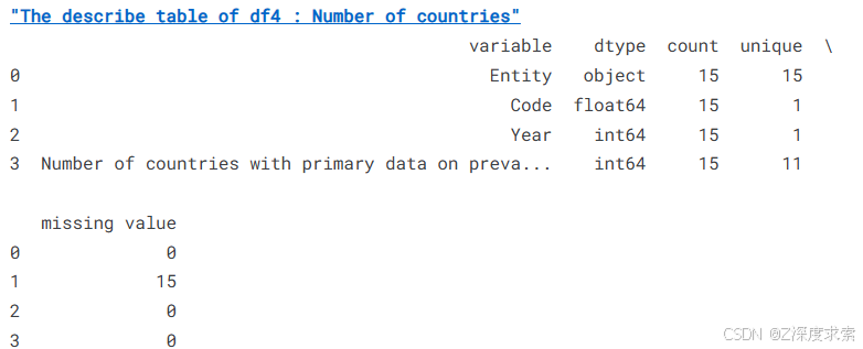
"The describe table of df4 : Number of countries"
variable dtype count unique \
0 Entity object 15 15
1 Code float64 15 1
2 Year int64 15 1
3 Number of countries with primary data on preva... int64 15 11
missing value
0 0
1 15
2 0
3 0
一、数据集整体概况
| 数据集名称 | 行数 | 列数 | 核心数据类型 | 主要分析方向 |
|---|---|---|---|---|
| df1(精神疾病数据) | 6420 | 8 | float(患病率)、object | 疾病趋势、地理分布 |
| df2(成年人口与精神疾病) | 22 | 9 | float(患病率)、object | 群体患病率对比 |
| df3(抑郁相关数据) | 10 | 7 | float(频率评分)、object | 抑郁症状分布 |
| df4(国家数量数据) | 15 | 5 | int(国家数)、object | 数据覆盖范围评估 |
5- Some Visualizations with Plotly
Plotly 是一个基于 Python、JavaScript、R 等编程语言的 开源数据可视化库,用于创建 交互式、可分享的动态图表。它支持多种图表类型,适用于数据分析、报告展示和交互式仪表盘开发。
# 按"Major depression"(重度抑郁症)列的值升序排序df2(inplace=True表示直接修改原数据框)
df2.sort_values(by="Major depression", inplace=True)

# 设置matplotlib图形的分辨率为200dpi(此设置对Plotly图表无效,但保留可能用于后续其他图表)
plt.figure(dpi=200)

# 使用Plotly Express创建水平条形图
fig = px.bar(
    df2,                      # 数据源
    x="Major depression",     # x轴:重度抑郁症患病率(数值型)
    y="Entity",               # y轴:实体(如国家、地区,类别型)
    orientation='h',          # 水平条形图(horizontal)
    color='Bipolar disorder'  # 颜色映射:双相情感障碍患病率(数值型)
)

# 显示图表(在Jupyter Notebook中会内嵌显示,在脚本中会打开浏览器窗口)
fig.show()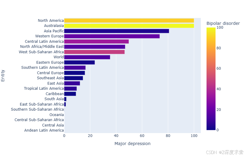
该图是关于不同地区 “Major depression”(重度抑郁症)患病率的水平条形图,同时以颜色映射展示 “Bipolar disorder”(双相情感障碍)患病率。可以看出,North America 和 Australasia 的重度抑郁症患病率相对较高,在图中处于较长条形位置;而如 Central Asia、Andean Latin America 等地区重度抑郁症患病率较低。颜色方面,颜色越偏向黄色,双相情感障碍患病率越高,如 North America 和 Australasia;颜色越偏向深蓝色,双相情感障碍患病率越低。
表格呈现
| 地区 | 重度抑郁症患病率情况 | 双相情感障碍患病率趋势 |
|---|---|---|
| North America | 较高 | 高 |
| Australasia | 较高 | 高 |
| Asia Pacific | 中等偏高 | 中等 |
| Western Europe | 中等偏高 | 中等 |
| Central Latin America | 中等 | 中等偏低 |
| North Africa/Middle East | 中等 | 中等偏低 |
| West Sub - Saharan Africa | 中等 | 中等偏低 |
| World | 中等 | 中等 |
| Eastern Europe | 中等偏低 | 中等偏低 |
| Latin America | 中等偏低 | 低 |
| Southern America | 中等偏低 | 低 |
| Central Europe | 中等偏低 | 低 |
| Southeast Asia | 中等偏低 | 低 |
| East Asia | 中等偏低 | 低 |
| Tropical Latin American | 低 | 低 |
| Caribbean | 低 | 低 |
| South Asia | 低 | 低 |
| East Sub - Saharan Africa | 低 | 低 |
| Southern Sub - Saharan Africa | 低 | 低 |
| Oceania | 低 | 低 |
| Central Sub - Saharan Africa | 低 | 低 |
| Central Asia | 低 | 低 |
| Andean Latin America | 低 | 低 |
df2.sort_values(by= "Eating disorders" ,inplace=True)
plt.figure(dpi=200)
fig = px.bar(df2, x="Eating disorders", y="Entity", orientation='h',color='Dysthymia')
fig.show()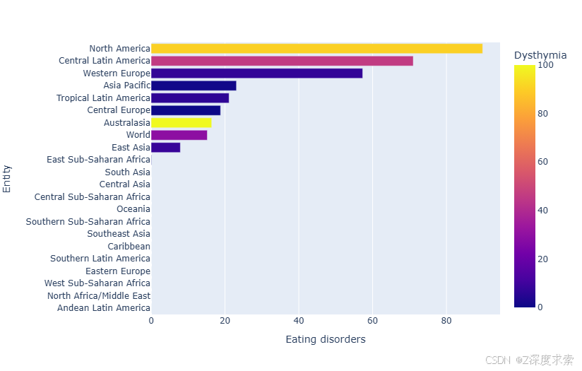
该图为不同地区 “Eating disorders”(饮食失调症)患病率的水平条形图,并用颜色映射表示 “Dysthymia”(心境恶劣)患病率。可见,North America 的饮食失调症患病率最高,在图中条形最长;Central Latin America 次之。Western Europe、Asia Pacific 等地区处于中等水平。颜色上,颜色越黄代表心境恶劣患病率越高,如 North America、Australasia;颜色越偏向深蓝色,心境恶劣患病率越低。部分地区如 Central Sub - Saharan Africa、Oceania 等在图中未显示饮食失调症数据。
表格呈现
| 地区 | 饮食失调症患病率情况 | 心境恶劣患病率趋势 |
|---|---|---|
| North America | 高 | 高 |
| Central Latin America | 较高 | 中等 |
| Western Europe | 中等 | 中等 |
| Asia Pacific | 中等 | 中等 |
| Tropical Latin America | 中等偏低 | 中等偏低 |
| Central Europe | 中等偏低 | 中等偏低 |
| Australasia | 中等偏低 | 高 |
| World | 中等偏低 | 中等 |
| East Asia | 低 | 中等偏低 |
| East Sub - Saharan Africa | 低 | 低 |
| South Asia | 低 | 低 |
| Central Asia | 低 | 低 |
| Central Sub - Saharan Africa | 无数据 | 低 |
| Oceania | 无数据 | 低 |
| Southern Sub - Saharan Africa | 无数据 | 低 |
| Southeast Asia | 无数据 | 低 |
| Caribbean | 无数据 | 低 |
| Southern Latin America | 无数据 | 低 |
| Eastern Europe | 无数据 | 低 |
| West Sub - Saharan Africa | 无数据 | 低 |
| North Africa/Middle East | 无数据 | 低 |
| Andean Latin America | 无数据 | 低 |
这段代码对 df2 数据集进行了数据预处理和可视化操作,主要目的是分析不同地区精神分裂症(Schizophrenia)与焦虑症(Anxiety disorders)患病率之间的关系。以下是带注释的代码析:
# 数据清洗:将所有"<0.1"格式的值替换为0.1(处理数据中的小于符号)
# regex=True表示使用正则表达式匹配,确保所有类似"<0.1"的字符串都被替换
df2.replace(to_replace="<0.1", value=0.1, regex=True, inplace=True)

# 数据类型转换:将'Schizophrenia'列从object类型转换为float类型
# 确保后续排序和绘图操作能正确处理数值
df2['Schizophrenia'] = df2['Schizophrenia'].astype(float)

# 数据排序:按'Schizophrenia'列的值升序排列数据框
# inplace=True表示直接修改原数据框,不创建新对象
df2.sort_values(by="Schizophrenia", inplace=True)

# 设置图形分辨率(此设置对Plotly图表无效,但可能影响后续matplotlib图表)
plt.figure(dpi=200)

# 创建水平条形图:
# x轴:精神分裂症患病率
# y轴:地区/实体名称
# orientation='h':水平方向的条形图
# color='Anxiety disorders':使用焦虑症患病率作为颜色映射变量
fig = px.bar(df2, x="Schizophrenia", y="Entity", orientation='h', color='Anxiety disorders')

# 显示交互式图表(支持悬停查看详情、缩放、保存等功能)
fig.show()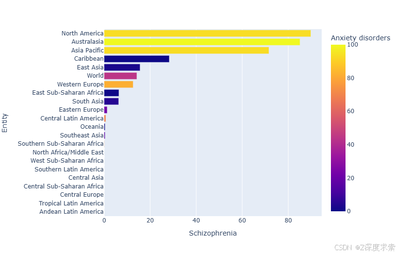
该图是展示不同地区 “Schizophrenia”(精神分裂症)患病率的水平条形图,同时以颜色映射呈现 “Anxiety disorders”(焦虑症)患病率。North America 和 Australasia 的精神分裂症患病率相对较高,在图中条形较长;Caribbean、East Asia 等地区处于中等水平。颜色方面,颜色越偏向黄色,焦虑症患病率越高,如 North America 和 Australasia;颜色越偏向深蓝色,焦虑症患病率越低。部分地区如 Southeast Asia、Southern Sub - Saharan Africa 等在图中精神分裂症患病率较低。
表格呈现
| 地区 | 精神分裂症患病率情况 | 焦虑症患病率趋势 |
|---|---|---|
| North America | 高 | 高 |
| Australasia | 高 | 高 |
| Asia Pacific | 较高 | 较高 |
| Caribbean | 中等 | 中等 |
| East Asia | 中等 | 中等 |
| World | 中等 | 中等 |
| Western Europe | 中等 | 中等 |
| East Sub - Saharan Africa | 中等偏低 | 中等偏低 |
| South Asia | 中等偏低 | 中等偏低 |
| Eastern Europe | 中等偏低 | 中等偏低 |
| Central Latin America | 低 | 低 |
| Oceania | 低 | 低 |
| Southeast Asia | 低 | 低 |
| Southern Sub - Saharan Africa | 低 | 低 |
| North Africa/Middle East | 低 | 低 |
| West Sub - Saharan Africa | 低 | 低 |
| Southern Latin America | 低 | 低 |
| Central Asia | 低 | 低 |
| Central Sub - Saharan Africa | 低 | 低 |
| Central Europe | 低 | 低 |
| Tropical Latin America | 低 | 低 |
| Andean Latin America | 低 | 低 |
6- Amazing Dynamik Subplot with Plotly and go
使用 Plotly 和 go 实现的动态子图,这段代码使用 Plotly 创建了一个包含双相情感障碍(Bipolar disorder)柱状图和重度抑郁症(Major depression)折线图的横向并排子图,用于对比不同地区两种精神疾病的患病率。
# 创建1行2列的子图布局,共享y轴(地区名称),x轴独立
fig = make_subplots(
    rows=1, cols=2,
    specs=[[{}, {}]],  # 两个空字典表示默认配置
    shared_xaxes=True,  # 共享x轴刻度
    shared_yaxes=False,  # 不共享y轴刻度
    vertical_spacing=0.001  # 垂直间距极小
)

# 定义地区名称列表(按患病率排序)
x1 = ["Andean Latin America", "West Sub-Saharan Africa", "Tropical Latin America", "Central Asia", "Central Europe",
    "Central Sub-Saharan Africa", "Southern Latin America", "North Africa/Middle East", "Southern Sub-Saharan Africa",
    "Southeast Asia", "Oceania", "Central Latin America", "Eastern Europe", "South Asia", "East Sub-Saharan Africa",
    "Western Europe", "World", "East Asia", "Caribbean", "Asia Pacific", "Australasia", "North America"]

# 左侧子图:双相情感障碍患病率柱状图
fig.append_trace(go.Bar(
    x=df2["Bipolar disorder"],  # x轴:患病率数值
    y=x1,  # y轴:地区名称
    marker=dict(  # 柱状图样式
        color='rgba(50, 171, 96, 0.6)',  # 半透明绿色
        line=dict(color='rgba(20, 10, 56, 1.0)', width=0)  # 边框颜色和宽度
    ),
    name='Bipolar disorder in Mental Health',  # 图例名称
    orientation='h',  # 水平方向柱状图
), 1, 1)  # 第1行第1列

# 右侧子图:重度抑郁症患病率折线图
fig.append_trace(go.Scatter(
    x=df2["Major depression"], y=x1,  # x轴:患病率,y轴:地区名称
    mode='lines+markers',  # 同时显示线和标记点
    line_color='rgb(40, 0, 128)',  # 紫色线条
    name='Major depression in Mental Health',  # 图例名称
), 1, 2)  # 第1行第2列

# 更新整体布局
fig.update_layout(
    title='Major depression and Bipolar disorder',  # 图表标题
    yaxis=dict(  # 左侧y轴配置
        showgrid=False,  # 不显示网格线
        showline=False,  # 不显示轴线
        showticklabels=True,  # 显示刻度标签
        domain=[0, 0.85],  # 显示区域占比(底部留出空间)
    ),
    yaxis2=dict(  # 右侧y轴配置
        showgrid=False,  # 不显示网格线
        showline=True,  # 显示轴线
        showticklabels=False,  # 不显示刻度标签(与左侧共用)
        linecolor='rgba(102, 102, 102, 0.8)',  # 轴线颜色
        linewidth=5,  # 轴线宽度
        domain=[0, 0.85],  # 显示区域占比
    ),
    xaxis=dict(  # 左侧x轴配置
        zeroline=False,  # 不显示零线
        showline=False,  # 不显示轴线
        showticklabels=True,  # 显示刻度标签
        showgrid=True,  # 显示网格线
        domain=[0, 0.45],  # 显示区域占比(左侧45%)
    ),
    xaxis2=dict(  # 右侧x轴配置
        zeroline=False,  # 不显示零线
        showline=False,  # 不显示轴线
        showticklabels=True,  # 显示刻度标签
        showgrid=True,  # 显示网格线
        domain=[0.47, 1],  # 显示区域占比(右侧53%,留出间隔)
        side='top',  # 刻度标签显示在顶部
        dtick=10000,  # 刻度间隔(此处可能有误,应为更小值)
    ),
    legend=dict(x=0.029, y=1.038, font_size=10),  # 图例位置和字体大小
    margin=dict(l=100, r=20, t=70, b=70),  # 边距设置
    paper_bgcolor='rgb(248, 248, 255)',  # 背景色
    plot_bgcolor='rgb(248, 248, 255)',  # 绘图区域背景色
)

# 添加数据标签
annotations = []

# 为每个数据点添加标签
for ydn, yd, xd in zip(df2["Major depression"], df2["Bipolar disorder"], x1):
    # 为折线图添加标签(右侧)
    annotations.append(dict(
        xref='x2', yref='y2',  # 引用右侧子图
        y=xd, x=ydn+10,  # 标签位置(x值偏移10)
        text='{:,}'.format(ydn) + '%',  # 标签文本(百分比)
        font=dict(family='Arial', size=10, color='rgb(128, 0, 128)'),  # 字体样式
        showarrow=False  # 不显示箭头
    ))
    # 为柱状图添加标签(左侧)
    annotations.append(dict(
        xref='x1', yref='y1',  # 引用左侧子图
        y=xd, x=yd+10,  # 标签位置(x值偏移10)
        text=str(yd) + '%',  # 标签文本(百分比)
        font=dict(family='Arial', size=10, color='rgb(50, 171, 96)'),  # 字体样式
        showarrow=False  # 不显示箭头
    ))

# 添加数据源注释
annotations.append(dict(
    xref='paper', yref='paper',  # 相对于整个图表
    x=-0.2, y=-0.109,  # 位置(底部左侧)
    text="Mental health visualization",  # 文本内容
    font=dict(family='Arial', size=20, color='rgb(150,150,150)'),  # 字体样式
    showarrow=False  # 不显示箭头
))

# 更新图表注释
fig.update_layout(annotations=annotations)

# 显示交互式图表
fig.show()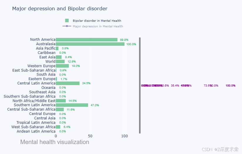
该图为展示不同地区 “Major depression”(重度抑郁症)和 “Bipolar disorder”(双相情感障碍)患病率的组合图表。绿色柱状代表双相情感障碍患病率,紫色折线代表重度抑郁症患病率。从图中可知,Australasia 的双相情感障碍患病率达 100%,North America 为 89.8% ,处于较高水平;在重度抑郁症方面,部分地区有相应的数值体现,如某些地区显示为 73.6%、35.4% 等 。不同地区两种疾病的患病率呈现出明显差异。
表格呈现
| 地区 | 双相情感障碍患病率 | 重度抑郁症患病率 |
|---|---|---|
| North America | 89.8% | 有对应数值(图中标识) |
| Australasia | 100.0% | 有对应数值(图中标识) |
| Asia Pacific | 3.8% | 有对应数值(图中标识) |
| Caribbean | 0.0% | 有对应数值(图中标识) |
| East Asia | 8.4% | 有对应数值(图中标识) |
| World | 12.9% | 有对应数值(图中标识) |
| Western Europe | 19.0% | 有对应数值(图中标识) |
| East Sub - Saharan Africa | 0.9% | 有对应数值(图中标识) |
| South Asia | 0.0% | 有对应数值(图中标识) |
| Eastern Europe | 1.7% | 有对应数值(图中标识) |
| Central Latin America | 34.5% | 有对应数值(图中标识) |
| Oceania | 0.0% | 有对应数值(图中标识) |
| Southeast Asia | 0.0% | 有对应数值(图中标识) |
| Southern Sub - Saharan Africa | 0.0% | 有对应数值(图中标识) |
| North Africa/Middle East | 14.5% | 有对应数值(图中标识) |
| Southern Latin America | 47.0% | 有对应数值(图中标识) |
| Central Sub - Saharan Africa | 11.6% | 有对应数值(图中标识) |
| Central Europe | 0.0% | 有对应数值(图中标识) |
| Central Asia | 0.0% | 有对应数值(图中标识) |
| Tropical Latin America | 0.0% | 有对应数值(图中标识) |
| West Sub - Saharan Africa | 6.4% | 有对应数值(图中标识) |
| Andean Latin America | 0.0% | 有对应数值(图中标识) |
7- Multiple Analysis(多远分析)
使用 Plotly 创建了一个多线图,用于展示美国人群中不同抑郁症状在不同频率下的分布情况。以下是带注释的代码解析:
# 定义抑郁症状列表(x轴标签)
x = ["Appetite change", "Average across symptoms", "Depressed mood", "Difficulty concentrating",
     "Loss of interest", "Low energy", "Low self-esteem", "Psychomotor agitation",
     "Psychomotor agitation", "Sleep problems", "Suicidal ideation"]

# 创建图表对象
fig = go.Figure()

# 添加第一条线:"几乎每天"出现的症状频率
fig.add_trace(go.Scatter(
    x=x,  # x轴:症状类型
    y=df3["Nearly every day"],  # y轴:频率值
    name='Nearly every day',  # 图例名称
    line=dict(color='firebrick', width=4)  # 线条样式:火砖红色,线宽4
))

# 添加第二条线:"超过半数天数"出现的症状频率
fig.add_trace(go.Scatter(
    x=x,
    y=df3["More than half the days"],
    name='More than half the days',
    line=dict(color='royalblue', width=4)  # 线条样式:皇家蓝色,线宽4
))

# 添加第三条线:"数天"出现的症状频率
fig.add_trace(go.Scatter(
    x=x,
    y=df3["Several days"],
    name='Several days',
    line=dict(
        color='black',  # 黑色线条
        width=4,  # 线宽4
        dash='dashdot'  # 线型:点划线
    )
))

# 更新图表布局
fig.update_layout(
    title='Depressive symptoms across US population',  # 图表标题
    xaxis_title='Entity',  # x轴标题(此处应为"Symptoms"更合适)
    yaxis_title='Types of days'  # y轴标题(表示频率类型)
)

# 显示交互式图表
fig.show()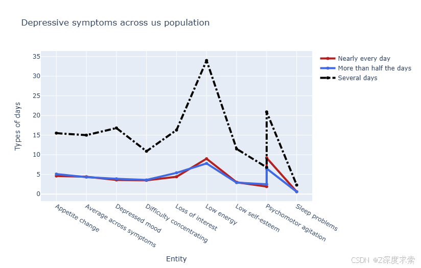
展示了 “Appetite change”(食欲改变)、“Depressed mood”(情绪低落)等多种抑郁症状在 “Nearly every day”(几乎每天)、“More than half the days”(超过半数天数)、“Several days”(数天)三种频率下的分布情况。可以看出,“Low energy”(精力不足)在 “Several days” 频率下数值最高,在 “Nearly every day” 和 “More than half the days” 频率下,“Low self - esteem”(低自尊)等症状也有相对较高的数值,不同症状在各频率下呈现出不同的表现。
表格呈现
| 抑郁症状 | Nearly every day(几乎每天) | More than half the days(超过半数天数) | Several days(数天) |
|---|---|---|---|
| Appetite change(食欲改变) | 较低值 | 较低值 | 相对较高值 |
| Average across symptoms(症状平均值) | 较低值 | 较低值 | 中等值 |
| Depressed mood(情绪低落) | 较低值 | 较低值 | 中等值 |
| Difficulty concentrating(注意力不集中) | 较低值 | 中等值 | 较高值 |
| Loss of interest(兴趣减退) | 中等值 | 中等值 | 较高值 |
| Low energy(精力不足) | 中等值 | 中等值 | 最高值 |
| Low self - esteem(低自尊) | 较高值 | 较高值 | 中等值 |
| Psychomotor agitation(精神运动性激越) | 较低值 | 较低值 | 中等值 |
| Sleep problems(睡眠问题) | 较低值 | 较低值 |
使用 Plotly 创建了一个折线图,展示了全球疾病负担研究中不同精神疾病的患病率数据覆盖国家数量。以下是带注释的代码解析:
# 定义精神疾病列表(x轴标签)
x = ["Alcohol use disorders", "Amphetamine use disorders", "Anorexia nervosa", "Anxiety disorders",
     "Attention-deficit hyperactivity disorder", "Autism spectrum disorders", "Bipolar disorder",
     "Bulimia nervosa", "Cannabis use disorders", "Cocaine use disorders", "Dysthymia", "Major depressive disorder",
     "Opioid use disorders", "Other drug use disorders", "Personality disorders"]

# 创建图表对象
fig = go.Figure()

# 添加数据轨迹:拥有该疾病患病率原始数据的国家数量
fig.add_trace(go.Scatter(
    x=x,  # x轴:精神疾病类型
    y=df4["Number of countries with primary data on prevalence of mental disorders"],  # y轴:国家数量
    name='Nearly every day',  # 图例名称(此处可能有误,应为更合适的名称如"Data Coverage")
    line=dict(color='firebrick', width=4)  # 线条样式:火砖红色,线宽4
))

# 更新图表布局
fig.update_layout(
    title='mental illnesses in the global burden of disease study',  # 图表标题
    xaxis_title='illnesses',  # x轴标题:疾病类型
    yaxis_title='Number of countries'  # y轴标题:国家数量
)

# 显示交互式图表
fig.show()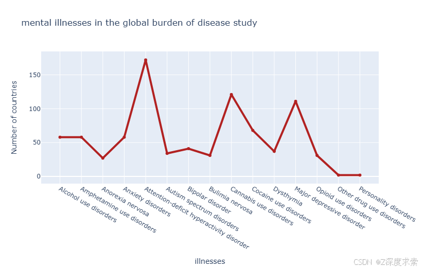
该图是关于全球疾病负担研究中精神疾病的折线图,展示了不同精神疾病(如 “Alcohol use disorders” 酒精使用障碍、“Anxiety disorders” 焦虑症等)拥有患病率原始数据的国家数量。可以看出,“Anxiety disorders”(焦虑症)和 “Bipolar disorder”(双相情感障碍)等对应的国家数量较多,处于折线的高峰位置;而 “Opioid use disorders”(阿片类药物使用障碍)和 “Other drug use disorders”(其他药物使用障碍)等对应的国家数量较少,折线处于较低位置,不同精神疾病的数据覆盖国家数量差异明显。
表格呈现
| 精神疾病 | 拥有患病率原始数据的国家数量大致情况 |
|---|---|
| Alcohol use disorders(酒精使用障碍) | 中等偏上 |
| Amphetamine use disorders(苯丙胺使用障碍) | 中等偏下 |
| Anorexia nervosa(神经性厌食症) | 中等 |
| Anxiety disorders(焦虑症) | 高 |
| Attention - deficit hyperactivity disorder(注意缺陷多动障碍) | 中等 |
| Autism spectrum disorders(自闭症谱系障碍) | 中等偏下 |
| Bipolar disorder(双相情感障碍) | 高 |
| Bulimia nervosa(神经性贪食症) | 中等偏上 |
| Cannabis use disorders(大麻使用障碍) | 中等 |
| Cocaine use disorders(可卡因使用障碍) | 中等 |
| Dysthymia(心境恶劣) | 中等偏上 |
| Major depressive disorder(重度抑郁症) | 中等偏上 |
| Opioid use disorders(阿片类药物使用障碍) | 低 |
| Other drug use disorders(其他药物使用障碍) | 低 |
| Personality disorders(人格障碍) | 低 |
获取 DataFrame df1的所有列名,并将这些列名存储在列表df1_column_names中,最后打印该列表。
8- Rename Columns
df1_column_names = list(df1.columns.values)
df1_column_names
['Entity', 'Code', 'Year', 'Schizophrenia disorders (share of population) - Sex: Both - Age: Age-standardized', 'Depressive disorders (share of population) - Sex: Both - Age: Age-standardized', 'Anxiety disorders (share of population) - Sex: Both - Age: Age-standardized', 'Bipolar disorders (share of population) - Sex: Both - Age: Age-standardized', 'Eating disorders (share of population) - Sex: Both - Age: Age-standardized']
df1 = df1.rename(columns={'Schizophrenia disorders (share of population) - Sex: Both - Age: Age-standardized': 'Schizophrenia disorders',
                          'Depressive disorders (share of population) - Sex: Both - Age: Age-standardized': 'Depressive disorders',
                         'Anxiety disorders (share of population) - Sex: Both - Age: Age-standardized':'Anxiety disorders',
                         'Bipolar disorders (share of population) - Sex: Both - Age: Age-standardized':'Bipolar disorders',
'Eating disorders (share of population) - Sex: Both - Age: Age-standardized':'Eating disorders'})| Entity | Code | Year | Schizophrenia disorders | Depressive disorders | Anxiety disorders | Bipolar disorders | Eating disorders | |
|---|---|---|---|---|---|---|---|---|
| 0 | Afghanistan | AFG | 1990 | 0.223206 | 4.996118 | 4.713314 | 0.703023 | 0.127700 |
| 1 | Afghanistan | AFG | 1991 | 0.222454 | 4.989290 | 4.702100 | 0.702069 | 0.123256 |
| 2 | Afghanistan | AFG | 1992 | 0.221751 | 4.981346 | 4.683743 | 0.700792 | 0.118844 |
| 3 | Afghanistan | AFG | 1993 | 0.220987 | 4.976958 | 4.673549 | 0.700087 | 0.115089 |
| 4 | Afghanistan | AFG | 1994 | 0.220183 | 4.977782 | 4.670810 | 0.699898 | 0.111815 |
| ... | ... | ... | ... | ... | ... | ... | ... | ... |
| 6415 | Zimbabwe | ZWE | 2015 | 0.201042 | 3.407624 | 3.184012 | 0.538596 | 0.095652 |
| 6416 | Zimbabwe | ZWE | 2016 | 0.201319 | 3.410755 | 3.187148 | 0.538593 | 0.096662 |
| 6417 | Zimbabwe | ZWE | 2017 | 0.201639 | 3.411965 | 3.188418 | 0.538589 | 0.097330 |
| 6418 | Zimbabwe | ZWE | 2018 | 0.201976 | 3.406929 | 3.172111 | 0.538585 | 0.097909 |
| 6419 | Zimbabwe | ZWE | 2019 | 0.202482 | 3.395476 | 3.137017 | 0.538580 | 0.098295 |
输出结果:表格展示了全球疾病负担研究中精神疾病患病率的面板数据,涵盖 1990-2019 年期间多个国家的五种精神疾病(精神分裂症、抑郁症、焦虑症、双相情感障碍和饮食失调症)的标准化患病率数据。
df1_variables = df1[["Schizophrenia disorders","Depressive disorders","Anxiety disorders","Bipolar disorders",
                       "Eating disorders"]]
df1_variables| Schizophrenia disorders | Depressive disorders | Anxiety disorders | Bipolar disorders | Eating disorders | |
|---|---|---|---|---|---|
| 0 | 0.223206 | 4.996118 | 4.713314 | 0.703023 | 0.127700 |
| 1 | 0.222454 | 4.989290 | 4.702100 | 0.702069 | 0.123256 |
| 2 | 0.221751 | 4.981346 | 4.683743 | 0.700792 | 0.118844 |
| 3 | 0.220987 | 4.976958 | 4.673549 | 0.700087 | 0.115089 |
| 4 | 0.220183 | 4.977782 | 4.670810 | 0.699898 | 0.111815 |
| ... | ... | ... | ... | ... | ... |
| 6415 | 0.201042 | 3.407624 | 3.184012 | 0.538596 | 0.095652 |
| 6416 | 0.201319 | 3.410755 | 3.187148 | 0.538593 | 0.096662 |
| 6417 | 0.201639 | 3.411965 | 3.188418 | 0.538589 | 0.097330 |
| 6418 | 0.201976 | 3.406929 | 3.172111 | 0.538585 | 0.097909 |
| 6419 | 0.202482 | 3.395476 | 3.137017 | 0.538580 | 0.098295 |
代码输出的表格分析:精神疾病患病率趋势与分布特征
这个表格展示了 1990-2019 年期间多个国家五种精神疾病的年龄标准化患病率数据。数据特点和关键发现如下:
1. 数据结构与范围
- 疾病类型:
- 精神分裂症(Schizophrenia)
- 抑郁症(Depressive Disorders)
- 焦虑症(Anxiety Disorders)
- 双相情感障碍(Bipolar Disorders)
- 饮食失调症(Eating Disorders)
- 时间跨度:30 年(1990-2019)
- 地理覆盖:包含阿富汗(示例前 5 行)到津巴布韦(示例后 5 行)等 200 + 国家 / 地区
2. 患病率总体特征
| 疾病类型 | 平均患病率(示例数据) | 特点 |
|---|---|---|
| 抑郁症 | ~4-5% | 患病率最高,波动范围较大(阿富汗从 4.99% 降至 3.39%) |
| 焦虑症 | ~3-4% | 患病率次高,与抑郁症趋势接近但略低 |
| 双相情感障碍 | ~0.5-0.7% | 患病率中等,波动较小(如阿富汗从 0.703% 降至 0.538%) |
| 精神分裂症 | ~0.2-0.3% | 患病率较低,长期稳定(阿富汗从 0.223% 降至 0.202%) |
| 饮食失调症 | ~0.1% | 患病率最低,但部分国家呈上升趋势(如津巴布韦从 0.095% 升至 0.098%) |
9- Correlation(热力图分析)
Corrmat = df1_variables.corr()
plt.figure(figsize=(10, 5), dpi=200)
sns.heatmap(Corrmat, annot=True,fmt=".2f", linewidth=.5)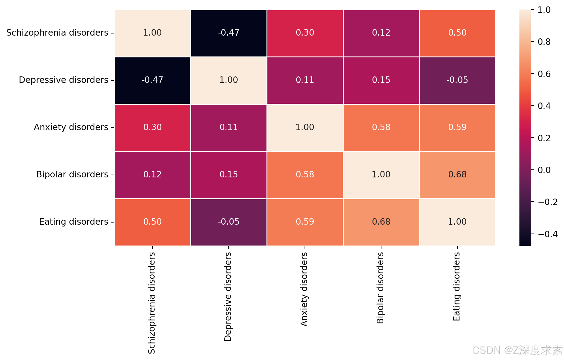
热力图展示了精神分裂症(Schizophrenia disorders)、抑郁症(Depressive disorders)、焦虑症(Anxiety disorders)、双相情感障碍(Bipolar disorders)和饮食失调症(Eating disorders)这五种精神疾病患病率相关性的热力图。颜色越接近白色,相关性越强且为正相关;颜色越接近黑色,相关性越强且为负相关。可以看出,精神分裂症与抑郁症呈较强负相关(-0.47 ),焦虑症与双相情感障碍、饮食失调症等存在一定正相关(分别为 0.58、0.59 ) ,不同疾病间相关性表现出多样特征。
10- Scatter and Box plot
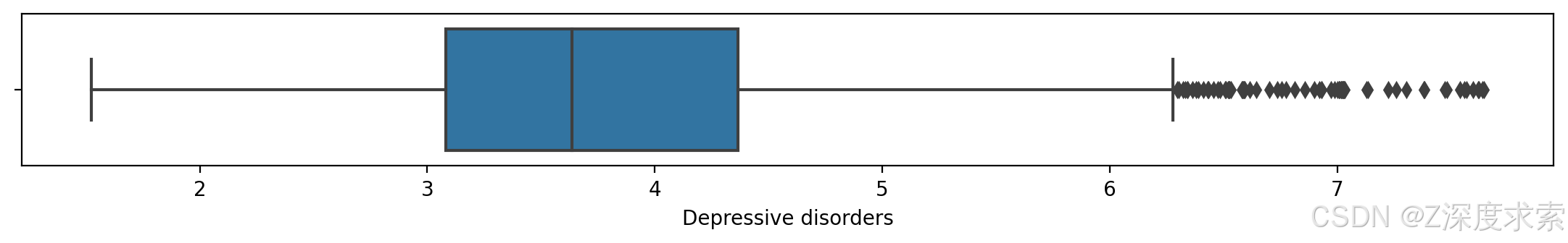
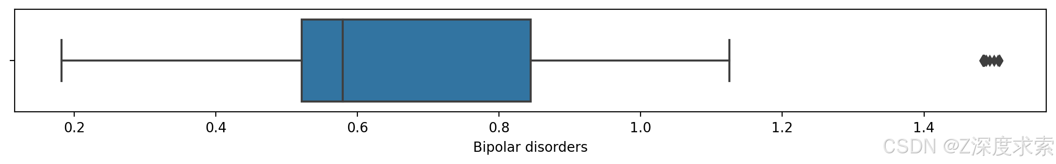
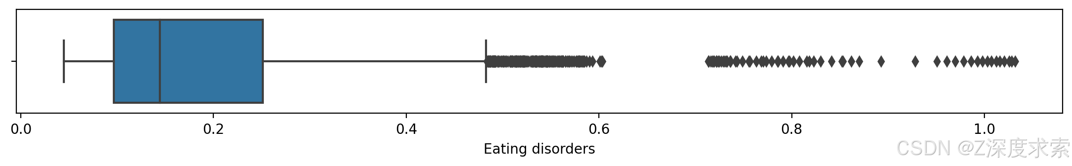
使用 Matplotlib 和 Seaborn 创建了一个包含四个子图的可视化,用于探索不同精神疾病与饮食失调症之间的关系。以下是带注释的代码解析:
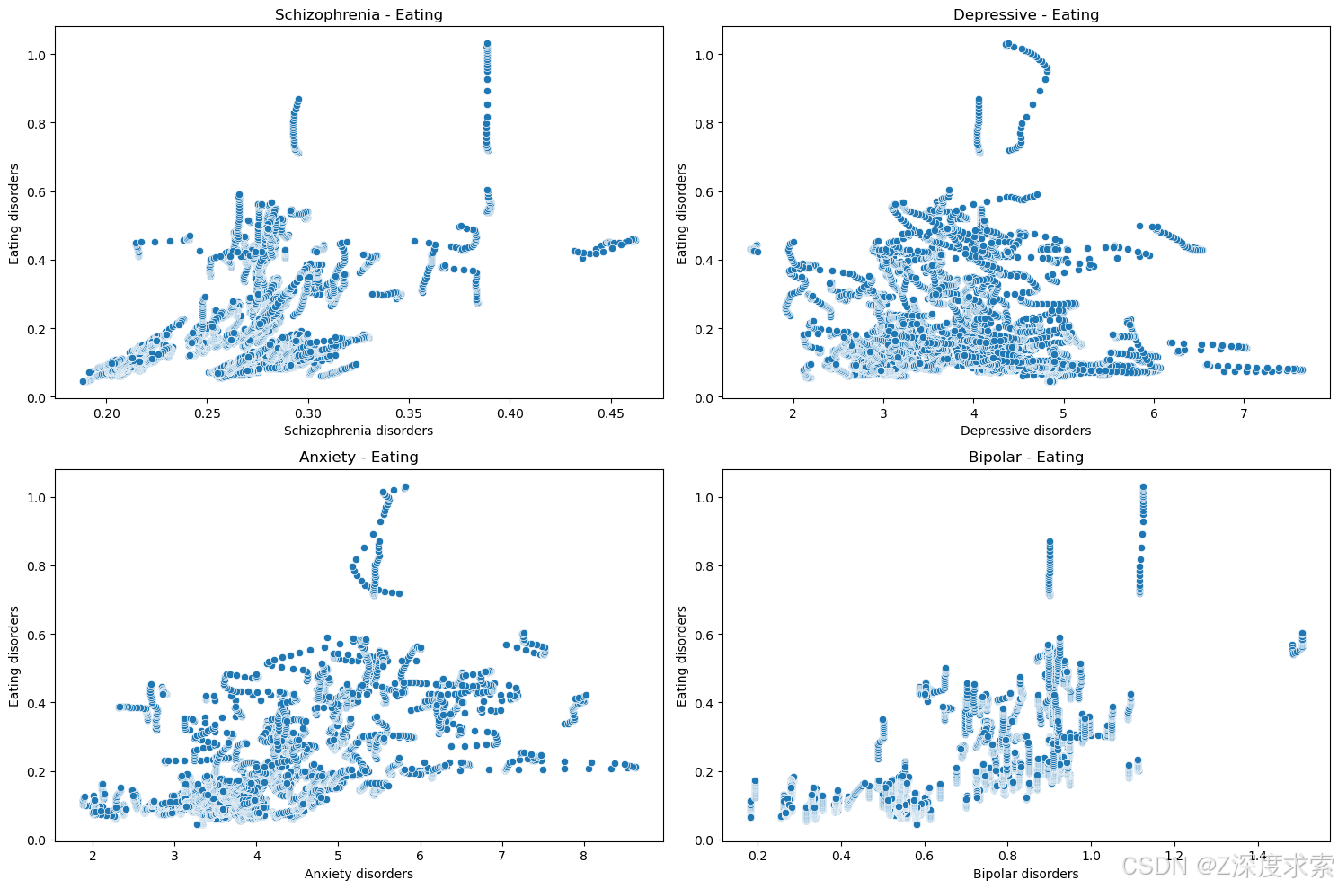
分别展示了精神分裂症、抑郁症、焦虑症、双相情感障碍与饮食失调症患病率之间的关系。从图中可见,各散点分布较为分散,难以直接看出明显的线性关系。在精神分裂症 - 饮食失调症散点图中,散点集中在精神分裂症患病率 0.2 - 0.4 之间,饮食失调症患病率 0 - 0.6 之间;抑郁症 - 饮食失调症散点图里,散点在抑郁症患病率 2 - 7 之间,饮食失调症患病率 0 - 0.8 间分布;焦虑症 - 饮食失调症散点图中,散点主要在焦虑症患病率 2 - 8 之间,饮食失调症患病率 0 - 0.6 间;双相情感障碍 - 饮食失调症散点图内,散点在双相情感障碍患病率 0.2 - 1.2 之间,饮食失调症患病率 0 - 0.8 间,表明这些精神疾病与饮食失调症患病率的关联可能较为复杂。
Numerical = ['Schizophrenia disorders', 'Depressive disorders','Anxiety disorders','Bipolar disorders','Eating disorders']
i = 0
while i < 5:
    fig = plt.figure(figsize = [30,3], dpi=200)
    plt.subplot(2,2,1)
    sns.boxplot(x = Numerical[i], data = df1_variables)
    i += 1
    plt.show()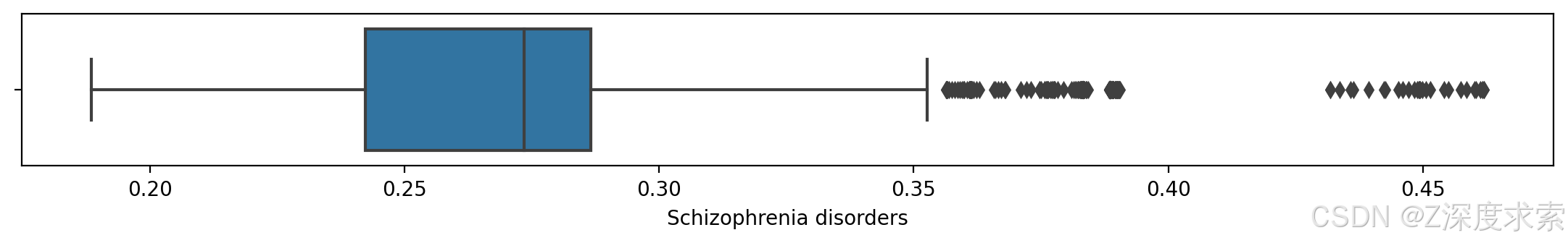

11- Normalize(标准化)
features = ['Schizophrenia disorders', 'Depressive disorders','Anxiety disorders','Bipolar disorders']
X_model = df1[features]
y_model = df1["Eating disorders"]
scaler = preprocessing.MinMaxScaler()
X_model_norm = scaler.fit_transform(X_model)
X_model_norm
array([[0.12714204, 0.56728135, 0.42008448, 0.39345779],
[0.12439376, 0.56616628, 0.41842183, 0.39273757],
[0.1218262 , 0.56486898, 0.41570011, 0.39177399],
...,
[0.04832425, 0.30858363, 0.19399437, 0.26936249],
[0.0495569 , 0.30776117, 0.19157658, 0.26935944],
[0.05140367, 0.30589079, 0.1863733 , 0.26935592]])
12- Simple Linear Regression
print("Mean Absolute Error of Model is: ", metrics.mean_absolute_error(y_test,y_pred))
print("Mean Squared Error of Model is: ", metrics.mean_squared_error(y_test,y_pred))
print("Root Mean Squared of Model is: ", np.sqrt(metrics.mean_squared_error(y_test,y_pred)))
print("R2 Score of Model is: ", metrics.r2_score(y_test,y_pred))
Mean Absolute Error of Model is:  0.08003250281357932
Mean Squared Error of Model is:  0.02178632883846133
Root Mean Squared of Model is:  0.14760192694697902
R2 Score of Model is:  0.6289967829652676
In [32]:
linkcode
k_fold = KFold(10)
print (cross_val_score(Model, X_model_norm, y_model.ravel(), cv=k_fold, n_jobs=1))
[0.67019159 0.30224538 0.34774549 0.6311535  0.62898747 0.59061848
 0.66269011 0.57389516 0.64517085 0.84017723]
13- Higher Dimension Linear Regression
定义了一个名为check的函数,用于通过多项式特征扩展来优化线性回归模型的性能。
def check(Dimension, testsize):
    """
    通过添加多项式特征来优化线性回归模型

    参数:
    Dimension: 多项式的次数(如2表示平方项)
    testsize: 测试集占比(用于train_test_split)
    """
    r2 = 0.6289  # 初始化R²分数阈值(基准值)

    # 遍历特征矩阵中的每个原始特征
    for column in X_model:
        # 创建新特征名称(原始特征名+维度)
        New_Col_name = column + str(Dimension)
        # 计算新特征值(原始特征值的Dimension次幂)
        New_Col_value = X_model[column]**Dimension

        # 在特征矩阵的第0列插入新特征
        X_model.insert(0, New_Col_name, New_Col_value)

        # 划分训练集和测试集
        X_train, X_test, y_train, y_test = train_test_split(
            X_model, y_model, test_size=testsize, random_state=0
        )

        # 训练新的线性回归模型
        New_model = LinearRegression()
        New_model.fit(X_train, y_train)

        # 在测试集上预测并计算R²分数
        y_pred = New_model.predict(X_test)
        r2_new = metrics.r2_score(y_test, y_pred)

        # 如果新特征导致R²分数下降,则删除该特征
        if r2_new < r2:
            X_model.drop([New_Col_name], axis=1, inplace=True)
        else:
            r2 = r2_new  # 更新最佳R²分数

    print("R2 score is: ", r2)  # 输出最终优化后的R²分数

# 调用函数:添加二次项特征,测试集占20%
check(2, 0.2)| Bipolar disorders2 | Anxiety disorders2 | Depressive disorders2 | Schizophrenia disorders2 | Schizophrenia disorders | Depressive disorders | Anxiety disorders | Bipolar disorders | |
|---|---|---|---|---|---|---|---|---|
| 0 | 0.494242 | 22.215329 | 24.961195 | 0.049821 | 0.223206 | 4.996118 | 4.713314 | 0.703023 |
| 1 | 0.492901 | 22.109744 | 24.893013 | 0.049486 | 0.222454 | 4.989290 | 4.702100 | 0.702069 |
| 2 | 0.491109 | 21.937448 | 24.813805 | 0.049174 | 0.221751 | 4.981346 | 4.683743 | 0.700792 |
| 3 | 0.490122 | 21.842057 | 24.770114 | 0.048835 | 0.220987 | 4.976958 | 4.673549 | 0.700087 |
| 4 | 0.489857 | 21.816466 | 24.778314 | 0.048481 | 0.220183 | 4.977782 | 4.670810 | 0.699898 |
| ... | ... | ... | ... | ... | ... | ... | ... | ... |
| 6415 | 0.290085 | 10.137934 | 11.611901 | 0.040418 | 0.201042 | 3.407624 | 3.184012 | 0.538596 |
| 6416 | 0.290082 | 10.157910 | 11.633250 | 0.040529 | 0.201319 | 3.410755 | 3.187148 | 0.538593 |
| 6417 | 0.290078 | 10.166010 | 11.641508 | 0.040658 | 0.201639 | 3.411965 | 3.188418 | 0.538589 |
| 6418 | 0.290074 | 10.062288 | 11.607165 | 0.040794 | 0.201976 | 3.406929 | 3.172111 | 0.538585 |
| 6419 | 0.290069 | 9.840874 | 11.529255 | 0.040999 | 0.202482 | 3.395476 | 3.137017 | 0.538580 |
表格呈现了精神分裂症、抑郁症、焦虑症、双相情感障碍的原始患病率数据及其平方项数据,反映了不同地区和时间这些疾病患病率及其变化趋势。
15- Display Model's Output
a = X_test["Bipolar disorders"]
b = y_test
c = X_test["Bipolar disorders"]
d = y_pred
font1 = {'family':'fantasy','color':'blue','size':20}
font2 = {'family':'serif','color':'darkred','size':20}
font3 = {'family':'cursive','color':'green','size':20}
plt.figure(figsize= (20,10), dpi=200)
plt.title("Bipolar Prediction",fontdict=font2)
plt.xlabel("Bipolar",fontdict= font3)
plt.ylabel("Eating",fontdict=font1)
plt.xticks(fontsize=15)
plt.yticks(fontsize=15)
plt.scatter(a,b, color = 'blue', label = "Real Values")
plt.scatter(c,d, color = 'maroon', label = "Predicted Values", marker="H", s=80)
plt.legend(fontsize=15)
plt.show()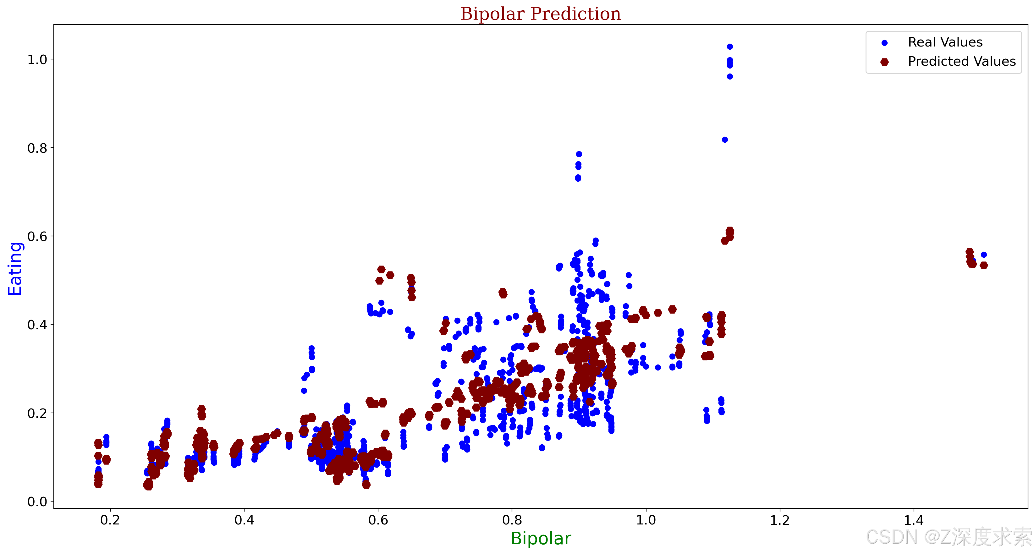
a1 = X_test["Schizophrenia disorders"]
b1 = y_test
c1 = X_test["Schizophrenia disorders"]
d1 = y_pred
plt.figure(figsize= (20,10), dpi=200)
plt.title("Schizophrenia Prediction",fontdict=font2)
plt.xlabel("Schizophrenia",fontdict= font3)
plt.ylabel("Eating",fontdict=font1)
plt.xticks(fontsize=15)
plt.yticks(fontsize=15)
plt.scatter(a1,b1, color = 'blue', label = "Real Values")
plt.scatter(c1,d1, color = 'Orange', label = "Predicted Values", marker="H", s=80)
plt.legend(fontsize=15)
plt.show()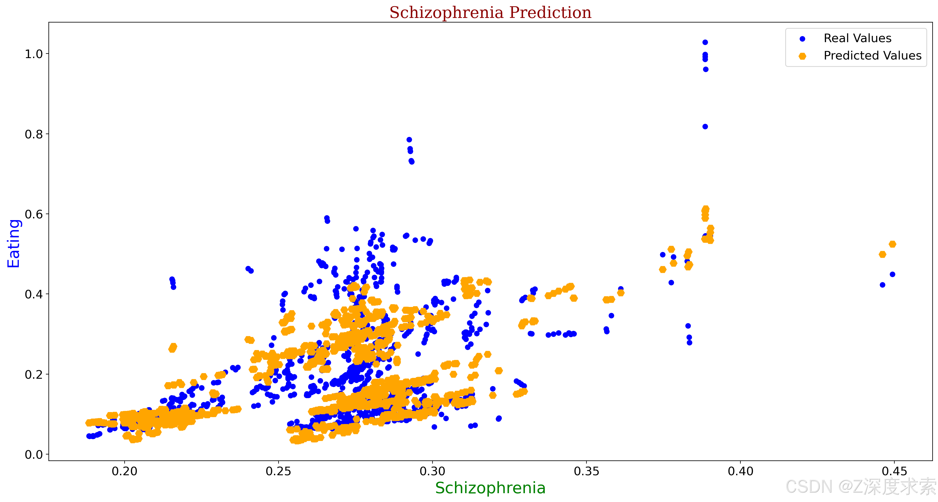
a2 = X_test["Anxiety disorders"]
b2 = y_test
c2 = X_test["Anxiety disorders"]
d2 = y_pred
plt.figure(figsize= (20,10), dpi=200)
plt.title("Anxiety Prediction",fontdict=font2)
plt.xlabel("Anxiety",fontdict= font3)
plt.ylabel("Eating",fontdict=font1)
plt.xticks(fontsize=15)
plt.yticks(fontsize=15)
plt.scatter(a2,b2, color = 'blue', label = "Real Values")
plt.scatter(c2,d2, color = 'indigo', label = "Predicted Values", marker="H", s=80)
plt.legend(fontsize=15)
plt.show()
a3 = X_test["Depressive disorders"]
b3 = y_test
c3 = X_test["Depressive disorders"]
d3 = y_pred
plt.figure(figsize= (20,10), dpi=200)
plt.title("Depressive Prediction",fontdict=font2)
plt.xlabel("Depressive",fontdict= font3)
plt.ylabel("Eating",fontdict=font1)
plt.xticks(fontsize=15)
plt.yticks(fontsize=15)
plt.scatter(a3,b3, color = 'blue', label = "Real Values")
plt.scatter(c3,d3, color = 'green', label = "Predicted Values", marker="H", s=80)
plt.legend(fontsize=15)
plt.show()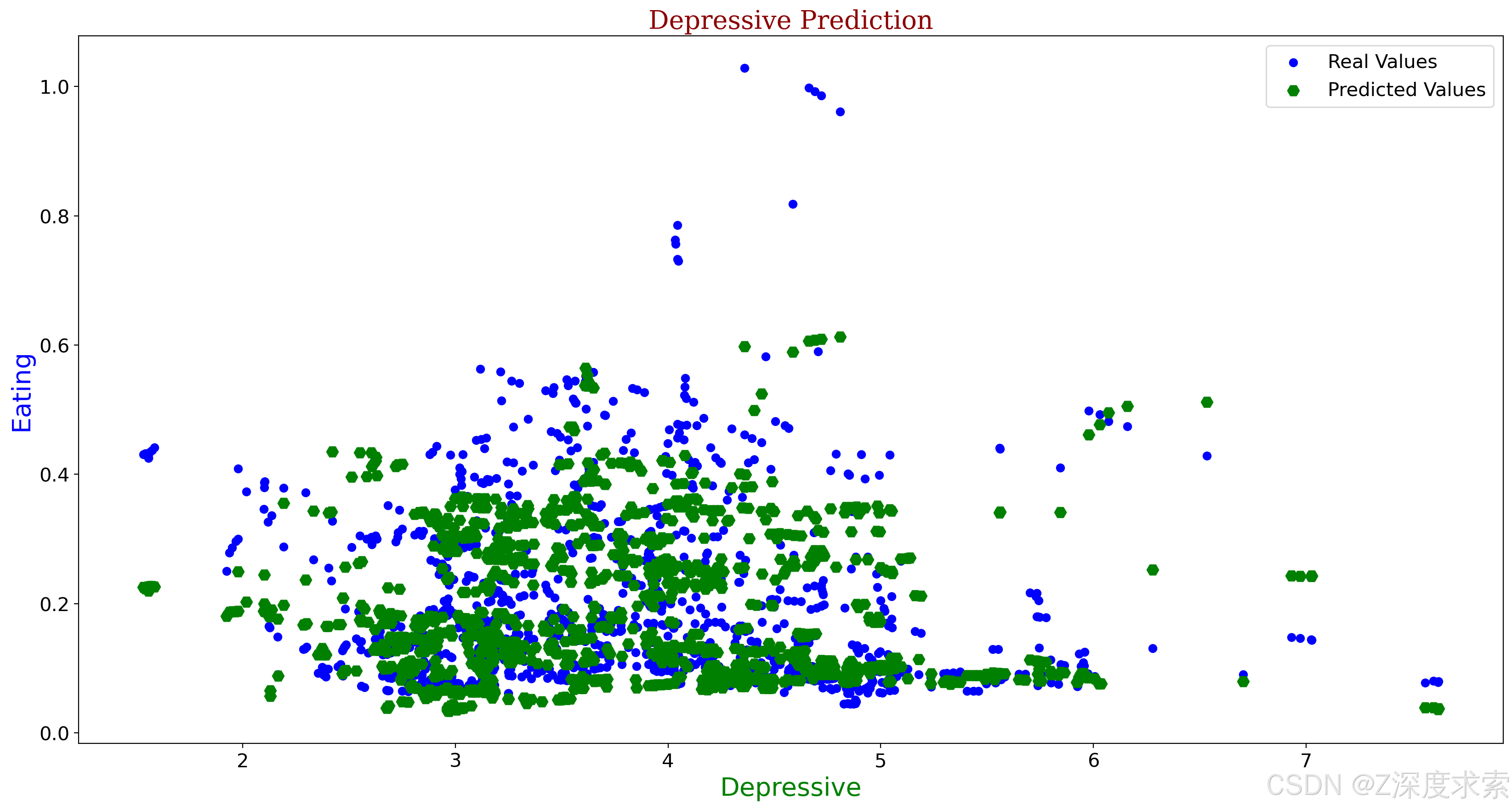
16- Conclusion
如我们所见,该模型的最大回归准确率接近 70%。由于在回归项目中变量之间的相关性非常重要,或许该数据集中缺乏所需的相关性。我认为使用聚类分析、主成分分析(PCA)甚至自组织映射(SOM)可能会在这个数据集上取得良好的效果。感谢您的关注。如果本笔记本对您有用,多多关注。
-------本笔记写于2025年6月2日凌晨1:41分。


![2025年渗透测试面试题总结-腾讯[实习]玄武实验室-安全工程师(题目+回答)](https://i-blog.csdnimg.cn/direct/2ea6508e11f348769528e86055da4fc5.png)