文章目录
- Bootstrap 按钮组
- 基本的按钮组
- 按钮工具栏
- 按钮的大小
- 嵌套
- 垂直的按钮组
Bootstrap 按钮组
按钮组允许多个按钮被堆叠在同一行上。当你想要把按钮对齐在一起时,这就显得非常有用。您可以通过 Bootstrap 按钮(Button) 插件 添加可选的 JavaScript 单选框和复选框样式行为。
下面的表格总结了 Bootstrap 提供的使用按钮组的一些重要的 class:
| Class | 描述 | 代码示例 |
|---|---|---|
| .btn-group | 该 class 用于形成基本的按钮组。在 .btn-group 中放置一系列带有 class .btn 的按钮。 | <div class="btn-group"> <button type="button" class="btn btn-default">Button1</button> <button type="button" class="btn btn-default">Button2</button></div> |
| .btn-toolbar | 该 class 有助于把几组 <div class="btn-group"> 结合到一个 <div class="btn-toolbar"> 中,一般获得更复杂的组件。 | <div class="btn-toolbar" role="toolbar"><div class="btn-group">...</div><div class="btn-group">...</div></div> |
| .btn-group-lg, .btn-group-sm, .btn-group-xs | 这些 class 可应用到整个按钮组的大小调整,而不需要对每个按钮进行大小调整。 | <div class="btn-group btn-group-lg">...</div><div class="btn-group btn-group-sm">...</div><div class="btn-group btn-group-xs">...</div> |
| .btn-group-vertical | 该 class 让一组按钮垂直堆叠显示,而不是水平堆叠显示。 | <div class="btn-group-vertical"> ...</div> |
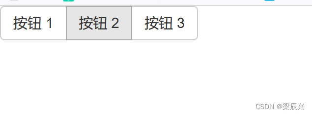
基本的按钮组
下面的实例演示了上面表格中讨论到的 class .btn-group 的使用:
<div class="btn-group">
    <button type="button" class="btn btn-default">按钮 1</button>
    <button type="button" class="btn btn-default">按钮 2</button>
    <button type="button" class="btn btn-default">按钮 3</button>
</div>
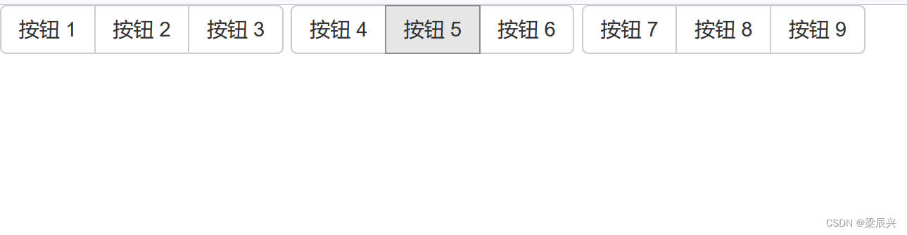
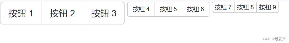
按钮工具栏
下面的实例演示了上面表格中讨论到的 class .btn-toolbar 的使用:
<div class="btn-toolbar" role="toolbar">
<div class="btn-group">
    <button type="button" class="btn btn-default">按钮 1</button>
    <button type="button" class="btn btn-default">按钮 2</button>
    <button type="button" class="btn btn-default">按钮 3</button>
</div>
<div class="btn-group">
    <button type="button" class="btn btn-default">按钮 4</button>
    <button type="button" class="btn btn-default">按钮 5</button>
    <button type="button" class="btn btn-default">按钮 6</button>
</div>
<div class="btn-group">
    <button type="button" class="btn btn-default">按钮 7</button>
    <button type="button" class="btn btn-default">按钮 8</button>
    <button type="button" class="btn btn-default">按钮 9</button>
</div>
</div>
按钮的大小
下面的实例演示了上面表格中讨论到的 class .btn-group-* 的使用:
<div class="btn-group btn-group-lg">
    <button type="button" class="btn btn-default">按钮 1</button>
    <button type="button" class="btn btn-default">按钮 2</button>
    <button type="button" class="btn btn-default">按钮 3</button>
</div>
    <div class="btn-group btn-group-sm">
    <button type="button" class="btn btn-default">按钮 4</button>
    <button type="button" class="btn btn-default">按钮 5</button>
    <button type="button" class="btn btn-default">按钮 6</button>
</div>
    <div class="btn-group btn-group-xs">
    <button type="button" class="btn btn-default">按钮 7</button>
    <button type="button" class="btn btn-default">按钮 8</button>
    <button type="button" class="btn btn-default">按钮 9</button>
</div>
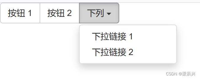
嵌套
您可以在一个按钮组内嵌套另一个按钮组,即,在一个 .btn-group 内嵌套另一个 .btn-group 。当您向让下拉菜单与一系列按钮组合使用时,就会用到这个。
<div class="btn-group">
    <button type="button" class="btn btn-default">按钮 1</button>
    <button type="button" class="btn btn-default">按钮 2</button>
    <div class="btn-group">
    <button type="button" class="btn btn-default dropdown-toggle" data-toggle="dropdown">
        下列
        <span class="caret"></span>
    </button>
    <ul class="dropdown-menu">
        <li><a href="#">下拉链接 1</a></li>
        <li><a href="#">下拉链接 2</a></li>
    </ul>
    </div>
</div>
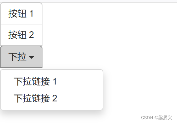
垂直的按钮组
下面的实例演示了上面表格中讨论到的 class .btn-group-vertical 的使用:
<div class="btn-group-vertical">
    <button type="button" class="btn btn-default">按钮 1</button>
    <button type="button" class="btn btn-default">按钮 2</button>
    <div class="btn-group-vertical">
    <button type="button" class="btn btn-default dropdown-toggle" data-toggle="dropdown">
        下拉
        <span class="caret"></span>
    </button>
    <ul class="dropdown-menu">
        <li><a href="#">下拉链接 1</a></li>
        <li><a href="#">下拉链接 2</a></li>
    </ul>
    </div>
</div>