返回主章节 → 鸿蒙UI(ArkUI-方舟UI框架)
文章目录
- 弹框概述
- 使用弹出框(Dialog)
- 弹出框概述
- 不依赖UI组件的全局自定义弹出框(openCustomDialog)(推荐)
- 生命周期
- 自定义弹出框的打开与关闭
- 更新自定义弹出框内容
- 更新自定义弹出框的属性
- 完整示例
- 基础自定义弹出框(CustomDialog)(不推荐)
- 固定样式弹出框
- 使用约束
- 操作菜单(showAMenu)
- 对话框(showDialog)
- 选择器弹框(PickerDialog)
- 生命周期
- 日历选择器弹窗 (CalendarPickerDialog)
- 日期滑动选择器弹窗 (DatePickerDialog)
- 时间滑动选择器弹窗 (TimePickerDialog)
- 文本滑动选择器弹窗 (TextPickerDialog)
- 列表选择弹窗 (ActionSheet)
- 警告弹窗 (AlertDialog)
- 菜单控制(Menu)
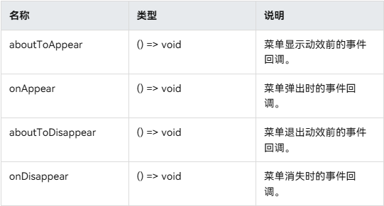
- 生命周期
- 创建默认样式的菜单
- 创建自定义样式的菜单
- @Builder开发菜单内的内容
- bindMenu属性绑定组件
- 创建支持右键或长按的菜单
- 气泡提示(Popup)
- 文字提示气泡
- 添加气泡状态变化的事件
- 带按钮的提示气泡
- 气泡的动画
- 自定义气泡
- 气泡样式
- 绑定模态页面
- 绑定模态页面概述
- 绑定半模态页面(bindSheet)
- 绑定全模态页面(bindContentCover)
- 即时反馈(Toast)
- 使用建议
- 即时反馈模式对比
- 创建即时反馈
- 设置浮层(OverlayManager)
- 规格约束
- 设置浮层
弹框概述
弹窗一般指打开应用时自动弹出或者用户行为操作时弹出的UI界面,用于短时间内展示用户需关注的信息或待处理的操作。
- 模态弹框
为强交互形式,会中断用户当前的操作流程,要求用户必须作出响应才能继续其他操作,通常用于向用户传达重要信息的场景 - 非模态弹框
为弱交互形式,不会影响用户当前的操作行为,用户可以不对其进行回答,通常都有时间限制,出现一段时间后会自动消失。一般用于告诉用户信息内容外还需要用户进行功能操作的场景
使用弹出框(Dialog)
弹出框概述
弹出框是一种模态窗口,通常用于在保持当前上下文环境的同时,临时展示用户需关注的信息或待处理的操作。
- 自定义弹出框
开发者需要根据使用场景,传入自定义组件填充在弹出框中实现自定义的弹出框内容。主要包括基础自定义弹出框 (CustomDialog)、不依赖UI组件的自定义弹出框 (openCustomDialog)。 - 固定样式弹出框
开发者可使用固定样式弹出框,指定需要显示的文本内容和按钮操作,完成简单的交互效果。主要包括警告弹窗 (AlertDialog)、列表选择弹窗 (ActionSheet)、选择器弹窗 (PickerDialog)、对话框 (showDialog)、操作菜单 (showActionMenu)。
不依赖UI组件的全局自定义弹出框(openCustomDialog)(推荐)
由于CustomDialogController在使用上存在诸多限制,不支持动态创建也不支持动态刷新,在相对较复杂的应用场景中推荐使用UIContext中获取到的PromptAction对象提供的openCustomDialog接口来实现自定义弹出框。
说明
弹出框(openCustomDialog)存在两种入参方式创建自定义弹出框:
- openCustomDialog(传参为ComponentContent形式):通过ComponentContent封装内容可以与UI界面解耦,调用更加灵活,可以满足开发者的封装诉求。拥有更强的灵活性,弹出框样式是完全自定义的,且在弹出框打开之后可以使用updateCustomDialog方法动态更新弹出框的一些参数。
- openCustomDialog(传builder的形式):相对于ComponentContent,builder必须要与上下文做绑定,与UI存在一定耦合。此方法有用默认的弹出框样式,适合于开发者想要实现与系统弹窗默认风格一致的效果。
弹出框(openCustomDialog)可以通过配置isModal来实现模态和非模态弹窗。isModal为true时,弹出框为模态弹窗。isModal为false时,弹出框为非模态弹窗。
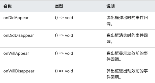
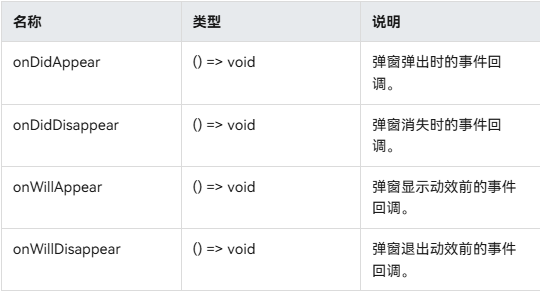
生命周期
弹出框提供了生命周期函数用于通知用户该弹出框的生命周期。生命周期的触发时序依次为:onWillAppear -> onDidAppear -> onWillDisappear -> onDidDisappear。
自定义弹出框的打开与关闭
-
1、 创建 CompenentContent
ComponentContent用于定义自定义弹出框的内容。其中,wrapBuilder(buildText)封装自定义组件,new Params(this.message)是自定义组件的入参,可以缺省,也可以传入基础数据类型。private contentNode: ComponentContent<Object> = new ComponentContent(this.ctx, wrapBuilder(buildText), new Params(this.message)); -
2、打开自定义弹出框
通过调用openCustomDialog接口打开的弹出框默认为customStyle为true的弹出框,即弹出框的内容样式完全按照contentNode自定义样式显示。PromptActionClass.ctx.getPromptAction().openCustomDialog(PromptActionClass.contentNode, PromptActionClass.options) .then(() => { console.info('OpenCustomDialog complete.') }) .catch((error: BusinessError) => { let message = (error as BusinessError).message; let code = (error as BusinessError).code; console.error(`OpenCustomDialog args error code is ${code}, message is ${message}`); }) -
3、关闭自定义弹出框
由于closeCustomDialog接口需要传入待关闭弹出框对应的ComponentContent。因此,如果需要在弹出框中设置关闭方法,则可参考完整示例封装静态方法来实现。关闭弹出框之后若需要释放对应的ComponentContent,则需要调用ComponentContent的dispose方法。
PromptActionClass.ctx.getPromptAction().closeCustomDialog(PromptActionClass.contentNode) .then(() => { console.info('CloseCustomDialog complete.') if (this.contentNode !== null) { this.contentNode.dispose(); // 释放contentNode } }) .catch((error: BusinessError) => { let message = (error as BusinessError).message; let code = (error as BusinessError).code; console.error(`CloseCustomDialog args error code is ${code}, message is ${message}`); })
更新自定义弹出框内容
ComponentContent与BuilderNode有相同的使用限制,不支持自定义组件使用@Reusable、@Link、@Provide、@Consume等装饰器,来同步弹出框弹出的页面与ComponentContent中自定义组件的状态。因此,若需要更新弹出框中自定义组件的内容可以通过ComponentContent提供的update方法来实现。
this.contentNode.update(new Params('update'))
更新自定义弹出框的属性
通过updateCustomDialog可以动态更新弹出框的属性。目前支持的属性包括alignment、offset、autoCancel、maskColor。
需要注意的是,更新属性时,未设置的属性会恢复为默认值。例如,初始设置{ alignment: DialogAlignment.Top, offset: { dx: 0, dy: 50 } },更新时设置{ alignment: DialogAlignment.Bottom },则初始设置的offset: { dx: 0, dy: 50 }不会保留,会恢复为默认值。
PromptActionClass.ctx.getPromptAction().updateCustomDialog(PromptActionClass.contentNode, options)
.then(() => {
console.info('UpdateCustomDialog complete.')
})
.catch((error: BusinessError) => {
let message = (error as BusinessError).message;
let code = (error as BusinessError).code;
console.error(`UpdateCustomDialog args error code is ${code}, message is ${message}`);
})
完整示例
// PromptActionClass.ets
import { BusinessError } from '@kit.BasicServicesKit';
import { ComponentContent, promptAction } from '@kit.ArkUI';
import { UIContext } from '@ohos.arkui.UIContext';
export class PromptActionClass {
static ctx: UIContext;
static contentNode: ComponentContent<Object>;
static options: promptAction.BaseDialogOptions;
static setContext(context: UIContext) {
PromptActionClass.ctx = context;
}
static setContentNode(node: ComponentContent<Object>) {
PromptActionClass.contentNode = node;
}
static setOptions(options: promptAction.BaseDialogOptions) {
PromptActionClass.options = options;
}
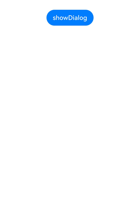
static openDialog() {
if (PromptActionClass.contentNode !== null) {
PromptActionClass.ctx.getPromptAction().openCustomDialog(PromptActionClass.contentNode, PromptActionClass.options)
  .then(() => {
    console.info('OpenCustomDialog complete.')
  })
  .catch((error: BusinessError) => {
    let message = (error as BusinessError).message;
    let code = (error as BusinessError).code;
    console.error(`OpenCustomDialog args error code is ${code}, message is ${message}`);
  })
}
}
static closeDialog() {
if (PromptActionClass.contentNode !== null) {
PromptActionClass.ctx.getPromptAction().closeCustomDialog(PromptActionClass.contentNode)
.then(() => {
console.info('CloseCustomDialog complete.')
})
.catch((error: BusinessError) => {
let message = (error as BusinessError).message;
let code = (error as BusinessError).code;
console.error(`CloseCustomDialog args error code is ${code}, message is ${message}`);
})
}
}
static updateDialog(options: promptAction.BaseDialogOptions) {
if (PromptActionClass.contentNode !== null) {
PromptActionClass.ctx.getPromptAction().updateCustomDialog(PromptActionClass.contentNode, options)
  .then(() => {
    console.info('UpdateCustomDialog complete.')
  })
  .catch((error: BusinessError) => {
    let message = (error as BusinessError).message;
    let code = (error as BusinessError).code;
    console.error(`UpdateCustomDialog args error code is ${code}, message is ${message}`);
  })
}
}
}
// Index.ets
import { ComponentContent } from '@kit.ArkUI';
import { PromptActionClass } from './PromptActionClass';
class Params {
text: string = ""
constructor(text: string) {
this.text = text;
}
}
@Builder
function buildText(params: Params) {
Column() {
Text(params.text)
.fontSize(50)
.fontWeight(FontWeight.Bold)
.margin({ bottom: 36 })
Button('Close')
.onClick(() => {
PromptActionClass.closeDialog()
})
}.backgroundColor('#FFF0F0F0')
}
@Entry
@Component
struct Index {
@State message: string = "hello"
private ctx: UIContext = this.getUIContext();
private contentNode: ComponentContent<Object> =
new ComponentContent(this.ctx, wrapBuilder(buildText), new Params(this.message));
aboutToAppear(): void {
PromptActionClass.setContext(this.ctx);
PromptActionClass.setContentNode(this.contentNode);
PromptActionClass.setOptions({ alignment: DialogAlignment.Top, offset: { dx: 0, dy: 50 } });
}
build() {
Row() {
Column() {
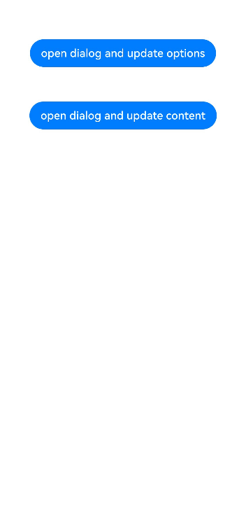
Button("open dialog and update options")
.margin({ top: 50 })
.onClick(() => {
PromptActionClass.openDialog()
setTimeout(() => {
PromptActionClass.updateDialog({
alignment: DialogAlignment.Bottom,
offset: { dx: 0, dy: -50 }
})
}, 1500)
})
Button("open dialog and update content")
.margin({ top: 50 })
.onClick(() => {
PromptActionClass.openDialog()
setTimeout(() => {
this.contentNode.update(new Params('update'))
}, 1500)
})
}
.width('100%')
.height('100%')
}
.height('100%')
}
}
基础自定义弹出框(CustomDialog)(不推荐)
固定样式弹出框
固定样式弹出框采用固定的布局格式,这使得开发者无需关心具体的显示布局细节,只需输入所需显示的文本内容,从而简化了使用流程,提升了便捷性。
使用约束
- 弹出框的弹出依赖UI的执行上下文,不可在UI上下文不明确的地方使用,具体约束参见UIContext说明。
- 可以通过调用UIContext或getUIContext,在非UI页面或某些异步回调中使用本文中的接口。CalendarPickerDialog当前不支持此操作。
- 操作菜单 (showActionMenu)、对话框 (showDialog)需先使用UIContext中的getPromptAction()方法获取到PromptAction对象,再通过该对象调用对应方法。
- 列表选择弹出框 (ActionSheet)、警告弹出框 (AlertDialog)、选择器弹出框 (PickerDialog)中除CalendarPickerDialog都需先使用ohos.window中的getUIContext()方法获取UIContext实例,再通过此实例调用对应方法。或者可以通过自定义组件内置方法getUIContext()获取。
操作菜单 (showActionMenu)、对话框 (showDialog)、列表选择弹出框 (ActionSheet)、警告弹出框 (AlertDialog)可以设置isModal为false变成非模态弹窗。
操作菜单(showAMenu)
操作菜单通过UIContext中的getPromptAction方法获取到PromptAction对象,再通过该对象调用showActionMenu接口实现,支持在回调或开发者自定义类中使用。
创建并显示操作菜单后,菜单的响应结果会异步返回选中按钮在buttons数组中的索引。
import { PromptAction } from '@kit.ArkUI';


let uiContext = this.getUIContext();
let promptAction: PromptAction = uiContext.getPromptAction();
try {
  promptAction.showActionMenu({
    title: 'showActionMenu Title Info',
    buttons: [
      {
        text: 'item1',
        color: '#666666'
      },
      {
        text: 'item2',
        color: '#000000'
      },
    ]
  })
    .then(data => {
      console.info('showActionMenu success, click button: ' + data.index);
    })
    .catch((err: Error) => {
      console.error('showActionMenu error: ' + err);
    })
} catch (error) {
}

对话框(showDialog)
对话框通过UIContext中的getPromptAction方法获取到PromptAction对象,再通过该对象调用showDialog接口实现,支持在回调或开发者自定义类中使用。
创建并显示对话框,对话框响应后异步返回选中按钮在buttons数组中的索引。
// xxx.ets
import { PromptAction } from '@kit.ArkUI';


let uiContext = this.getUIContext();
let promptAction: PromptAction = uiContext.getPromptAction();
try {
  promptAction.showDialog({
    title: 'showDialog Title Info',
    message: 'Message Info',
    buttons: [
      {
        text: 'button1',
        color: '#000000'
      },
      {
        text: 'button2',
        color: '#000000'
      }
    ]
  }, (err, data) => {
    if (err) {
      console.error('showDialog err: ' + err);
      return;
    }
    console.info('showDialog success callback, click button: ' + data.index);
  });
} catch (error) {
}
选择器弹框(PickerDialog)
选择器弹窗通常用于在用户进行某些操作(如点击按钮)时显示特定的信息或选项。
生命周期
弹窗提供了生命周期函数用于通知用户该弹窗的生命周期。
日历选择器弹窗 (CalendarPickerDialog)
日历选择器弹窗提供日历视图,包含年、月和星期信息,通过CalendarPickerDialog接口实现。开发者可调用show函数,定义并弹出日历选择器弹窗。
通过配置 acceptButtonStyle、cancelButtonStyle可以实现自定义按钮样式。
// xxx.ets
@Entry
@Component
struct CalendarPickerDialogExample {
private selectedDate: Date = new Date('2024-04-23')
build() {
Column() {
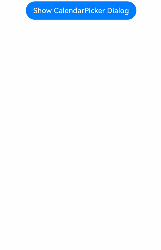
Button("Show CalendarPicker Dialog")
.margin(20)
.onClick(() => {
console.info("CalendarDialog.show")
CalendarPickerDialog.show({
selected: this.selectedDate,
acceptButtonStyle: {
fontColor: '#2787d9',
fontSize: '16fp',
backgroundColor: '#f7f7f7',
borderRadius: 10
},
cancelButtonStyle: {
fontColor: Color.Red,
fontSize: '16fp',
backgroundColor: '#f7f7f7',
borderRadius: 10
},
onAccept: (date: Date)=>{
// 当弹出框再次弹出时显示选中的是上一次确定的日期
this.selectedDate = date
}
})
})
}.width('100%')
}
}
日期滑动选择器弹窗 (DatePickerDialog)
开发者可以利用指定的日期范围,创建日期滑动选择器弹窗,将日期信息清晰地展示在弹出的窗口上。
日期滑动选择器弹窗通过UIContext中的showDatePickerDialog接口实现。
弹窗中配置lunarSwitch、showTime为true时,展示切换农历的开关以及时间,当checkbox被选中时,显示农历。当按下确定按钮时,弹窗会通过onDateAccept返回目前所选中的日期。如需弹窗再次弹出时显示选中的是上一次确定的日期,就要在回调中重新给selectTime进行赋值。
@Entry
@Component
struct DatePickerDialogExample {
  @State selectTime: Date = new Date('2023-12-25T08:30:00');


  build() {
    Column() {
      Button('showDatePickerDialog')
        .margin(30)
        .onClick(() => {
          this.getUIContext().showDatePickerDialog({
            start: new Date("2000-1-1"),
            end: new Date("2100-12-31"),
            selected: this.selectTime,
            lunarSwitch: true,
            showTime: true,
            onDateAccept: (value: Date) => {
              this.selectTime = value
              console.info("DatePickerDialog:onAccept()" + JSON.stringify(value))
            },
          })
        })
    }.width('100%').margin({ top: 5 })
  }
}

该示例通过配置disappearTextStyle、textStyle、selectedTextStyle、acceptButtonStyle、cancelButtonStyle实现了自定义文本以及按钮样式
@Entry
@Component
struct DatePickerDialogExample {
  @State selectTime: Date = new Date('2023-12-25T08:30:00');


  build() {
    Column() {
      Button('showDatePickerDialog')
        .margin(30)
        .onClick(() => {
          this.getUIContext().showDatePickerDialog({
            start: new Date("2000-1-1"),
            end: new Date("2100-12-31"),
            selected: this.selectTime,
            textStyle: { color: '#2787d9', font: { size: '14fp', weight: FontWeight.Normal } },
            selectedTextStyle: { color: '#004aaf', font: { size: '18fp', weight: FontWeight.Regular } },
            acceptButtonStyle: {
              fontColor: '#2787d9',
              fontSize: '16fp',
              backgroundColor: '#f7f7f7',
              borderRadius: 10
            },
            cancelButtonStyle: {
              fontColor: Color.Red,
              fontSize: '16fp',
              backgroundColor: '#f7f7f7',
              borderRadius: 10
            }
          })
        })
    }.width('100%').margin({ top: 5 })
  }
}
时间滑动选择器弹窗 (TimePickerDialog)
开发者可根据24小时的时间区间,创建时间滑动选择器弹窗,将时间信息清晰地展示在弹出的窗口上。
时间滑动选择器弹窗通过UIContext中的showTimePickerDialog接口实现。
该示例通过配置disappearTextStyle、textStyle、selectedTextStyle、acceptButtonStyle、cancelButtonStyle实现了自定义文本以及按钮样式。
// xxx.ets


@Entry
@Component
struct TimePickerDialogExample {
  @State selectTime: Date = new Date('2023-12-25T08:30:00');


  build() {
    Column() {
      Button('showTimePickerDialog')
        .margin(30)
        .onClick(() => {
          this.getUIContext().showTimePickerDialog({
            selected: this.selectTime,
            textStyle: { color: '#2787d9', font: { size: '14fp', weight: FontWeight.Normal } },
            selectedTextStyle: { color: '#004aaf', font: { size: '18fp', weight: FontWeight.Regular } },
            acceptButtonStyle: {
              fontColor: '#2787d9',
              fontSize: '16fp',
              backgroundColor: '#f7f7f7',
              borderRadius: 10
            },
            cancelButtonStyle: {
              fontColor: Color.Red,
              fontSize: '16fp',
              backgroundColor: '#f7f7f7',
              borderRadius: 10
            }
          })
        })
    }.width('100%').margin({ top: 5 })
  }
}
文本滑动选择器弹窗 (TextPickerDialog)
开发者可根据指定的选择范围,创建文本滑动选择器弹窗,将文本信息清晰地展示在弹出的窗口上。
文本滑动选择器弹窗通过UIContext中的showTextPickerDialog接口实现。
该示例通过设置range的参数类型为TextCascadePickerRangeContent[]类型实现3列文本选择器弹窗。当按下确定按钮时,弹窗会通过onAccept返回目前所选中文本和索引值。如需弹窗再次弹出时显示选中的是上一次确定的文本,就要在回调中重新给select进行赋值。
@Entry
@Component
struct TextPickerDialogExample {
  private fruits: TextCascadePickerRangeContent[] = [
    {
      text: '辽宁省',
      children: [{ text: '沈阳市', children: [{ text: '沈河区' }, { text: '和平区' }, { text: '浑南区' }] },
        { text: '大连市', children: [{ text: '中山区' }, { text: '金州区' }, { text: '长海县' }] }]
    },
    {
      text: '吉林省',
      children: [{ text: '长春市', children: [{ text: '南关区' }, { text: '宽城区' }, { text: '朝阳区' }] },
        { text: '四平市', children: [{ text: '铁西区' }, { text: '铁东区' }, { text: '梨树县' }] }]
    },
    {
      text: '黑龙江省',
      children: [{ text: '哈尔滨市', children: [{ text: '道里区' }, { text: '道外区' }, { text: '南岗区' }] },
        { text: '牡丹江市', children: [{ text: '东安区' }, { text: '西安区' }, { text: '爱民区' }] }]
    }
  ]
  private select : number  = 0;
  build() {
    Column() {
      Button('showTextPickerDialog')
        .margin(30)
        .onClick(() => {
          this.getUIContext().showTextPickerDialog({
            range: this.fruits,
            selected: this.select,
            onAccept: (value: TextPickerResult) => {
              this.select = value.index as number
            }
          })
        })
    }.width('100%').margin({ top: 5 })
  }
}

列表选择弹窗 (ActionSheet)
列表选择器弹窗适用于呈现多个操作选项,尤其当界面中仅需展示操作列表而无其他内容时。
列表选择器弹窗通过UIContext中的showActionSheet接口实现。
该示例通过配置width、height、transition等接口定义了弹窗的样式以及弹出动效。
@Entry
@Component
struct showActionSheetExample {
  build() {
    Column() {
      Button('showActionSheet')
        .margin(30)
        .onClick(() => {
          this.getUIContext().showActionSheet({
            title: 'ActionSheet title',
            message: 'message',
            autoCancel: false,
            width: 300,
            height: 300,
            cornerRadius: 20,
            borderWidth: 1,
            borderStyle: BorderStyle.Solid,
            borderColor: Color.Blue,
            backgroundColor: Color.White,
            transition: TransitionEffect.asymmetric(TransitionEffect.OPACITY
              .animation({ duration: 3000, curve: Curve.Sharp })
              .combine(TransitionEffect.scale({ x: 1.5, y: 1.5 }).animation({ duration: 3000, curve: Curve.Sharp })),
              TransitionEffect.OPACITY.animation({ duration: 100, curve: Curve.Smooth })
                .combine(TransitionEffect.scale({ x: 0.5, y: 0.5 }).animation({ duration: 100, curve: Curve.Smooth }))),
            confirm: {
              value: 'Confirm button',
              action: () => {
                console.info('Get Alert Dialog handled')
              }
            },
            alignment: DialogAlignment.Center,
            sheets: [
              {
                title: 'apples',
                action: () => {
                }
              },
              {
                title: 'bananas',
                action: () => {
                }
              },
              {
                title: 'pears',
                action: () => {
                  console.log('pears')
                }
              }
            ]
          })
        })
    }.width('100%').margin({ top: 5 })
  }
}
警告弹窗 (AlertDialog)
需要向用户提问或得到用户的许可时,可使用警告弹窗。
- 警告弹窗用来提示重要信息,但会中断当前任务,尽量提供必要的信息和有用的操作。
- 避免仅使用警告弹窗提供信息,用户不喜欢被信息丰富但不可操作的警告打断。
警告弹窗通过UIContext中的showAlertDialog接口实现。
该示例通过配置width、height、transition等接口定义了多个按钮弹窗的样式以及弹出动效。
@Entry
@Component
struct showAlertDialogExample {
  build() {
    Column() {
      Button('showAlertDialog')
        .margin(30)
        .onClick(() => {
          this.getUIContext().showAlertDialog(
            {
              title: 'title',
              message: 'text',
              autoCancel: true,
              alignment: DialogAlignment.Center,
              offset: { dx: 0, dy: -20 },
              gridCount: 3,
              transition: TransitionEffect.asymmetric(TransitionEffect.OPACITY
                .animation({ duration: 3000, curve: Curve.Sharp })
                .combine(TransitionEffect.scale({ x: 1.5, y: 1.5 }).animation({ duration: 3000, curve: Curve.Sharp })),
                TransitionEffect.OPACITY.animation({ duration: 100, curve: Curve.Smooth })
                  .combine(TransitionEffect.scale({ x: 0.5, y: 0.5 })
                    .animation({ duration: 100, curve: Curve.Smooth }))),
              buttons: [{
                value: 'cancel',
                action: () => {
                  console.info('Callback when the first button is clicked')
                }
              },
                {
                  enabled: true,
                  defaultFocus: true,
                  style: DialogButtonStyle.HIGHLIGHT,
                  value: 'ok',
                  action: () => {
                    console.info('Callback when the second button is clicked')
                  }
                }],
            }
          )
        })
    }.width('100%').margin({ top: 5 })
  }
}
菜单控制(Menu)
Menu是菜单接口,一般用于鼠标右键弹窗、点击弹窗等。具体用法请参考菜单控制。
使用bindContextMenu并设置预览图,菜单弹出时有蒙层,此时为模态。
使用bindMenu或bindContextMenu未设置预览图时,菜单弹出无蒙层,此时为非模态。
生命周期
创建默认样式的菜单
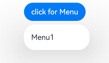
菜单需要调用bindMenu接口来实现。bindMenu响应绑定组件的点击事件,绑定组件后手势点击对应组件后即可弹出。
Button('click for Menu')
  .bindMenu([
    {
      value: 'Menu1',
      action: () => {
        console.info('handle Menu1 select')
      }
    }
  ])
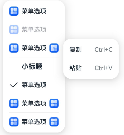
创建自定义样式的菜单
当默认样式不满足开发需求时,可使用**@Builder自定义菜单内容**,通过bindMenu接口进行菜单的自定义。
@Builder开发菜单内的内容
class Tmp {
  iconStr2: ResourceStr = $r("app.media.view_list_filled")


  set(val: Resource) {
    this.iconStr2 = val
  }
}


@Entry
@Component
struct menuExample {
  @State select: boolean = true
  private iconStr: ResourceStr = $r("app.media.view_list_filled")
  private iconStr2: ResourceStr = $r("app.media.view_list_filled")


  @Builder
  SubMenu() {
    Menu() {
      MenuItem({ content: "复制", labelInfo: "Ctrl+C" })
      MenuItem({ content: "粘贴", labelInfo: "Ctrl+V" })
    }
  }


  @Builder
  MyMenu() {
    Menu() {
      MenuItem({ startIcon: $r("app.media.icon"), content: "菜单选项" })
      MenuItem({ startIcon: $r("app.media.icon"), content: "菜单选项" }).enabled(false)
      MenuItem({
        startIcon: this.iconStr,
        content: "菜单选项",
        endIcon: $r("app.media.arrow_right_filled"),
        // 当builder参数进行配置时,表示与menuItem项绑定了子菜单。鼠标hover在该菜单项时,会显示子菜单。
        builder: this.SubMenu
      })
      MenuItemGroup({ header: '小标题' }) {
        MenuItem({ content: "菜单选项" })
          .selectIcon(true)
          .selected(this.select)
          .onChange((selected) => {
            console.info("menuItem select" + selected);
            let Str: Tmp = new Tmp()
            Str.set($r("app.media.icon"))
          })
        MenuItem({
          startIcon: $r("app.media.view_list_filled"),
          content: "菜单选项",
          endIcon: $r("app.media.arrow_right_filled"),
          builder: this.SubMenu
        })
      }


      MenuItem({
        startIcon: this.iconStr2,
        content: "菜单选项",
        endIcon: $r("app.media.arrow_right_filled")
      })
    }
  }


  build() {
    // ...
  }
}
bindMenu属性绑定组件
Button('click for Menu')
  .bindMenu(this.MyMenu)
创建支持右键或长按的菜单
通过bindContextMenu接口自定义菜单,设置菜单弹出的触发方式,触发方式为右键或长按。使用bindContextMenu弹出的菜单项是在独立子窗口内的,可显示在应用窗口外部。
- @Builder开发菜单内的内容与上文写法相同。
- 确认菜单的弹出方式,使用bindContextMenu属性绑定组件。示例中为右键弹出菜单。
Button('click for Menu')
  .bindContextMenu(this.MyMenu, ResponseType.RightClick)
气泡提示(Popup)
Popup属性可绑定在组件上显示气泡弹窗提示,设置弹窗内容、交互逻辑和显示状态。主要用于屏幕录制、信息弹出提醒等显示状态。
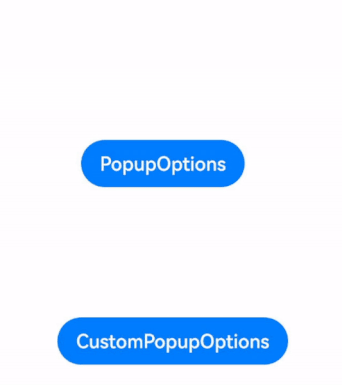
气泡分为两种类型,一种是系统提供的气泡PopupOptions,一种是开发者可以自定义的气泡CustomPopupOptions。其中,PopupOptions通过配置primaryButton和secondaryButton来设置带按钮的气泡,CustomPopupOptions通过配置builder来设置自定义的气泡。
气泡可以通过配置mask来实现模态和非模态窗口,mask为true或者颜色值的时候,气泡为模态窗口,mask为false时,气泡为非模态窗口。
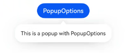
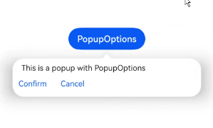
文字提示气泡
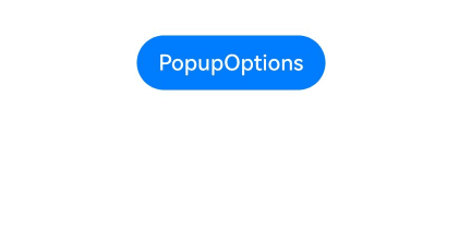
文本提示气泡常用于只展示带有文本的信息提示,不带有任何交互的场景。Popup属性需绑定组件,当bindPopup属性中参数show为true时会弹出气泡提示。
在Button组件上绑定Popup属性,每次点击Button按钮,handlePopup会切换布尔值,当值为true时,触发bindPopup弹出气泡。
@Entry
@Component
struct PopupExample {
  @State handlePopup: boolean = false


  build() {
    Column() {
      Button('PopupOptions')
        .onClick(() => {
          this.handlePopup = !this.handlePopup
        })
        .bindPopup(this.handlePopup, {
          message: 'This is a popup with PopupOptions',
        })
    }.width('100%').padding({ top: 5 })
  }
}
添加气泡状态变化的事件
通过onStateChange参数为气泡添加状态变化的事件回调,可以判断当前气泡的显示状态。
@Entry
@Component
struct PopupExample {
  @State handlePopup: boolean = false


  build() {
    Column() {
      Button('PopupOptions')
        .onClick(() => {
          this.handlePopup = !this.handlePopup
        })
        .bindPopup(this.handlePopup, {
          message: 'This is a popup with PopupOptions',
          onStateChange: (e)=> { // 返回当前的气泡状态
            if (!e.isVisible) {
              this.handlePopup = false
            }
          }
        })
    }.width('100%').padding({ top: 5 })
  }
}
带按钮的提示气泡
通过primaryButton、secondaryButton属性为气泡最多设置两个Button按钮,通过此按钮进行简单的交互,开发者可以通过配置action参数来设置想要触发的操作。
@Entry
@Component
struct PopupExample22 {
  @State handlePopup: boolean = false


  build() {
    Column() {
      Button('PopupOptions').margin({ top: 200 })
        .onClick(() => {
          this.handlePopup = !this.handlePopup
        })
        .bindPopup(this.handlePopup, {
          message: 'This is a popup with PopupOptions',
          primaryButton: {
            value: 'Confirm',
            action: () => {
              this.handlePopup = !this.handlePopup
              console.info('confirm Button click')
            }
          },
          secondaryButton: {
            value: 'Cancel',
            action: () => {
              this.handlePopup = !this.handlePopup
            }
          },
          onStateChange: (e) => {
            if (!e.isVisible) {
              this.handlePopup = false
            }
          }
        })
    }.width('100%').padding({ top: 5 })
  }
}
气泡的动画
气泡通过定义transition控制气泡的进场和出场动画效果。
// xxx.ets
@Entry
@Component
struct PopupExample {
  @State handlePopup: boolean = false
  @State customPopup: boolean = false


  // popup构造器定义弹框内容
  @Builder popupBuilder() {
    Row() {
      Text('Custom Popup with transitionEffect').fontSize(10)
    }.height(50).padding(5)
  }


  build() {
    Flex({ direction: FlexDirection.Column }) {
      // PopupOptions 类型设置弹框内容
      Button('PopupOptions')
        .onClick(() => {
          this.handlePopup = !this.handlePopup
        })
        .bindPopup(this.handlePopup, {
          message: 'This is a popup with transitionEffect',
          placementOnTop: true,
          showInSubWindow: false,
          onStateChange: (e) => {
            if (!e.isVisible) {
              this.handlePopup = false
            }
          },
          // 设置弹窗显示动效为透明度动效与平移动效的组合效果,无退出动效
          transition:TransitionEffect.asymmetric(
            TransitionEffect.OPACITY.animation({ duration: 1000, curve: Curve.Ease }).combine(
              TransitionEffect.translate({ x: 50, y: 50 })),
            TransitionEffect.IDENTITY)
        })
        .position({ x: 100, y: 150 })


      // CustomPopupOptions 类型设置弹框内容
      Button('CustomPopupOptions')
        .onClick(() => {
          this.customPopup = !this.customPopup
        })
        .bindPopup(this.customPopup, {
          builder: this.popupBuilder,
          placement: Placement.Top,
          showInSubWindow: false,
          onStateChange: (e) => {
            if (!e.isVisible) {
              this.customPopup = false
            }
          },
          // 设置弹窗显示动效与退出动效为缩放动效
          transition:TransitionEffect.scale({ x: 1, y: 0 }).animation({ duration: 500, curve: Curve.Ease })
        })
        .position({ x: 80, y: 300 })
    }.width('100%').padding({ top: 5 })
  }
}
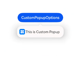
自定义气泡
开发者可以使用CustomPopupOptions的builder创建自定义气泡,@Builder中可以放自定义的内容。除此之外,还可以通过popupColor等参数控制气泡样式。
@Entry
@Component
struct Index {
  @State customPopup: boolean = false
  // popup构造器定义弹框内容
  @Builder popupBuilder() {
    Row({ space: 2 }) {
      Image($r("app.media.icon")).width(24).height(24).margin({ left: 5 })
      Text('This is Custom Popup').fontSize(15)
    }.width(200).height(50).padding(5)
  }
  build() {
    Column() {
      Button('CustomPopupOptions')
        .position({x:100,y:200})
        .onClick(() => {
          this.customPopup = !this.customPopup
        })
        .bindPopup(this.customPopup, {
          builder: this.popupBuilder, // 气泡的内容
          placement:Placement.Bottom, // 气泡的弹出位置
          popupColor:Color.Pink, // 气泡的背景色
          onStateChange: (e) => {
            if (!e.isVisible) {
              this.customPopup = false
            }
          }
        })
    }
    .height('100%')
  }
}
使用者通过配置placement参数将弹出的气泡放到需要提示的位置。弹窗构造器会触发弹出提示信息,来引导使用者完成操作,也让使用者有更好的UI体验。
气泡样式
以下示例通过设置popupColor(背景颜色)、mask(蒙层样式)、width(气泡宽度)、placement(显示位置)实现气泡的样式。
// xxx.ets


@Entry
@Component
struct PopupExample {
  @State handlePopup: boolean = false


  build() {
    Column({ space: 100 }) {
      Button('PopupOptions')
        .onClick(() => {
          this.handlePopup = !this.handlePopup
        })
        .bindPopup(this.handlePopup, {
          width: 200,
          message: 'This is a popup.',
          popupColor: Color.Red, // 设置气泡的背景色
          mask: {
            color: '#33d9d9d9'
          },
          placement: Placement.Top,
          backgroundBlurStyle: BlurStyle.NONE // 去除背景模糊效果需要关闭气泡的模糊背景
        })
    }
    .width('100%')
  }
}
绑定模态页面
绑定模态页面概述
模态页面是一种大面板大视图交互式的弹窗,和其他弹窗组件一样,通常用于在保持当前的上下文环境时,临时展示用户需关注的信息或待处理的操作。相比于其他弹窗组件,模态页面的内容都需要开发者通过自定义组件来填充实现,可展示的视图往往也很大。默认需要用户进行交互才能够退出模态页面。ArkUI当前提供了半模态和全模态两类模态页面组件。
- 半模态:开发者可以利用此模态页面实现多形态效果。支持不同宽度设备显示不同样式的半模态页面。允许用户通过侧滑,点击蒙层,点击关闭按钮,下拉关闭半模态页面。
- 全模态:开发者可以利用此模态页面实现全屏的模态弹窗效果。默认需要侧滑才能关闭。
绑定半模态页面(bindSheet)
绑定全模态页面(bindContentCover)
即时反馈(Toast)
即时反馈(Toast)是一种临时性的消息提示框,用于向用户显示简短的操作反馈或状态信息。它通常在屏幕的底部或顶部短暂弹出,随后在一段时间后自动消失。即时反馈的主要目的是提供简洁、不打扰的信息反馈,避免干扰用户当前的操作流程。
可以通过使用UIContext中的getPromptAction方法获取当前UI上下文关联的PromptAction对象,再通过该对象调用showToast创建并显示文本提示框。
使用建议
- 合理使用弹出场景,而不是频繁的提醒用户
- 注意文本的信息密度,即使反馈展示时间有限,应当避免长文本的出现
- 杜绝强制占位和密集弹出的提示
- 遵从系统默认弹出位置
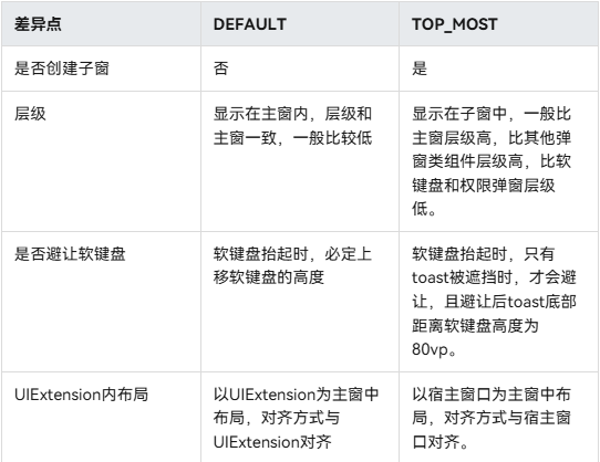
即时反馈模式对比
即时反馈提供了两种显示模式,分别为DEFAULT(显示在应用内)、TOP_MOST(显示在应用之上)。
在TOP_MOST类型的Toast显示前,会创建一个全屏大小的子窗(手机上子窗大小和主窗大小一致),然后在该子窗上计算Toast的布局位置,最后显示在该子窗上。具体和DEFAULT模式Toast的差异如下:
import {promptAction} from '@kit.ArkUI';
@Entry
@Component
struct Index {
  build() {
    Column({space: 10}) {
      TextInput()
      Button() {
        Text("DEFAULT类型Toast")
          .fontSize(20)
          .fontWeight(FontWeight.Bold)


      }
      .width('100%')
      .onClick(()=>{
        promptAction.showToast({
          message:"ok,我是DEFAULT toast",
          duration:2000,
          showMode: promptAction.ToastShowMode.DEFAULT,
          bottom:80
        })
      })
      Button() {
        Text("TOPMOST类型Toast")
          .fontSize(20)
          .fontWeight(FontWeight.Bold)


      }
      .width('100%')
      .onClick(()=>{
        promptAction.showToast({
          message:"ok,我是TOP_MOST toast",
          duration:2000,
          showMode: promptAction.ToastShowMode.TOP_MOST,
          bottom:85
        })
      })
    }
  }
}
创建即时反馈
适用于短时间内提示自动消失的场景
import { LengthMetrics, PromptAction } from '@kit.ArkUI'
import { BusinessError } from '@kit.BasicServicesKit'


@Entry
@Component
struct toastExample {
  private uiContext: UIContext = this.getUIContext()
  private promptAction: PromptAction = this.uiContext.getPromptAction()


  build() {
    Column() {
      Button('Show toast').fontSize(20)
        .onClick(() => {
          try {
            this.promptAction.showToast({
              message: 'Hello World',
              duration: 2000
            });
          } catch (error) {
            let message = (error as BusinessError).message
            let code = (error as BusinessError).code
            console.error(`showToast args error code is ${code}, message is ${message}`);
          };
        })
    }.height('100%').width('100%').justifyContent(FlexAlign.Center)
  }
}
设置浮层(OverlayManager)
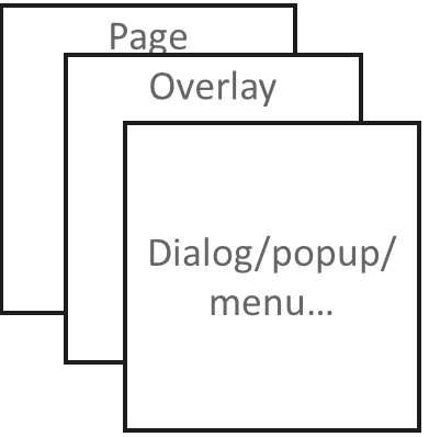
浮层(OverlayManager) 用于将自定义的UI内容展示在页面(Page)之上,在Dialog、Popup、Menu、BindSheet、BindContentCover和Toast等组件之下,展示的范围为当前窗口安全区内。可适用于常驻悬浮等场景。
可以通过使用UIContext中的getOverlayManager方法获取当前UI上下文关联的OverlayManager对象,再通过该对象调用对应方法。
规格约束
- OverlayManager上节点的层级在Page页面层级之上,在Dialog、Popup、Menu、BindSheet、BindContentCover和Toast等组件之下。
- OverlayManager添加的节点显示和消失时没有默认动画
- OverlayManager上节点安全区域内外的绘制方式与Page一致,键盘避让方式与Page一致。
- 与OverlayManager相关的属性推荐采用AppStorage来进行应用全局存储,以免切换页面后属性值发生变化从而导致业务错误。
设置浮层
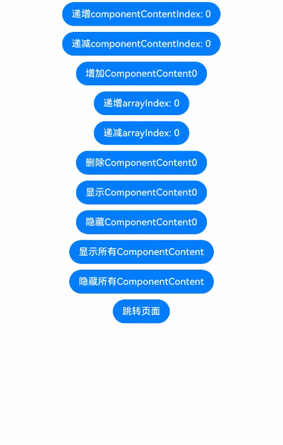
在OverlayManager上新增指定节点(addComponentContent)、删除指定节点(removeComponentContent)、显示所有节点(showAllComponentContents)和隐藏所有节点(hideAllComponentContents)。
import { ComponentContent, OverlayManager, router } from '@kit.ArkUI';


class Params {
  text: string = ""
  offset: Position
  constructor(text: string, offset: Position) {
    this.text = text
    this.offset = offset
  }
}
@Builder
function builderText(params: Params) {
  Column() {
    Text(params.text)
      .fontSize(30)
      .fontWeight(FontWeight.Bold)
  }.offset(params.offset)
}


@Entry
@Component
struct OverlayExample {
  @State message: string = 'ComponentContent';
  private uiContext: UIContext = this.getUIContext()
  private overlayNode: OverlayManager = this.uiContext.getOverlayManager()
  @StorageLink('contentArray') contentArray: ComponentContent<Params>[] = []
  @StorageLink('componentContentIndex') componentContentIndex: number = 0
  @StorageLink('arrayIndex') arrayIndex: number = 0
  @StorageLink("componentOffset") componentOffset: Position = {x: 0, y: 80}


  build() {
    Column({space:10}) {
      Button("递增componentContentIndex: " + this.componentContentIndex).onClick(()=>{
        ++this.componentContentIndex
      })
      Button("递减componentContentIndex: " + this.componentContentIndex).onClick(()=>{
        --this.componentContentIndex
      })
      Button("增加ComponentContent" + this.contentArray.length).onClick(()=>{
        let componentContent = new ComponentContent(
          this.uiContext, wrapBuilder<[Params]>(builderText),
          new Params(this.message + (this.contentArray.length), this.componentOffset)
        )
        this.contentArray.push(componentContent)
        this.overlayNode.addComponentContent(componentContent, this.componentContentIndex)
      })
      Button("递增arrayIndex: " + this.arrayIndex).onClick(()=>{
        ++this.arrayIndex
      })
      Button("递减arrayIndex: " + this.arrayIndex).onClick(()=>{
        --this.arrayIndex
      })
      Button("删除ComponentContent" + this.arrayIndex).onClick(()=>{
        if (this.arrayIndex >= 0 && this.arrayIndex < this.contentArray.length) {
          let componentContent = this.contentArray.splice(this.arrayIndex, 1)
          this.overlayNode.removeComponentContent(componentContent.pop())
        } else {
          console.info("arrayIndex有误")
        }
      })
      Button("显示ComponentContent" + this.arrayIndex).onClick(()=>{
        if (this.arrayIndex >= 0 && this.arrayIndex < this.contentArray.length) {
          let componentContent = this.contentArray[this.arrayIndex]
          this.overlayNode.showComponentContent(componentContent)
        } else {
          console.info("arrayIndex有误")
        }
      })
      Button("隐藏ComponentContent" + this.arrayIndex).onClick(()=>{
        if (this.arrayIndex >= 0 && this.arrayIndex < this.contentArray.length) {
          let componentContent = this.contentArray[this.arrayIndex]
          this.overlayNode.hideComponentContent(componentContent)
        } else {
          console.info("arrayIndex有误")
        }
      })
      Button("显示所有ComponentContent").onClick(()=>{
          this.overlayNode.showAllComponentContents()
      })
      Button("隐藏所有ComponentContent").onClick(()=>{
        this.overlayNode.hideAllComponentContents()
      })


      Button("跳转页面").onClick(()=>{
        router.pushUrl({
          url: 'pages/Second'
        })
      })
    }
    .width('100%')
    .height('100%')
  }
}
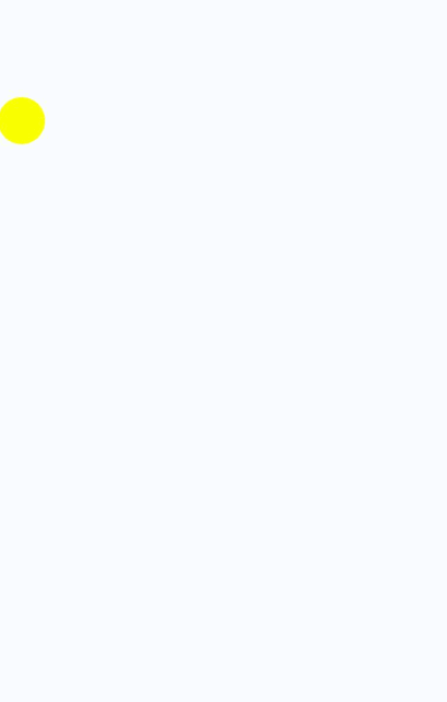
显示一个始终在屏幕左侧的悬浮球,点击可以弹出alertDialog弹窗。
import { ComponentContent, OverlayManager } from '@kit.ArkUI';


class Params {
  context: UIContext
  offset: Position
  constructor(context: UIContext, offset: Position) {
    this.context = context
    this.offset = offset
  }
}
@Builder
function builderOverlay(params: Params) {
  Column() {
    Stack(){
    }.width(50).height(50).backgroundColor(Color.Yellow).position(params.offset).borderRadius(50)
    .onClick(() => {
      params.context.showAlertDialog(
        {
          title: 'title',
          message: 'Text',
          autoCancel: true,
          alignment: DialogAlignment.Center,
          gridCount: 3,
          confirm: {
            value: 'Button',
            action: () => {}
          },
          cancel: () => {}
        }
      )
    })
  }.focusable(false).width('100%').height('100%').hitTestBehavior(HitTestMode.Transparent)
}


@Entry
@Component
struct OverlayExample {
  @State message: string = 'ComponentContent';
  private uiContext: UIContext = this.getUIContext()
  private overlayNode: OverlayManager = this.uiContext.getOverlayManager()
  private overlayContent:ComponentContent<Params>[] = []
  controller: TextInputController = new TextInputController()


  aboutToAppear(): void {
    let uiContext = this.getUIContext();
    let componentContent = new ComponentContent(
      this.uiContext, wrapBuilder<[Params]>(builderOverlay),
      new Params(uiContext, {x:0, y: 100})
    )
    this.overlayNode.addComponentContent(componentContent, 0)
    this.overlayContent.push(componentContent)
  }


  aboutToDisappear(): void {
    let componentContent = this.overlayContent.pop()
    this.overlayNode.removeComponentContent(componentContent)
  }


  build() {
    Column() {


    }
    .width('100%')
    .height('100%')
  }
}
![学习笔记(24): 机器学习之数据预处理Pandas和转换成张量格式[2]](https://i-blog.csdnimg.cn/direct/db92e58cde9b4aa194d3629461b095ab.png)