大家好,散点图通常用于比较2个不同特征以确定它们之间的关系,散点图也可以添加更多的维度来反映数据,例如使用颜色、气泡大小等。在本文中,将介绍如何绘制一个五维的散点图。
数据集:
https://github.com/checkming00/Medium_datasets/blob/main/WH%20Report_preprocessed.csv
让我们从二维开始,简单地看一下Healthy_life_expectancy_at_birth和Log_GDP_per_capita的图:
df.plot.scatter('Healthy_life_expectancy_at_birth', 'Log_GDP_per_capita')
我们可以看到这2个特征具有很强的正相关关系。然后我们可以将year作为我们的三维视觉效果添加到绘图中:
import matplotlib.pyplot as plt
import numpy as np

plt.figure(figsize=(15, 8))

years = np.sort(df.year.unique())
for i, year in enumerate(years):
    BM = df.year == year
    X = df[BM]['Healthy_life_expectancy_at_birth']
    Y = df[BM]['Log_GDP_per_capita']
    plt.subplot(2, 5, i+1) # 2X5 structure of subplots, at i+1 position
    plt.scatter(X, Y)
    plt.title(year)
    plt.xlim([30, 80]) # x axis range
    plt.ylim([6, 12]) # y axis range
plt.show()
plt.tight_layout()
它显示了多年来Healthy_life_expectancy_at_birth和Log_GDP_per_capita之间的关系。另一方面,我们可以让它具有交互性:
def plotyear(year):
    BM = df.year == year
    X = df[BM]['Healthy_life_expectancy_at_birth']
    Y = df[BM]['Log_GDP_per_capita']
    plt.scatter(X, Y)
    plt.xlabel('Healthy_life_expectancy_at_birth')
    plt.ylabel('Log_GDP_per_capita')
    plt.xlim([30, 80])
    plt.ylim([6, 12])
    plt.show()
from ipywidgets import interact, widgets
min_year=df.year.min()
max_year=df.year.max()
interact(plotyear,
year=widgets.IntSlider(min=min_year,
max=max_year, step=1, value=min_year))
然后我们可以拖动顶部的控制条来更改年份。现在让我们把第四个维度Continent作为图例放入:
continents = df.Continent.unique()

con_colors = dict(zip(continents, ['b', 'g', 'r', 'c', 'm', 'y' ,'k']))
import seaborn as sns
def plotyear_continent(year):
BM = df.year == year
sns.scatterplot(data=df[BM], x='Healthy_life_expectancy_at_birth',
y='Log_GDP_per_capita', hue='Continent', palette=con_colors)
plt.xlabel('Healthy_life_expectancy_at_birth')
plt.ylabel('Log_GDP_per_capita')
plt.xlim([30, 80])
plt.ylim([6, 12])
plt.legend()
plt.show()interact(plotyear_continent,
year=widgets.IntSlider(min=min_year,
max=max_year, step=1,
value=round(df.year.mean(),0)))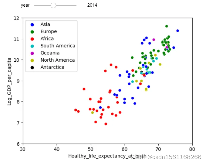
它显示了不同大洲之间的关系,将默认年份设置为2014年(value=round(df.year.mean(),0))。
我们可以在视觉上做得更多的是气泡的大小。所以我们可以把population作为第五维:
continents = df.Continent.unique()

con_colors = dict(zip(continents, ['b', 'g', 'r', 'c', 'm', 'y' ,'k']))

min_size=df['population'].min()/1000000  # Scale bubble minimum size
max_size=df['population'].max()/1000000  # Scale bubble maximum size

def plotyear_continent_pop(year):
    BM = df.year == year
    sns.scatterplot(data=df[BM], x='Healthy_life_expectancy_at_birth',
                    y='Log_GDP_per_capita', hue='Continent',
                    palette=con_colors, size='population',
                    sizes=(min_size, max_size))
    plt.xlabel('Healthy_life_expectancy_at_birth')
    plt.ylabel('Log_GDP_per_capita')
    plt.xlim([30, 80])
    plt.ylim([6, 12])
    plt.legend()
    plt.show()
interact(plotyear_continent_pop,
         year=widgets.IntSlider(min=min_year,
                                max=max_year, step=1,
                                value=round(df.year.mean(),0)))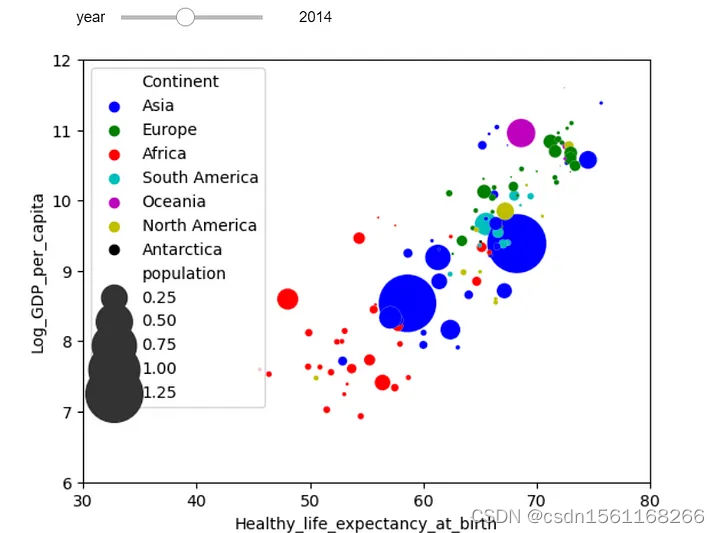
它显示了各大洲与气泡大小作为人口的关系。
这就是我们制作5D散点图的方式,它可以尽可能在同一图像中告诉人们所需要的信息。