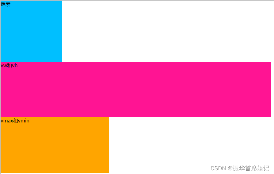
新增长度单位
<!DOCTYPE html>
<html lang="zh-CN">
<head>
    <meta charset="UTF-8">
    <title>Document</title>
    <style>
        * {
            margin: 0;
            padding: 0;
        }
        .box1 {
            width: 200px;
            height: 200px;
            background-color: deepskyblue;
        }
        .box2 {
            width: 50vw;
            height: 20vh;
            background-color: deeppink;
        }
        .box3 {
            width: 20vmax;
            height: 20vmin;
            background-color: orange;
        }
    </style>
</head>
<body>
    <div class="box1">像素</div>
    <div class="box2">vw和vh</div>
    <div class="box3">vmax和vmin</div>
</body>
</html>
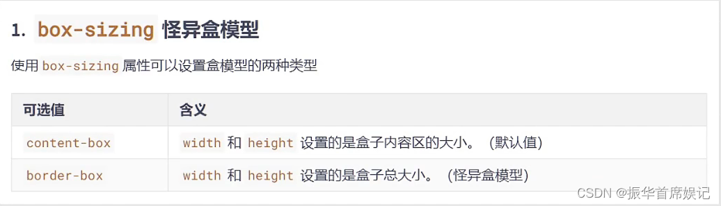
新增盒子模型
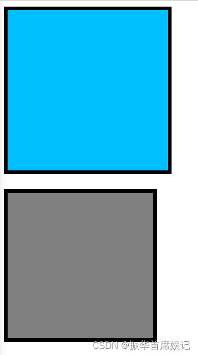
box-sizing
<!DOCTYPE html>
<html lang="zh-CN">
<head>
    <meta charset="UTF-8">
    <title>Document</title>
    <style>
        .box1 {
            width: 200px;
            height: 200px;
            background-color: deepskyblue;
            padding: 5px;
            border: 5px solid black;
            margin-bottom: 20px;
        }
        .box2 {
            width: 200px;
            height: 200px;
            background-color: gray;
            padding: 5px;
            border: 5px solid black;
            box-sizing: border-box;
        }
    </style>
</head>
<body>
    <div class="box1"></div>
    <div class="box2"></div>
</body>
</html>
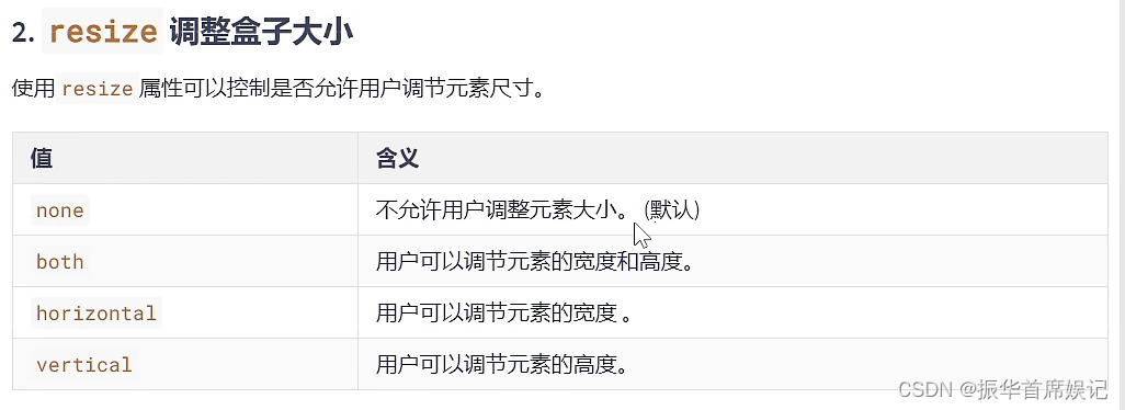
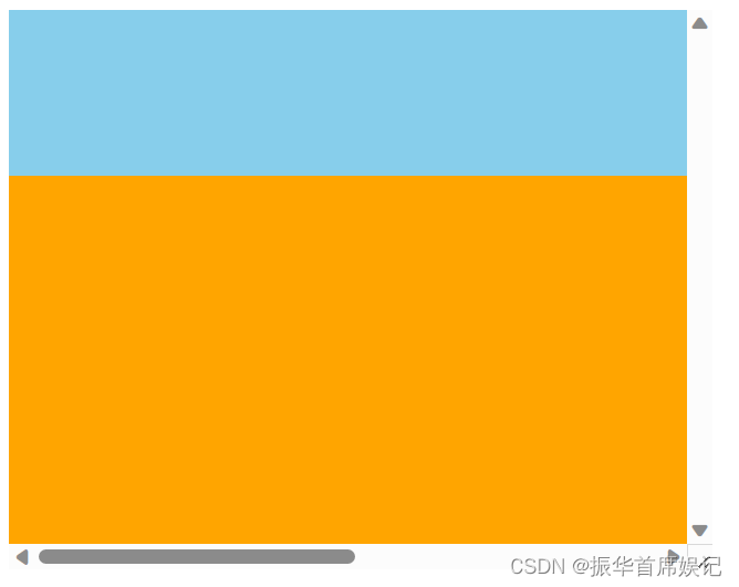
resize
<!DOCTYPE html>
<html lang="zh-CN">
<head>
    <meta charset="UTF-8">
    <title>Document</title>
    <style>
        .box1 {
            width: 400px;
            height: 400px;
            background-color: orange;
            resize: both;
            overflow: scroll;
        }
        .box2 {
            width: 800px;
            height: 100px;
            background-color: skyblue;
        }
    </style>
</head>
<body>
    <div class="box1">
        <div class="box2"></div>
    </div>

</body>
</html>
box-shadow
<!DOCTYPE html>
<html lang="zh-CN">
<head>
    <meta charset="UTF-8">
    <title>Document</title>
    <style>
        .box1 {
            width: 400px;
            height: 400px;
            background-color: orange;
            margin: 0 auto;
            margin-top: 100px;
            font-size: 40px;
            /* 2个值:水平位置,垂直位置 */
            /* box-shadow: 10px 10px; */

             /* 3个值:水平位置,垂直位置,阴影颜色 */
             /* box-shadow: 10px 10px blue; */

              /* 3个值:水平位置,垂直位置,模糊程度 */
              /* box-shadow: 10px 10px 20px; */

              /* 4个值:水平位置,垂直位置,模糊程度,阴影颜色 */
              /* box-shadow: 10px 10px 20px blue; */

              /* 5个值:水平位置,垂直位置,模糊程度,阴影外延,阴影颜色 */
              /* box-shadow: 10px 10px 20px 0px blue; */

               /* 6个值:水平位置,垂直位置,模糊程度,阴影外延,阴影颜色,内阴影 */
              /* box-shadow: 10px 10px 20px 0px blue inset;  */
        }
    </style>
</head>
<body>
    <div class="box1">你好啊</div>
</body>
</html>
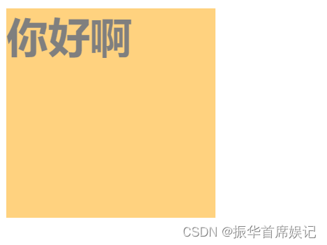
opacity
<!DOCTYPE html>
<html lang="zh-CN">
<head>
    <meta charset="UTF-8">
    <title>Document</title>
    <style>
        .box1 {
            width: 200px;
            height: 200px;
            background-color: orange;
            font-size: 40px;
            opacity: 0.5;
            font-weight: bold;
        }
    </style>
</head>
<body>
    <div class="box1">你好啊</div>
</body>
</html>
新增背景相关属性
background-origin
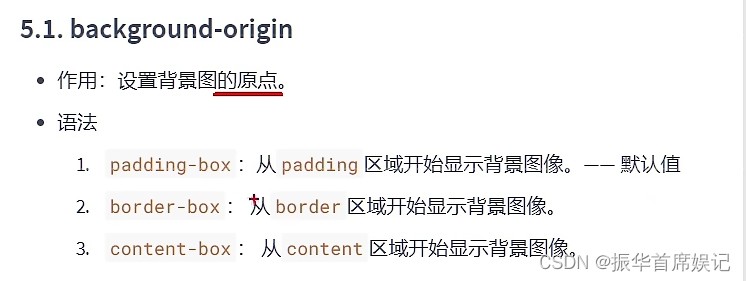
<!DOCTYPE html>
<html lang="zh-CN">

<head>
    <meta charset="UTF-8">
    <title>Document</title>
    <style>
        .box1 {
            width: 400px;
            height: 400px;
            background-color: skyblue;
            margin: 0 auto;
            font-size: 40px;
            padding: 50px;
            border: 50px dashed rgba(255,0,0,0.7);
            background-image: url("资料/图片/bg01.jpg");
            background-repeat: no-repeat;
            background-origin: content-box;
        }

    </style>
</head>

<body>
    <div class="box1">你好啊</div>
</body>

</html>
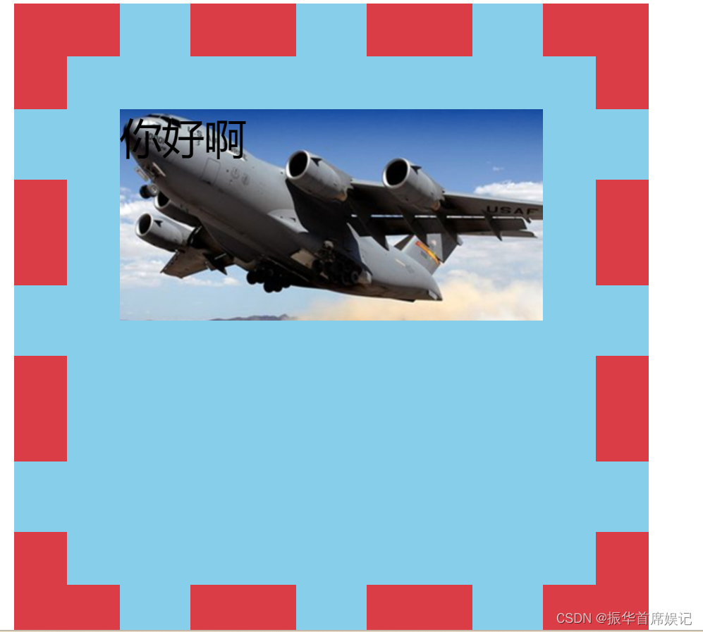
background-clip
<!DOCTYPE html>
<html lang="zh-CN">

<head>
    <meta charset="UTF-8">
    <title>Document</title>
    <style>
        .box1 {
            width: 400px;
            height: 400px;
            background-color: skyblue;
            margin: 0 auto;
            font-size: 40px;
            padding: 50px;
            border: 50px dashed rgba(255,0,0,0.7);
            background-image: url("资料/图片/bg02.jpg");
            background-repeat: no-repeat;
            background-clip: padding-box;
        }

    </style>
</head>

<body>
    <div class="box1">你好啊</div>
</body>

</html>
<!DOCTYPE html>
<html lang="zh-CN">

<head>
    <meta charset="UTF-8">
    <title>Document</title>
    <style>
        .box1 {
            width: 400px;
            height: 400px;
            background-color: skyblue;
            margin: 0 auto;
            font-size: 40px;
            padding: 50px;
            border: 50px dashed rgba(255,0,0,0.7);
            color: transparent;
            background-image: url("资料/图片/bg02.jpg");
            background-repeat: no-repeat;
            background-clip: padding-box;
            -webkit-background-clip: text;
        }

    </style>
</head>

<body>
    <div class="box1">你好啊</div>
</body>

</html>
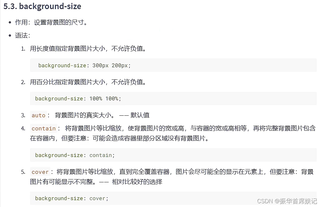
background-size
<!DOCTYPE html>
<html lang="zh-CN">
<head>
    <meta charset="UTF-8">
    <title>Document</title>
    <style>
        div {
            width: 400px;
            height: 400px;
            border: 1px solid black;
            background-image: url('./资料/图片/bg03.jpg');
            /* background-size: 400px 400px; */
            /* background-size: 100% 100%; */
            /* background-size: contain; */
            background-size:auto;
        }
    </style>
</head>
<body>
    <div>
    </div>
</body>
</html>
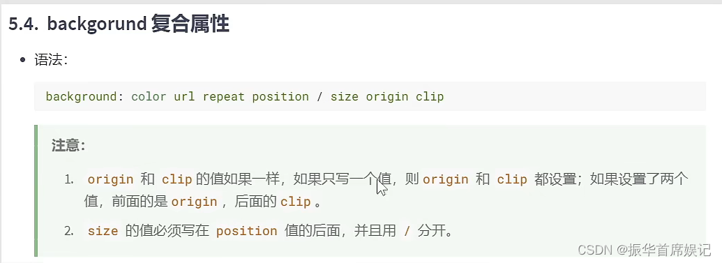
background复合属性
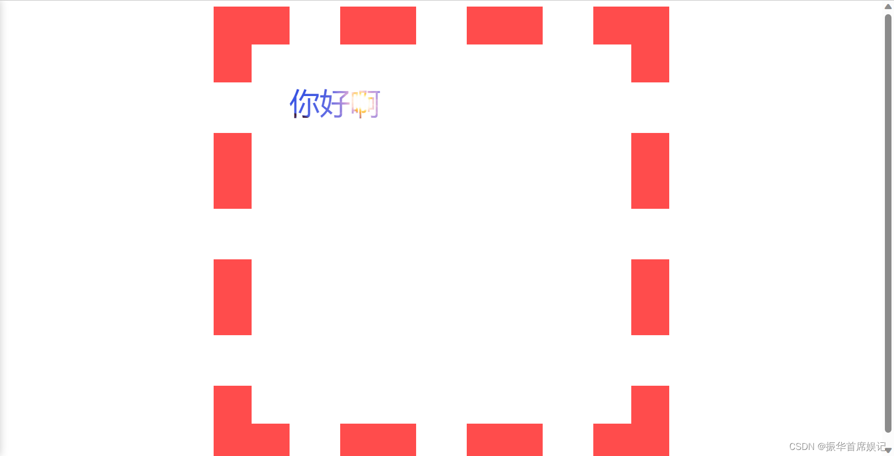
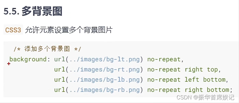
多背景图
<!DOCTYPE html>
<html lang="zh-CN">
<head>
    <meta charset="UTF-8">
    <title>Document</title>
    <style>
        div {
            width: 400px;
            height: 400px;
            border: 1px solid black;
            background: url('./资料/图片/bg-lt.png') no-repeat left top,
                        url('./资料/图片/bg-rt.png') no-repeat right top,
                        url('./资料/图片/bg-lb.png') no-repeat left bottom,
                        url('./资料/图片/bg-rb.png') no-repeat right bottom;
        }
    </style>
</head>
<body>
    <div>
    </div>
</body>
</html>
新增边框相关属性
边框圆角
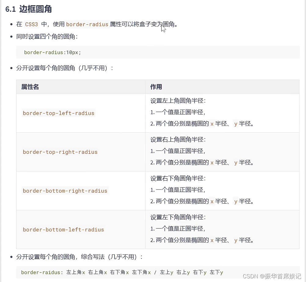
<!DOCTYPE html>
<html lang="zh-CN">
<head>
    <meta charset="UTF-8">
    <meta http-equiv="X-UA-Compatible" content="IE=edge">
    <meta name="viewport" content="width=device-width, initial-scale=1.0">
    <title>Document</title>
    <style>
        div {
            width: 400px;
            height: 400px;
            border: 2px solid black;
            margin: 0 auto;
            /* border-radius: 200px; */
            /* border-radius: 50%; */

            /* border-top-left-radius: 100px;
            border-top-right-radius: 50px;
            border-bottom-left-radius: 20px;
            border-bottom-right-radius: 10px; */

            /* border-top-left-radius: 100px 50px;
            border-top-right-radius: 50px 20px;
            border-bottom-left-radius: 20px 10px;
            border-bottom-right-radius: 10px 5px; */

            /* border-radius: 100px 50px 20px 10px / 50px 20px 10px 5px; */
        }
    </style>
</head>
<body>
    <div></div>
</body>
</html>
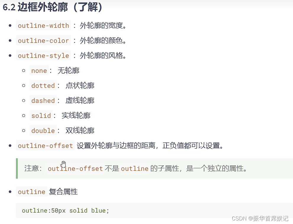
边框外轮廓
新增文本属性
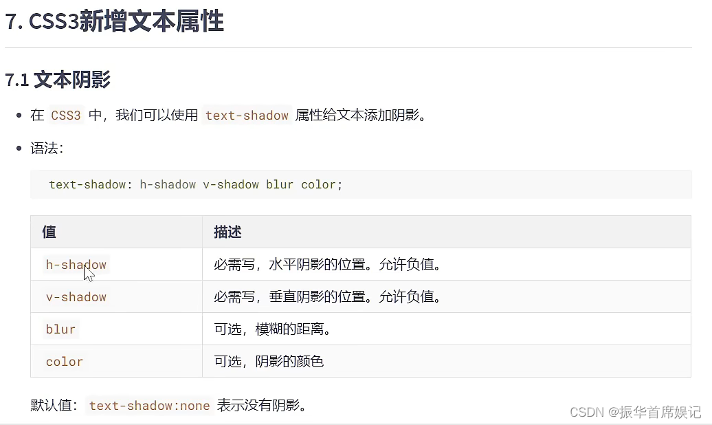
文本阴影
<!DOCTYPE html>
<html lang="zh-CN">
<head>
    <meta charset="UTF-8">
    <meta http-equiv="X-UA-Compatible" content="IE=edge">
    <meta name="viewport" content="width=device-width, initial-scale=1.0">
    <title>Document</title>
    <style>
        h1 {
            font-size: 80px;
            text-align: center;
            color: white;
            /* text-shadow: 3px 3px 10px red; */

            text-shadow: 0px 0px 15px black;
        }
    </style>
</head>
<body>
    <h1>你好呀</h1>
</body>
</html>
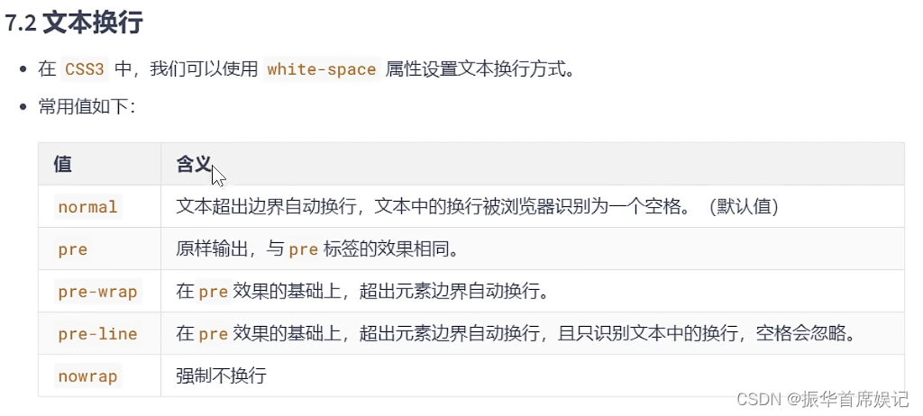
文本换行
<!DOCTYPE html>
<html lang="zh-CN">
<head>
<meta charset="UTF-8">
<meta http-equiv="X-UA-Compatible" content="IE=edge">
<meta name="viewport" content="width=device-width, initial-scale=1.0">
<title>Document</title>
<style>
div {
width: 400px;
height: 400px;
border: 1px solid black;
font-size: 20px;
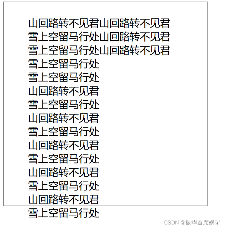
white-space: pre-wrap;
}
</style>
</head>
<body>
<div>
山回路转不见君山回路转不见君
雪上空留马行处山回路转不见君
雪上空留马行处山回路转不见君
雪上空留马行处
雪上空留马行处
山回路转不见君
雪上空留马行处
山回路转不见君
雪上空留马行处
山回路转不见君
雪上空留马行处
山回路转不见君
雪上空留马行处
山回路转不见君
雪上空留马行处
</div>
</body>
</html>
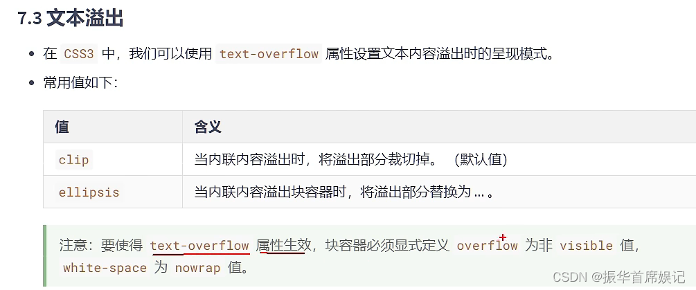
文本溢出
<!DOCTYPE html>
<html lang="zh-CN">
<head>
<meta charset="UTF-8">
<meta http-equiv="X-UA-Compatible" content="IE=edge">
<meta name="viewport" content="width=device-width, initial-scale=1.0">
<title>Document</title>
<style>
ul {
width: 400px;
height: 400px;
border: 1px solid black;
font-size: 20px;
list-style: none;
padding-left: 0;
}
li {
margin-bottom: 10px;
white-space: nowrap;
text-overflow: ellipsis;
overflow: hidden;
}
</style>
</head>
<body>
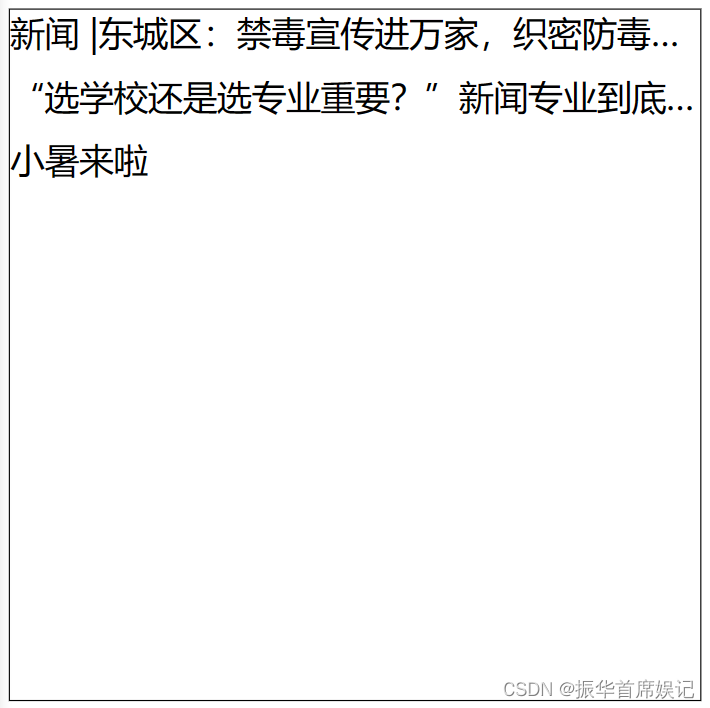
<ul>
<li>新闻 |东城区:禁毒宣传进万家,织密防毒“安全网”</li>
<li>“选学校还是选专业重要?”新闻专业到底是不是如张雪峰所说的?
</li>
<li>小暑来啦</li>
</ul>
</body>
</html>
文本修饰
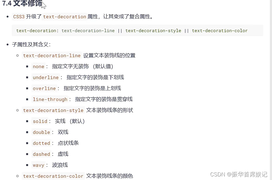
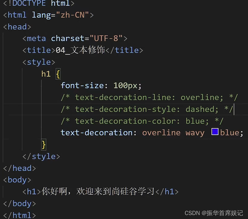
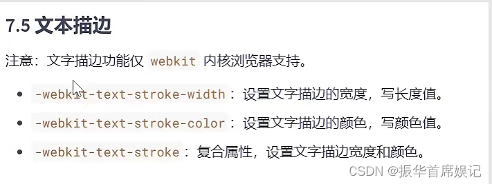
文本描边

![CodeForces..碰撞字符.[简单].[遍历求最大连续]](https://img-blog.csdnimg.cn/f694566aa1e94d7bab641179d5d31d29.png)