Compose给我们提供了一个Material Design样式的首页组件(Scaffold),我们可以直接套用从而完成一个APP的首页界面
由于Scaffold中还包含有其他的组件,所以讲解Scaffold先讲解前置的一些组件
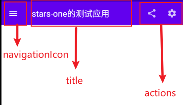
TopAppBar
首先,便是TopAppBar,其本质就是我们Android原生常见的Toolbar,不过其封装的比较好,可以快速构建,下面是其的参数列表
TopAppBar(
    title: @Composable () -> Unit,
    modifier: Modifier = Modifier,
    navigationIcon: @Composable (() -> Unit)? = null,
    actions: @Composable RowScope.() -> Unit = {},
    backgroundColor: Color = MaterialTheme.colors.primarySurface,
    contentColor: Color = contentColorFor(backgroundColor),
    elevation: Dp = AppBarDefaults.TopAppBarElevation
)
title标题,接收Compose组件,可以传个Text文本进去modifier修饰符,详情见上一章节navigationIcon导航图标actions动作组件backgroundColor背景色contentColor内容颜色elevation阴影
可能说的那么明确,我们直接上代码和效果图,各位就清晰了
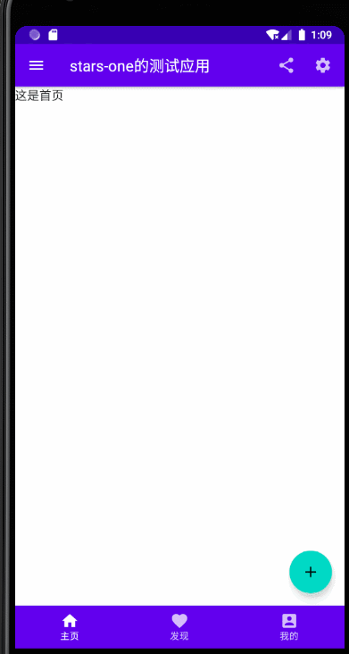
TopAppBar(
    navigationIcon = {
        IconButton(
            onClick = {}
        ) {
            Icon(Icons.Filled.Menu, null)
        }
    },
    title = {
        Text("stars-one的测试应用")
    },actions = {
        IconButton(
            onClick = {}
        ) {
            Icon(Icons.Filled.Share, null)
        }
        IconButton(
            onClick = {}
        ) {
            Icon(Icons.Filled.Settings, null)
        }
    }
)
效果图如下
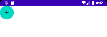
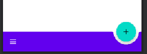
FloatingActionButton
比较常见的悬浮按钮,一般里面是个简单的按钮,参数与之前的Button一样
FloatingActionButton(
    onClick: () -> Unit,
    modifier: Modifier = Modifier,
    interactionSource: MutableInteractionSource = remember { MutableInteractionSource() },
    shape: Shape = MaterialTheme.shapes.small.copy(CornerSize(percent = 50)),
    backgroundColor: Color = MaterialTheme.colors.secondary,
    contentColor: Color = contentColorFor(backgroundColor),
    elevation: FloatingActionButtonElevation = FloatingActionButtonDefaults.elevation(),
    content: @Composable () -> Unit
)
使用:
FloatingActionButton(onClick = { /*TODO*/ }) {
    Icon(imageVector = Icons.Default.Add, contentDescription = null)
}
PS: 一般这个与
Scaffold连用,Scaffold里面可控制FloatingActionButton的位置
除此之外,还有个ExtendedFloatingActionButton,这种就是可以带图标和文字的,如下图
ExtendedFloatingActionButton(
    icon = { Icon(Icons.Filled.Favorite, contentDescription = null) },
    text = { Text("ADD TO BASKET") },
    onClick = { /*do something*/ }
)
ExtendedFloatingActionButton和FloatingActionButton区别是,ExtendedFloatingActionButton是以文字为主,图标是可选的,而FloatingActionButton只显示图标
BottomAppBar
这个与之前的TopAppBar参数有所不同,从名字看我们知道其实放在底部的一个Toolbar,但是其本身是不带有位置控制,也是得与Scaffold连用,如果单独使用,效果也是会和TopAppBar的一样放在页面的顶头
BottomAppBar(
    modifier: Modifier = Modifier,
    backgroundColor: Color = MaterialTheme.colors.primarySurface,
    contentColor: Color = contentColorFor(backgroundColor),
    cutoutShape: Shape? = null,
    elevation: Dp = AppBarDefaults.BottomAppBarElevation,
    contentPadding: PaddingValues = AppBarDefaults.ContentPadding,
    content: @Composable RowScope.() -> Unit
)
可以把这个布局看作是个Row布局,里面的参数从名字都能看到出来,设置背景色或者设置padding边距的,这里不再赘述
唯一值得注意的是cutoutShape属性,如果在Scaffold中,有BottomAppBar和FloatingActionButton,可以实现下面的效果
BottomNavigation
BottomNavigation里面会有N个BottomNavigationItem,这里就看你自己准备定义多少个菜单项了
BottomNavigation(
    modifier: Modifier = Modifier,
    backgroundColor: Color = MaterialTheme.colors.primarySurface,
    contentColor: Color = contentColorFor(backgroundColor),
    elevation: Dp = BottomNavigationDefaults.Elevation,
    content: @Composable RowScope.() -> Unit
)
BottomNavigation提供的一些参数也就是改变颜色或者阴影,重点是在BottomNavigationItem
BottomNavigationItem(
    selected: Boolean,
    onClick: () -> Unit,
    icon: @Composable () -> Unit,
    modifier: Modifier = Modifier,
    enabled: Boolean = true,
    label: @Composable (() -> Unit)? = null,
    alwaysShowLabel: Boolean = true,
    interactionSource: MutableInteractionSource = remember { MutableInteractionSource() },
    selectedContentColor: Color = LocalContentColor.current,
    unselectedContentColor: Color = selectedContentColor.copy(alpha = ContentAlpha.medium)
)
BottomNavigationItem有个selected参数,表示是否选中
icon则是图标的设置,label则是文字,这两个都是需要接收一个组件的
selectedContentColor选中颜色unselectedContentColor未选中颜色
下面直接来个例子讲解
var selectIndex by remember {
    mutableStateOf(0)
}
val navList = listOf("首页","发现","我的")
BottomNavigation() {
    navList.forEachIndexed { index, str ->
        BottomNavigationItem(
            selected = index == selectIndex, onClick = { selectIndex = index },
            icon = {
                Icon(imageVector = Icons.Default.Favorite, contentDescription =null )
            },label = {Text(str)}
        )
    }
}

Text(text = "这是${navList[selectIndex]}")
效果如下所示

PS:如果使用了 appbar 或者 bootomBar,就会把 content 中的内容挡住,这个时候就需要使用
PaddingValue设置内边距了,如
Scaffold(){
     Surface(modifier = Modifier.padding(bottom = it.calculateBottomPadding())) {

     }
}
Scaffold
Scaffold(
    modifier: Modifier = Modifier,
    scaffoldState: ScaffoldState = rememberScaffoldState(),
    topBar: @Composable () -> Unit = {},
    bottomBar: @Composable () -> Unit = {},
    snackbarHost: @Composable (SnackbarHostState) -> Unit = { SnackbarHost(it) },
    floatingActionButton: @Composable () -> Unit = {},
    floatingActionButtonPosition: FabPosition = FabPosition.End,
    isFloatingActionButtonDocked: Boolean = false,
    drawerContent: @Composable (ColumnScope.() -> Unit)? = null,
    drawerGesturesEnabled: Boolean = true,
    drawerShape: Shape = MaterialTheme.shapes.large,
    drawerElevation: Dp = DrawerDefaults.Elevation,
    drawerBackgroundColor: Color = MaterialTheme.colors.surface,
    drawerContentColor: Color = contentColorFor(drawerBackgroundColor),
    drawerScrimColor: Color = DrawerDefaults.scrimColor,
    backgroundColor: Color = MaterialTheme.colors.background,
    contentColor: Color = contentColorFor(backgroundColor),
    content: @Composable (PaddingValues) -> Unit
)
属性说明
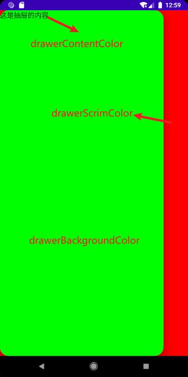
topBar顶部的布局bottomBar底部的布局floatingActionButton悬浮按钮布局floatingActionButtonPosition悬浮按钮位置,有FabPosition.End(默认)和FabPosition.Center可选isFloatingActionButtonDocked与BottomAppBar配合使用,可以实现底部导航条的裁剪效果,效果可以看下图drawerGesturesEnabled是否开启侧边抽屉手势(开启后可侧滑弹出抽屉)drawerShape抽屉的形状drawerContent侧边抽屉内容,是个Column布局,自己可以顺便排列drawerElevation侧边抽屉的阴影drawerBackgroundColor侧边抽屉的背景色drawerContentColor侧边抽屉内容颜色(似乎是覆盖字体颜色而已)drawerScrimColor侧边抽屉遮盖最底层的颜色
基本使用
使用5个属性topBar bottomBar floatingActionButton floatingActionButtonPosition isFloatingActionButtonDocked,实现个简单架构效果
Scaffold(
    topBar = {
        TopAppBar(
            navigationIcon = {
                IconButton(
                    onClick = {}
                ) {
                    Icon(Icons.Filled.Menu, null)
                }
            },
            title = {
                Text("stars-one的测试应用")
            },actions = {
                IconButton(
                    onClick = {}
                ) {
                    Icon(Icons.Filled.Share, null)
                }
                IconButton(
                    onClick = {}
                ) {
                    Icon(Icons.Filled.Settings, null)
                }
            }
        )
    },
    floatingActionButton = {
        FloatingActionButton(onClick = { /*TODO*/ }) {
            Icon(imageVector = Icons.Default.Favorite, contentDescription = null)
        }
    },
    bottomBar = {

        BottomAppBar(cutoutShape = CircleShape) {

        }
    },
    //注意此参数,可以实现图中那种被裁剪的效果,前提是上面的cutoutShape也有设置
    isFloatingActionButtonDocked = true,
    floatingActionButtonPosition = FabPosition.End

) {
    //这里是主界面
    Text("我是要展示的内容")
}
效果如下图所示

底部导航条
我们在上面的基础改下即可(主要是bottomAppBar这个参数),代码如下所示
//当前选择的NavItem
var selectIndex by remember { mutableStateOf(0) }
val navTextList = listOf("主页", "发现", "我的")
//图标
val iconList = listOf(Icons.Default.Home,Icons.Default.Favorite,Icons.Default.AccountBox)
Scaffold(
    topBar = {
        TopAppBar(
            navigationIcon = {
                IconButton(
                    onClick = {}
                ) {
                    Icon(Icons.Filled.Menu, null)
                }
            },
            title = {
                Text("stars-one的测试应用")
            },actions = {
                IconButton(
                    onClick = {}
                ) {
                    Icon(Icons.Filled.Share, null)
                }
                IconButton(
                    onClick = {}
                ) {
                    Icon(Icons.Filled.Settings, null)
                }
            }
        )
    },
    floatingActionButton = {
        FloatingActionButton(onClick = { /*TODO*/ }) {
            Icon(imageVector = Icons.Default.Add, contentDescription = null)
        }
    },
    bottomBar = {

        BottomNavigation() {
            navTextList.forEachIndexed { index, str ->
                BottomNavigationItem(label = {Text(str)},selected = index==selectIndex , onClick = {selectIndex = index },icon = {
                    Icon(imageVector = iconList[index], contentDescription = null)
                })
            }
        }
    },
    //注意此参数,可以实现图中那种被裁剪的效果,前提是上面的cutoutShape也有设置
    floatingActionButtonPosition = FabPosition.End

) {
    //这里是主界面
    //根据底部导航选中的下标改变展示的页面
    when(selectIndex){
        0 -> Text("这是首页")
        1 -> Text("这是发现")
        2 -> Text("这是我的")
    }

}
效果如下图所示

带侧边抽屉
这里需要注意的是,弹出侧边抽屉是个挂起操作(suspend),所以需要使用到Kotlin中的协程,不过不是涉及太深,我们先知道怎么用即可,后面有空我再补充协程的用法
这里主要是测试了带drawer开头的那几个参数,及点击左上角的菜单按钮弹出侧边抽屉功能(即对应的点击事件)
//状态
val scaffoldState = rememberScaffoldState()
//协程的作用域
val scope = rememberCoroutineScope()
//当前选择的NavItem
var selectIndex by remember { mutableStateOf(0) }
val navTextList = listOf("主页", "发现", "我的")
//图标
val iconList =
    listOf(Icons.Default.Home, Icons.Default.Favorite, Icons.Default.AccountBox)
Scaffold(
    scaffoldState = scaffoldState,
    topBar = {
        TopAppBar(
            navigationIcon = {
                IconButton(
                    onClick = {
                        //使用协程
                        scope.launch {
                            //改变状态,显示drawer抽屉
                            scaffoldState.drawerState.open()
                        }
                    }
                ) {
                    Icon(Icons.Filled.Menu, null)
                }
            },
            title = {
                Text("stars-one的测试应用")
            }, actions = {
                IconButton(
                    onClick = {}
                ) {
                    Icon(Icons.Filled.Share, null)
                }
                IconButton(
                    onClick = {}
                ) {
                    Icon(Icons.Filled.Settings, null)
                }
            }
        )
    },
    floatingActionButton = {
        FloatingActionButton(onClick = { /*TODO*/ }) {
            Icon(imageVector = Icons.Default.Add, contentDescription = null)
        }
    },
    bottomBar = {

        BottomNavigation() {
            navTextList.forEachIndexed { index, str ->
                BottomNavigationItem(
                    label = { Text(str) },
                    selected = index == selectIndex,
                    onClick = { selectIndex = index },
                    icon = {
                        Icon(
                            imageVector = iconList[index],
                            contentDescription = null
                        )
                    })
            }
        }
    },
    //注意此参数,可以实现图中那种被裁剪的效果,前提是上面的cutoutShape也有设置
    floatingActionButtonPosition = FabPosition.End,
    drawerContent = {
        Text("这是抽屉的内容")
    },

    drawerContentColor = Color.Black,
    drawerBackgroundColor = Color.Green,
    drawerGesturesEnabled = true,
    drawerScrimColor = Color.Red,
    drawerShape = RoundedCornerShape(20.dp)

) {
    //这里是主界面
    //根据底部导航选中的下标改变展示的页面
    when (selectIndex) {
        0 -> Text("这是首页")
        1 -> Text("这是发现")
        2 -> Text("这是我的")
    }

}