前言
grid 网上有很多,但都是大而全的,感觉新人上手很吃力,本文仅以最快捷的方式进行介绍,如何使用grid宫格布局
本文是新人上手,若想了解更多grid布局,请阅读其他文章
使用
声明布局
display: grid;
声明排版
fr
此单位相当于把横向或纵向的内容进行分配
如:
1fr 2fr 1fr
每个单位所占百分比应当为1/(1+2+1)=1/4
横向
grid-template-columns: 1fr 2px 5fr;
此demo意思为,横向有三个隔断,分别是1个单位,2px,5个单位
纵向
grid-template-rows: 2fr 1fr 2fr 2px 1fr;
此demo意思为,纵向有五个隔断,分别是2个单位,1个单位,2个单位,2px,1个单位
得到布局
由上诉示例,得到如下宫格
| width:1fr; height:2fr | width:2px ; height:2fr | width:5fr; height:2fr |
| width:1fr; height:1fr | width:2px ; height:1fr | width:5fr; height:1fr |
| width:1fr; height:2fr | width:2px ; height:2fr | width:5fr; height:2fr |
| width:1fr; height:2px | width:2px ; height:2px | width:5fr; height:2px |
| width:1fr; height:1fr | width:2px ; height:1fr | width:5fr; height:1fr |
声明空间
在一些业务里,可能并不是一个内容只占一个空间,他可能占用两三个宫格
    grid-template-areas:
      'left-top vertical right-top'
      'left-top vertical right-top'
      'left-bottom vertical right-top'
      'left-bottom vertical horizontal'
      'left-bottom vertical right-bottom';
如此可以比较形象的声明所占宫格,例如left-top,他是可以自己去跨越两个宫格的,而不是在两个宫格内独立显示两块内容
分配空间
在待使用的空间上进行命名即可
    .left-top {
      grid-area: left-top;
    }
    .right-top {
      grid-area: right-top;
    }
    .left-bottom {
      grid-area: left-bottom;
    }
    .right-bottom {
      grid-area: right-bottom;
    }
    .vertical {
      grid-area: vertical;
    }
    .horizontal {
      grid-area: horizontal;
    }
汇总
本文主要是对新人的快速上手进行教学,将以上样式汇总后,可以得到如下
  .container {
    display: grid;
    grid-template-columns: 1fr 2px 5fr;
    grid-template-rows: 2fr 1fr 2fr 2px 1fr;
    grid-template-areas:
      'left-top vertical right-top'
      'left-top vertical right-top'
      'left-bottom vertical right-top'
      'left-bottom vertical horizontal'
      'left-bottom vertical right-bottom';
    }
    .left-top {
      grid-area: left-top;
    }
    .right-top {
      grid-area: right-top;
    }
    .left-bottom {
      grid-area: left-bottom;
    }
    .right-bottom {
      grid-area: right-bottom;
    }
    .vertical {
      grid-area: vertical;
    }
    .horizontal {
      grid-area: horizontal;
    }
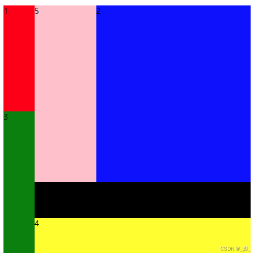
优化示例
<html>
<head>
<meta charset="utf-8">
<style>
  .container {
	height:500px;
	width: 500px;
    display: grid;
    grid-template-columns: 1fr 2fr 5fr;
    grid-template-rows: 2fr 1fr 2fr 1fr 1fr;
    grid-template-areas:
      'left-top vertical right-top'
      'left-top vertical right-top'
      'left-bottom vertical right-top'
      'left-bottom horizontal horizontal'
      'left-bottom right-bottom right-bottom';
    }
    .left-top {
      grid-area: left-top;
	  background:red;
    }
    .right-top {
      grid-area: right-top;
		background:blue;
    }
    .left-bottom {
      grid-area: left-bottom;
		background:green;
    }
    .right-bottom {
      grid-area: right-bottom;
		background:yellow;
    }
	.vertical {
      grid-area: vertical;
		background:pink;
    }
    .horizontal {
      grid-area: horizontal;
		background:black;
    }
</style>
</head>
<body>
<div class="container">
  <div class="left-top">1</div>
  <div class="right-top">2</div>
  <div class="left-bottom">3</div>
  <div class="right-bottom">4</div>
  <div class="vertical">5</div>
  <div class="horizontal">6</div>
</div>

</body>
</html>