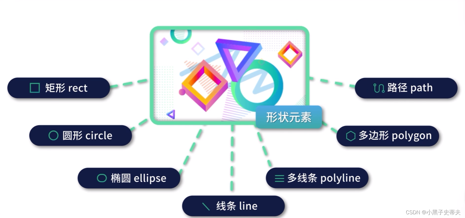
小黑子的SVG复习
- SFV画布
- 1. 初始SVG
- 2. SVG绘制矩形、圆形和椭圆形
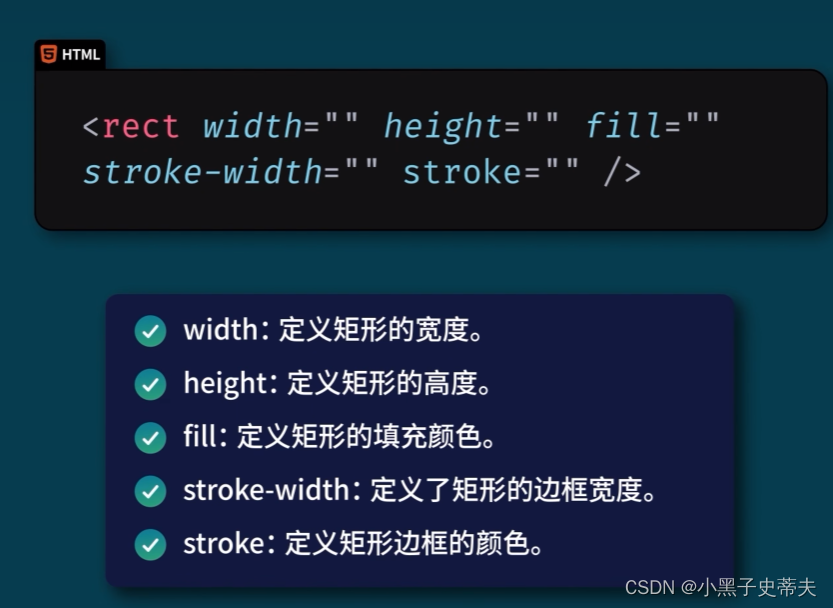
- 2.1 rect 矩形
- 2.2 circle 圆形
- 2.3 ellipse 椭圆
- 4. SVG绘制线条、多边形和多线条
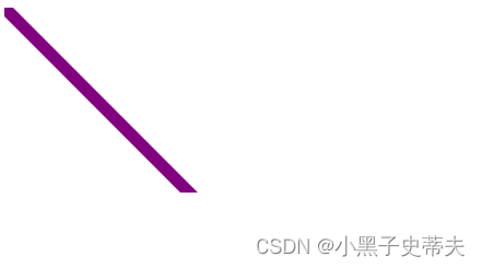
- 4.1 line 线条
- 4.2 polygon 多边形
- 4.3 polyline 多线条
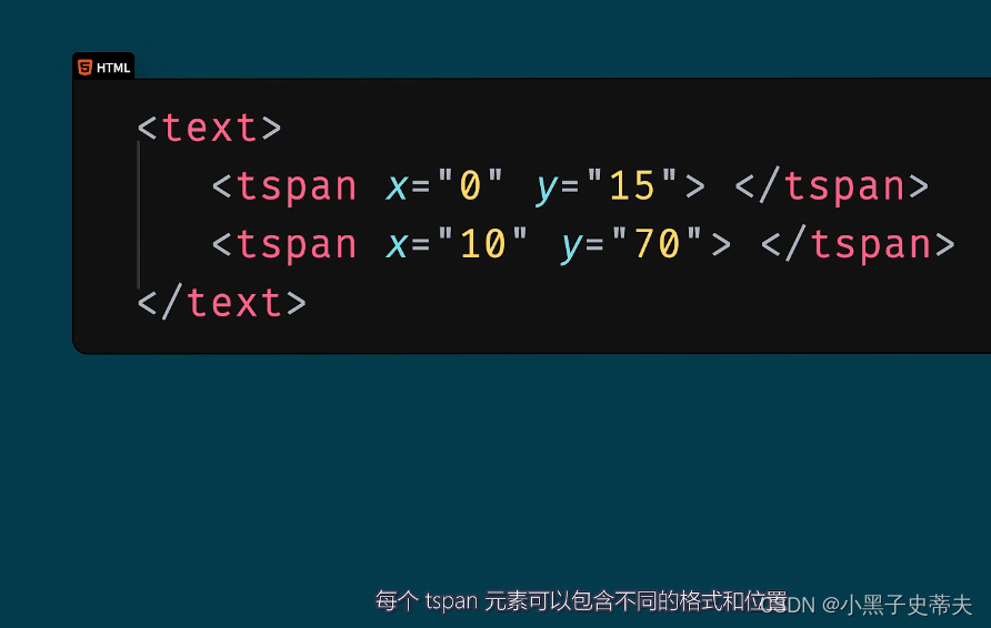
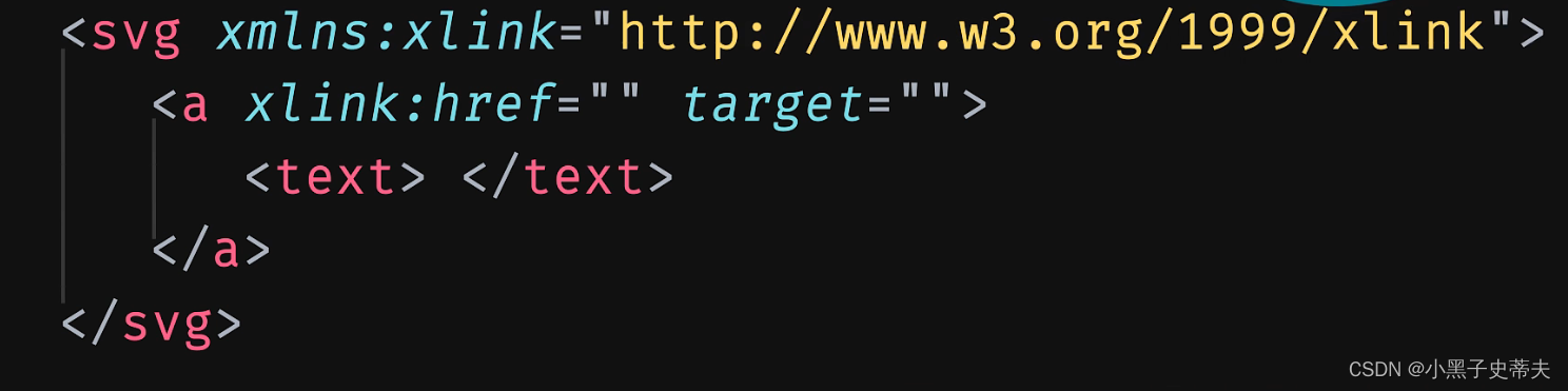
- 5. SVG绘制文本 text
- 6. SVG绘制路径 path
- 7. SVG描边属性
- 8. SVG 模糊和阴影效果
- 8.1 图形模糊效果
- 8.2 阴影效果
- 9. SVG 线性渐变和径向渐变
- 9.1 linearGradient 线性渐变
- 9.2 radialGradient 径向渐变
SFV画布
1. 初始SVG
SVG:是XML语法的图像格式,英宓全称是Scalable Vedor Graphias
即呵缩放矢量图,是W3C的一项建
用于解决网站图标模糊问题
- SVG则是属于对图像的形卷描述
- 所以它本质上是文本宓件。体积较小
- 且不管放大多少倍都不会失真
与png区别:
PNG图片是基于像素处理的,不能再VSCode里直接编辑,
而svg是用html编写出来的
SVG标签
sVG标签是SVG图形的一个容器,双标签


2. SVG绘制矩形、圆形和椭圆形
任何单标签,都可以在第二个尖叫号前写一个斜杠 /,表示标签闭合了。也就是用闭合标签表示单标签,更加严谨
2.1 rect 矩形
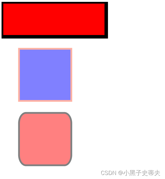
    <svg width="400" height="110">
        <rect width="300" height="100" fill="red" stroke-width="10" stroke="black" />
    </svg>

    <br>
    <svg width="400" height="180">
        <rect x="50" y="20" width="150" height="150" fill="blue" stroke="tomato" stroke-width="5" opacity="0.5"/>
    </svg>

    <br>
    <svg width="400" height="180">
        <rect x="50" y="20" width="150" height="150" fill="red" stroke="black" stroke-width="5" opacity="0.5" rx="20" ry="30" />
    </svg>
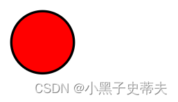
2.2 circle 圆形
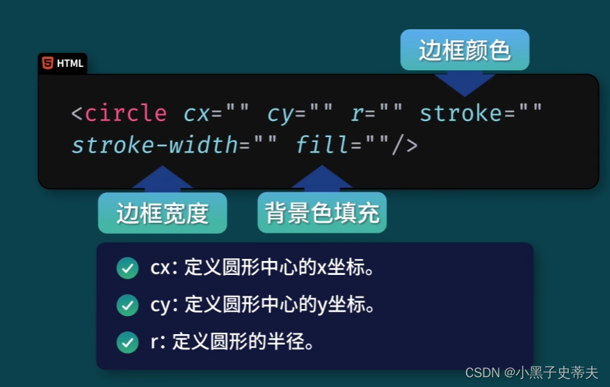
    <svg width="100" height="100">
        <circle cx="50" cy="50" r="40" stroke="black" stroke-width="3" fill="red"/>
    </svg>
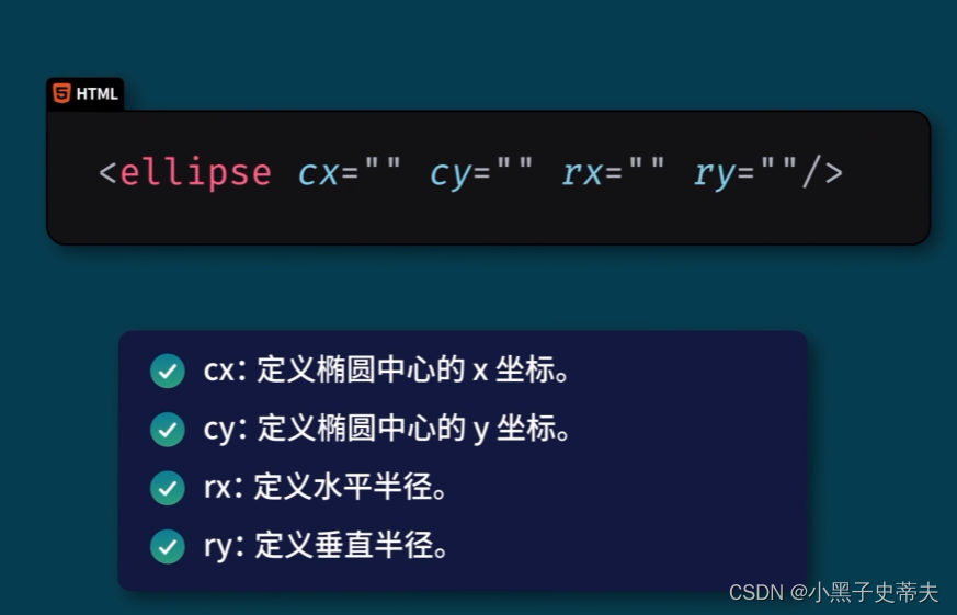
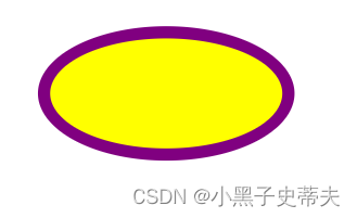
2.3 ellipse 椭圆
    <svg width="500" height="140">
        <ellipse cx="200" cy="80" rx="100" ry="50" stroke="purple" stroke-width="10" fill="yellow"/>
    </svg>
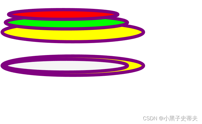
    <svg width="500" height="150">
        <ellipse cx="240" cy="100" rx="220" ry="30" stroke="purple" stroke-width="10" fill="yellow"/>
        <ellipse cx="220" cy="70" rx="190" ry="20" stroke="purple" stroke-width="10" fill="lime"/>
        <ellipse cx="210" cy="45" rx="170" ry="15" stroke="purple" stroke-width="10" fill="red"/>
    </svg>
    <br>
    <svg width="500" height="150">
        <ellipse cx="240" cy="50" rx="220" ry="30" stroke="purple" stroke-width="10" fill="yellow"/>
        <ellipse cx="220" cy="50" rx="190" ry="20" stroke="purple" stroke-width="10" fill="whitesmoke"/>
    </svg>
4. SVG绘制线条、多边形和多线条
4.1 line 线条
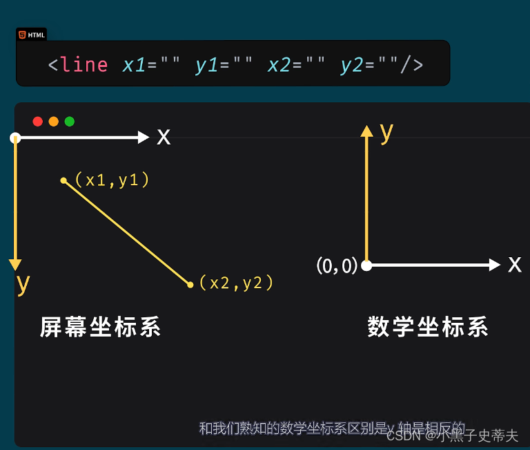
    <svg width="500" height="210">
        <line x1="0" y1="0" x2="200" y2="200" stroke="purple" stroke-width="10" />
    </svg>
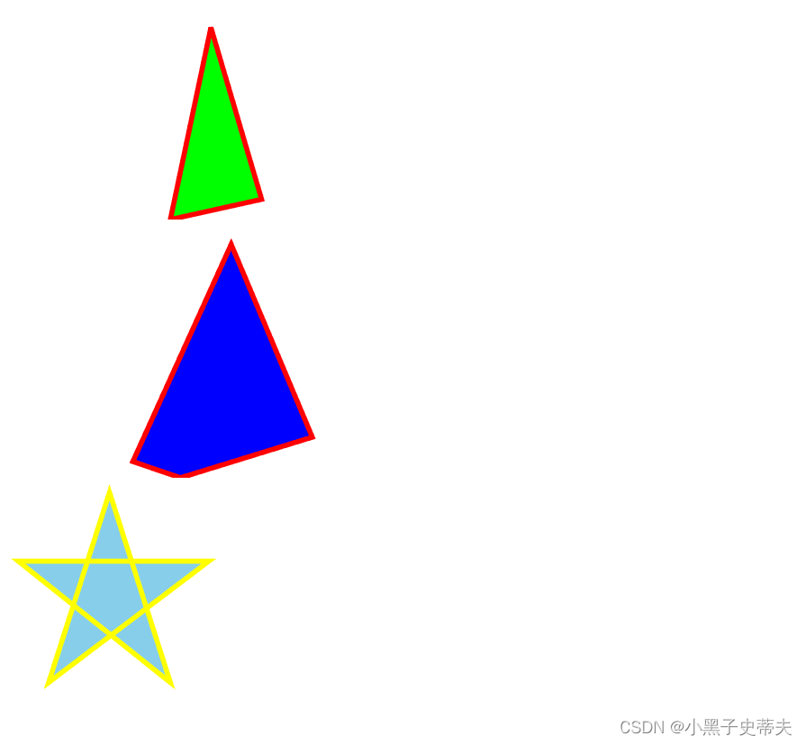
4.2 polygon 多边形
坐标之间用空格隔开,每一对坐标的x和y用逗号隔开
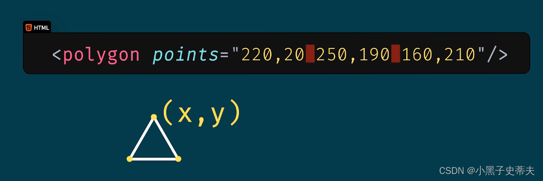
    <svg width="500" height="210">
        <polygon points="200,20 250,190,160,210" fill="lime" stroke="red" stroke-width="5"/>
    </svg>
    <br>
    <svg width="500" height="250">
        <polygon points="220,20 300,210 170,250 123,234" fill="blue" stroke="red" stroke-width="5"/>
    </svg>
    <br>
    <svg width="500" height="210">
        <polygon points="100,10 40,198 198,78 10,78 160,198" fill="skyblue" stroke="yellow" stroke-width="5"/>
    </svg>
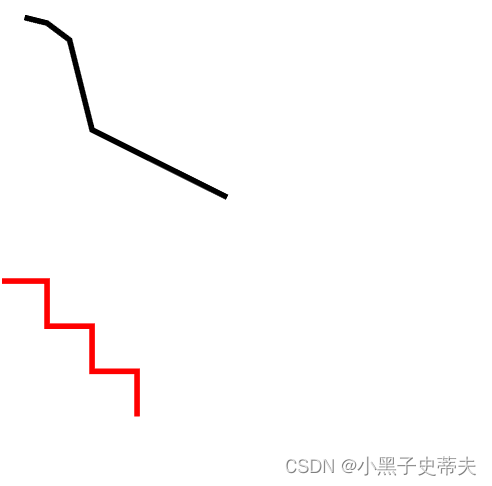
4.3 polyline 多线条
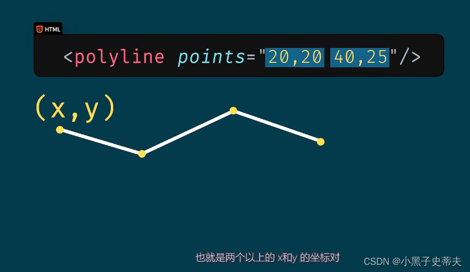
    <svg width="500" height="210">
        <polyline points="20,20 40,25 60,40 80,120 120,140 200,180" fill="none" stroke="black" stroke-width="5"/>
    </svg>
    <br>
    <svg width="500" height="180">
        <polyline points="0,40 40,40 40,80 80,80 80,120 120,120 120,160" fill="none" stroke="red" stroke-width="5"/>
    </svg>
5. SVG绘制文本 text
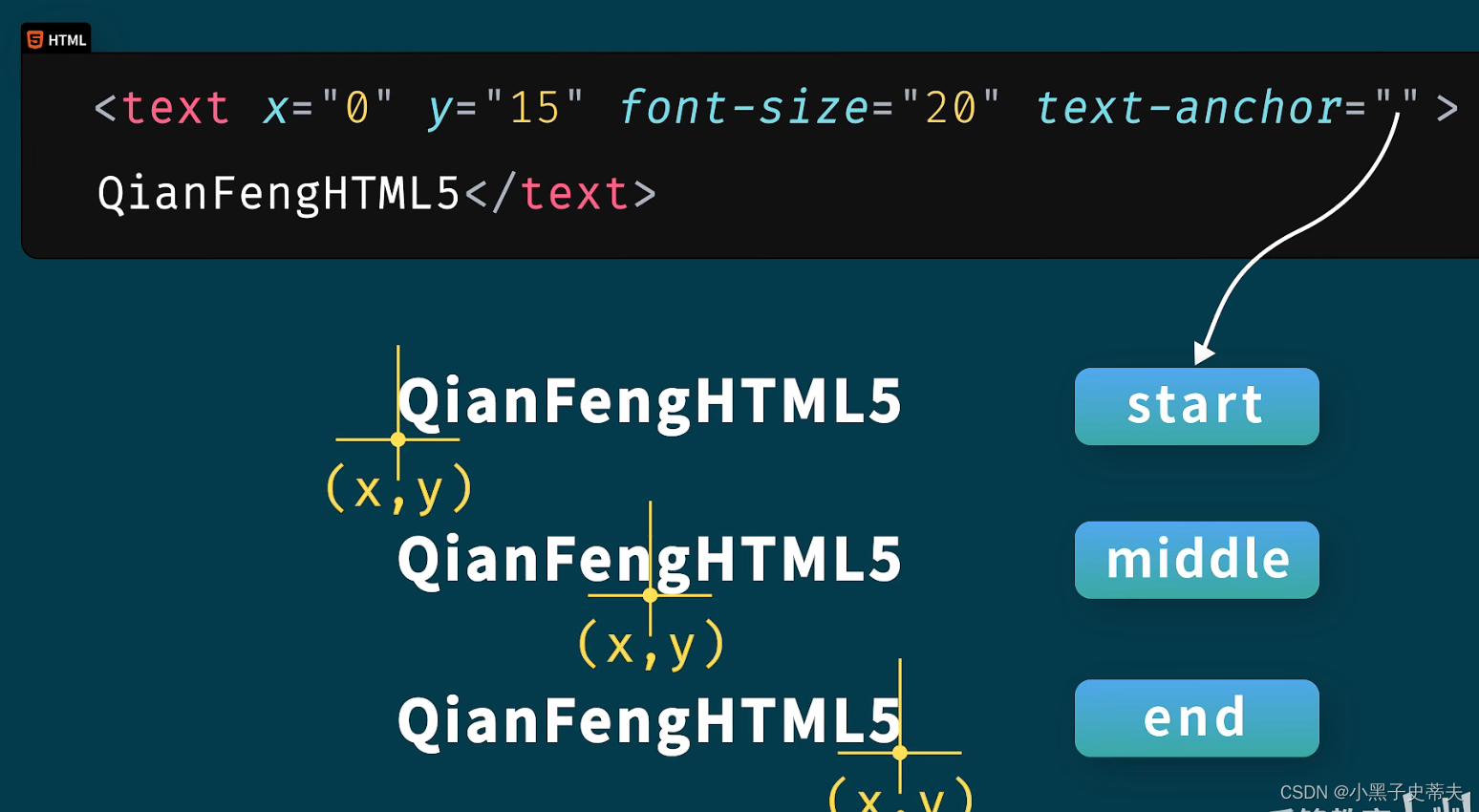

添加使用锚点跳转
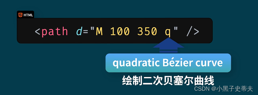
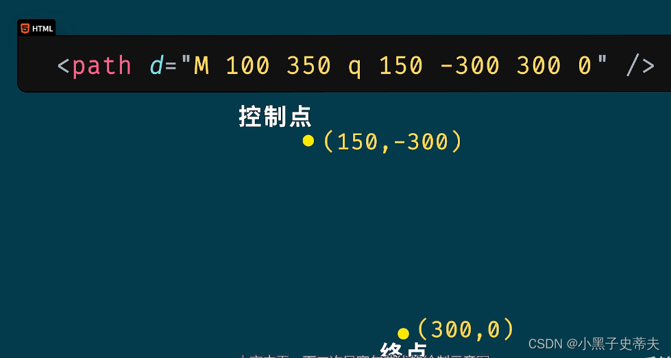
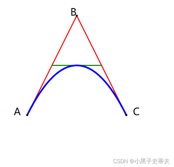
6. SVG绘制路径 path
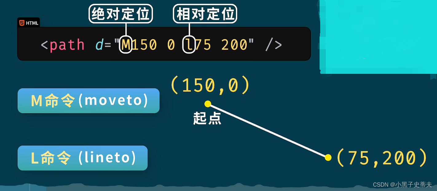
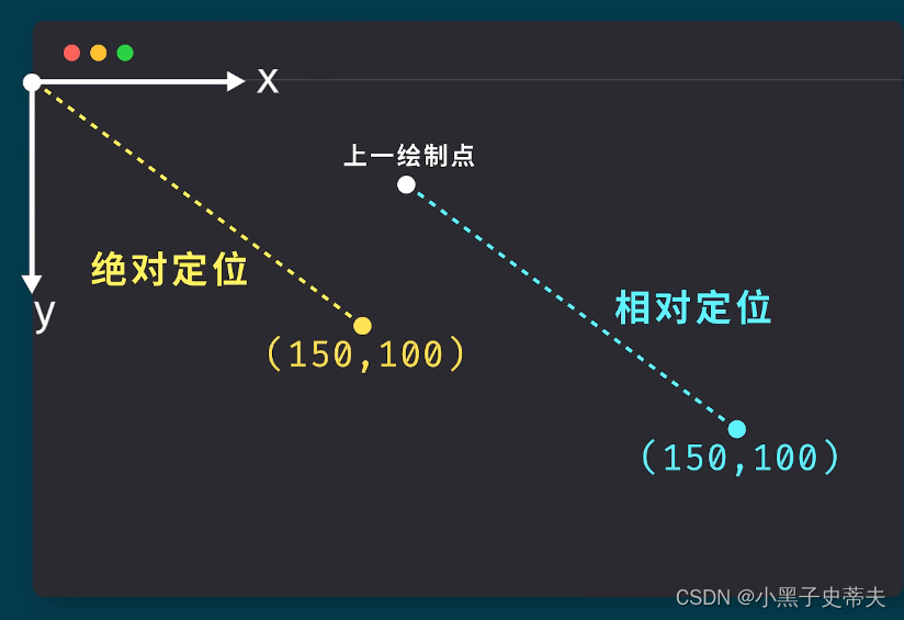
在path中绘制贝塞尔曲线使用q命令

    <svg width="450" height="400">
        <path d="M 100 350 l 150 -300" stroke="red" stroke-width="3" fill="none"></path>
        <path d="M 250 50 l 150 300" stroke="red" stroke-width="3" fill="none"></path>
        <path d="M 175 200 l 150 0" stroke="green" stroke-width="3" fill="none"></path>
        <path d="M 100 350 q 150 -300 300 0" stroke="blue" stroke-width="5" fill="none"></path>

        <g fill="black">
            <circle cx="100" cy="350" r="3"></circle>
            <circle cx="250" cy="50" r="3"></circle>
            <circle cx="400" cy="350" r="3"></circle>
        </g>
        <g font-size="30" fill="black" text-anchor="middle">
            <text x="100" y="350" dx="-30">A</text>
            <text x="250" y="50" dx="-10">B</text>
            <text x="400" y="350" dx="30">C</text>
        </g>
    </svg>
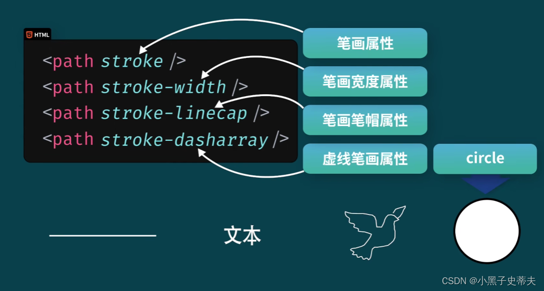
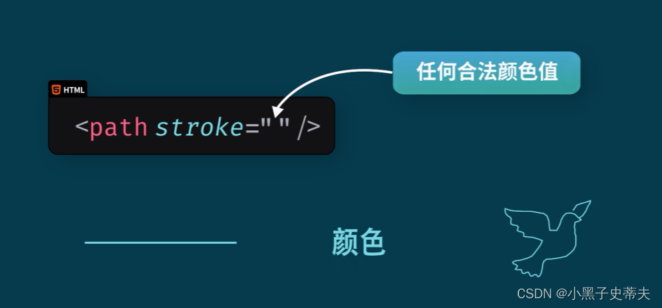
7. SVG描边属性
所有的描边属性都可以应用到如下
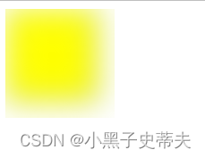
8. SVG 模糊和阴影效果
8.1 图形模糊效果

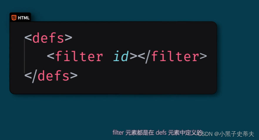
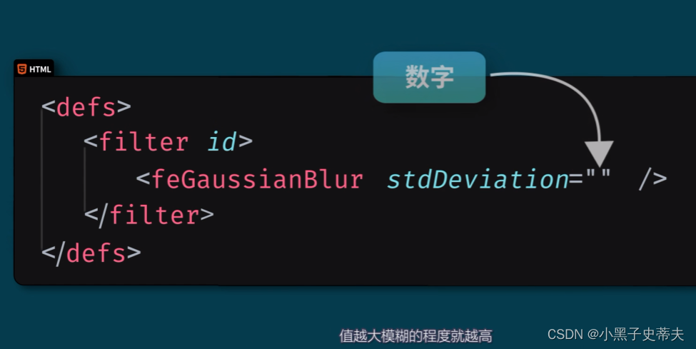
模糊效果可以通过feGaussianBlur创建,需要定义在filter标签里面
    <svg width="110" height="110">
        <defs>
            <filter x="0" y="0" id="f1">
                <feGaussianBlur stdDeviation="15"/>
            </filter>
        </defs>
        <rect width="90" height="90" stroke="green" stroke-width="3" fill="yellow" filter="url(#f1)"></rect>
    </svg>
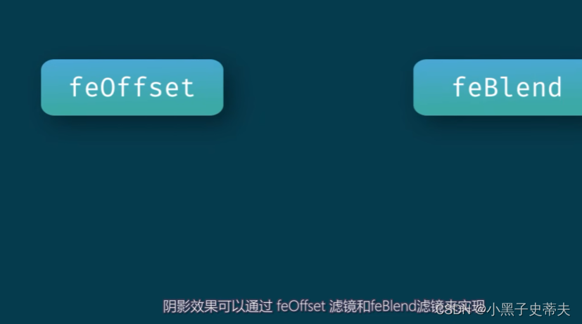
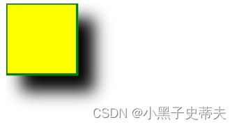
8.2 阴影效果
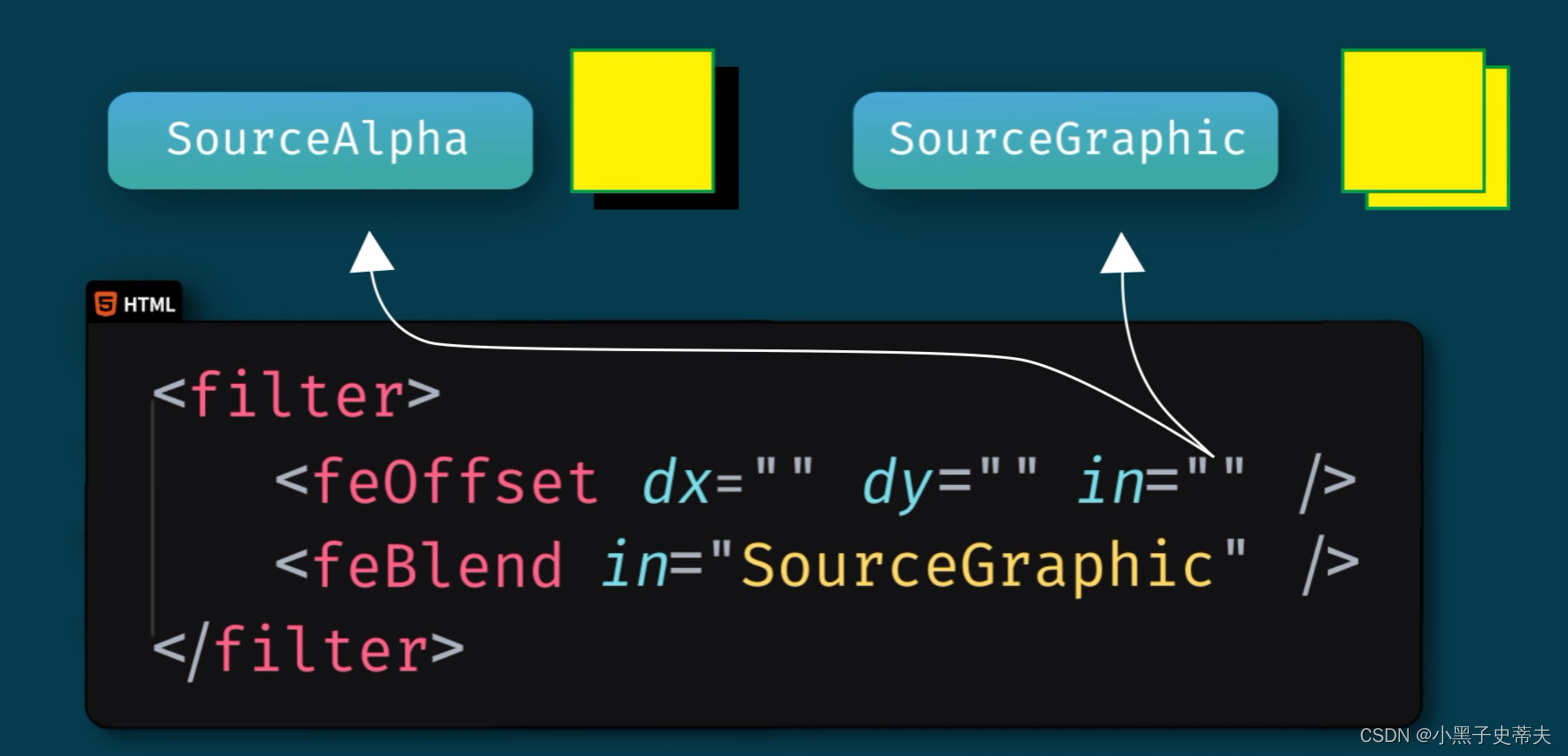
    <svg width="140" height="140">
        <defs>
            <filter x="0" y="0" width="200" height="200" id="f2">
                <feOffset in="SourceAlpha" dx="20" dy="20"/>
                <feGaussianBlur stdDeviation="10"/>
                <feBlend in="SourceGraphic"/>
            </filter>
        </defs>
        <rect width="90" height="90" stroke="green" stroke-width="3" fill="yellow" filter="url(#f2)"></rect>
    </svg>
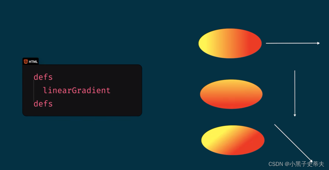
9. SVG 线性渐变和径向渐变
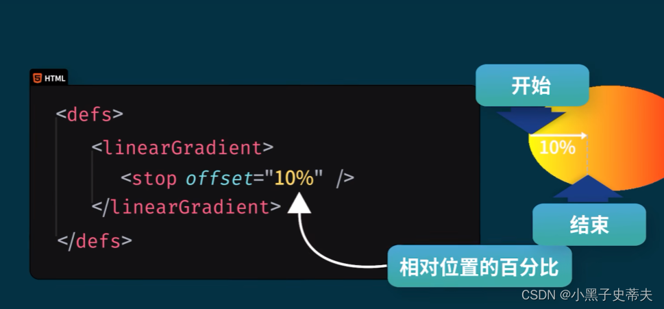
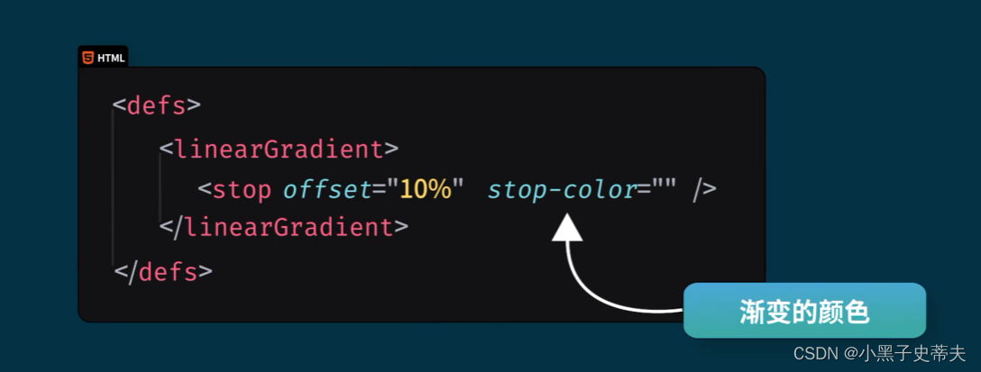
9.1 linearGradient 线性渐变
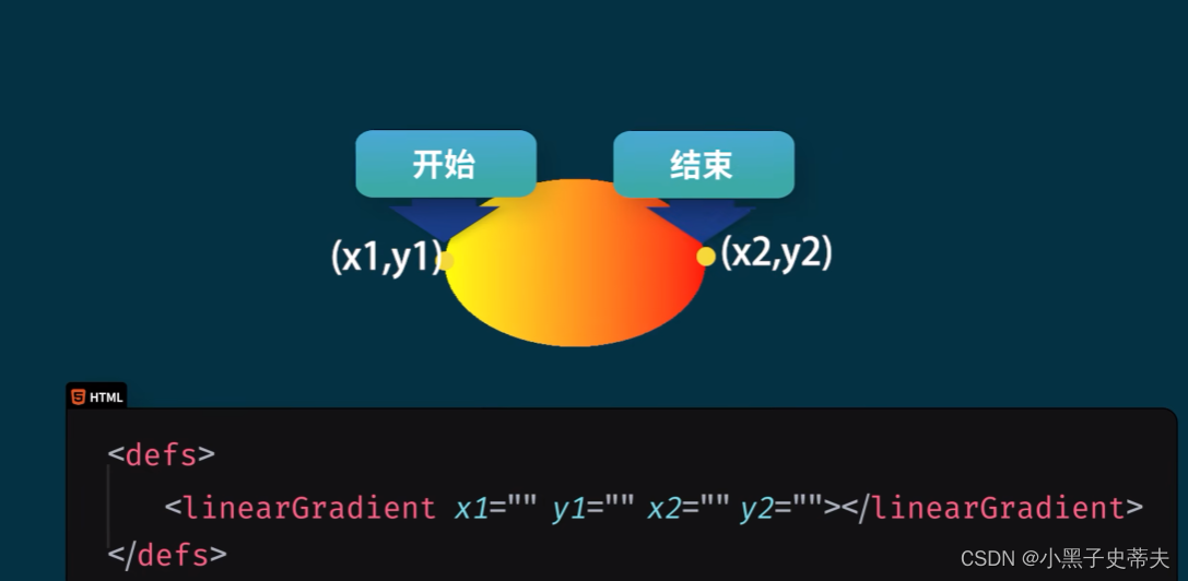
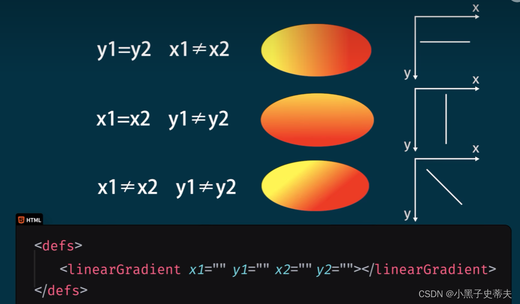
    <svg width="400" height="150">
        <defs>
            <linearGradient x1="0%" y1="0%" x2="0%" y2="100%" id="grad1">
                <stop offset="0%" stop-color="rgb(255,255,0)"/>
                <stop offset="100%" stop-color="rgb(255,0,0)"/>
            </linearGradient>
        </defs>

        <ellipse cx="200" cy="70" rx="85" ry="55"  fill="url(#grad1)"></ellipse>
        <text fill="white" font-size="45" x="150" y="86">SVG</text>
    </svg>

9.2 radialGradient 径向渐变
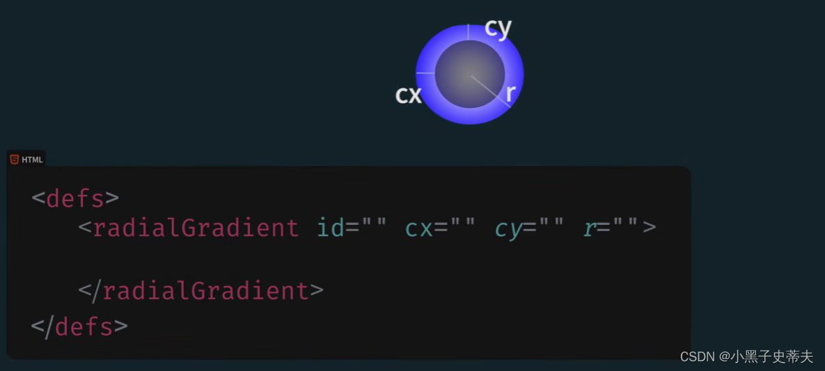
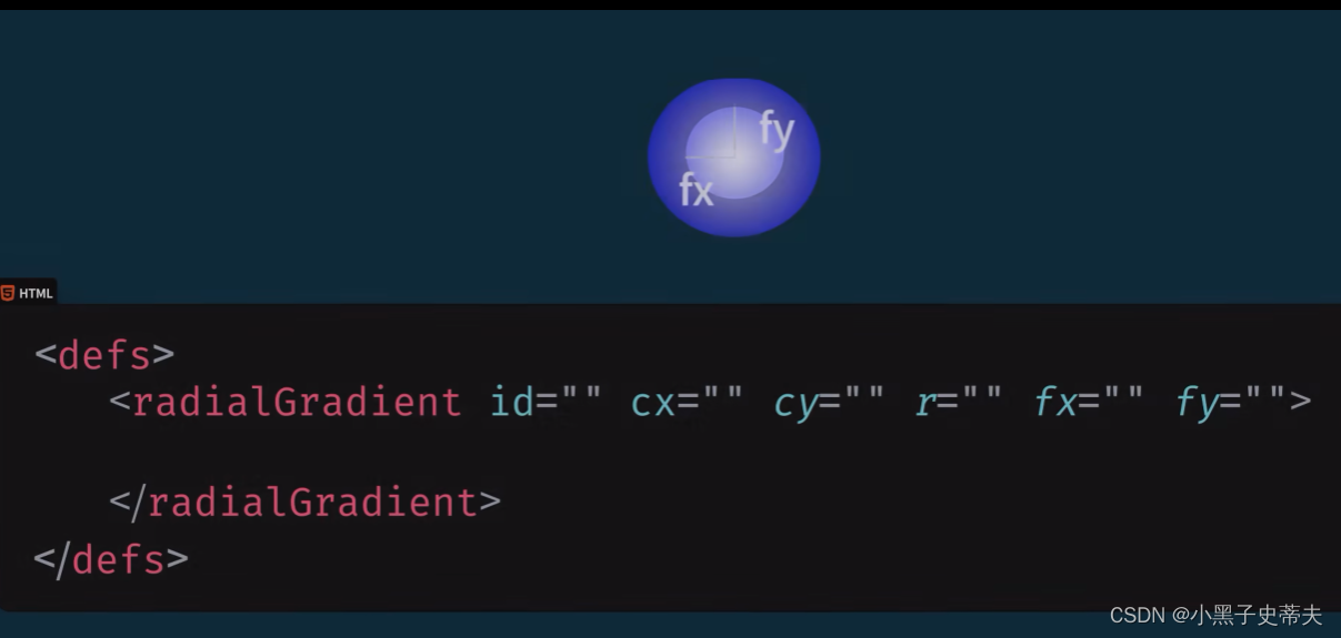
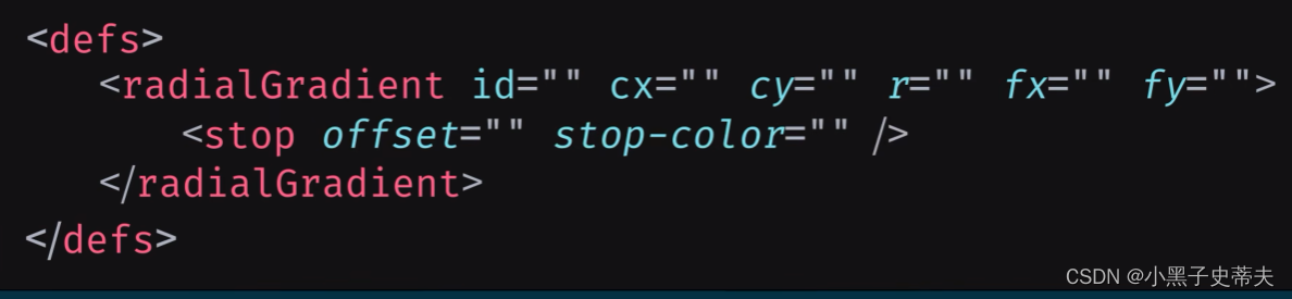
    <svg width="500" height="150">
        <defs>
            <radialGradient cx="30%" cy="30%" r="50%" fx="30%" fy="50%" id="grad2">
                <stop offset="0%" stop-color="rgb(255,255,0)"/>
                <stop offset="100%" stop-color="rgb(0,0,255)"/>
            </radialGradient>
        </defs>

        <ellipse cx="200" cy="70" rx="85" ry="55"  fill="url(#grad2)"></ellipse>
        <text fill="white" font-size="45" x="150" y="86">SVG</text>
    </svg>