1、js 动画库 web animation api
(1)初始化代码
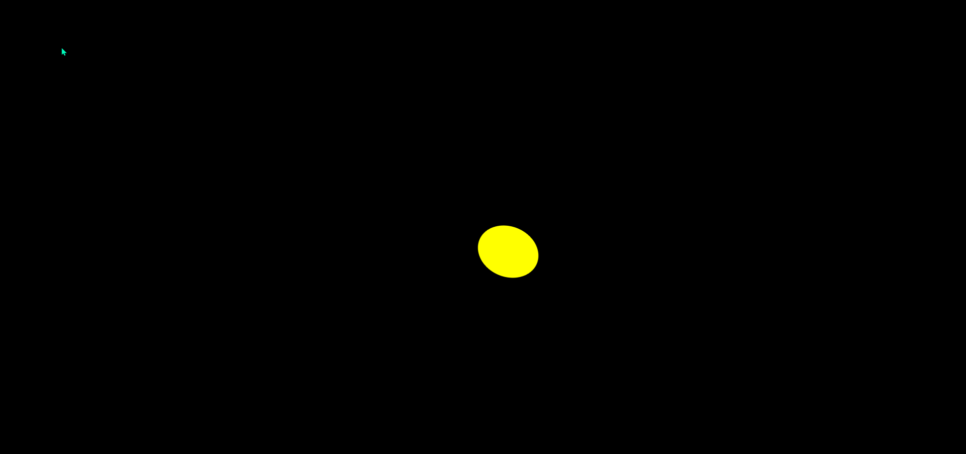
- hmtl、css 部分
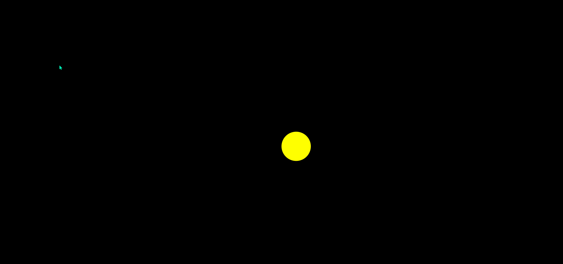
- 初始化全局背景黑色
- 初始化黄色小球
- js 部分
- 监听全局点击事件
- 创建并添加元素 class="pointer" 的 div 标签
- 设置 left、top 位置
- 监听动画结束事件,移除该元素
- 定位小球到画面中心
<!DOCTYPE html>
<html lang="en">
<head>
  <meta charset="UTF-8">
  <meta name="viewport" content="width=device-width, initial-scale=1.0">
  <title>Document</title>
  <link rel="stylesheet" href="./css/js动画库.css">
</head>
<body>
  <div class="ball"></div>
  <script src="./js/js动画库.js"></script>
</body>
</html>
const ball = document.querySelector('.ball');
function init() {
const x = window.innerWidth / 2;
const y = window.innerHeight / 2;
ball.style.transform = `translate(${x}px, ${y}px)`
}
init()body {
padding: 0;
margin: 0;
width: 100%;
height: 100vh;
background-color: #000;
}
.ball {
width: 100px;
height: 100px;
background-color: yellow;
border-radius: 50%;
}
(2)实现步骤
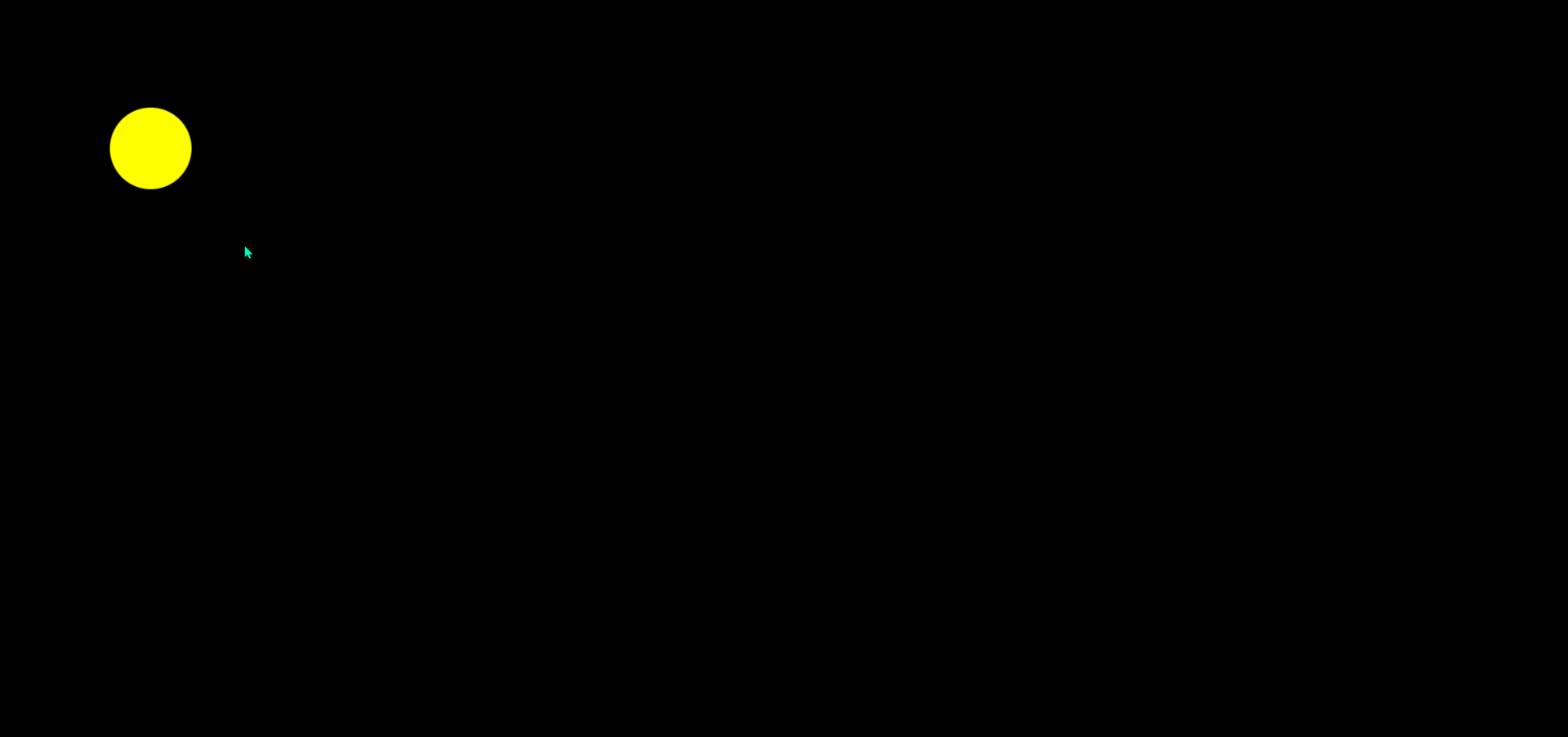
①点击小球移动
animate():不改变 dom 树,因此不需要浏览器主线程管理,就不会阻塞主线程
window.addEventListener("click", (e) => {
  const x = e.clientX;
  const y = e.clientY;
  move(x, y);
});

function move(x, y) {
  ball.animate(
    [
      {
        transform: `translate(0px, 0px)`,
      },
      {
        transform: `translate(${x}px, ${y}px)`,
      }
    ],
    2000
  )
}
②小球不回到中心位置
ball.animate(
  [
    {
      transform: `translate(0px, 0px)`,
    },
    {
      transform: `translate(${x}px, ${y}px)`,
    }
  ],
  {
    duration: 1000,
    fill: 'forwards',
  }
)
③获取小球当前位置
function move(x, y) {
  // 获取小球位置
  const rect = ball.getBoundingClientRect();
  const ballX = rect.left;
  const ballY = rect.top;

  ball.animate(
    [
      {
        transform: `translate(${ballX}px, ${ballY}px)`,
      },
      {
        transform: `translate(${x}px, ${y}px)`,
      }
    ],
    {
      duration: 1000,
      fill: 'forwards',
    }
  )
}
④清除上一个动画
// 注意:只能在获取小球位置后清除
ball.getAnimations().forEach(animation=>{
  animation.cancel();
})
⑤小球先原地拉伸,后移动
ball.animate(
  [
    {
      transform: `translate(${ballX}px, ${ballY}px)`,
    },
    {
      transform: `translate(${ballX}px, ${ballY}px) scaleX(1.5)`,
      offset: 0.6, // 该部分动画所占时长
    },
    {
      transform: `translate(${x}px, ${y}px) scaleX(1.5)`,
      offset: 0.8,
    },
    {
      transform: `translate(${x}px, ${y}px)`,
    }
  ],
  {
    duration: 1000,
    fill: 'forwards',
  }
)
⑤拉伸角度跟随鼠标位置
const rad = Math.atan2(y - ballY, x - ballX);
const deg = (rad * 180) / Math.PI;
ball.animate(
  [
    {
      transform: `translate(${ballX}px, ${ballY}px) rotate(${deg}deg)`,
    },
    {
      transform: `translate(${ballX}px, ${ballY}px) rotate(${deg}deg) scaleX(1.5)`,
      offset: 0.6, // 该部分动画所占时长
    },
    {
      transform: `translate(${x}px, ${y}px) rotate(${deg}deg) scaleX(1.5)`,
      offset: 0.8,
    },
    {
      transform: `translate(${x}px, ${y}px) rotate(${deg}deg)`,
    }
  ],
  {
    duration: 1000,
    fill: 'forwards',
  }
)
(3)完整代码
const ball = document.querySelector(".ball");

function init() {
  const x = window.innerWidth / 2;
  const y = window.innerHeight / 2;
  ball.style.transform = `translate(${x}px, ${y}px)`;
}
init();

window.addEventListener("click", (e) => {
  const x = e.clientX;
  const y = e.clientY;
  move(x, y);
});

function move(x, y) {
  // 获取小球位置
  const rect = ball.getBoundingClientRect();
  const ballX = rect.left;
  const ballY = rect.top;
  // 注意:只能在获取小球位置后清除
  ball.getAnimations().forEach((animation)=>{
    animation.cancel();
  })
  const rad = Math.atan2(y - ballY, x - ballX);
  const deg = (rad * 180) / Math.PI;
  ball.animate(
    [
      {
        transform: `translate(${ballX}px, ${ballY}px) rotate(${deg}deg)`,
      },
      {
        transform: `translate(${ballX}px, ${ballY}px) rotate(${deg}deg) scaleX(1.5)`,
        offset: 0.6, // 该部分动画所占时长
      },
      {
        transform: `translate(${x}px, ${y}px) rotate(${deg}deg) scaleX(1.5)`,
        offset: 0.8,
      },
      {
        transform: `translate(${x}px, ${y}px) rotate(${deg}deg)`,
      }
    ],
    {
      duration: 1000,
      fill: 'forwards',
    }
  )
}
2、实现 2048 的核心逻辑——合并
Array.prototype.print = function () {
  console.log(this.join("\n"));
};

// 棋盘
const matrix = [
  [0, 2, 2, 0],
  [0, 0, 2, 2],
  [2, 4, 4, 2],
  [2, 4, 4, 4],
];

/**
 * 移动
 * @param {*} matrix 棋盘
 * @param {*} direction 方向
 */
function move(matrix, direction) {
  const rows = matrix.length;
  const cols = matrix[0].length;
  /**
   * 是否越界
   * @param {*} i
   * @param {*} j
   * @returns
   */
  function _inRange(i, j) {
    return i >= 0 && i < rows && j >= 0 && j < cols;
  }
  // 配置方向
  const nexts = {
    up: (i, j) => [i + 1, j],
    down: (i, j) => [i - 1, j],
    left: (i, j) => [i, j + 1],
    right: (i, j) => [i, j - 1],
  };
  /**
   * 下一个位置
   * @param {*} i
   * @param {*} j
   * @returns
   */
  function _nextPos(i, j) {
    const [ni, nj] = nexts[direction](i, j);
    if (!_inRange(ni, nj)) {
      return null;
    }
    return [ni, nj];
  }

  /**
   * 得到下一个非0的位置
   * @param {*} i
   * @param {*} j
   * @returns
   */
  function _nextNonZeroPos(i, j) {
    const pos = _nextPos(i, j);
    if (!pos) {
      return null;
    }
    const [ni, nj] = pos;
    if (matrix[ni][nj] !== 0) {
      return pos;
    }
    return _nextNonZeroPos(ni, nj); // 递归
  }

  /**
   * 计算某个位置最新的值,同时计算该行或该列所有的最新值
   * @param {*} i
   * @param {*} j
   */
  function _calc(i, j) {
    const pos = _nextNonZeroPos(i, j);
    if (!pos) {
      return;
    }
    const [ni, nj] = pos;
    const v = matrix[i][j]; // 当前位置值
    const nv = matrix[ni][nj]; // 下一个位置值
    if (v === 0) {
      matrix[i][j] = nv;
      matrix[ni][nj] = 0;
      _calc(i, j); // 递归
    } else if (v === nv) {
      matrix[i][j] *= 2;
      matrix[ni][nj] = 0;
    }
    const nextPos = _nextPos(i, j);
    _calc(...nextPos);
  }

  if(direction === 'up') {
    for (let i = 0; i < cols; i++) {
      _calc(0, i);
    }
  }
  if(direction === 'down') {
    for (let i = 0; i < cols; i++) {
      _calc(rows - 1, i);
    }
  }
  if(direction === 'left') {
    for (let i = 0; i < cols; i++) {
      _calc(i, 0);
    }
  }
  if(direction === 'right') {
    for (let i = 0; i < cols; i++) {
      _calc(i, cols - 1);
    }
  }
}

matrix.print();
move(matrix, "down");
console.log("======================");
matrix.print();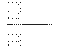
3、实现 add
让下面代码成立
const r1 = add[1][2][3] + 4; // 期望结果 10
const r2 = add[10][20] + 30; // 期望结果 60
const r3 = add[100][200][300] + 400; // 期望结果 1000
(1)实现思路
- 从 add 的调用得出,add 是对象且属性是未知的
- 如何读取未知属性对象呢?——完成一个代理辅助函数
(2)实现步骤
①读值
function createProxy() {
  return new Proxy(
    {},
    {
      get(target, prop) {
        console.log(prop);
      },
    }
  );
}

const add = createProxy();
add[100]; // 100
②返回值
步骤思路1:由 add[1][2][3] 可以看出返回值也必须是一个代理,这样在执行完 add[1] 后能继续执行后面的
const a1 = add[1];
const a2 = a1[2];
const a3 = a2[3];
步骤思路2:累计计算
以下代码报错的原因是 add[1] 是对象,而 2 是原始类型,二者无法相加
function createProxy(value = 0) {
  return new Proxy(
    {},
    {
      get(target, prop) {
        console.log(prop);
        return createProxy(value + Number(prop));
      },
    }
  );
}

const add = createProxy();
const a = add[1] + 2;
console.log(a); // 报错 TypeError: Cannot convert a Symbol value to a number
步骤思路3:对象转为原始类型
function createProxy(value = 0) {
  const handler = () => value;
  return new Proxy(
    {},
    {
      get(target, prop) {
        if(prop === Symbol.toPrimitive) {
          return handler;
        }
        return createProxy(value + Number(prop));
      },
    }
  );
}

const add = createProxy();
const a = add[1] + 2;
console.log(a); // 3
③完整代码-结果验证
function createProxy(value = 0) {
  const handler = () => value;
  return new Proxy(
    {},
    {
      get(target, prop) {
        if(prop === Symbol.toPrimitive) {
          return handler;
        }
        return createProxy(value + Number(prop));
      },
    }
  );
}

// 实现add
const add = createProxy();
// 让下面代码成立
const r1 = add[1][2][3] + 4; // 期望结果 10
const r2 = add[10][20] + 30; // 期望结果 60
const r3 = add[100][200][300] + 400; // 期望结果 1000
console.log(r1); // 10
console.log(r2); // 60
console.log(r3); // 1000
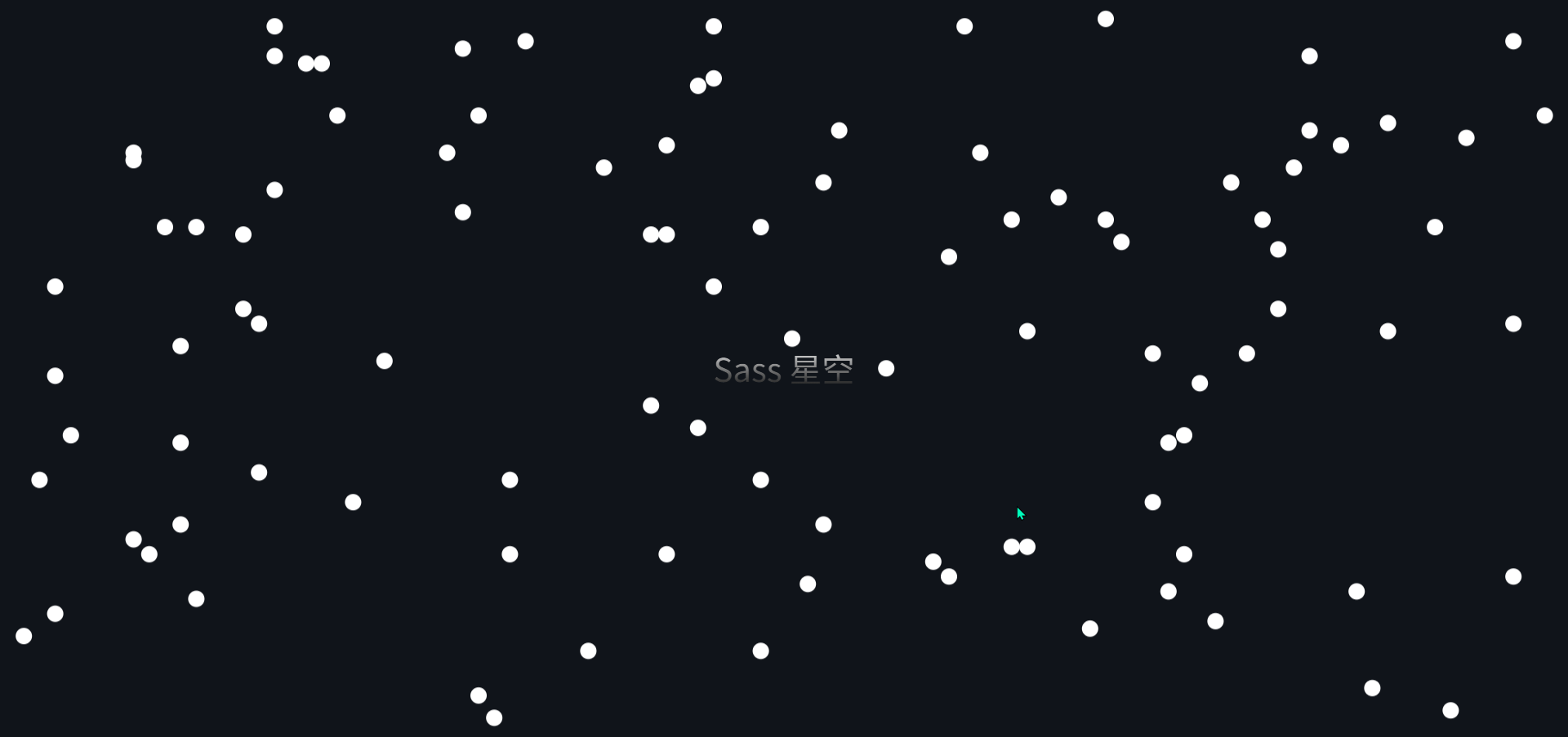
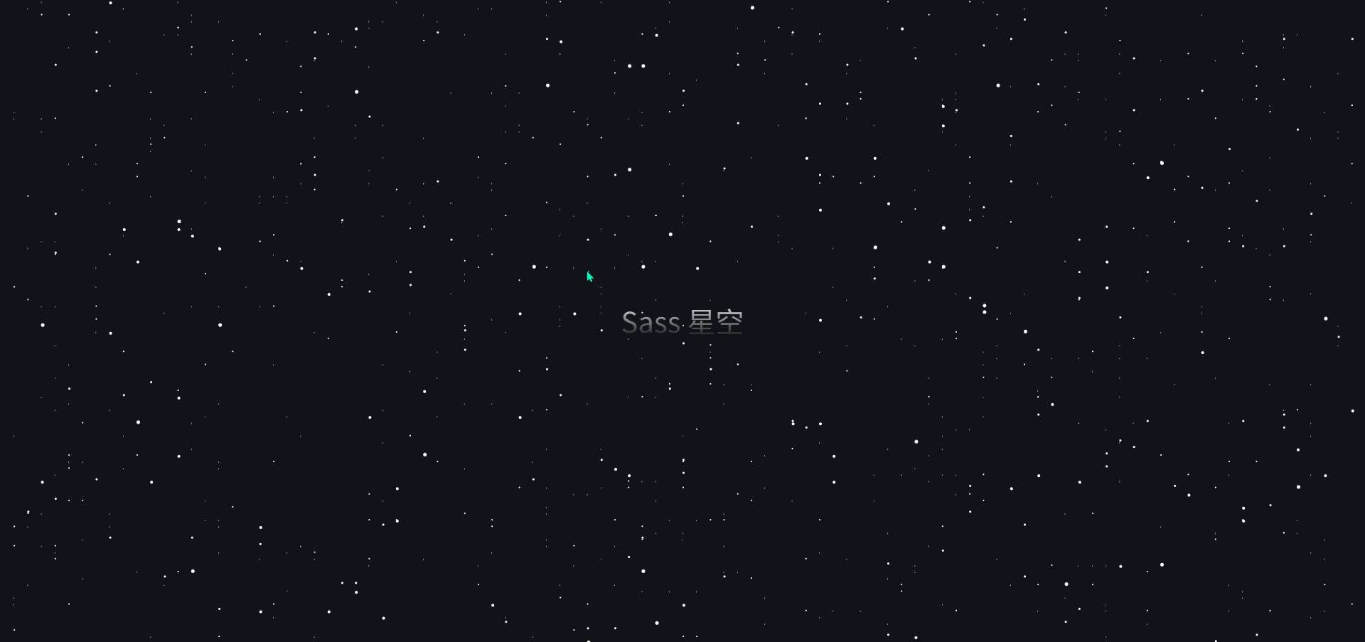
4、Sass 星空
(1)初始化代码
注意:html 引入的是 css 文件
<!DOCTYPE html>
<html lang="en">
<head>
  <meta charset="UTF-8">
  <meta name="viewport" content="width=device-width, initial-scale=1.0">
  <title>Document</title>
  <link rel="stylesheet" href="./css/Sass星空.css">
</head>
<body>
  <div class="layer1"></div>
  <div class="layer2"></div>
  <div class="layer3"></div>
  <div class="layer4"></div>
  <div class="layer5"></div>
  <div class="title">Sass 星空</div>
</body>
</html>
编写的 css 是在 scss 文件中,后续再通过编译生成对应的 css 文件即可
body {
  padding: 0;
  margin: 0;
  background-color: #10141A;
}

.title {
  font-size: 40px;
  background: linear-gradient(to top, #000 0%, #fff 100%);
  -webkit-background-clip: text;
  background-clip: text;
  -webkit-text-fill-color: transparent;
  color: transparent;
  position: absolute;
  top: 50%;
  left: 50%;
  transform: translate(-50%, -50%);
}
(2)实现步骤
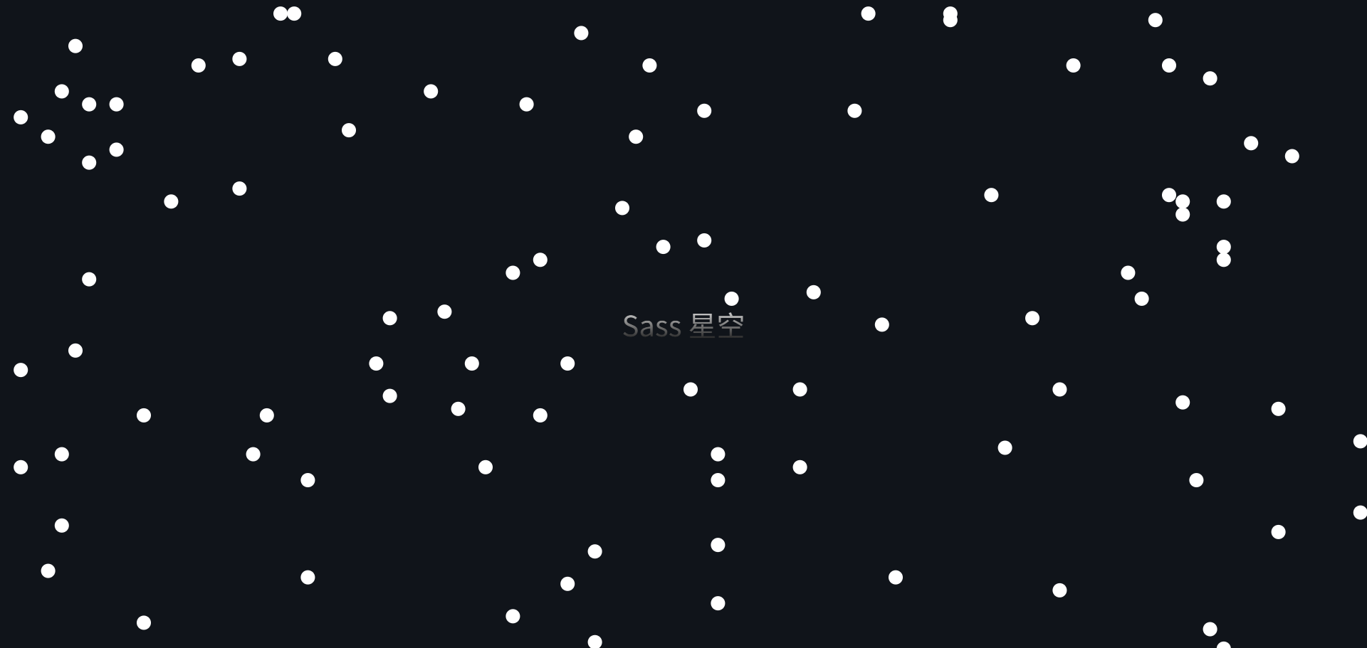
①用 函数+阴影 实现 n 个随机星星
@function star($n) {
  $result: '#{random(100)}vw #{random(100)}vh 0 #fff';
  @for $i from 2 through $n {
    $result: '#{$result},#{random(100)}vw #{random(100)}vh 0 #fff'
  }
  @return unquote($result);
}

.layer1 {
  position: fixed;
  width: 20px;
  height: 20px;
  border-radius: 50%;
  box-shadow: star(100);
}
②scss 编译成 css
- 在 scss 文件目录中下载 sass
-
npm install sass - 执行编译命令
-
sass Sass星空.scss Sass星空.css
③让星星动起来
.layer1 {
  position: fixed;
  width: 20px;
  height: 20px;
  border-radius: 50%;
  box-shadow: star(100);
  animation: moveUp 10s linear infinite;
}
@keyframes moveUp {
  to {
    transform: translateY((-100vh));
  }
}
④断层无感处理
.layer1 {
  position: fixed;
  width: 20px;
  height: 20px;
  left: 0;
  top: 0;
  border-radius: 50%;
  box-shadow: star(100);
  animation: moveUp 10s linear infinite;
}
.layer1::after {
  content: '';
  position: inherit;
  width: inherit;
  height: inherit;
  border-radius: inherit;
  box-shadow: inherit;
  left: 0;
  top: 100vh;
}
⑤循环多层
$n: 5;
$duration: 400s;
$count: 1000;
@for $i from 1 through $n {
  $duration: floor($duration / 2);
  $count: floor($count / 2);
  .layer#{$i} {
    position: fixed;
    width: #{$i}px;
    height: #{$i}px;
    left: 0;
    top: 0;
    border-radius: 50%;
    box-shadow: star($count);
    animation: moveUp $duration linear infinite;
  }
  .layer#{$i}::after {
    content: '';
    position: inherit;
    width: inherit;
    height: inherit;
    border-radius: inherit;
    box-shadow: inherit;
    left: 0;
    top: 100vh;
  }
}
(3)完整代码
body {
  padding: 0;
  margin: 0;
  width: 100%;
  height: 100vh;
  background-color: #10141A;
}

.title {
  font-size: 40px;
  background: linear-gradient(to top, #000 0%, #fff 100%);
  -webkit-background-clip: text;
  background-clip: text;
  -webkit-text-fill-color: transparent;
  color: transparent;
  position: absolute;
  top: 50%;
  left: 50%;
  transform: translate(-50%, -50%);
}

@function star($n) {
  $result: '#{random(100)}vw #{random(100)}vh 0 #fff';
  @for $i from 2 through $n {
    $result: '#{$result},#{random(100)}vw #{random(100)}vh 0 #fff'
  }
  @return unquote($result);
}

$n: 5;
$duration: 400s;
$count: 1000;
@for $i from 1 through $n {
  $duration: floor($duration / 2);
  $count: floor($count / 2);
  .layer#{$i} {
    position: fixed;
    width: #{$i}px;
    height: #{$i}px;
    left: 0;
    top: 0;
    border-radius: 50%;
    box-shadow: star($count);
    animation: moveUp $duration linear infinite;
  }
  .layer#{$i}::after {
    content: '';
    position: inherit;
    width: inherit;
    height: inherit;
    border-radius: inherit;
    box-shadow: inherit;
    left: 0;
    top: 100vh;
  }
}

@keyframes moveUp {
  to {
    transform: translateY((-100vh));
  }
}


![[免费]微信小程序网上花店系统(SpringBoot后端+Vue管理端)【论文+源码+SQL脚本】](https://i-blog.csdnimg.cn/direct/6e930f3dde3c4f2bb9cf4501c8642e1c.jpeg)
