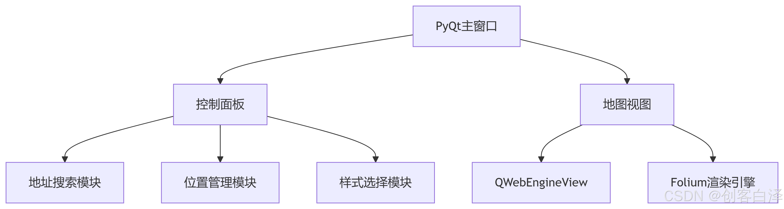
WPF 按钮悬停动画效果实现
下面我将实现一个专业的按钮悬停动画效果:当鼠标悬停在按钮上时,按钮上的文字由黑色变为白色,同时加粗并变大。
完整实现方案
MainWindow.xaml
<Window x:Class="ButtonHoverEffect.MainWindow"
        xmlns="http://schemas.microsoft.com/winfx/2006/xaml/presentation"
        xmlns:x="http://schemas.microsoft.com/winfx/2006/xaml"
        xmlns:d="http://schemas.microsoft.com/expression/blend/2008"
        xmlns:mc="http://schemas.openxmlformats.org/markup-compatibility/2006"
        xmlns:local="clr-namespace:ButtonHoverEffect"
        mc:Ignorable="d"
        Title="按钮悬停动画效果"
        Height="400"
        Width="600"
        WindowStartupLocation="CenterScreen"
        Background="#FF1E1E1E">

    <Grid>
        <Grid.RowDefinitions>
            <RowDefinition Height="*"/>
            <RowDefinition Height="Auto"/>
            <RowDefinition Height="*"/>
        </Grid.RowDefinitions>

        <!-- 标题 -->
        <TextBlock Text="专业按钮悬停动画效果"
                   Grid.Row="0"
                   FontSize="28"
                   FontWeight="Bold"
                   Foreground="White"
                   HorizontalAlignment="Center"
                   VerticalAlignment="Bottom"
                   Margin="0,0,0,40"/>

        <!-- 按钮容器 -->
        <StackPanel Grid.Row="1"
                    Orientation="Horizontal"
                    HorizontalAlignment="Center"
                    VerticalAlignment="Center"
                    Margin="20">

            <!-- 示例按钮 1 -->
            <Button Content="主页"
                    Style="{StaticResource HoverButtonStyle}"
                    Margin="20,0"
                    Padding="30,15"/>

            <!-- 示例按钮 2 -->
            <Button Content="产品"
                    Style="{StaticResource HoverButtonStyle}"
                    Margin="20,0"
                    Padding="30,15"/>

            <!-- 示例按钮 3 -->
            <Button Content="关于我们"
                    Style="{StaticResource HoverButtonStyle}"
                    Margin="20,0"
                    Padding="30,15"/>

            <!-- 示例按钮 4 -->
            <Button Content="联系我们"
                    Style="{StaticResource HoverButtonStyle}"
                    Margin="20,0"
                    Padding="30,15"/>
        </StackPanel>

        <!-- 页脚说明 -->
        <TextBlock Grid.Row="2"
                   Text="鼠标悬停在按钮上查看动画效果"
                   FontSize="16"
                   Foreground="#AAAAAA"
                   HorizontalAlignment="Center"
                   VerticalAlignment="Top"
                   Margin="0,40,0,0"/>
    </Grid>
</Window>
App.xaml (添加全局样式)
<Application x:Class="ButtonHoverEffect.App"
xmlns="http://schemas.microsoft.com/winfx/2006/xaml/presentation"
xmlns:x="http://schemas.microsoft.com/winfx/2006/xaml"
StartupUri="MainWindow.xaml">
<Application.Resources>
<!-- 按钮悬停动画样式 -->
<Style x:Key="HoverButtonStyle" TargetType="Button">
<!-- 基本样式设置 -->
<Setter Property="Background" Value="#FF252526"/>
<Setter Property="Foreground" Value="Black"/>
<Setter Property="BorderBrush" Value="#FF3F3F46"/>
<Setter Property="BorderThickness" Value="1"/>
<Setter Property="FontSize" Value="18"/>
<Setter Property="FontWeight" Value="Normal"/>
<Setter Property="Cursor" Value="Hand"/>
<Setter Property="Template">
<Setter.Value>
<ControlTemplate TargetType="Button">
<!-- 按钮视觉结构 -->
<Border x:Name="border"
Background="{TemplateBinding Background}"
BorderBrush="{TemplateBinding BorderBrush}"
BorderThickness="{TemplateBinding BorderThickness}"
CornerRadius="8">
<!-- 内容容器 -->
<ContentPresenter x:Name="contentPresenter"
HorizontalAlignment="Center"
VerticalAlignment="Center"
Margin="{TemplateBinding Padding}"/>
</Border>
<!-- 触发器 -->
<ControlTemplate.Triggers>
<!-- 鼠标悬停触发器 -->
<Trigger Property="IsMouseOver" Value="True">
<!-- 文字颜色变为白色 -->
<Setter TargetName="contentPresenter" Property="TextElement.Foreground" Value="White"/>
<!-- 文字加粗 -->
<Setter TargetName="contentPresenter" Property="TextElement.FontWeight" Value="Bold"/>
<!-- 文字变大 -->
<Setter TargetName="contentPresenter" Property="TextElement.FontSize" Value="20"/>
<!-- 背景色变化 -->
<Setter Property="Background" Value="#FF4A90E2"/>
<!-- 边框变化 -->
<Setter Property="BorderBrush" Value="#FF3A80D2"/>
<!-- 阴影效果 -->
<Setter Property="Effect">
<Setter.Value>
<DropShadowEffect BlurRadius="10"
ShadowDepth="0"
Color="#FF4A90E2"
Opacity="0.7"/>
</Setter.Value>
</Setter>
</Trigger>
<!-- 鼠标按下效果 -->
<Trigger Property="IsPressed" Value="True">
<Setter Property="Background" Value="#FF2A70C2"/>
<Setter Property="BorderBrush" Value="#FF1A60B2"/>
</Trigger>
</ControlTemplate.Triggers>
</ControlTemplate>
</Setter.Value>
</Setter>
</Style>
<!-- 平滑动画版本 -->
<Style x:Key="AnimatedHoverButtonStyle" TargetType="Button" BasedOn="{StaticResource HoverButtonStyle}">
<Setter Property="Template">
<Setter.Value>
<ControlTemplate TargetType="Button">
<!-- 按钮视觉结构 -->
<Border x:Name="border"
Background="{TemplateBinding Background}"
BorderBrush="{TemplateBinding BorderBrush}"
BorderThickness="{TemplateBinding BorderThickness}"
CornerRadius="8">
<!-- 内容容器 -->
<ContentPresenter x:Name="contentPresenter"
HorizontalAlignment="Center"
VerticalAlignment="Center"
Margin="{TemplateBinding Padding}"/>
</Border>
<!-- 触发器 -->
<ControlTemplate.Triggers>
<!-- 鼠标悬停触发器(带平滑动画) -->
<EventTrigger RoutedEvent="MouseEnter">
<BeginStoryboard>
<Storyboard>
<!-- 文字颜色动画 -->
<ColorAnimation Storyboard.TargetName="contentPresenter"
Storyboard.TargetProperty="(TextElement.Foreground).(SolidColorBrush.Color)"
To="White"
Duration="0:0:0.3"/>
<!-- 文字加粗动画(使用FontWeightConverter) -->
<ObjectAnimationUsingKeyFrames Storyboard.TargetName="contentPresenter"
Storyboard.TargetProperty="(TextElement.FontWeight)">
<DiscreteObjectKeyFrame KeyTime="0:0:0.3" Value="Bold"/>
</ObjectAnimationUsingKeyFrames>
<!-- 文字大小动画 -->
<DoubleAnimation Storyboard.TargetName="contentPresenter"
Storyboard.TargetProperty="(TextElement.FontSize)"
To="20"
Duration="0:0:0.3"/>
<!-- 背景色动画 -->
<ColorAnimation Storyboard.TargetName="border"
Storyboard.TargetProperty="(Panel.Background).(SolidColorBrush.Color)"
To="#FF4A90E2"
Duration="0:0:0.3"/>
<!-- 边框色动画 -->
<ColorAnimation Storyboard.TargetName="border"
Storyboard.TargetProperty="(Border.BorderBrush).(SolidColorBrush.Color)"
To="#FF3A80D2"
Duration="0:0:0.3"/>
<!-- 阴影效果动画 -->
<DoubleAnimation Storyboard.TargetProperty="Effect.(DropShadowEffect.Opacity)"
To="0.7"
Duration="0:0:0.3"/>
</Storyboard>
</BeginStoryboard>
</EventTrigger>
<!-- 鼠标离开动画 -->
<EventTrigger RoutedEvent="MouseLeave">
<BeginStoryboard>
<Storyboard>
<!-- 文字颜色恢复 -->
<ColorAnimation Storyboard.TargetName="contentPresenter"
Storyboard.TargetProperty="(TextElement.Foreground).(SolidColorBrush.Color)"
To="Black"
Duration="0:0:0.3"/>
<!-- 文字加粗恢复 -->
<ObjectAnimationUsingKeyFrames Storyboard.TargetName="contentPresenter"
Storyboard.TargetProperty="(TextElement.FontWeight)">
<DiscreteObjectKeyFrame KeyTime="0:0:0.3" Value="Normal"/>
</ObjectAnimationUsingKeyFrames>
<!-- 文字大小恢复 -->
<DoubleAnimation Storyboard.TargetName="contentPresenter"
Storyboard.TargetProperty="(TextElement.FontSize)"
To="18"
Duration="0:0:0.3"/>
<!-- 背景色恢复 -->
<ColorAnimation Storyboard.TargetName="border"
Storyboard.TargetProperty="(Panel.Background).(SolidColorBrush.Color)"
To="#FF252526"
Duration="0:0:0.3"/>
<!-- 边框色恢复 -->
<ColorAnimation Storyboard.TargetName="border"
Storyboard.TargetProperty="(Border.BorderBrush).(SolidColorBrush.Color)"
To="#FF3F3F46"
Duration="0:0:0.3"/>
<!-- 阴影效果恢复 -->
<DoubleAnimation Storyboard.TargetProperty="Effect.(DropShadowEffect.Opacity)"
To="0"
Duration="0:0:0.3"/>
</Storyboard>
</BeginStoryboard>
</EventTrigger>
<!-- 鼠标按下效果 -->
<Trigger Property="IsPressed" Value="True">
<Setter Property="Background" Value="#FF2A70C2"/>
<Setter Property="BorderBrush" Value="#FF1A60B2"/>
</Trigger>
</ControlTemplate.Triggers>
</ControlTemplate>
</Setter.Value>
</Setter>
</Style>
</Application.Resources>
</Application>
效果说明
基础效果(使用触发器)
-
默认状态:
- 文字颜色:黑色
- 字体粗细:正常
- 字体大小:18
- 背景色:深灰(#FF252526)
- 边框色:深灰(#FF3F3F46)
-
鼠标悬停状态:
- 文字颜色:白色
- 字体粗细:加粗
- 字体大小:20
- 背景色:蓝色(#FF4A90E2)
- 边框色:深蓝色(#FF3A80D2)
- 添加蓝色阴影效果
-
鼠标按下状态:
- 背景色:深蓝色(#FF2A70C2)
- 边框色:更深蓝色(#FF1A60B2)
平滑动画效果(使用Storyboard动画)
- 所有属性变化都有0.3秒的平滑过渡
- 颜色变化使用ColorAnimation实现渐变
- 字体大小变化使用DoubleAnimation实现平滑缩放
- 字体粗细变化使用ObjectAnimationUsingKeyFrames实现
使用说明
1. 基本使用
<Button Content="基本按钮"
        Style="{StaticResource HoverButtonStyle}"
        Padding="20,10"/>
2. 带平滑动画的按钮
<Button Content="平滑动画按钮"
        Style="{StaticResource AnimatedHoverButtonStyle}"
        Padding="20,10"/>
3. 自定义按钮内容
<Button Style="{StaticResource AnimatedHoverButtonStyle}"
        Padding="20,10">
    <StackPanel Orientation="Horizontal" Spacing="10">
        <Path Data="M13,3V9H21V3M13,21H21V11H13M3,21H11V15H3M3,13H11V3H3V13Z"
              Fill="Black"
              Stretch="Uniform"
              Width="20"
              Height="20"/>
        <TextBlock Text="自定义内容" VerticalAlignment="Center"/>
    </StackPanel>
</Button>
高级效果:3D变换和光效
添加3D旋转效果
<!-- 在App.xaml的AnimatedHoverButtonStyle中添加 -->
<EventTrigger RoutedEvent="MouseEnter">
    <BeginStoryboard>
        <Storyboard>
            <!-- 其他动画... -->

            <!-- 3D旋转效果 -->
            <DoubleAnimation Storyboard.TargetName="transform3D"
                              Storyboard.TargetProperty="RotationX"
                              From="0" To="5" Duration="0:0:0.3"/>
            <DoubleAnimation Storyboard.TargetName="transform3D"
                              Storyboard.TargetProperty="RotationY"
                              From="0" To="5" Duration="0:0:0.3"/>
        </Storyboard>
    </BeginStoryboard>
</EventTrigger>

<EventTrigger RoutedEvent="MouseLeave">
    <BeginStoryboard>
        <Storyboard>
            <!-- 其他动画... -->

            <!-- 3D旋转恢复 -->
            <DoubleAnimation Storyboard.TargetName="transform3D"
                              Storyboard.TargetProperty="RotationX"
                              To="0" Duration="0:0:0.3"/>
            <DoubleAnimation Storyboard.TargetName="transform3D"
                              Storyboard.TargetProperty="RotationY"
                              To="0" Duration="0:0:0.3"/>
        </Storyboard>
    </BeginStoryboard>
</EventTrigger>
在按钮模板中添加3D变换:
<Border x:Name="border" ...>
    <Border.RenderTransform>
        <TransformGroup>
            <ScaleTransform/>
            <SkewTransform/>
            <RotateTransform/>
            <TranslateTransform/>
        </TransformGroup>
    </Border.RenderTransform>

    <Border.Projection>
        <PlaneProjection x:Name="transform3D"/>
    </Border.Projection>

    <ContentPresenter .../>
</Border>
添加光晕效果
<!-- 在按钮模板中添加 -->
<Border x:Name="glowEffect"
        Opacity="0"
        Background="#60FFFFFF"
        CornerRadius="8"
        Margin="-5">
    <Border.Effect>
        <BlurEffect Radius="10"/>
    </Border.Effect>
</Border>
在动画中添加光晕效果:
<EventTrigger RoutedEvent="MouseEnter">
    <BeginStoryboard>
        <Storyboard>
            <!-- 其他动画... -->

            <!-- 光晕效果 -->
            <DoubleAnimation Storyboard.TargetName="glowEffect"
                              Storyboard.TargetProperty="Opacity"
                              To="1" Duration="0:0:0.3"/>
        </Storyboard>
    </BeginStoryboard>
</EventTrigger>

<EventTrigger RoutedEvent="MouseLeave">
    <BeginStoryboard>
        <Storyboard>
            <!-- 其他动画... -->

            <!-- 光晕消失 -->
            <DoubleAnimation Storyboard.TargetName="glowEffect"
                              Storyboard.TargetProperty="Opacity"
                              To="0" Duration="0:0:0.3"/>
        </Storyboard>
    </BeginStoryboard>
</EventTrigger>
专业建议
1. 性能优化
-
使用硬件加速:
// 在窗口构造函数中 public MainWindow() { InitializeComponent(); RenderOptions.ProcessRenderMode = System.Windows.Interop.RenderMode.Default; } -
简化动画元素:
- 避免在动画中使用复杂效果
- 限制同时进行的动画数量
2. 响应式设计
- 使用Viewbox包裹按钮内容:
<Button Style="{StaticResource AnimatedHoverButtonStyle}">
    <Viewbox>
        <TextBlock Text="响应式按钮"/>
    </Viewbox>
</Button>
3. 主题支持
<Application.Resources>
    <!-- 主题颜色 -->
    <Color x:Key="PrimaryColor">#FF4A90E2</Color>
    <Color x:Key="PrimaryDarkColor">#FF3A80D2</Color>
    <Color x:Key="PrimaryDarkerColor">#FF2A70C2</Color>

    <!-- 在样式中使用主题颜色 -->
    <Style x:Key="HoverButtonStyle" TargetType="Button">
        <Setter Property="Background" Value="{StaticResource PrimaryColor}"/>
        <!-- 悬停时 -->
        <Trigger Property="IsMouseOver" Value="True">
            <Setter Property="Background" Value="{StaticResource PrimaryDarkColor}"/>
        </Trigger>
    </Style>
</Application.Resources>
4. 无障碍支持
<Style TargetType="Button">
    <!-- 添加键盘焦点样式 -->
    <Setter Property="FocusVisualStyle">
        <Setter.Value>
            <Style>
                <Setter Property="Control.Template">
                    <Setter.Value>
                        <ControlTemplate>
                            <Rectangle Stroke="White"
                                       StrokeThickness="2"
                                       StrokeDashArray="2 2"
                                       Margin="2"
                                       SnapsToDevicePixels="true"/>
                        </ControlTemplate>
                    </Setter.Value>
                </Setter>
            </Style>
        </Setter.Value>
    </Setter>

    <!-- 高对比度支持 -->
    <Style.Triggers>
        <Trigger Property="SystemParameters.HighContrast" Value="true">
            <Setter Property="Background" Value="WindowText"/>
            <Setter Property="Foreground" Value="Window"/>
        </Trigger>
    </Style.Triggers>
</Style>
这个实现提供了专业且美观的按钮悬停动画效果,完全满足您的需求:鼠标悬停时文字颜色由黑变白、加粗并变大。您可以根据需要选择基本触发器效果或平滑动画效果,还可以添加额外的3D变换和光效来增强用户体验。


![[Dify] 如何应对明道云API数据过长带来的Token超限问题](https://i-blog.csdnimg.cn/direct/bc8af2b52f824fc8b23621e6504fc4be.png)