本系列可作为前端学习系列的笔记,代码的运行环境是在HBuilder中,小编会将代码复制下来,大家复制下来就可以练习了,方便大家学习。
HTML系列文章 已经收录在前端专栏,有需要的宝宝们可以点击前端专栏查看!
点赞关注不迷路!您的点赞、关注和收藏是对小编最大的支持和鼓励!
系列文章目录
CSS- 1.1 css选择器
CSS- 2.1 实战之图文混排、表格、表单、学校官网一级导航栏
CSS- 3.1 盒子模型-块级元素、行内元素、行内块级元素和display属性
CSS- 4.1 浮动(Float)
CSS- 4.2 相对定位(position: relative)
CSS- 4.3 绝对定位(position: absolute)&学校官网导航栏实例
CSS- 4.4 固定定位(fixed)& 咖啡售卖官网实例
目录
系列文章目录
前言
一、固定定位(fixed)详解
1、固定定位(fixed)的基本概念
2、固定定位的核心特性
1. 相对于视口定位
2. 脱离文档流
3. 定位属性
3、固定定位的常见应用场景
1. 固定导航栏
2. 返回顶部按钮
3. 浮动广告或通知
4. 视频播放器控件
4、固定定位的注意事项
1. 层叠上下文
2. 移动设备上的行为
3. 键盘弹出影响
4. 内容重叠问题
5. 打印样式
5、固定定位与其他定位方式的比较
6、最佳实践建议
二、代码实例
1.练习代码实例如下:
2.咖啡售卖官网 代码实例如下:
总结
前言
小编作为新晋码农一枚,会定期整理一些写的比较好的代码,作为自己的学习笔记,会试着做一下批注和补充,如转载或者参考他人文献会标明出处,非商用,如有侵权会删改!欢迎大家斧正和讨论!
一、固定定位(fixed)详解
1、固定定位(fixed)的基本概念
固定定位(position: fixed)是CSS中一种特殊的定位方式,它使元素相对于浏览器视口(viewport)进行定位,即使页面滚动,元素也会保持在视口的固定位置。固定定位元素会脱离正常的文档流,不占据原始文档空间。
2、固定定位的核心特性
1. 相对于视口定位
- 固定定位元素的位置始终相对于浏览器窗口,而不是文档或任何父元素
- 即使页面滚动,元素也会保持在屏幕上的相同位置
2. 脱离文档流
- 与绝对定位类似,固定定位元素不占据文档中的空间
- 其他元素会忽略它的存在,就好像它从文档中"消失"了一样
3. 定位属性
- 使用
top、right、bottom、left属性来精确控制位置 - 示例:
css
.fixed-element {
  position: fixed;
  top: 20px;
  right: 20px;
  width: 150px;
  background: rgba(0,0,0,0.7);
  color: white;
  padding: 10px;
  text-align: center;
}
3、固定定位的常见应用场景
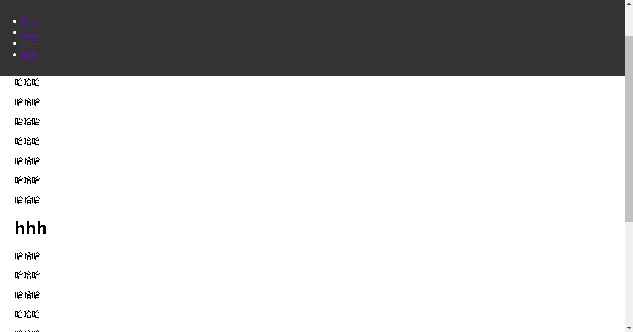
1. 固定导航栏
html
<!DOCTYPE html>
<html>
	<head>
		<meta charset="utf-8">
		<title></title>
		<style type="text/css">
			.fixed-nav {
			  position: fixed;
			  top: 0;
			  left: 0;
			  width: 100%;
			  background: #333;
			  color: white;
			  padding: 15px 0;
			  z-index: 1000;
			}
			.content {
			  margin-top: 60px; /* 为固定导航栏留出空间 */
			  padding: 20px;
			}
		</style>
	</head>
	<body>
		<nav class="fixed-nav">
		  <ul>
		    <li><a href="#">首页</a></li>
		    <li><a href="#">产品</a></li>
		    <li><a href="#">关于</a></li>
		    <li><a href="#">联系</a></li>
		  </ul>
		</nav>
		<div class="content">
			<p>哈哈哈</p>
			<p>哈哈哈</p>
			<p>哈哈哈</p>
			<p>哈哈哈</p>
			<p>哈哈哈</p>
			<p>哈哈哈</p>
			<p>哈哈哈</p>
			<p>哈哈哈</p>
			<p>哈哈哈</p>
			<p>哈哈哈</p>
			<p>哈哈哈</p>
			<h1>hhh </h1>
			<p>哈哈哈</p>
			<p>哈哈哈</p>
			<p>哈哈哈</p>
			<p>哈哈哈</p>
			<p>哈哈哈</p>
			<p>哈哈哈</p>
			<p>哈哈哈</p>
			<p>哈哈哈</p>
			<p>哈哈哈</p>
			<p>哈哈哈</p>
			<p>哈哈哈</p>
			<h1>hhh </h1>
		  <!-- 大量内容... -->
		</div>
	</body>
</html>
css
.fixed-nav {
  position: fixed;
  top: 0;
  left: 0;
  width: 100%;
  background: #333;
  color: white;
  padding: 15px 0;
  z-index: 1000;
}
.content {
  margin-top: 60px; /* 为固定导航栏留出空间 */
  padding: 20px;
}
代码运行:导航栏固定在上方
2. 返回顶部按钮
html
<button class="back-to-top">↑ 返回顶部</button>css
.back-to-top {
  position: fixed;
  bottom: 30px;
  right: 30px;
  padding: 10px 15px;
  background: #333;
  color: white;
  border: none;
  border-radius: 50%;
  cursor: pointer;
  opacity: 0;
  transition: opacity 0.3s;
}
.back-to-top.visible {
  opacity: 1;
}
(通常配合JavaScript在滚动一定距离后显示)
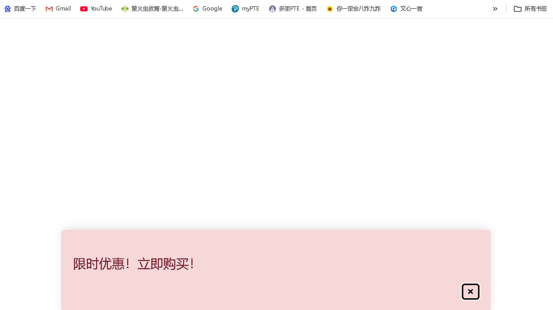
3. 浮动广告或通知
html
<div class="floating-ad">
  <p>限时优惠!立即购买!</p>
  <button class="close-ad">×</button>
</div>
css
.floating-ad {
  position: fixed;
  bottom: 0;
  left: 50%;
  transform: translateX(-50%);
  width: 90%;
  max-width: 500px;
  background: #f8d7da;
  color: #721c24;
  padding: 15px;
  border-radius: 5px 5px 0 0;
  box-shadow: 0 -2px 10px rgba(0,0,0,0.1);
}
.close-ad {
  float: right;
  background: none;
  border: none;
  font-weight: bold;
  cursor: pointer;
} 
4. 视频播放器控件
html
<div class="video-container">
  <video src="video.mp4" controls></video>
  <div class="video-controls">
    <!-- 播放/暂停按钮、进度条等 -->
  </div>
</div>
css
.video-controls {
  position: fixed;
  bottom: 20px;
  left: 50%;
  transform: translateX(-50%);
  background: rgba(0,0,0,0.8);
  padding: 10px 20px;
  border-radius: 30px;
  display: flex;
  align-items: center;
  gap: 15px;
} 
4、固定定位的注意事项
1. 层叠上下文
- 固定定位元素会创建新的层叠上下文(当设置了
z-index值时) - 示例:
css
.fixed-header {
  position: fixed;
  top: 0;
  left: 0;
  width: 100%;
  z-index: 100; /* 确保在大多数内容之上 */
  background: white;
}
2. 移动设备上的行为
- 在iOS等移动设备上,固定定位元素在滚动时可能会有轻微抖动
- 某些移动浏览器可能会忽略
fixed定位或表现不一致
3. 键盘弹出影响
- 在移动设备上,当键盘弹出时,固定定位元素的位置可能会受到影响
4. 内容重叠问题
- 固定定位元素可能会遮挡页面内容,需要为下方内容留出空间
- 示例:
css
body {
  padding-top: 60px; /* 为固定导航栏留出空间 */
}
5. 打印样式
- 固定定位元素在打印时可能不会按预期显示,需要特殊处理
5、固定定位与其他定位方式的比较
| 定位方式 | 是否脱离文档流 | 定位基准点 | 滚动行为 | 适用场景 |
|---|---|---|---|---|
| static (默认) | 否 | 正常文档流 | 随文档滚动 | 默认布局 |
| relative | 否 | 相对于自身原始位置 | 随文档滚动 | 微调元素位置 |
| absolute | 是 | 相对于最近的已定位祖先元素 | 随文档滚动 | 创建浮动元素、工具提示等 |
| fixed | 是 | 相对于视口 | 不随文档滚动 | 固定导航栏、返回顶部按钮 |
| sticky | 否(滚动时是) | 相对于最近的滚动祖先和视口 | 滚动到阈值后固定 | 粘性头部、侧边栏 |
6、最佳实践建议
-
考虑移动设备兼容性:在移动设备上测试固定定位元素的行为,特别是滚动和键盘弹出时
-
为下方内容留出空间:使用
margin-top或padding-top为固定定位元素下方的页面内容留出空间,防止内容被遮挡 -
合理使用z-index:确保固定定位元素在正确的层叠顺序中,避免被其他元素遮挡
-
响应式设计:在小屏幕上可能需要调整固定定位元素的位置或完全隐藏它们
-
性能考虑:避免在固定定位元素上使用复杂的动画或效果,这可能会影响滚动性能
-
可访问性:确保固定定位元素不会干扰键盘导航或屏幕阅读器的使用
固定定位是创建现代网页布局中非常有用的工具,特别适合需要始终可见的元素。然而,由于其特殊的行为,使用时需要特别注意其对页面布局和用户体验的影响。
二、代码实例
1.练习代码实例如下:
<!DOCTYPE html>
<html>
<head>
<meta charset="utf-8">
<title>定位-固定定位</title>
<style type="text/css">
.fix {
width: 100px;
height: 100px;
background-color: #996600;
border-radius: 40px 40px;
position: fixed;
bottom: 0px;
right: 0px;
}
.fix a:link,a:visited {
color: white;
text-decoration: none;
display: block;
width: 100px;
height: 100px;
text-align: center;
line-height: 100px;
}
</style>
</head>
<body>
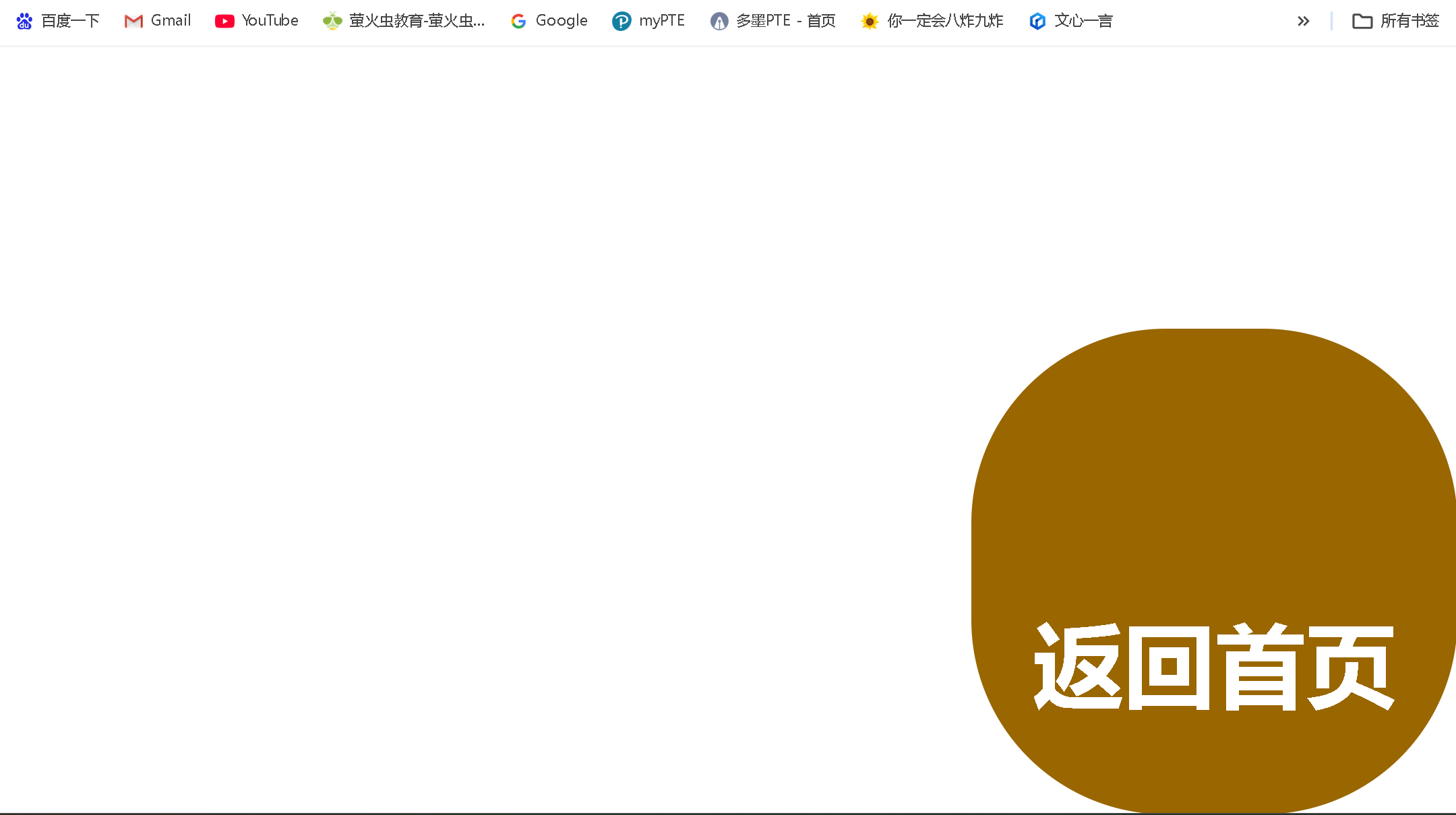
<div class="fix">
<a href="../个人主题网站/index.html"><h3 align="center">返回首页</h3></a>
</div>
</body>
</html>
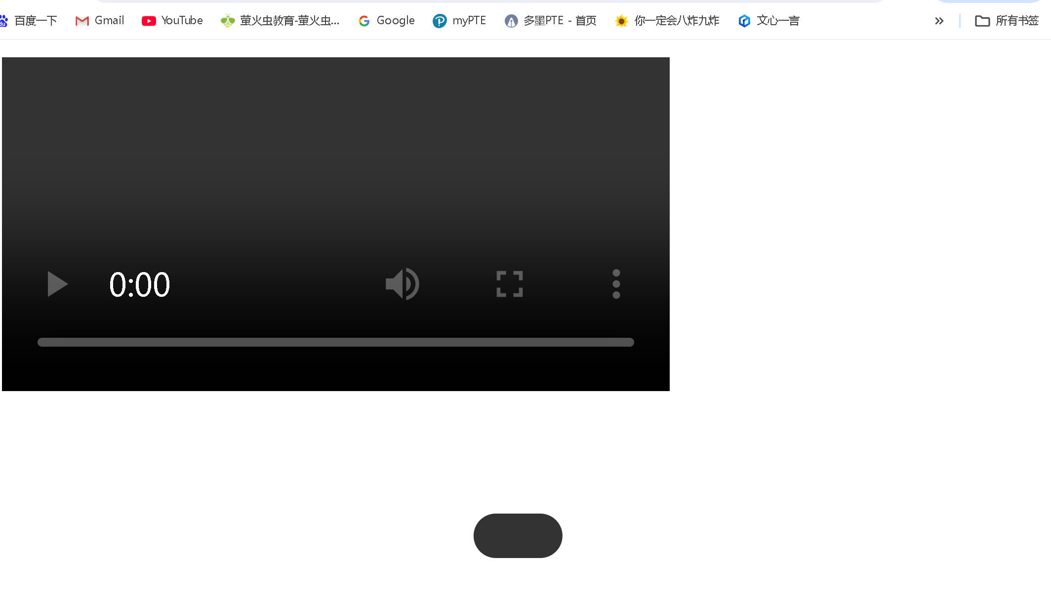
代码运行:有一个固定的图标在页面右下角
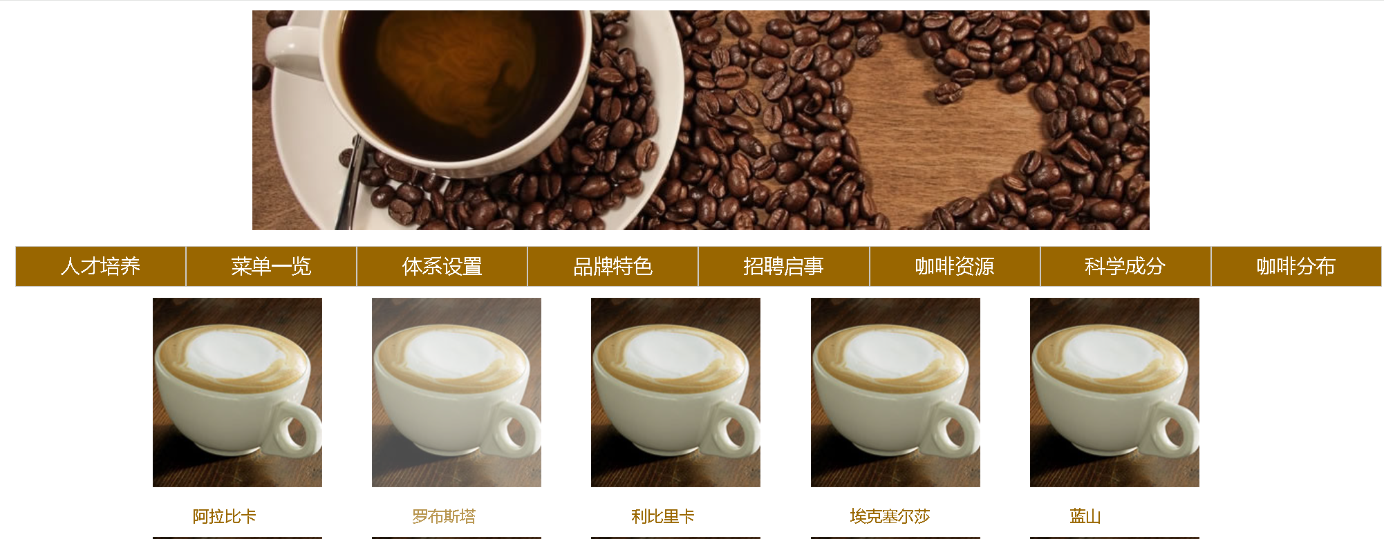
2.咖啡售卖官网 代码实例如下:
html
<!DOCTYPE html>
<html>
<head>
<meta charset="utf-8">
<title>子绝父相</title>
<link rel="stylesheet" type="text/css" href="../css/cs4-6.css" />
<style type="text/css">
.fix {
width: 100px;
height: 100px;
background-color: #996600;
border-radius: 40px 40px;
position: fixed;
bottom: 0px;
right: 0px;
}
.fix a:link,a:visited {
color: white;
text-decoration: none;
display: block;
width: 100px;
height: 100px;
text-align: center;
line-height: 100px;
}
.header {
width: 900px;
height: 220px;
margin: 10px auto;
}
.showpic {
width: 1100px;
height: 230px;
margin: 10px auto;
}
.container {
width: 170px;
height: 230px;
/* border: 1px solid black; */
position: relative;
float: left;
margin-right: 50px;
}
.container .coffee:link,
.coffee:visited {
text-decoration: none;
color: #996600;
}
.container .tag {
position: absolute;
bottom: 1px;
left: 40px;
/* display: block;
width: 170px;
height: 35px;
text-align: center; */
}
.container a:hover {
opacity: 0.7;
}
</style>
</head>
<body>
<div class="header">
<img src="../img/coffee.jpg">
</div>
<div class="nvg">
<ul>
<li><a href="#">人才培养</a>
<ul>
<li><a href="#">咖啡简介</a></li>
<li><a href="#">历史沿革</a></li>
<li><a href="#">季节限定</a></li>
<li><a href="#">产地漫游</a></li>
</ul>
</li>
<li><a href="#">菜单一览</a>
<ul>
<li><a href="#">咖啡简介</a></li>
<li><a href="#">历史沿革</a></li>
<li><a href="#">季节限定</a></li>
<li><a href="#">产地漫游</a></li>
</ul>
</li>
<li><a href="#">体系设置</a>
<ul>
<li><a href="#">咖啡简介</a></li>
<li><a href="#">历史沿革</a></li>
<li><a href="#">季节限定</a></li>
<li><a href="#">产地漫游</a></li>
</ul>
</li>
<li><a href="#">品牌特色</a>
<ul>
<li><a href="#">咖啡简介</a></li>
<li><a href="#">历史沿革</a></li>
<li><a href="#">季节限定</a></li>
<li><a href="#">产地漫游</a></li>
</ul>
</li>
<li><a href="#">招聘启事</a>
<ul>
<li><a href="#">咖啡简介</a></li>
<li><a href="#">历史沿革</a></li>
<li><a href="#">季节限定</a></li>
<li><a href="#">产地漫游</a></li>
</ul>
</li>
<li><a href="#">咖啡资源</a>
<ul>
<li><a href="#">咖啡简介</a></li>
<li><a href="#">历史沿革</a></li>
<li><a href="#">季节限定</a></li>
<li><a href="#">产地漫游</a></li>
</ul>
</li>
<li><a href="#">科学成分</a>
<ul>
<li><a href="#">咖啡简介</a></li>
<li><a href="#">历史沿革</a></li>
<li><a href="#">季节限定</a></li>
<li><a href="#">产地漫游</a></li>
</ul>
</li>
<li><a href="#">咖啡分布</a>
<ul>
<li><a href="#">咖啡简介</a></li>
<li><a href="#">历史沿革</a></li>
<li><a href="#">季节限定</a></li>
<li><a href="#">产地漫游</a></li>
</ul>
</li>
</ul>
</div>
<div class="showpic">
<div class="container">
<a href="#" class="coffee">
<img src="../img/kbjn.jpg">
<span class="tag">阿拉比卡</span>
</a>
</div>
<div class="container">
<a href="#" class="coffee">
<img src="../img/kbjn.jpg">
<span class="tag">罗布斯塔</span>
</a>
</div>
<div class="container">
<a href="#" class="coffee">
<img src="../img/kbjn.jpg">
<span class="tag">利比里卡</span>
</a>
</div>
<div class="container">
<a href="#" class="coffee">
<img src="../img/kbjn.jpg">
<span class="tag">埃克塞尔莎</span>
</a>
</div>
<div class="container">
<a href="#" class="coffee">
<img src="../img/kbjn.jpg">
<span class="tag">蓝山</span>
</a>
</div>
</div>
<div class="showpic">
<div class="container">
<a href="#" class="coffee">
<img src="../img/kbjn.jpg">
<span class="tag">格拉纳达</span>
</a>
</div>
<div class="container">
<a href="#" class="coffee">
<img src="../img/kbjn.jpg">
<span class="tag">铁皮卡</span>
</a>
</div>
<div class="container">
<a href="#" class="coffee">
<img src="../img/kbjn.jpg">
<span class="tag">波旁</span>
</a>
</div>
<div class="container" class="coffee">
<a href="#" class="coffee">
<img src="../img/kbjn.jpg">
<span class="tag">瑰夏</span>
</a>
</div>
<div class="container">
<a href="#" class="coffee">
<img src="../img/kbjn.jpg">
<span class="tag">耶加雪菲</span>
</a>
</div>
</div>
<div class="fix">
</div>
</body>
</html>
css
/* 导航栏的父盒子 */
* {
	padding: 0px;
}
.nvg {
	width: 1376px;
	height: 42px;
	/* border: 1px solid black; */
	margin: 10px auto;
}
/* 一级二级导航栏框架 */
.nvg ul {
	list-style-type: none;
}
/* 一级导航栏 */
/* .nvg>ul>li {
	list-style-type: none;
} */
.nvg>ul>li:hover ul{
	display: block;
}
/* 二级导航栏 */
.nvg>ul>li>ul {
	display: none;
	position: absolute;
	top: 42px;
	z-index: 999;
}
/* 每一个li */
.nvg ul li {
	width: 170px;
	height: 40px;
	background-color: #996600;
	border: 1px solid #CCCCCC;
	position: relative;
	float: left;
}
.nvg a:link,a:visited {
	text-decoration: none;
	font: 20px "times new roman";
	color: white;
	display: block;
	width: 170px;
	height: 40px;
	text-align: center;
	line-height: 40px;
}
.nvg a:hover {
	background-color: #492002;
}
代码运行如下:
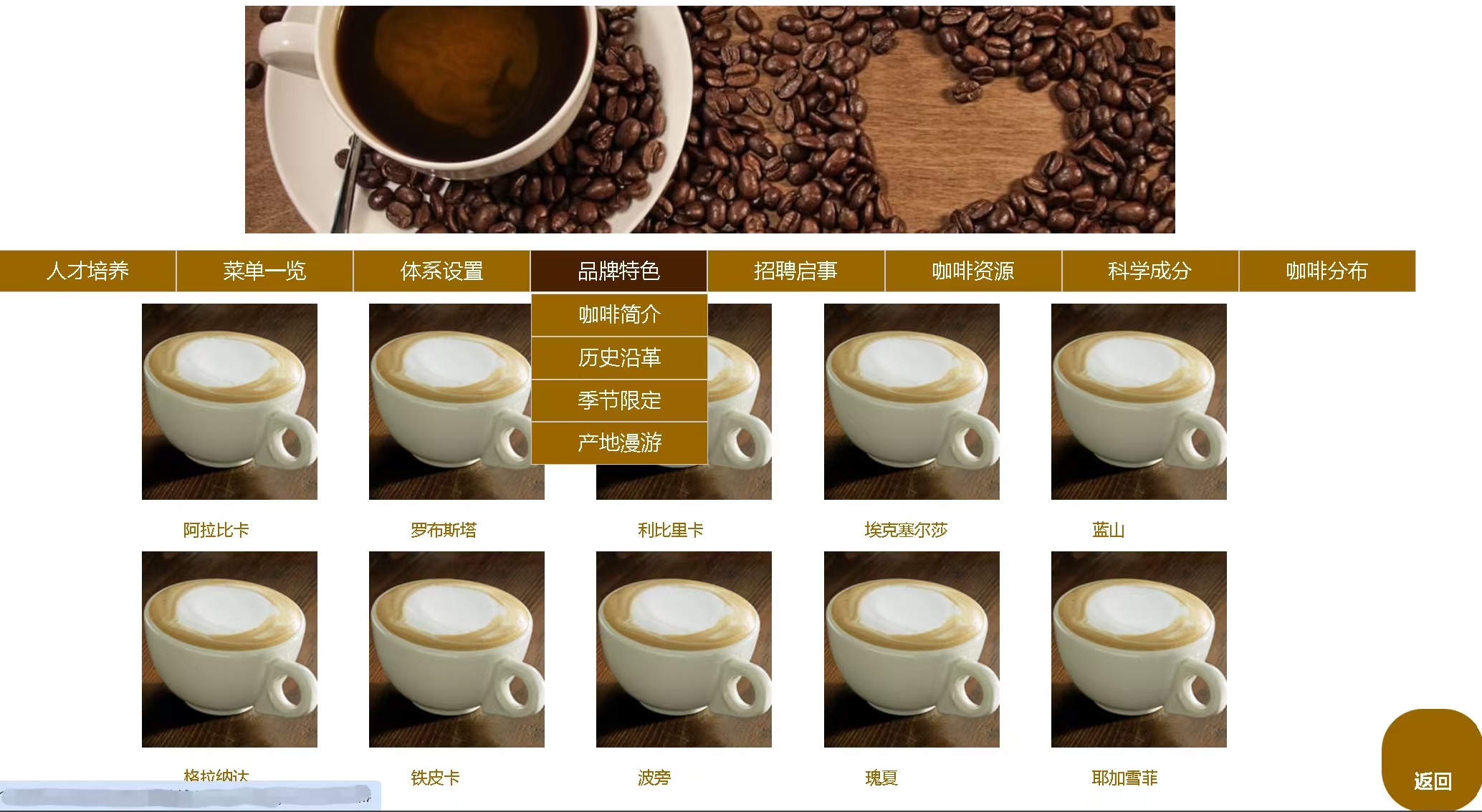 当鼠标悬停在图片上时,清晰度变化:
- 正常状态:链接保持完全不透明(opacity: 1)
- 悬停状态:当鼠标移动到链接上时,不透明度变为0.7,产生淡出效果
- 鼠标移出:当鼠标移开时,不透明度恢复为1
.container a:hover {
  opacity: 0.7;
} 
总结
以上就是今天要讲的内容,本文简单记录了固定定位(fixed)以及咖啡售卖官网,仅作为一份简单的笔记使用,大家根据注释理解