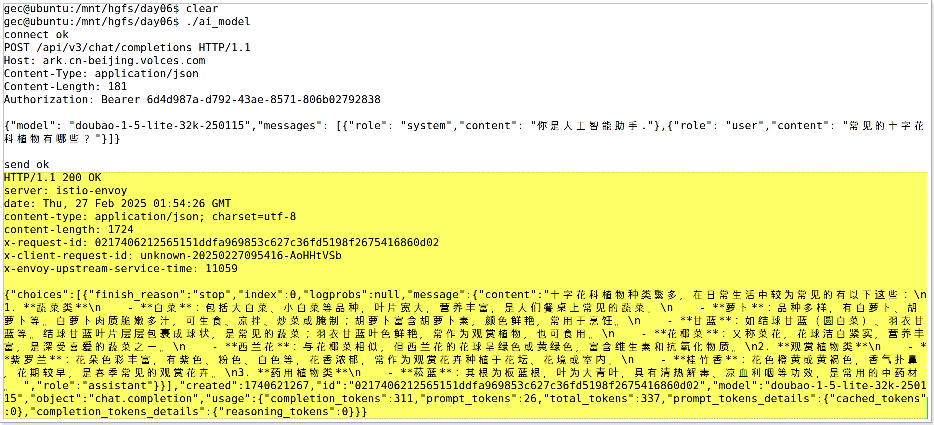
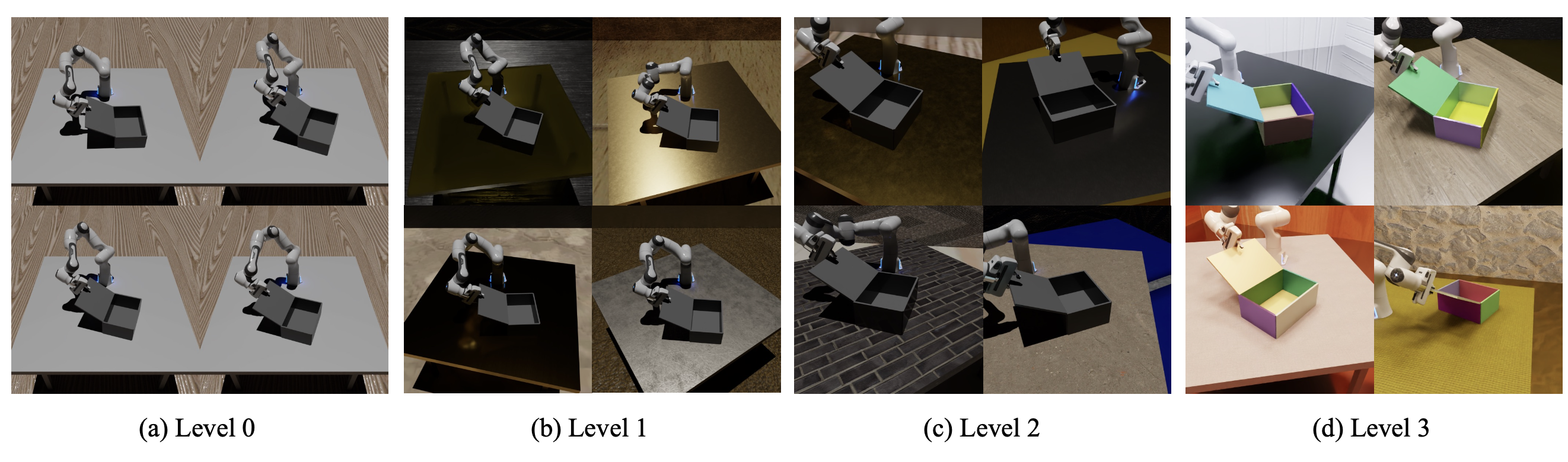
1. 效果图

2. 代码
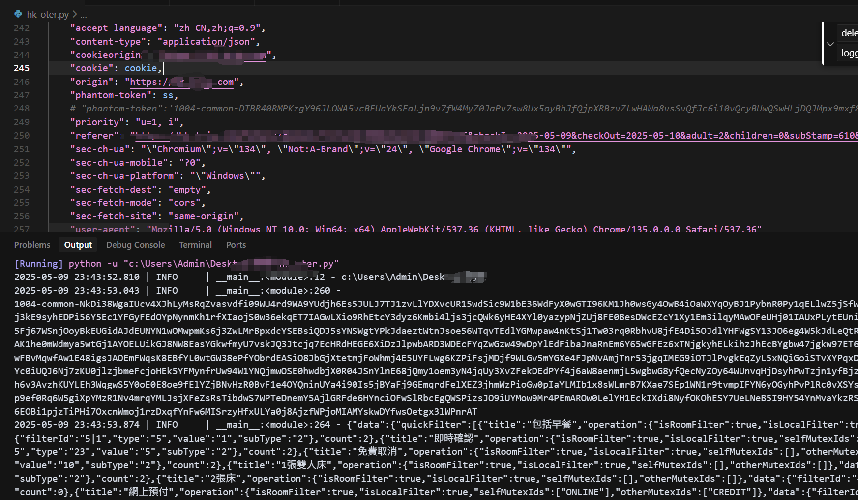
数据是GO的输出结果,本文使用的是 metascape 输出的excel挑选的若干行。
# 1. 读取数据
dat=read.csv("E:\\research\\scPolyA-seq2\\GO-APA-Timepoint\\test.csv", sep="\t")
head(dat)

# 2. 选择所需要的列
dat.use=dat[, c("LogQvalue", "Description", "GroupID", "Symbols")]
# 如果只有Qvalue,则ggplot2中使用x=log10(Qvalue);
# GroupID是分组,不是必须的。主要用于区分颜色,一个类可以有多个term。
查看中间数据:
> head(dat.use, 2)
  LogQvalue                            Description    GroupID
1    -2.685      Thyroid hormone signaling pathway  1_Summary
2    -1.003 positive regulation of protein binding 10_Summary
                                                                                                                                                   Symbols
1 ATP2A2,PFKP,RAF1,SLC9A1,HDAC3,NCOA2,MED13L,SIN3A,EGR2,NFKB1,THRAP3,CASP3,KMT2A,SLIT3,CCAR2,SLC9A3,MEF2D,TFAM,GBF1,BBS9,SGK1,TXN2,PI4KA,PEMT,PNPLA6,ACSL5
2                                               ABL1,PPP2CB,TIAM1,NMD3,ATP2A2,NFKB1,RAF1,OXSR1,NDFIP2,CCAR2,TAF3,UBLCP1,GBF1,DLC1,GLG1,STXBP3,SIN3A,JMJD1C
                             Symbols2
1 ATP2A2,PFKP,RAF1,SLC9A1,HDAC3,NCOA2
2 ABL1,PPP2CB,TIAM1,NMD3,ATP2A2,NFKB1
继续:
# set y order
#dat.use$Description=factor(dat.use$Description)

# 3.选择所需要的行 select rows to draw
cols=c("#D51F26","#00A08A","#F2AD00","#F98400","#5BBCD6")
dat.use=dat.use[1:length(cols), ]

# 4.仅显示不超过n=5个基因
n=6 #最多保留的基因个数
dat.use$Symbols2=sapply(dat.use$Symbols, function(x){
  arr=strsplit(x, ",")[[1]]
  len=ifelse(length(arr)>n, n, length(arr));
  arr=arr[1:len]
  paste0(arr, collapse = ",")
}) |> as.character()


# 5.画图
library(ggplot2)
ggplot(dat.use, aes(x=-LogQvalue, y = Description, fill = GroupID)) +
  #1. barplot of GO Q value
  geom_bar(stat ="identity", width =0.5) +
  geom_text(aes(x=0.1/5, #文字和y轴的缝隙
                y=Description, label=Description),
            size=4,
            #fontface="bold",
            hjust=0) +
  scale_fill_manual(values = cols)+ #bar plot fill color
  scale_x_continuous(expand = c(0,0))+ #bar和y轴无间隔
  #2. add gene list
  geom_text(data = dat.use,
          aes(x =0.1/5, #文字和y轴的缝隙
              y = Description,
              label = Symbols2, #基因列表
              color = GroupID),
          size =3.5,
          fontface ='italic',
          hjust =0,
          vjust =2.3) +
  scale_color_manual(values=cols) + #gene list text colors
  #3. theme and style
  theme_classic(base_size = 14)+
  theme(axis.text.y = element_blank(), #no y title, ticks, text
        axis.title.y = element_blank(),
        axis.ticks.y = element_blank(),
        axis.line = element_line(colour ='black', linewidth =1),
        axis.text.x = element_text(colour ='black', size =12),
        axis.ticks.x = element_line(colour ='black', linewidth = 1),
        axis.title.x = element_text(colour ='black', size =12),
        legend.position ="none")+ #no legend
  scale_y_discrete( #expand = c(0.2, 0), #为bar下的字符留空间,缺点是上面也有空间了
    expand=expansion(mult = c(0.2, 0)), #ggplot 3.5.1
    limits=rev( dat.use$Description)  #设置bar的顺序
  ) +
  labs(x="-Log10(Qvalue)", title="Enrichment of xx")
Ref
- https://mp.weixin.qq.com/s/h_x2Iz7FQdZWiT0WwY-9Eg