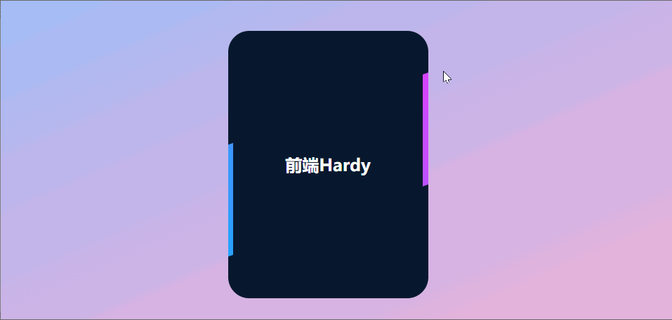
效果演示
这段代码创建了一个具有动态背景和渐变效果的卡片。卡片背景有一个无限循环的旋转动画,增加了视觉吸引力。这种效果可以用于展示个人信息、项目介绍或其他需要吸引用户注意的内容。
HTML
  <div class="card">
      <h3>前端Hardy</h3>
  </div>
CSS
html,body {
    width: 100vw;
    height: 100vh;
    display: flex;
    justify-content: center;
    align-items: center;
    margin: 0;
    overflow: hidden;
    background: #f7d6ff;
    background-image: linear-gradient(to bottom right, #91defe, #99c0f9, #bdb6ec, #d7b3e3, #efb3d5, #f9bccc);
}

.card {
    width: 190px;
    height: 254px;
    background: #07182E;
    position: relative;
    display: flex;
    place-content: center;
    place-items: center;
    overflow: hidden;
    border-radius: 20px;
}

.card h3 {
    z-index: 1;
    color: white;
    font-size:  1em;
}

.card::before {
    content: '';
    position: absolute;
    width: 100px;
    background-image: linear-gradient(180deg, rgb(0, 183, 255), rgb(255, 48, 255));
    height: 130%;
    animation: rotBGimg 3s linear infinite;
    transition: all 0.2s linear;
}

@keyframes rotBGimg {
    from {
        transform: rotate(0deg);
    }

    to {
        transform: rotate(360deg);
    }
}

.card::after {
    content: '';
    position: absolute;
    background: #07182E;
    ;
    inset: 5px;
    border-radius: 15px;
}
html, body:
- width: 100vw: 宽度设置为视口宽度的100%。
- height: 100vh: 高度设置为视口高度的100%。
- display: flex: 使用 Flexbox 布局。
- justify-content: center: 水平居中。
- align-items: center: 垂直居中。
- margin: 0: 移除外边距。
- overflow: hidden: 隐藏溢出的内容。
- background: 设置背景颜色和渐变,从左上到右下的渐变色。
.card: 定义卡片的样式。
- width: 190px: 宽度为190像素。
- height: 254px: 高度为254像素。
- background: #07182E: 背景颜色为深蓝色。
- position: relative: 相对定位。
- display: flex: 使用 Flexbox 布局。
- place-content: center: 水平居中。
- place-items: center: 垂直居中。
- overflow: hidden: 隐藏溢出的内容。
- border-radius: 20px: 圆角为20像素。
.card h3: 定义卡片内标题的样式。
- z-index: 1: 堆叠顺序为1。
- color: white: 文本颜色为白色。
- font-size: 1em: 字体大小为1em。
.card::before: 背景动画。
- content: “”: 伪元素的内容为空。
- position: absolute: 绝对定位。
- right: 0: 靠右对齐。
- top: 0: 顶部对齐。
- height: 7px: 高度为7像素。
- width: 45px: 宽度为45像素。
- border-radius: 4px: 圆角。
- box-shadow: 创建多个阴影效果,模拟加载器的动画效
.card::after: 用于增加额外的样式效果。
- content: ‘’: 伪元素的内容为空。
- position: absolute: 绝对定位。
- background: #07182E: 背景颜色为深蓝色。
- inset: 5px: 内边距为5像素。
- border-radius: 15px: 圆角为15像素。
动画
- @keyframes rotBGimg: 定义名为 rotBGimg 的关键帧动画,用于旋转背景。from: 从0度开始,to: 旋转到360度。


](https://i-blog.csdnimg.cn/direct/de4122e5c2d34143b803adb6d9a7292b.png)