导入所需要的package
import numpy as np
import pandas as pd
import matplotlib.pyplot as plt
import seaborn as sns
import datetime
%matplotlib inline
plt.rcParams['font.sans-serif'] = ['KaiTi']  #中文
plt.rcParams['axes.unicode_minus'] = False   #负号
数据清洗和读取数据
df = pd.read_csv("energy.csv")
df.shape
###展示数据前6行
df.head(6)

# 删除特定的列   在数据中体现为 Unnamed: 0
df = df.drop(['Unnamed: 0'], axis=1)
df.head(6)
 ###重新命名列名称 即简化名称
df.rename(columns={'Energy_type' : 'e_type', 'Energy_consumption' : 'e_con', 'Energy_production' : 'e_prod'
             , 'Energy_intensity_per_capita' : 'ei_capita', 'Energy_intensity_by_GDP' : 'ei_gdp'}, inplace=True)

df['e_type'] = df['e_type'].astype('category')

df['e_type'] = df['e_type'].cat.rename_categories({'all_energy_types': 'all', 'natural_gas': 'nat_gas','petroleum_n_other_liquids': 'pet/oth',
                                    'renewables_n_other': 'ren/oth'})

df['e_type'] = df['e_type'].astype('object')

df.info()
###对所以特征进行统计性描述
df.describe(include='all') ##得出每一种变量的总数
for var in df:
    print(f'{var}: {df[var].nunique()}')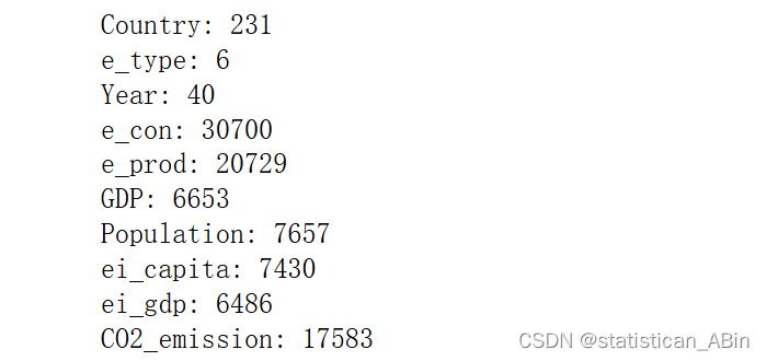
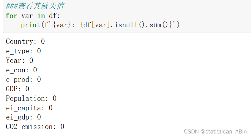
###缺失值的处理
#先查看缺失值
for var in df:
print(f'{var}: {df[var].isnull().sum()}')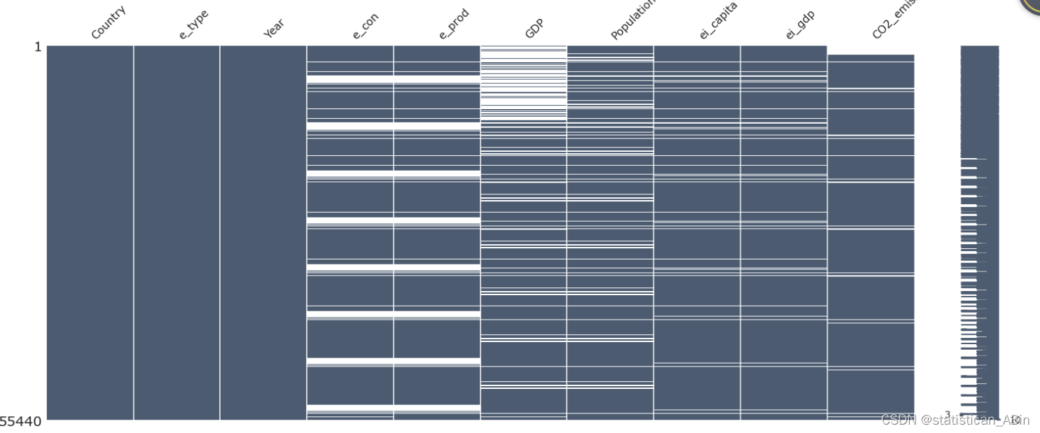 从上面可以看到有的特征变量有很多缺失值
 由于大多数国家不消费或生产核能,因此缺少e_con和e_prod的许多价值,因此他们将其保留为Nan。我将添加 0 来代替这些
nuclear = df[df['e_type']=='nuclear']


temp_ecp = df[df['e_type']!='nuclear']

# Replacing all Nan values of e_con and e_prod of e_type nuclear to 0
nuclear[['e_con', 'e_prod']] = nuclear[['e_con', 'e_prod']].replace(np.nan, 0)

# Joining them back up
df = pd.concat([nuclear, temp_ecp]).sort_index()
处理完之后再看,没有缺失值了
 现在可以开始查看数据了,可视化
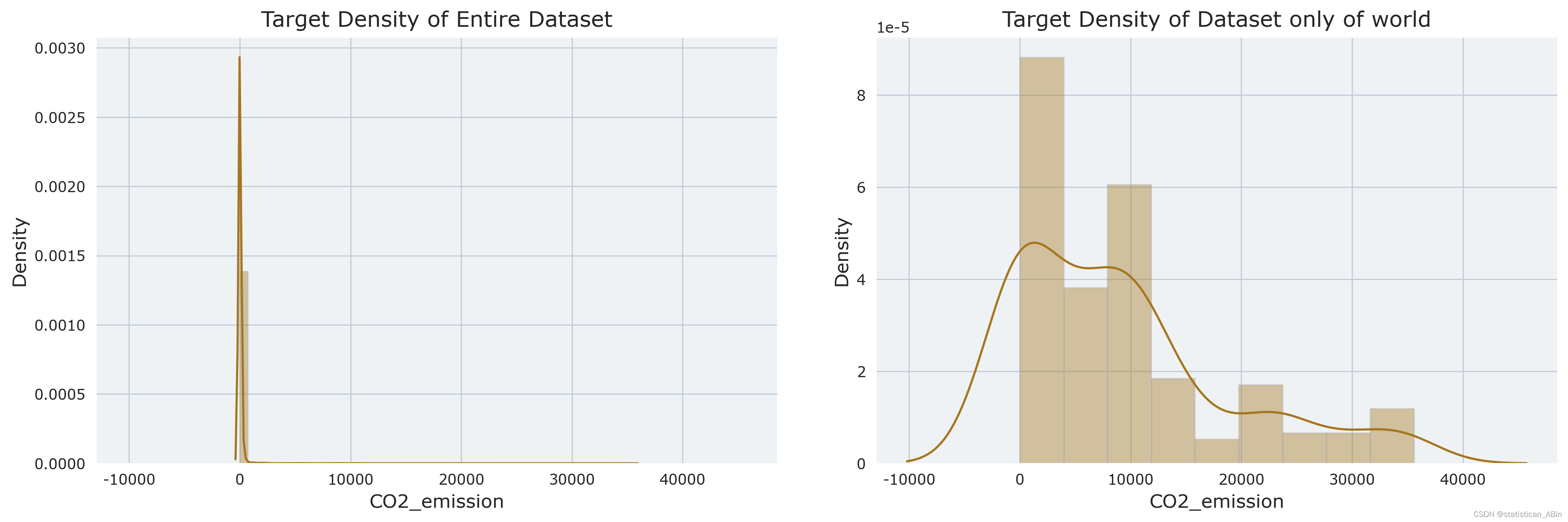

从上图可以看出分布高度右偏。
接下来查看能源类型分布
###画出其环形图 看其分布和占比情况
percent = temp_dist['CO2_emission']
labels= temp_dist['e_type']

my_pie,_,_ = plt.pie(percent, radius = 2.2, labels=labels, autopct="%.1f%%")
plt.setp(my_pie, width=0.6, edgecolor='white')
plt.show()
从上图可以看出,所有能源都分布较为均匀
计算相关系数并画出其热力图

不同可视化分析
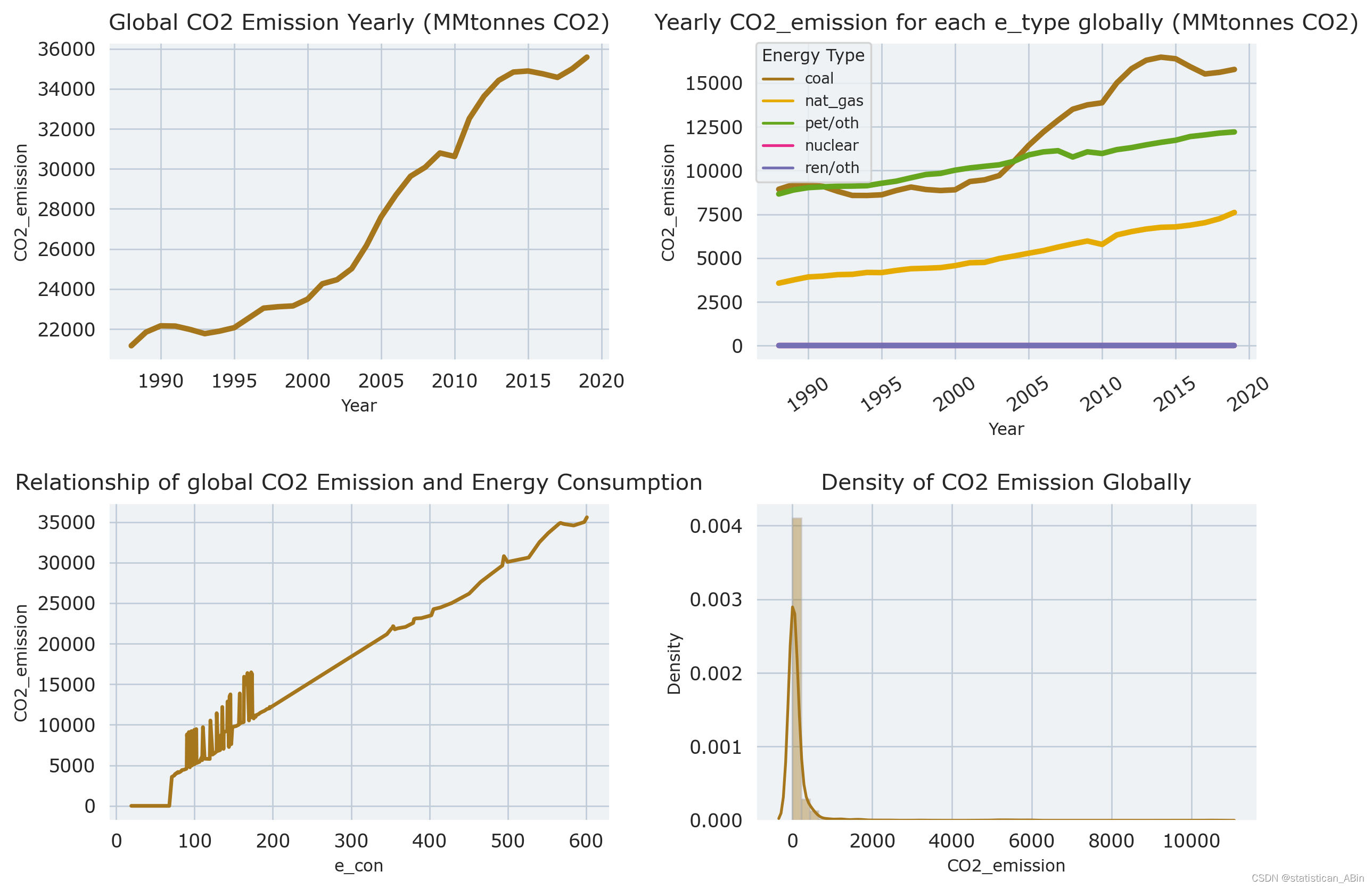
with plt.rc_context(rc = {'figure.dpi': 250, 'axes.labelsize': 9,
                          'xtick.labelsize': 10, 'ytick.labelsize': 10,
                          'legend.title_fontsize': 7, 'axes.titlesize': 12,
                          'axes.titlepad': 7}):

    # Data with only the 'World' values
    cd = df[df['Country']=='World']


    fig, ax = plt.subplots(2, 2, figsize = (10, 7), # constrained_layout = True,
                               gridspec_kw = {'width_ratios': [3, 3],
                                                'height_ratios': [3, 3]})

    ax_flat = ax.flatten()


    ### 1st graph
    sns.lineplot(ax=ax_flat[0], data=cd[cd['e_type']=='all'],
                 x='Year', y='CO2_emission', lw=3).set_title('Global CO2 Emission Yearly (MMtonnes CO2)')


    ### 2nd graph
    sns.lineplot(ax=ax_flat[1], data=cd[cd['e_type']!='all'],
            x='Year',
            y='CO2_emission',
            hue='e_type',
            lw=3,
            ).set_title('Yearly CO2_emission for each e_type globally (MMtonnes CO2)')

    ax_flat[1].legend(fontsize=8, title='Energy Type', title_fontsize=9, loc='upper left', borderaxespad=0)
    ax_flat[1].tick_params(axis='x', rotation=35)


    ### 3rd graph
    sns.lineplot(ax=ax_flat[2], data=cd,
                x='e_con', y='CO2_emission', lw=2
               ).set_title('Relationship of global CO2 Emission and Energy Consumption')


    ### 4th graph
    for_dist = df[df['Country']!='World'][df['e_type']=='all']
    sns.distplot(for_dist['CO2_emission'], ax=ax_flat[3]).set_title('Density of CO2 Emission Globally')


    plt.tight_layout(pad = 1)
    plt.show()
# 前 6 个国家/地区的年度二氧化碳排放量
fig, ax = plt.subplots(2, 3, figsize = (20, 10))


# Top 6 Countries
countries = temp_cd['Country'].head(6)

# Average CO2 Emission each year for top 6 emiters
for idx, (country, axes) in enumerate(zip(countries, ax.flatten())):

    cd3 = df[df['Country']==country][df['e_type']=='all']
    temp_data = cd3.groupby(['Year'])['CO2_emission'].sum().reset_index().sort_values(by='CO2_emission',ascending=False)
    plot_ = sns.barplot(ax=axes, data=temp_data, x='Year', y='CO2_emission', palette="Reds_d")

    # Title
    axes.set_title(country)

    # Reducing Density of X-ticks
    for ind, label in enumerate(plot_.get_xticklabels()):
        if ind % 4 == 0:  # every 10th label is kept
            label.set_visible(True)
        else:
            label.set_visible(False)

    # Rotating X axis
    for tick in axes.get_xticklabels():
        tick.set_rotation(45)


### Removing empty figures
else:
    [axes.set_visible(False) for axes in ax.flatten()[idx + 1:]]


plt.tight_layout(pad=0.4, w_pad=2, h_pad=2)
plt.show()
 # 在此期间,中国和印度的排放量增加了很多。
#从这一时期开始到结束,二氧化碳排放量增加/减少幅度最大的国家
# 然后绘图
# Countries with biggest increase in CO2 emission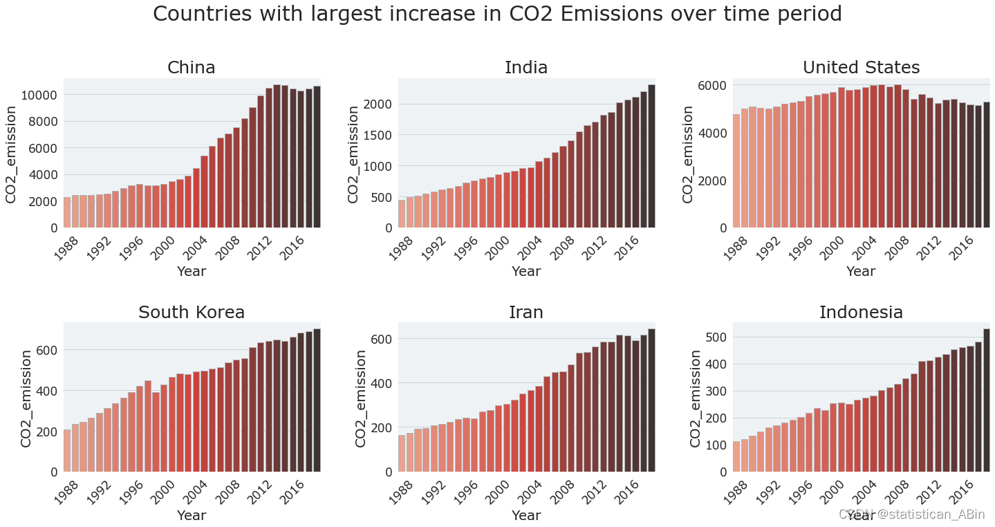
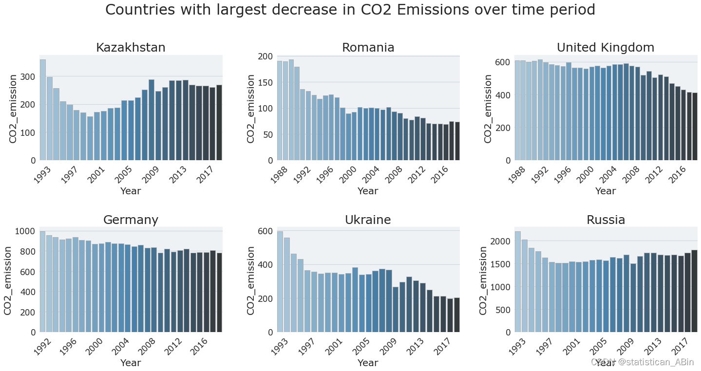
Countries with biggest decrease in CO2 emission
结论
关于CO2排放量的结论
1.在此期间,二氧化碳排放量一直在增加。
2.煤炭和石油/其他液体一直是这一时期的主要能源。
3.二氧化碳排放量平均每年增长1.71%,整个时期整体增长68.14%。
4.截至2019年,当年平均二氧化碳排放量为10.98(百万吨二氧化碳)。
5.在整个时期,二氧化碳排放量最大的国家是中国和美国,这两个国家的二氧化碳排放量几乎是其他国家的4倍或更多。
6.在此期间,中国和印度的二氧化碳排放量增加是其他所有国家中最多的。
7.在此期间,前苏联加盟共和国的二氧化碳排放量下降幅度最大,英国和德国的排放量也略有下降。
8.一般来说,人口越多,该国排放的二氧化碳就越多。
9.GDP越大,该国二氧化碳排放量越大。
10.一个国家的能源消耗越大,二氧化碳排放量就越大。
11.按人均能源强度的GDP计算的高或低能源强度并不一定能预测大量的二氧化碳排放量,但一般来说,它越低越好(节约的能量越多意味着二氧化碳排放量越少)。
代码和数据
创作不易,希望大家多多点赞收藏和评论!