一、文本组件
1.1 概述
Text为文本组件,用于显示文字内容
1.2 参数
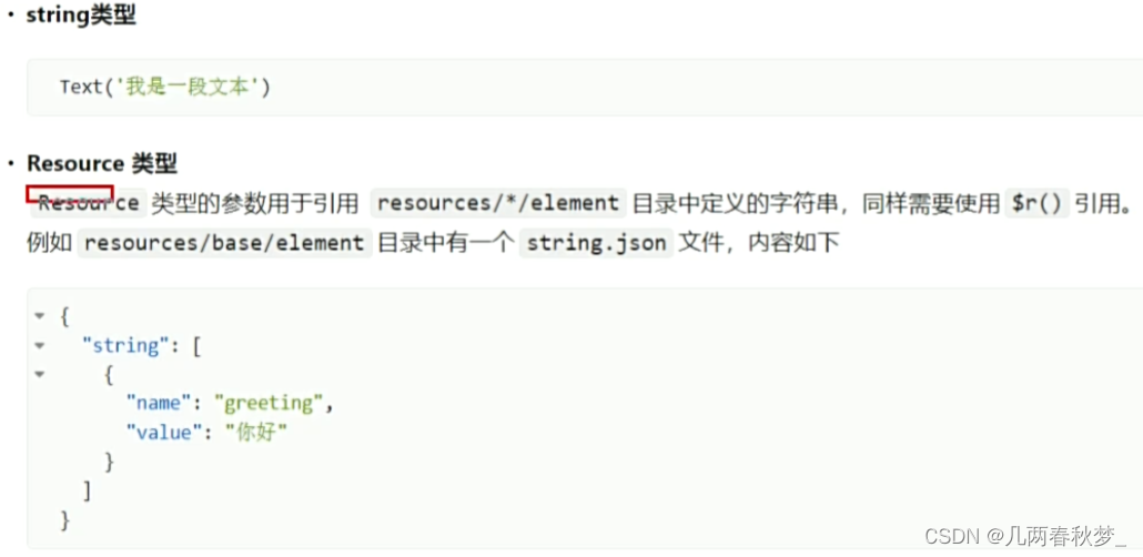
Text组件的参数类型为string | Resource
@Entry
@Component
struct Index {
  build() {
    Column({space : 50}) {
      Text('你好')
        .fontSize(50)
    }
    .width('100%')
    .height('100%')
    .justifyContent(FlexAlign.Center)
  }
}
1.3 属性
字体大小可通过fontSize()方法进行设置,该方法的参数类型主要有string | number | Resource
字体粗细可通过fontWeight()方法进行设置

字体颜色可通过fontColor()方法进行设置,该方法的参数类型为Color | string | number | Resource
文本对齐可通过textAlign()方法进行设置,该方法的参数为枚举类型TextAlign
二、按钮
2.1 概述
Button为按钮组件,通常用于响应用户的点击操作
2.2 参数
Button组件有两种使用方式,分别是不包含子组件和包含子组件

@Entry
@Component
struct Index {
  build() {
    Column({space : 50}) {
      //不包含子组件
      Button('按钮',{type:ButtonType.Capsule,stateEffect:true})
        .fontSize(25)
        .width(150)
        .height(60)

      //不包含子组件
      Button({type:ButtonType.Capsule,stateEffect:true}){
        Row({space:5}){
          Text('新建')
            .fontColor(Color.White)
            .fontSize(25)
            .fontWeight(500)
        }
      }
    }
    .width('100%')
    .height('100%')
    .justifyContent(FlexAlign.Center)
  }
}
2.3 常用属性
背景颜色可使用backgroundColor()方法进行设置
边框圆角的大小可使用borderRadius()方法进行设置
2.4 常用事件
可通过onClick()方法绑定点击事件
Button('按钮',{type:ButtonType.Capsule,stateEffect:true})
        .fontSize(25)
        .width(150)
        .height(60)
        .onClick(() =>{
          console.log("我被点击了");
        })
三、切换按钮
3.1 概述
Toggle为切换按钮组件,一般用于两种状态之间的切换
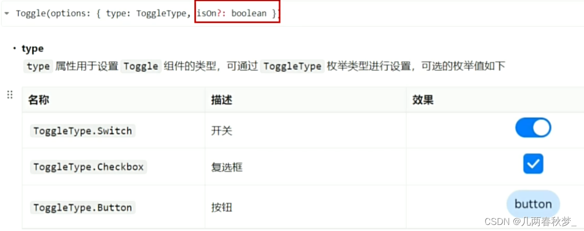
3.2 参数
3.3 常用属性
选中状态背景色:可使用selectedColor()方法设置Toggle组件在选中或打开状态心爱的背景色
Switch滑块颜色:可使用设置switchPointColor()方法设置Switch类型的Toggle组件中的圆形滑块颜色
3.4 常用事件
Toggle组件常用事件为change事件,每当Toggle组件的状态发生变化,就会触发change事件


![[Leetcode]用栈实现队列](https://img-blog.csdnimg.cn/direct/52fabee278f54153a9d72aa18e2c4192.png)