组件代码
import React from 'react';
import { View, StyleSheet, Modal, TouchableOpacity, Text, TouchableWithoutFeedback } from 'react-native';

const BottomPopup = ({ visible, onClose, children, leftButtonTitle, rightButtonTitle, onLeftButtonPress, onRightButtonPress }) => {

  const handleLeftButtonPress = () => {
    onLeftButtonPress();
  };

  const handleRightButtonPress = () => {
    onRightButtonPress();
  };

  return (
    <Modal
      animationType="slide"
      transparent={true}
      visible={visible}
      onRequestClose={onClose}
    >
      <TouchableWithoutFeedback onPress={onClose}>
        <View style={styles.container}>
          <TouchableWithoutFeedback onPress={() => {}}>
            <View style={styles.popup}>
              <View style={styles.buttonsContainer}>
                <TouchableOpacity onPress={handleLeftButtonPress} style={styles.leftButton}>
                  <Text style={styles.leftButtonText}>{leftButtonTitle}</Text>
                </TouchableOpacity>
                <TouchableOpacity onPress={handleRightButtonPress} style={styles.rightButton}>
                  <Text style={styles.rightButtonText}>{rightButtonTitle}</Text>
                </TouchableOpacity>
              </View>
              {children}
            </View>
          </TouchableWithoutFeedback>
        </View>
      </TouchableWithoutFeedback>
    </Modal>
  );
};

const styles = StyleSheet.create({
  container: {
    flex: 1,
    justifyContent: 'flex-end',
    backgroundColor: 'rgba(0, 0, 0, 0.5)',
  },
  popup: {
    backgroundColor: '#fff',
    borderTopLeftRadius: 20,
    borderTopRightRadius: 20,
    padding: 20,
    elevation: 5,
  },
  buttonsContainer: {
    flexDirection: 'row',
    justifyContent: 'space-between',
    marginBottom: 10,
  },
  leftButton: {
    padding: 10,
  },
  leftButtonText: {
    color: 'blue',
    fontSize: 16,
  },
  rightButton: {
    padding: 10,
  },
  rightButtonText: {
    color: 'blue',
    fontSize: 16,
  },
});

export default BottomPopup;
使用方式
import React, { useState } from 'react';
import { View, Button, Text } from 'react-native';
import BottomPopup from './bbb';
const MyComponent = () => {
const [isVisible, setIsVisible] = useState(false);
const togglePopup = () => {
setIsVisible(!isVisible);
};
const handleCancelButtonPress = () => {
setIsVisible(false);
console.log('取消按钮被点击');
};
const handleConfirmButtonPress = () => {
setIsVisible(false);
console.log('确认按钮被点击');
};
return (
<View style={{ flex: 1, justifyContent: 'center', alignItems: 'center' }}>
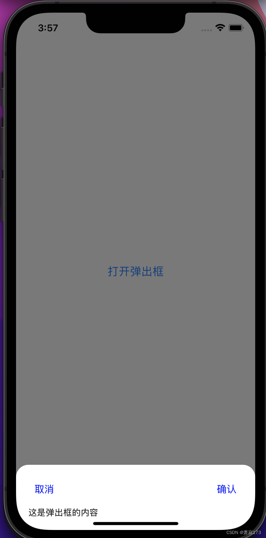
<Button title="打开弹出框" onPress={togglePopup} />
<BottomPopup
visible={isVisible}
onClose={togglePopup}
leftButtonTitle="取消"
onLeftButtonPress={handleCancelButtonPress}
rightButtonTitle="确认"
onRightButtonPress={handleConfirmButtonPress}
>
<Text>这是弹出框的内容</Text>
</BottomPopup>
</View>
);
};
export default MyComponent;
参数说明
- visible (boolean): 控制弹出框是否可见。
- onClose (function): 关闭弹出框的回调函数。
- leftButtonTitle (string): 左上按钮的标题。
- onLeftButtonPress (function): 左上按钮点击时触发的回调函数。
- rightButtonTitle (string): 右上按钮的标题。
- onRightButtonPress (function): 右上按钮点击时触发的回调函数。
效果图(点击确认或者取消或者阴影部分均可以关闭弹出框)
![[CISCN2019 华东北赛区]Web2](https://img-blog.csdnimg.cn/img_convert/9da188646ff17b2386d7b836e48a2a89.png)
![【P1328】[NOIP2014 提高组] 生活大爆炸版石头剪刀布](https://img-blog.csdnimg.cn/img_convert/cb242bcc076eb19b2e006cd6118d44a3.png)
![[Android]创建Google Play内购aab白包](https://img-blog.csdnimg.cn/direct/a1c0bdd8ed754881ad03444872c6befa.png)