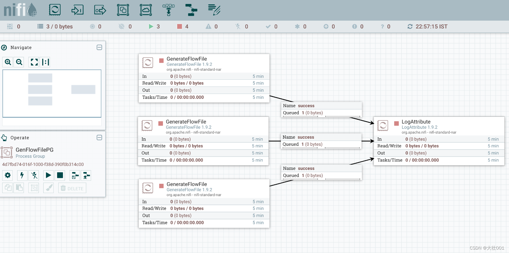
实现效果:
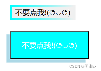
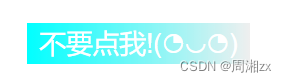
当鼠标点击按钮时:
实现代码:
<!DOCTYPE html>
<html>
	<head>
		<meta charset="utf-8">
		<title></title>
		<style>
			div{
				margin-top: 20px;
				margin-left: 20px;
			}
			.button{

				border: solid 4px transparent;
				border-image: linear-gradient(to right, aqua,transparent);
				border-image-slice: 1;
			}
			.button:active{
				color: white;
				background-image: linear-gradient(to right, aqua, transparent);
				border: none;
			}

			.button-3D{
				position: relative;
				background-color: aqua;
				color: white;
				padding: 15px 20px;
				font-size: 1.5fr;
				box-shadow: -6px 6px 0 lightblue;
			}
			.button-3D:active {
			  background: hsl(77, 100%, 40%);
			  top: 3px;
			  left: -3px;
			  box-shadow: -3px 3px 0 hsl(80, 100%, 30%);
			}
		</style>
	</head>

	<body>
		<div id="button1">
			<button class="button">不要点我!(◔◡◔)</button>
		</div>
		<div id="button2">
			<button class="button-3D">不要点我!(◔◡◔)</button>
		</div>

	</body>
</html>