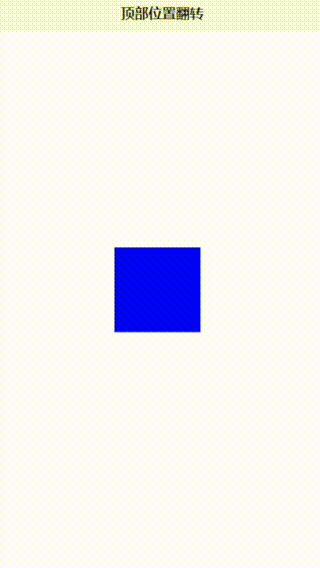
<template>
	<div class="container" @mouseenter="startAnimation" @mouseleave="stopAnimation">
		<!-- 旋方块 -->
		<div class="box" :class="{ 'rotate-hor-top': isAnimating }">
			<!-- 元素内容 -->
		</div>
	</div>
</template>

<script setup>
	import {
		onMounted,
		ref,
		watch,
		onUnmounted
	} from 'vue';

	const isAnimating = ref(false); // 控制是否应用动画的响应式状态
	function startAnimation() {
		// 鼠标进入容器时,启动动画
		isAnimating.value = true;
	}

	function stopAnimation() {
		// 鼠标离开容器时,停止动画
		isAnimating.value = false;
	}

	onMounted(() => {
		setInterval(() => {

			if(isAnimating.value == false){

			isAnimating.value = true
			}else{

			isAnimating.value = false
			}

		}, 500)
	})

	// onUnmounted(() => {
	// 	clearInterval(timer)
	// });
</script>

<style>
	.container {
		/* 定义容器宽度和高度 */
		width: 100px;
		height: 100px;
		margin-top: 250px;
		margin-left: 40%;
	}

	.box {
		/* 定义方块宽度和高度 */
		width: 100px;
		height: 100px;
		background-color: blue;
	}

.rotate-hor-top {
	-webkit-animation: rotate-hor-top 0.5s cubic-bezier(0.645, 0.045, 0.355, 1.000) both;
	        animation: rotate-hor-top 0.5s cubic-bezier(0.645, 0.045, 0.355, 1.000) both;
}

@-webkit-keyframes rotate-hor-top {
  0% {
    -webkit-transform: rotateX(0);
            transform: rotateX(0);
    -webkit-transform-origin: top;
            transform-origin: top;
  }
  100% {
    -webkit-transform: rotateX(-360deg);
            transform: rotateX(-360deg);
    -webkit-transform-origin: top;
            transform-origin: top;
  }
}
@keyframes rotate-hor-top {
  0% {
    -webkit-transform: rotateX(0);
            transform: rotateX(0);
    -webkit-transform-origin: top;
            transform-origin: top;
  }
  100% {
    -webkit-transform: rotateX(-360deg);
            transform: rotateX(-360deg);
    -webkit-transform-origin: top;
            transform-origin: top;
  }
}
</style>
教学视频地址
点击跳转教学视频


![[SDCTF 2022]jawt that down!](https://img-blog.csdnimg.cn/direct/5c3a7cc1ce954297aedc55eb8b4cf42e.png)