一、效果图
二、参数配置
1、代码示例
<t-antd-select
  v-model="selectVlaue"
  :optionSource="stepList"
  @change="selectChange"
/>
2、配置参数(Attributes)继承 a-select Attributes
| 参数 | 说明 | 类型 | 默认值 |
|---|---|---|---|
| v-model | 绑定值 | boolean / string / number/Array | - |
| mode | 设置’multiple’'tags’多选 (显示全选) | String | - |
| optionSource | 下拉数据源 | Array | - |
| width | select宽度(可以设置百分比或px) | String | 100% |
| customLabel | 是否自定义设置下拉label | String | - |
| valueKey | 传入的 option 数组中,要作为最终选择项的键值 key | String | ‘key’ |
| labelKey | 传入的 option 数组中,要作为显示项的键值名称 | String | ‘label’ |
| isShowPagination | 是否显示分页(分页不显示全选框) | Boolean | false |
| paginationOption | 分页配置项 | Object | - |
2-1、paginationOption配置参数(Attributes)继承 a-pagination Attributes
| 参数 | 说明 | 类型 | 默认值 |
|---|---|---|---|
| current | 当前页数 | number | 1 |
| pageSize | 每页显示条目个数 | number | 6 |
| total | 总条目数 | number | 0 |
| bind | 继承a-pagination属性 | Object | - |
3、继承 a-select&&a-pagination events
| 事件名 | 说明 | 返回值 |
|---|---|---|
| current-change | 当前页码 | 当前选中的页码 |
三、源码
<template>
  <div @mousedown="e => {
    e.preventDefault()
    selectOpen = true
  }" ref="main">
    <a-select
      class="t_select"
      v-model="childSelectedValue"
      :style="{width: width||'100%'}"
      :placeholder="placeholder"
      :open="selectOpen"
      @select="handleSelect"
      v-bind="attrs"
      v-on="$listeners"
      :mode="mode"
    >
      <template v-for="(index, name) in $slots" v-slot:[name]>
        <slot :name="name" />
      </template>
      <template v-for="(index, name) in $scopedSlots" v-slot:[name]="data">
        <slot :name="name" v-bind="data"></slot>
      </template>
      <div slot="dropdownRender" slot-scope="menu">
        <a-checkbox
          v-if="mode&&!isShowPagination"
          :checked="selectChecked"
          @change="selectAll"
          class="all_checkbox"
        >全选</a-checkbox>
        <v-nodes :vnodes="menu" />
        <div class="t_select__pagination" v-if="isShowPagination">
          <a-pagination
            :page-size.sync="paginationOption.pageSize"
            v-model="paginationOption.current"
            :total="paginationOption.total"
            @change="currentChange"
            v-bind="{
            size:'small',
            'hide-on-single-page':true,
            'showQuickJumper': true,
            ...$attrs,
            ...paginationOption.bind,
          }"
            v-on="$listeners"
          />
        </div>
      </div>
      <a-select-option
        v-for="(item,index) in optionSource"
        :key="index"
        :value="item[valueKey]"
      >{{customLabel?customLabelHandler(item):item[labelKey]}}</a-select-option>
    </a-select>
  </div>
</template>
<script>
export default {
  name: 'TAntdSelect',
  components: {
    VNodes: {
      functional: true,
      render: (h, ctx) => ctx.props.vnodes
    }
  },
  props: {
    value: {
      type: [String, Number, Array, Boolean, Object]
    },
    // 多选 'multiple'
    mode: {
      type: String
    },
    placeholder: {
      type: String,
      default: '请选择'
    },
    // 选择框宽度
    width: {
      type: String
    },
    // 是否自定义设置下拉label
    customLabel: {
      type: String
    },
    // 传入的option数组中,要作为最终选择项的键值key
    valueKey: {
      type: String,
      default: 'key'
    },
    // 传入的option数组中,要作为显示项的键值名称
    labelKey: {
      type: String,
      default: 'label'
    },
    // 下拉框组件数据源
    optionSource: {
      type: Array
    },
    // 是否显示分页
    isShowPagination: {
      type: Boolean,
      default: false
    },
    // 分页配置项
    paginationOption: {
      type: Object,
      default: () => {
        return {
          pageSize: 6, // 每页显示条数
          current: 1, // 当前页
          total: 0 // 总条数
        }
      }
    }
  },
  data() {
    return {
      selectOpen: false
    }
  },
  computed: {
    childSelectedValue: {
      get() {
        return this.value || undefined
      },
      set(val) {
        this.$emit('input', val)
      }
    },
    attrs() {
      return {
        allowClear: true,
        showSearch: true,
        ...this.$attrs
      }
    },
    selectChecked: {
      get() {
        return this.childSelectedValue?.length === this.optionSource?.length
      },
      set(val) {
        // console.log('set', val)
        this.$emit('input', val)
      }
    }
  },
  mounted() {
    document.addEventListener('click', this.bodyCloseMenus)
  },
  beforeDestroy() {
    document.removeEventListener('click', this.bodyCloseMenus)
  },
  methods: {
    // 点击空白区域
    bodyCloseMenus(e) {
      if (this.$refs.main && !this.$refs.main.contains(e.target)) {
        if (this.selectOpen == true) {
          this.selectOpen = false
        }
      }
    },
    // 点击全选
    selectAll(val) {
      const options = JSON.parse(JSON.stringify(this.optionSource))
      if (val.target.checked) {
        this.childSelectedValue = options?.map(item => {
          return item[this.valueKey]
        })
        setTimeout(() => {
          this.$emit('change', this.childSelectedValue)
        }, 0)
      } else {
        this.childSelectedValue = null
      }
      this.selectOpen = false
    },
    handleSelect(value, option) {
      if (value) {
        this.selectOpen = false
      }
      this.$emit('select', value, option)
    },
    // 切换分页
    currentChange(val) {
      // console.log('切换分页', val)
      if (!this.mode) {
        this.childSelectedValue = null
      }
      setTimeout(() => {
        this.selectOpen = true
      }, 0)
      this.$emit('current-change', val)
    },
    // 自定义label显示
    customLabelHandler(item) {
      // eslint-disable-next-line no-eval
      return eval(this.customLabel)
    }
  }
}
</script>
<style lang="scss">
.all_checkbox {
  margin-left: 12px;
  margin-top: 5px;
}
</style>
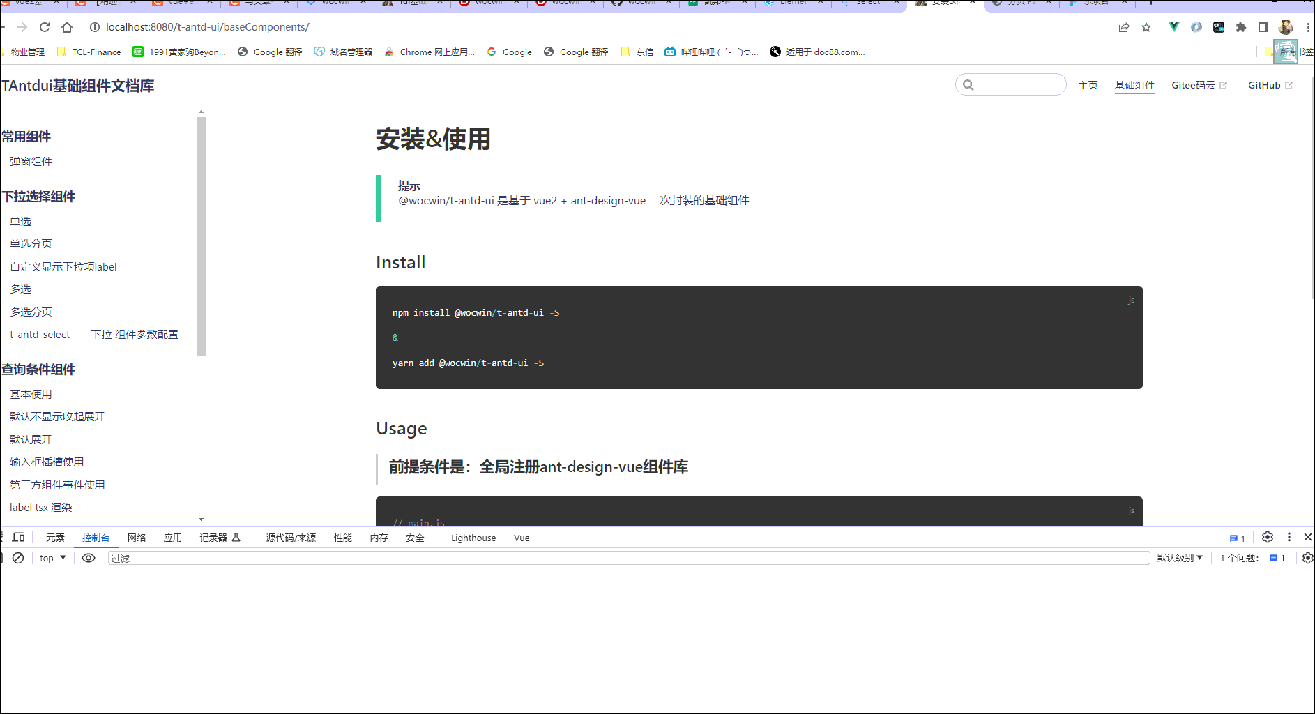
四、组件地址
gitHub组件地址
gitee码云组件地址
五、相关文章
基于ElementUi再次封装基础组件文档
基于ant-design-vue再次封装基础组件文档
vue3+ts基于Element-plus再次封装基础组件文档