制作包含logo、菜单、按钮的3分离布局菜单
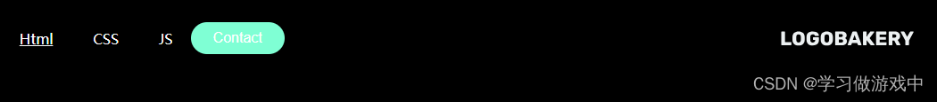
完成效果

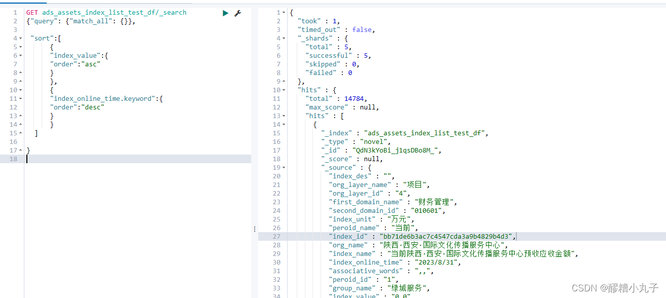
准备html
<!DOCTYPE html>
<html lang="en">
<head>
    <meta charset="UTF-8">
    <meta name="viewport" content="width=device-width, initial-scale=1.0">
    <title>Document</title>
    <link rel="stylesheet" href="style.css">
</head>
<body>
    <header>
        <img src="./logo.svg" alt="logo" class="logo">
        <nav>
            <ul class="nav_links">
                <li><a href="#">Html</a></li>
                <li><a href="#">CSS</a></li>
                <li><a href="#">JS</a></li>
            </ul>
        </nav>
        <a href="#"><button>Contact</button></a>
    </header>
</body>
</html>
编写css
*{
    box-sizing: border-box;
    margin: 0px;
    padding: 0px;
    background-color: black;
}
li,a,button{
    font-weight: 500;
    font-size: 16px;
    color: white;
    text-decoration: none;
}
header{
    display: flex;
    justify-content: space-between;
    align-items: center;
    padding: 30px 10%;
}
.logo{
    cursor: pointer;
}
.nav_links{
    list-style: none;
}
.nav_links li{
    display: inline-block;
    padding: 0px 20px;
}
.nav_links li:nth-child(1){
    text-decoration: underline;
}
.nav_links li a{
    transition: all .3s ease 0s;
}
.nav_links li a:hover{
    color: aquamarine;
}
button{
    padding: 9px 25px;
    background-color: aquamarine;
    border: none;
    border-radius: 50px;
    cursor: pointer;
    transition: all .3s ease 0s;
}
button:hover{
    background-color: rgba(127, 255, 212, .8);
}
补充
flex中的元素,可通过order配置顺序,数字越大,越靠后
margin-left: auto; 可控制所占位置,把左边的挤过去
在.logo中添加
order: 3;
margin-left: auto;
变为