这里写目录标题
- 前言
- 组件
- 选择器视图
- 选择器
- 组件使用示例
- 注意事项
- 扩展
前言
基于 Vant的checkbox配合popup和input定制选择器 实现一个React的版本
组件库:antd mobile
适用:移动端
UI如下:
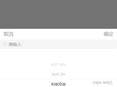
功能点:
- 选择器在弹出层内,取消隐藏,确定带回选项
- 选项展示数据可动态自定义,选项带出数据可动态自定义
- 输入框动态展示
- 输入框分为两个功能:过滤和远程搜索
- 已选项定位到其位置(当选了第三个数据,再打开弹窗时,列表定位到第三个数据)
组件
选择器视图
import {PickerView} from "antd-mobile";
import React from "react";

const Select = (props) => {
    const {showOptions, value, setValue} = props;
    return <PickerView
        columns={showOptions}
        value={value}
        onChange={val => {
            setValue(val)
        }}
    />
}
Select.propTypes = {
    showOptions: propTypes.array, //选择器列表数据
    value: propTypes.oneOfType([
        propTypes.string,
        propTypes.number,
        propTypes.object, //指定为多种类型的一种
    ]),
    setValue: propTypes.func,
};
Select.defaultProps = {
    showOptions: [],
};

export default React.memo(Select);
选择器
import React, {memo, useCallback, useEffect, useMemo, useState} from "react";
import {Button, SearchBar, PickerView, Popup} from "antd-mobile";
import propTypes from "prop-types";
import "./index.scss";
import Select from "./select";


function Filter(props) {
    const {
        placeholder,
        filterable,
        remote,
        defaultValue,
        showPicker = true,
        setShowPicker,
    } = props;
    const [searchText, setSearchText] = useState("");
    const [value, setValue] = useState([]);

    useEffect(() => {
        setValue([defaultValue]);
    }, [defaultValue]);
    /**
     * 根据是否可过滤来获取下拉列表
     * 依据为输入框是否有值
     * 由于showOptions要求是二维数组,所以返回值包了一层
     */
    const showOptions = useMemo(() => {
        if (!searchText) {
            return [props.children.slice(0)];
        } else if (filterable && !remote) {
            return [props.children.filter((item) => item.label.indexOf(searchText) > -1)] || []
        }
    }, [props.children, searchText])
    /**
     * 当输入框值发生改变时,判断是远程搜索,还是内部过滤
     */
    const searchValue = (val) => {
        setSearchText(val)
        if (remote) {
            props.search(val);
        }
    };
    /**
     * 提交值:选了数据才触发事件,否则仅关闭弹出层
     */
    const onConfirm = () => {
        if (value) {
            props.confirm(value[0]); //由于value是数组,所以默认取索引0的值
            setSearchText("");
        }
        setShowPicker(false);
    };
    return (
        <>
            <Popup
                visible={showPicker}
                position="bottom"
                bodyStyle={{width: "100vw", height: "50vw"}}
            >
                <div className="flex-side">
                    <Button
                        color="primary"
                        fill="none"
                        onClick={() => setShowPicker(false)}
                        style={{
                            '--text-color': '#969799'
                        }}
                    >
                        取消
                    </Button>
                    <Button color="primary" fill="none" onClick={() => onConfirm()}
                            style={{
                                '--text-color': '#969799'
                            }}>
                        确定
                    </Button>
                </div>
                {(remote || filterable) && (
                    <SearchBar
                        placeholder={placeholder}
                        value={searchText}
                        onChange={(val) => searchValue(val)}
                        className="filter-input"
                        clearable
                    />
                )}
                <Select
                    showOptions={showOptions}
                    setValue={setValue}
                    value={value}
                ></Select>
            </Popup>
        </>
    );
}

Filter.propTypes = {
     filterable: propTypes.bool,//数据过滤标识
    remote: propTypes.bool, //远程搜索标识,默认为false
    search: propTypes.func, //远程搜索事件函数
    showPicker: propTypes.bool, //弹窗展示
    defaultValue: propTypes.oneOfType([ //默认选项
        propTypes.string,
        propTypes.number,
        propTypes.object, //指定为多种类型的一种
    ])
};
Filter.defaultProps = {
    filterable: false,
    remote: false,
    showPicker: true,
    defaultValue: null
};
export default React.memo(Filter);
组件使用示例
<div className="comment-eml-info" onClick={() => openPicker()}></div>
{showPicker &&
            <Filter setShowPicker={setShowPicker} placeholder={'请输入'} filterable={true} defaultValue={defaultValue}
                    label="name" search-value="item" confirm={confirm}>
                {
                    recipients.map(item => ({
                        ...item,
                        label: item.name,
                        value: item
                    }))
                }
            </Filter>}


const openPicker = () => {
    setShowPicker(true);
};
const confirm= (item) => {
    setDefaultValue(item)
    setShowPicker(false)
    arr.push(item);
    setData(arr);
};
注意事项
pickerView组件绑定的columns是二维数组,value是一维数组,在做数据时需小心数据类型
当value值传的是对象时,组件底层会由于key值报错,这个还没解决
扩展
这里的pickerView只能做单选,可以使用<CheckList />做成单选+多选