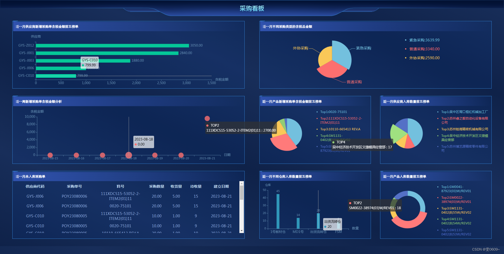
效果如图
此图只实现 左下与右下边角样式
右上与左上同理
/*  容器 */
.card-mini {
  position: relative;
}
/*  左下*/
.card-mini::before {
  content: '';
  position: absolute;
  left: 0;
  bottom: 0;
  width: 20px;
  height: 20px;
  border-bottom: 2px solid #253d64;
  border-left: 2px solid #253d64;
  border-bottom-left-radius: 10px;
}
/*  右下*/
.card-mini::after {
  content: '';
  position: absolute;
  right: 0;
  bottom: 0;
  width: 20px;
  height: 20px;
  border-bottom: 2px solid #253d64;
  border-right: 2px solid #253d64;
  border-bottom-right-radius: 10px;
}
右上与左上 将上面的bottom改为top
.card-mini::before {
  content: '';
  position: absolute;
  left: 0;
  top: 0;
  width: 20px;
  height: 20px;
  border-top: 2px solid #253d64;
  border-left: 2px solid #253d64;
  border-top-left-radius: 10px;
}
.card-mini::after {
  content: '';
  position: absolute;
  right: 0;
  top: 0;
  width: 20px;
  height: 20px;
  border-top: 2px solid #253d64;
  border-right: 2px solid #253d64;
  border-top-right-radius: 10px;
}

![[保研/考研机试] KY124 二叉搜索树 浙江大学复试上机题 C++实现](https://img-blog.csdnimg.cn/597052c09e38465a885e775ff4caafeb.png)