WPF(Windows Presentation Foundation)是一个用于构建 Windows 应用程序的框架,它提供了丰富的控件和布局方式,帮助开发者快速构建出现代化的应用程序。
WPF常用控件
-
Button 控件 WPF 中最常用的控件之一。它由一个文本标签和一个可选图像定义。
<Button Content="Click Me!" /> <Button Content="Save" ImageSource="/Images/save.png" /> - Label 控件用于显示文本,它通常用于标识其他控件。
<Label Content="Username:" /> - TextBox 控件允许用户输入文本。
<TextBox /> - PasswordBox控件用于输入密码,它不会显示输入的字符。
<PasswordBox /> - CheckBox控件允许用户选择是否选中一个选项。它通常用于开关选项。
<CheckBox Content="I agree to the terms and conditions." /> - RadioButton 控件用于选择一组互斥的选项。只有一个选项可以被选中。
<RadioButton Content="Male" GroupName="gender" /> <RadioButton Content="Female" GroupName="gender" /> - ComboBox控件允许用户从一个下拉列表中选择一个选项。
<ComboBox> <ComboBoxItem Content="Red" /> <ComboBoxItem Content="Green" /> <ComboBoxItem Content="Blue" /> </ComboBox> - ListBox控件用于显示一个列出的项目,用户可以从中选择一个或多个。
<ListBox> <ListBoxItem Content="Item 1" /> <ListBoxItem Content="Item 2" /> <ListBoxItem Content="Item 3" /> </ListBox> - TabControl 标签页控件
<Window x:Class="WpfApp1.MainWindow" xmlns="http://schemas.microsoft.com/winfx/2006/xaml/presentation" xmlns:x="http://schemas.microsoft.com/winfx/2006/xaml" xmlns:d="http://schemas.microsoft.com/expression/blend/2008" xmlns:mc="http://schemas.openxmlformats.org/markup-compatibility/2006" xmlns:local="clr-namespace:WpfApp1" xmlns:sys="clr-namespace:WpfApp1.UserControls.TestControl;assembly=WpfApp1.UserControls" mc:Ignorable="d" Title="MainWindow" Height="450" Width="800"> <Grid> <TabControl SelectedIndex="1"> <TabItem Header="测试页"> <sys:TestControl /> </TabItem> <TabItem Header="测试页2"> <sys:TestControl /> </TabItem> </TabControl> </Grid> </Window> - UserControl 用户控件
<UserControl x:Class="WpfApp1.UserControls.TestControl"
             xmlns="http://schemas.microsoft.com/winfx/2006/xaml/presentation"
             xmlns:x="http://schemas.microsoft.com/winfx/2006/xaml"
             xmlns:mc="http://schemas.openxmlformats.org/markup-compatibility/2006"
             xmlns:d="http://schemas.microsoft.com/expression/blend/2008"
             xmlns:local="clr-namespace:MES.Client.Test.UserControls"
             mc:Ignorable="d"
             d:DesignHeight="450" d:DesignWidth="800">
    <Grid>

    </Grid>
</UserControl>
注意:TabControl 标签页控件中TabItem 为对应用户控件,sys为引用命名空间名称,TestControl指向具体用户控件

WPF布局面板:
-
栅格布局(Grid) :栅格布局是 WPF 中最灵活和最强大的布局方式之一。它允许你将 UI 元素划分为行和列,并在每个单元格中放置 UI 元素。
-
堆叠布局(StackPanel):堆叠布局是一种简单的布局方式,它按照水平或垂直顺序将 UI 元素堆叠在一起。可以使用 Orientation 属性来控制堆叠的方向。
-
流式布局(WrapPanel):流式布局是一种自适应的布局方式,它按照水平或垂直顺序将 UI 元素排列在一行或一列中,当元素无法全部显示在行或列中时,它们将自动换行。
-
均匀布局(UniformGrid):均匀布局将 UI 元素均匀分布在一个网格中。可以使用 Rows 和 Columns 属性来控制行数和列数。
-
DockPanel(停靠面板) - 它允许你将 UI 元素放置在容器的上、下、左、右或中心位置。
-
Canvas(画布) - 可以将控件按照绝对位置进行放置,常用于绘制图形或自定义布局。
常用布局演示代码
<Window x:Class="WpfApp1.MainWindow"
xmlns="http://schemas.microsoft.com/winfx/2006/xaml/presentation"
xmlns:x="http://schemas.microsoft.com/winfx/2006/xaml"
xmlns:d="http://schemas.microsoft.com/expression/blend/2008"
xmlns:mc="http://schemas.openxmlformats.org/markup-compatibility/2006"
xmlns:local="clr-namespace:WpfApp1"
mc:Ignorable="d"
Title="MainWindow" Height="450" Width="800">
<Grid>
<Grid>
<Grid.RowDefinitions>
<!--①:绝对尺寸
<RowDefinition Height="161" />
②:自动尺寸
<RowDefinition Height="auto" />
③:按比例尺寸
<RowDefinition Height="*" />-->
<RowDefinition Height="*" />
<RowDefinition Height="*" />
<RowDefinition Height="*" />
<RowDefinition Height="*" />
<RowDefinition Height="*" />
<RowDefinition Height="*" />
</Grid.RowDefinitions>
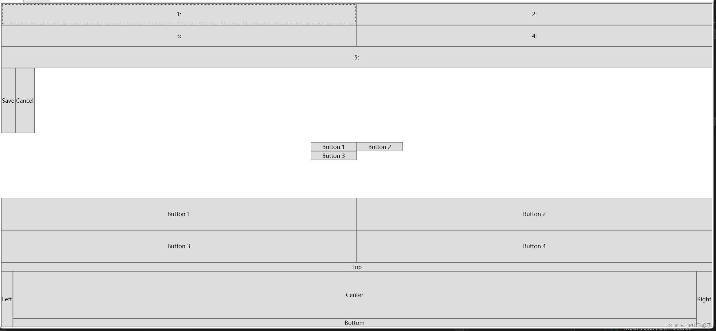
<!--栅格布局:栅格布局是 WPF 中最灵活和最强大的布局方式之一。它允许你将 UI 元素划分为行和列,并在每个单元格中放置 UI 元素-->
<Grid Grid.Row="0">
<Grid.RowDefinitions>
<RowDefinition Height="*" />
<RowDefinition Height="*" />
<RowDefinition Height="*" />
</Grid.RowDefinitions>
<Grid.ColumnDefinitions>
<ColumnDefinition Width="*" />
<ColumnDefinition Width="*" />
</Grid.ColumnDefinitions>
<Button Grid.Row="0" Grid.Column="0" Content="1:" />
<Button Grid.Row="0" Grid.Column="1" Content="2:" />
<Button Grid.Row="1" Grid.Column="0" Content="3:" />
<Button Grid.Row="1" Grid.Column="1" Content="4:" />
<Button Grid.Row="2" Grid.Column="0" Grid.ColumnSpan="2" Content="5:"/>
</Grid>
<!--堆叠布局(StackPanel):堆叠布局是一种简单的布局方式,它按照水平或垂直顺序将 UI 元素堆叠在一起。可以使用 Orientation 属性来控制堆叠的方向-->
<StackPanel Grid.Row="1" Orientation="Horizontal">
<Button Content="Save" />
<Button Content="Cancel" />
</StackPanel>
<!--流式布局(WrapPanel):流式布局是一种自适应的布局方式,它按照水平或垂直顺序将 UI 元素排列在一行或一列中,当元素无法全部显示在行或列中时,它们将自动换行-->
<WrapPanel Grid.Row="2" Width="200" Height="100">
<Button Content="Button 1" Width="100"/>
<Button Content="Button 2" Width="100" />
<Button Content="Button 3" Width="100" />
</WrapPanel>
<!--均匀布局(UniformGrid):均匀布局将 UI 元素均匀分布在一个网格中。可以使用 Rows 和 Columns 属性来控制行数和列数-->
<UniformGrid Grid.Row="3" Rows="2" Columns="2" >
<Button Content="Button 1" />
<Button Content="Button 2" />
<Button Content="Button 3" />
<Button Content="Button 4" />
</UniformGrid>
<!--DockPanel:DockPanel 是一种布局方式,它允许你将 UI 元素放置在容器的上、下、左、右或中心位置-->
<DockPanel Grid.Row="4" >
<Button DockPanel.Dock="Top" Content="Top" />
<Button DockPanel.Dock="Left" Content="Left" />
<Button DockPanel.Dock="Right" Content="Right" />
<Button DockPanel.Dock="Bottom" Content="Bottom" />
<Button Content="Center" />
</DockPanel>
<!--Canvas(画布) - 可以将控件按照绝对位置进行放置,常用于绘制图形或自定义布局-->
<Canvas Grid.Row="5" >
<Button Canvas.Left="10" Canvas.Top="10" Content="Button 1" />
<Button Canvas.Left="50" Canvas.Top="20" Content="Button 2" />
<Button Canvas.Left="90" Canvas.Top="30" Content="Button 3" />
</Canvas>
</Grid>
</Grid>
</Window>
演示效果:
总结
WPF 提供了大量的控件和布局方式,可以帮助快速构建应用程序。在选择控件和布局方式时,需要根据具体的需求进行选择。