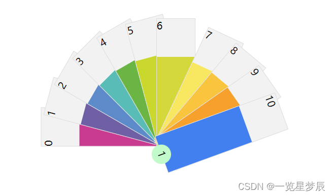
vue3实现扇形展示
效果

html部分
<div class="box1">
	<div class="box">
			<div class="single" v-for="(item,index) in arr" :key="index"
			     :style="'transform:rotate('+angle[index]+'deg);transform-origin: 10px 192px;transition-duration:1s'"
			     @click="singleClick(index)">
				<div style="height: 30%;">{{ item.id }}</div>
				<div :style="'height: 70%;background-color:'+item.color"></div>
			</div>
			<div class="button" @click="btn"
			     :style="'transform:rotate('+angle[10]+'deg);transform-origin: -5px 8px;transition-duration:1s'">1
				</div>
			<div>
		</div>
	</div>
</div>
js部分
import {reactive, ref} from 'vue'

const angle = reactive(Array(10).fill(''))

const qw = ref(0)
const flag = ref(true)
const arr = reactive([
    {id: 0, color: '#c93b91'},
    {id: 1, color: '#6f60a5'},
    {id: 2, color: '#5d8bc9'},
    {id: 3, color: '#59bcb6'},
    {id: 4, color: '#6bb544'},
    {id: 5, color: '#cad82e'},
    {id: 6, color: '#d5d83b'},
    {id: 7, color: '#f8e761'},
    {id: 8, color: '#f9c43e'},
    {id: 9, color: '#f5a12b'},
    {id: 10, color: '#4280f0'},
])
const btn = () => {
    if (flag.value) {
        for (let i = -90; i < 75; i += 15) {
            angle[qw.value] = i
            qw.value++
        }
        qw.value = 0
        flag.value = !flag.value
    } else {
        flag.value = !flag.value
        for (let i = 0; i <= 10; i++) {
            angle[i] = ''
        }
    }
}
const singleClick = (e) => {
    color.value = 0
    if (e === 10) {
        btn()
        return
    }
    if (flag.value === false) {
        const timer = ref()
        timer.value = setInterval(() => {
            color.value += 0.1
            if (color.value >= 1) {
                clearInterval(timer.value)
            }
        }, 100)
        angle[e] = 0
        for (let i = e; i >= 0; i--) {
            angle[i] = -(e - i) * 15
        }
        for (let i = e; i <= 10; i++) {
            angle[i + 1] = (i - e) * 15 + 25
        }
    }
}
const color = ref(0)
css部分
.search {
  width: 10px;
  height: 10px;
  border-radius: 50%;
  border: 1px solid #eee;
}
.button {
  width: 30px;
  height: 30px;
  position: absolute;
  background-color: #c2facc;
  border-radius: 50%;
  text-align: center;
  bottom: -15px;
  left: 13px;
  line-height: 30px;
  cursor: pointer;
}

.box1 {
  width: 1200px;
  margin: 100px auto;
  display: flex;
  justify-content: center;
}

.box {
  width: 300px;
  height: 200px;
  position: relative;

  .single {
    width: 60px;
    height: 200px;
    background-color: #f2f2f2;
    position: absolute;
    border: 1px solid #ddd;
  }
}

.btn {
  margin-left: 100px;
}