通过这个实例我们主要是掌握如下知识点
- 灵活使用 CSS 变量
- 使用 JS 获取 CSS 变量
- 灵活使用 CSS 的
transform和transition属性
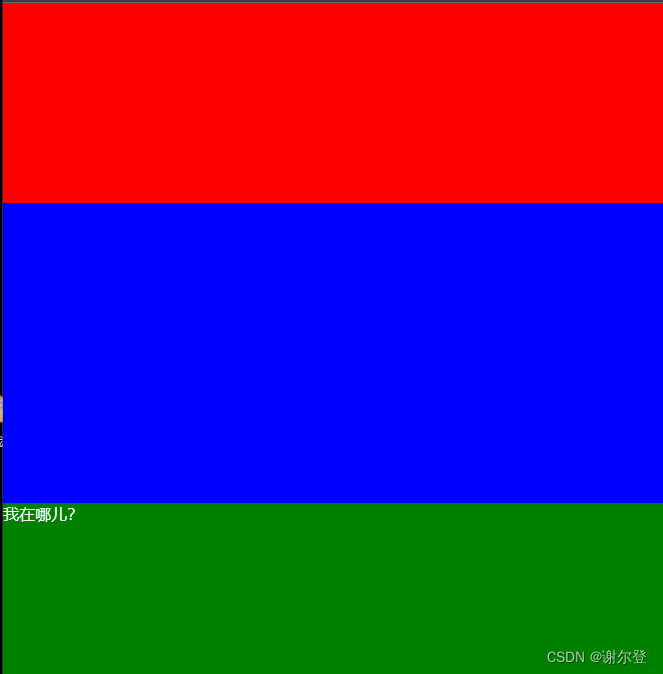
效果图


实现页面布局
从效果图我们首先可以实现页面的大致布局,具体的代码如下:
<h2 class="main-title">主题切换</h2>
<button class="theme-switch-btn">
  <svg class="icon" viewBox="0 0 1024 1024" width="24" height="24">
    <path></path>
  </svg>
  切换主题
</button>
<div class="sun-moon-container">
  <!-- 太阳 -->
  <svg class="sun" viewBox="0 0 1024 1024" width="24" height="24">
    <path></path>
  </svg>

  <!-- 月亮 -->
  <svg class="moon" viewBox="0 0 1024 1024" width="24" height="24">
    <path></path>
  </svg>
</div>
body {
  --accent-color: orangered;
  --background-color: white;
  --text-color: black;
  --button-text-color: var(--background-color);
  --transition-delay: 1s;

  display: flex;
  flex-direction: column;
  justify-content: center;
  align-items: center;
  height: 100vh;
  margin: 0;

  background-color: var(--background-color);
  color: var(--text-color);
}
body.dark {
  --accent-color: #d0d066;
  --background-color: #333;
  --text-color: white;
}

.main-title {
  margin: 0;
  margin-bottom: 25px;
}

.theme-switch-btn {
  background-color: var(--accent-color);
  color: var(--button-text-color);

  display: flex;
  flex-flow: row wrap;
  justify-content: center;
  align-items: center;
  padding: 8px 24px;
  border-radius: 6px;
  border: none;
  outline: none;
  cursor: pointer;
  font-size: 16px;
}
实现上述的代码后效果如下:

为按钮绑定事件
document.querySelector(".theme-switch-btn").addEventListener("click", () => {
  document.body.classList.toggle("dark");
});
为切换按钮绑定事件后,我们就可以在深色主题和浅色主题之间进行切换。但是我们的页面没有动画效果。
为按钮添加放大缩小的动画
.theme-switch-btn类添加如下代码:
transition: var(--transition-delay);
transform: scale(1);
太阳和月亮图标添加对应样式
太阳和月亮图标在切换主题的时候会有旋转的动画,所以我们先把太阳和月亮进行绝对定位。
.sun-moon-container {
  display: flex;
  justify-content: center;
  align-items: center;
  position: absolute;
  pointer-events: none;
  height: 200vmin;
  top: 0;
}
.sun,
.moon {
  position: absolute;
}
.sun {
  top: 5%;
}

.dark .sun {
  opacity: 0;
}

.moon {
  bottom: 5%;
  opacity: 1;
}

.dark .moon {
  opacity: 1;
}
重新设置太阳和月亮的透明度以及动画
.sun-moon-container {
  --rotation: 0;

  display: flex;
  justify-content: center;
  align-items: center;
  position: absolute;
  pointer-events: none;
  height: 200vmin;
  top: 0;
  transform: rotate(var(--rotation));
  transition: transform var(--transition-delay);
}

.dark .sun-moon-container {
  --rotation: 180deg;
}

.sun,
.moon {
  position: absolute;
  transition: opacity, fill, var(--transition-delay);
  width: 30px;
  height: 30px;
  fill: var(--accent-color);
}
.moon {
  bottom: 5%;
  opacity: 1;
  transform: rotate(180deg);
}
完成上述代码后,我们的主题切换动画效果基本已经实现,但是太阳和月亮都是左右进行切换,效果并不是很好,所以我们可以添加 JS 来辅助修改切换的动画。
使用getComputedStyle获取 CSS 变量并重新设置值
首先需要修改太阳和月亮容器的对应样式
.sun-moon-container {
  --rotation: 0;

  display: flex;
  justify-content: center;
  align-items: center;
  position: absolute;
  pointer-events: none;
  height: 200vmin;
  top: 0;
  transform: rotate(calc(var(--rotation) * 1deg));
  transition: transform var(--transition-delay);
}

/* 当初始化为黑暗主题时有一个初始值 */
.dark .sun-moon-container {
  --rotation: 0;
}
const sunMonnContainer = document.querySelector(".sun-moon-container");

document.querySelector(".theme-switch-btn").addEventListener("click", () => {
  document.body.classList.toggle("dark");

  const currentTotation = parseInt(
    getComputedStyle(sunMonnContainer).getPropertyValue("--rotation")
  );

  // 在旋转后的角度上在加上180度作为下次动画的旋转角度
  sunMonnContainer.style.setProperty("--rotation", currentTotation + 180);
});
完整代码
完整代码示例下载


![[HDBits] Exams/m2014 q4h](https://img-blog.csdnimg.cn/img_convert/62d78d13e41875f7ecba29f0b2475fd7.png)