最近在开发项目的时候,定制了一个公司内部样式的Modal模态框组件。
Modal组件伪代码
<!-- Modal/index.vue-->
<template>
<div class="modal-container" id="modalContainer">
<!-- Modal Content -->
<div class="modal-content">
<!-- Close Button -->
<span class="modal-close" @click="props.cancel">×</span>
<!-- Modal Header -->
<div class="modal-header">{{ props.title }}</div>
<!-- Modal Body -->
<div class="modal-body">
<p>{{ props.content }}</p>
</div>
<!-- Modal Footer -->
<div class="modal-footer">
<button class="button secondary" @click="props.cancel">{{ props.cancelButtonText }}</button>
<button class="button primary" @click="props.confirm">{{ props.confirmButtonText }}</button>
</div>
</div>
</div>
</template>
<script setup name="Modal">
const props = defineProps({
title: {
type: String,
default: 'Modal Title',
},
content: {
type: String,
default: 'This is the modal content.',
},
confirmButtonText: {
type: String,
default: 'Confirm',
},
cancelButtonText: {
type: String,
default: 'Cancel',
},
confirm: {
type: Function,
default: () => {},
},
cancel: {
type: Function,
default: () => {},
},
})
</script>
<style scoped>
.modal-container {
position: fixed;
top: 0;
left: 0;
width: 100%;
height: 100%;
background-color: rgba(0, 0, 0, 0.5);
z-index: 999;
}
/* Styles for the modal content */
.modal-content {
position: absolute;
top: 50%;
left: 50%;
transform: translate(-50%, -50%);
background-color: #fff;
padding: 20px;
border-radius: 4px;
box-shadow: 0 2px 6px rgba(0, 0, 0, 0.2);
width: 300px;
}
/* Styles for the close button */
.modal-close {
position: absolute;
top: 10px;
right: 10px;
cursor: pointer;
}
/* Styles for the modal header */
.modal-header {
font-weight: bold;
margin-bottom: 10px;
}
/* Styles for the modal body */
.modal-body {
margin-bottom: 20px;
}
/* Styles for the modal footer */
.modal-footer {
text-align: right;
}
/* Example styles for buttons */
.button {
padding: 8px 16px;
border: none;
border-radius: 4px;
cursor: pointer;
}
.primary {
background-color: #1890ff;
color: #fff;
}
.secondary {
background-color: #ccc;
}
</style>
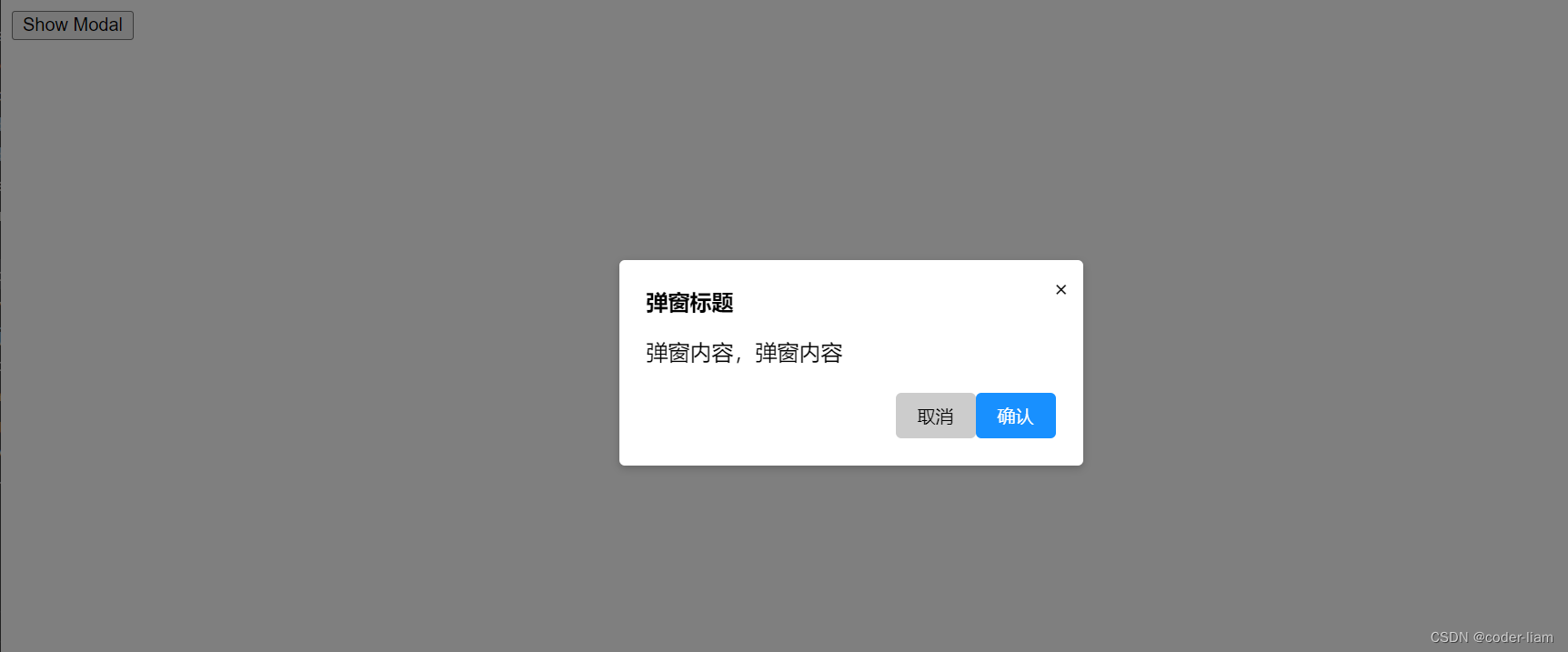
使用组件
<template>
 <button @click="toggleModal">Show Modal</button>
  <Modal v-if="modalVisible" v-bind="modalProps"></Modal>
</template>

<script setup>
  import { ref } from 'vue'
  import Modal from '../components/Modal/index.vue'

  const modalProps = {
    title: '弹窗标题',
    content: '弹窗内容,弹窗内容',
    confirmButtonText: '确认',
    cancelButtonText: '取消',
    confirm() {
      console.log('confirm')
      toggleModal()
    },
    cancel() {
      console.log('cancel')
      toggleModal()
    }
  }
  const modalVisible = ref(false)

  function toggleModal() {
    modalVisible.value = !modalVisible.value
  }
</script>
调用成功
改造支持函数形式调用
由于使用频率很高,每次都引入组件再使用略显麻烦,于是决定改造一下,支持函数调用该
Modal组件
- 新建js文件,导入
Modal.vue(单文件组件实际上是一个JS对象) - 使用vue提供的
createApp实例化Modal.vue组件,第一个参数是组件,第二个参数是传递给组件的props - 创建一个div标签并插入body,调用modal实例下的
mount方法挂载到div上。 - 销毁Modal:调用
unmount方法并移除div元素
// Modal/index.js
import { createApp } from 'vue'
import Modal from './index.vue'

export function showModal(props = {}) {
  // 创建一个div并插入body
  const div = document.createElement('div')
  document.body.appendChild(div)

  // 创建一个modal实例
  const modal = createApp(Modal, {
    ...props,
    // 劫持取消事件,卸载组件
    cancel() {
      props.cancel()
      unMount()
    },
    // 劫持确认事件,卸载组件
    confirm() {
      props.confirm()
      unMount()
    }
  })
  // 挂载到div上
  modal.mount(div)

  // 卸载组件
  function unMount() {
    modal.unmount()
    div.remove()
  }
}
函数式调用
<template>
  <div>函数式调用:<button @click="handleClick">Show Modal</button></div>
</template>

<script setup name="FunctionComponent">
  import { showModal } from '../components/Modal';

  const modalProps = {
    title: '弹窗标题',
    content: '弹窗内容,弹窗内容',
    confirmButtonText: '确认',
    cancelButtonText: '取消',
    confirm() {
      console.log('confirm')
    },
    cancel() {
      console.log('cancel')
    }
  }

  // 函数式调用
  function handleClick() {
    showModal(modalProps)
  }
</script>