APIs
| 参数 | 说明 | 类型 | 默认值 | 必传 |
|---|---|---|---|---|
| color | 自定义小圆点的颜色 | string | ‘’ | false |
| count | 展示的数字,大于 overflowCount 时显示为 overflowCount+,为 0 时隐藏 | number | slot | 0 | false |
| overflowCount | 展示封顶的数字值 | number | 99 | false |
| showZero | 当数值为 0 时,是否展示 Badge | boolean | false | false |
| dot | 不展示数字,只有一个小红点 | boolean | false | false |
| status | 设置 Badge 为状态点 | ‘success’ | 'processing | ‘default’ | ‘error’ | ‘warn’ | undefined | false |
| text | 在设置了 status 的前提下有效,设置状态点的文本 | string | slot | ‘’ | false |
| numberStyle | 设置状态点的样式 | CSSProperties | {} | false |
| title | 设置鼠标放在状态点上时显示的文字 | string | ‘’ | false |
| ripple | 是否开启涟漪动画效果 | boolean | true | false |
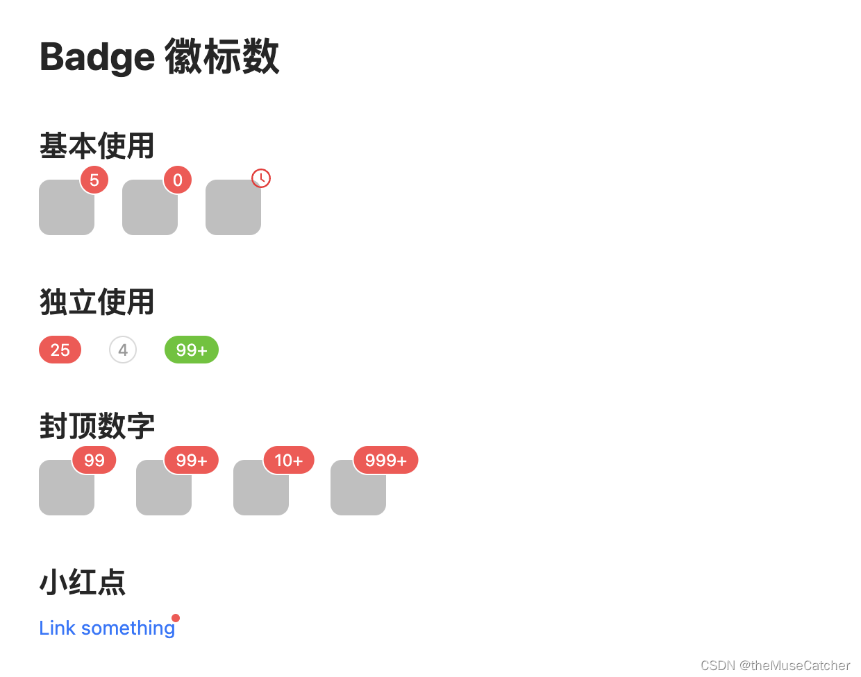
效果如下图:在线预览
创建徽标数组件Badge.vue
<script setup lang="ts">
import type { CSSProperties } from 'vue'
import { ref, computed, onMounted } from 'vue'
enum Status {
  success = 'success',
  process = 'processing',
  default = 'default',
  error = 'error',
  warn = 'warn'
}
interface Props {
  color?: string // 自定义小圆点的颜色
  count?: number // 展示的数字,大于 overflowCount 时显示为 overflowCount+,为 0 时隐藏;number | slot
  overflowCount?: number // 展示封顶的数字值
  showZero?: boolean // 当数值为 0 时,是否展示 Badge
  dot?: boolean // 不展示数字,只有一个小红点
  status?: Status // 设置 Badge 为状态点
  text?: string // 在设置了 status 的前提下有效,设置状态点的文本 string | slot
  numberStyle?: CSSProperties // 设置状态点的样式
  title?: string // 设置鼠标放在状态点上时显示的文字
  ripple?: boolean // 是否开启涟漪动画效果
}
const props = withDefaults(defineProps<Props>(), {
  color: '',
  count: 0,
  overflowCount: 99,
  showZero: false,
  dot: false,
  status: undefined,
  text: '',
  numberStyle: () => ({}),
  title: '',
  ripple: true
})
const presetColor = ['pink', 'red', 'yellow', 'orange', 'cyan', 'green', 'blue', 'purple', 'geekblue', 'magenta', 'volcano', 'gold', 'lime']
const customStyle = computed(() => {
  if (props.color && !presetColor.includes(props.color)) {
    return {
      color: props.color,
      backgroundColor: props.color
    }
  }
})
const contentRef = ref()
const showContent = ref(1)
const countRef = ref()
const showCount = ref(1)
onMounted(() => {
  if (!props.status && !props.color) {
    showContent.value = contentRef.value.offsetHeight
    showCount.value = countRef.value.offsetHeight
  }
})
</script>
<template>
  <div class="m-badge" :class="{'badge-status': status}">
    <template v-if="status||color">
      <span class="u-status-dot" :class="[`status-${status||color}`, {'dot-ripple': ripple}]" :style="customStyle"></span>
      <span class="u-status-text">
        <slot>{{ text }}</slot>
      </span>
    </template>
    <template v-else>
      <span ref="contentRef" v-if="showContent">
        <slot></slot>
      </span>
      <span
        ref="countRef"
        v-if="showCount"
        class="m-count"
        :class="{'only-number': !showContent}">
        <slot name="count"></slot>
      </span>
      <Transition name="zoom" v-else>
        <div
          v-show="showZero || count !== 0 || dot"
          class="m-badge-count"
          :class="{'small-num': count < 10, 'only-number': !showContent, 'only-dot': count === 0 && !showZero}"
          :style="numberStyle"
          :title="title || String(count)">
          <span v-if="!dot" class="m-number" style="transition: none 0s ease 0s;">
            <span class="u-number">{{ count > overflowCount ? overflowCount + '+' : count }}</span>
          </span>
        </div>
      </Transition>
    </template>
  </div>
</template>
<style lang="less" scoped>
.zoom-enter-active {
  animation: zoomBadgeIn .3s cubic-bezier(0.12, 0.4, 0.29, 1.46);
  animation-fill-mode: both;
}
.zoom-leave-active {
  animation: zoomBadgeOut .3s cubic-bezier(0.12, 0.4, 0.29, 1.46);
  animation-fill-mode: both;
}
@keyframes zoomBadgeIn {
  0% {
    transform: scale(0) translate(50%, -50%);
    opacity: 0;
  }
  100% {
    transform: scale(1) translate(50%, -50%);
  }
}
@keyframes zoomBadgeOut {
  0% {
    transform: scale(1) translate(50%, -50%);
  }
  100% {
    transform: scale(0) translate(50%, -50%);
    opacity: 0;
  }
}
.m-badge {
  color: rgba(0, 0, 0, .88);
  font-size: 14px;
  line-height: 1;
  position: relative;
  display: inline-block;
  width: fit-content;
  .u-status-dot {
    position: relative;
    top: -1px;
    display: inline-block;
    width: 6px;
    height: 6px;
    vertical-align: middle;
    border-radius: 50%;
  }
  .dot-ripple {
    &::after {
      box-sizing: border-box;
      position: absolute;
      top: 0;
      inset-inline-start: 0;
      width: 100%;
      height: 100%;
      border-width: 1px;
      border-style: solid;
      border-color: inherit;
      border-radius: 50%;
      animation-name: dotRipple;
      animation-duration: 1.2s;
      animation-iteration-count: infinite;
      animation-timing-function: ease-in-out;
      content: "";
    }
    @keyframes dotRipple {
      0% {
        transform: scale(.8);
        opacity: .5;
      }
      100% {
        transform: scale(2.4);
        opacity: 0;
      }
    }
  }
  .status-success {
    color: #52c41a;
    background-color: #52c41a;
  }
  .status-error {
    color: #ff4d4f;
    background-color: #ff4d4f;
  }
  .status-default {
    color: rgba(0, 0, 0, .25);
    background-color: rgba(0, 0, 0, .25);
  }
  .status-processing {
    color: #1677ff;
    background-color: #1677ff;
  }
  .status-warn {
    color: #faad14;
    background-color: #faad14;
  }
  .status-pink {
    color: #eb2f96;
    background-color: #eb2f96;;
  }
  .status-red {
    color: #f5222d;
    background-color: #f5222d;
  }
  .status-yellow {
    color: #fadb14;
    background-color: #fadb14;
  }
  .status-orange {
    color: #fa8c16;
    background-color: #fa8c16;
  }
  .status-cyan {
    color: #13c2c2;
    background-color: #13c2c2;
  }
  .status-green {
    color: #52c41a;
    background-color: #52c41a;
  }
  .status-blue {
    color: #1677ff;
    background-color: #1677ff;
  }
  .status-purple {
    color: #722ed1;
    background-color: #722ed1;
  }
  .status-geekblue {
    color: #2f54eb;
    background-color: #2f54eb;
  }
  .status-magenta {
    color: #eb2f96;
    background-color: #eb2f96;
  }
  .status-volcano {
    color: #fa541c;
    background-color: #fa541c;
  }
  .status-gold {
    color: #faad14;
    background-color: #faad14;
  }
  .status-lime {
    color: #a0d911;
    background-color: #a0d911;
  }
  .u-status-text {
    margin-inline-start: 8px;
    color: rgba(0, 0, 0, .88);
    font-size: 14px;
  }
  .m-count {
    position: absolute;
    top: 0;
    inset-inline-end: 0;
    transform: translate(50%, -50%);
    transform-origin: 100% 0%;
  }
  .m-badge-count {
    .m-count();
    overflow: hidden;
    padding: 0 8px;
    z-index: auto;
    min-width: 20px;
    height: 20px;
    color: #ffffff;
    font-weight: normal;
    font-size: 12px;
    line-height: 20px;
    white-space: nowrap;
    text-align: center;
    background: #ff4d4f;
    border-radius: 10px;
    box-shadow: 0 0 0 1px #ffffff;
    transition: background .2s;
    .m-number {
      position: relative;
      display: inline-block;
      height: 20px;
      transition: all .3s cubic-bezier(0.12, 0.4, 0.29, 1.46);
      -webkit-transform-style: preserve-3d; // 设置元素的子元素是位于 3D 空间中还是平面中 flat | preserve-3d
      -webkit-backface-visibility: hidden; // 当元素背面朝向观察者时是否可见 hidden | visible
      .u-number {
        display: inline-block;
        height: 20px;
        margin: 0;
        -webkit-transform-style: preserve-3d;
        -webkit-backface-visibility: hidden;
      }
    }
  }
  .small-num {
    padding: 0;
  }
  .only-number {
    position: relative;
    top: auto;
    display: block;
    transform-origin: 50% 50%;
    transform: none;
  }
  .only-dot {
    z-index: auto;
    width: 6px;
    min-width: 6px;
    height: 6px;
    background: #ff4d4f;
    border-radius: 100%;
    box-shadow: 0 0 0 1px #ffffff;
    padding: 0;
    transition: background .3s;
  }
}
.badge-status {
  line-height: inherit;
  vertical-align: baseline;
}
</style>
在要使用的页面引入
其中引入使用了 Vue3间距(Space)
<script setup lang="ts">
import Badge from './Badge.vue'
import { ref } from 'vue'
const show = ref(true)
const colors = [
'pink',
'red',
'yellow',
'orange',
'cyan',
'green',
'blue',
'purple',
'geekblue',
'magenta',
'volcano',
'gold',
'lime',
]
</script>
<template>
<div>
<h1>Badge 徽标数</h1>
<h2 class="mt30 mb10">基本使用</h2>
<Space :size="20">
<Badge :count="5">
<span class="u-cube"></span>
</Badge>
<Badge :count="0" show-zero>
<span class="u-cube"></span>
</Badge>
<Badge>
<template #count>
<svg focusable="false" class="u-svg" data-icon="clock-circle" width="1em" height="1em" fill="currentColor" aria-hidden="true" viewBox="64 64 896 896"><path d="M512 64C264.6 64 64 264.6 64 512s200.6 448 448 448 448-200.6 448-448S759.4 64 512 64zm0 820c-205.4 0-372-166.6-372-372s166.6-372 372-372 372 166.6 372 372-166.6 372-372 372z"></path><path d="M686.7 638.6L544.1 535.5V288c0-4.4-3.6-8-8-8H488c-4.4 0-8 3.6-8 8v275.4c0 2.6 1.2 5 3.3 6.5l165.4 120.6c3.6 2.6 8.6 1.8 11.2-1.7l28.6-39c2.6-3.7 1.8-8.7-1.8-11.2z"></path></svg>
</template>
<span class="u-cube"></span>
</Badge>
</Space>
<h2 class="mt30 mb10">独立使用</h2>
<Space :size="20">
<Badge :count="25" />
<Badge
:count="4"
:number-style="{
backgroundColor: '#fff',
color: '#999',
boxShadow: '0 0 0 1px #d9d9d9 inset',
}"
/>
<Badge :count="109" :number-style="{ backgroundColor: '#52c41a' }" />
</Space>
<h2 class="mt30 mb10">封顶数字</h2>
<Space :size="30">
<Badge :count="99">
<span class="u-cube"></span>
</Badge>
<Badge :count="100">
<span class="u-cube"></span>
</Badge>
<Badge :count="99" :overflow-count="10">
<span class="u-cube"></span>
</Badge>
<Badge :count="1000" :overflow-count="999">
<span class="u-cube"></span>
</Badge>
</Space>
<h2 class="mt30 mb10">小红点</h2>
<Badge dot>
<a href="#">Link something</a>
</Badge>
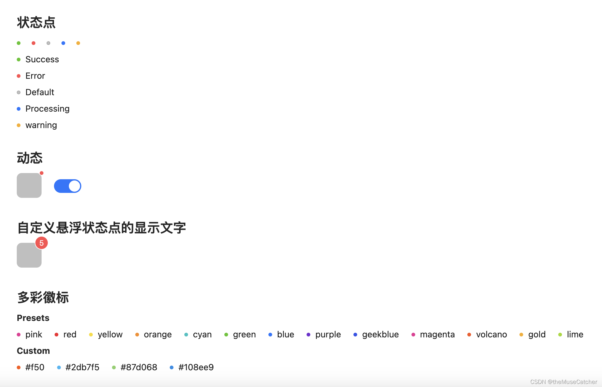
<h2 class="mt30 mb10">状态点</h2>
<Space :size="10">
<Badge status="success" />
<Badge status="error" />
<Badge status="default" />
<Badge status="processing" />
<Badge status="warn" />
</Space>
<br/>
<Space style="margin-top: 10px;" direction="vertical" :size="10">
<Badge status="success" text="Success" />
<Badge status="error" text="Error" />
<Badge status="default" text="Default" />
<Badge status="processing" text="Processing" />
<Badge status="warn" text="warning" />
</Space>
<h2 class="mt30 mb10">动态</h2>
<Space :size="20" align="center">
<Badge :dot="show">
<span class="u-cube"></span>
</Badge>
<Switch v-model:checked="show" />
</Space>
<h2 class="mt30 mb10">自定义悬浮状态点的显示文字</h2>
<Badge :count="5" title="Custom hover text">
<span class="u-cube"></span>
</Badge>
<h2 class="mt30 mb10">多彩徽标</h2>
<h4 class="mb10">Presets</h4>
<Space wrap :size="20">
<Badge
v-for="color in colors" :key="color"
:color="color"
:text="color" />
</Space>
<h4 class="mt10 mb10">Custom</h4>
<Space wrap :size="20">
<Badge color="#f50" text="#f50" />
<Badge color="#2db7f5" text="#2db7f5" />
<Badge color="#87d068" text="#87d068" />
<Badge color="#108ee9" text="#108ee9" />
</Space>
</div>
</template>
<style lang="less" scoped>
.u-cube {
display: inline-block;
border-radius: 8px;
width: 40px;
height: 40px;
background: rgba(0, 0, 0, 0.25);
}
.u-svg {
fill: #f5222d;
}
</style>