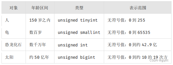
参考链接:
seaborn 柱状图上显示y值的方法
python柱形图填充
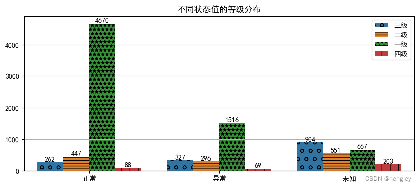
figs,ax = plt.subplots(figsize=(10,4))
fig = sns.countplot(x="状态",hue="等级", data=datas)// 不可通过设置hatch参数来设置
marks = ["o","---","***","|"] # '-'的个数影响疏密程度
for cons,mask in zip(fig.containers,marks):
    ax.bar_label(cons)  #添加柱状图的数据
    for con in cons:
        con.set_hatch(mask) #添加柱状图的形状
ax.grid(axis='y')
ax.set_title("不同状态值的等级分布")
plt.legend(loc='best') #设置图例显示位置(否则图例不更新)
plt.show()
![[STL]详解vector模拟实现](https://img-blog.csdnimg.cn/img_convert/2489d1738e6f13dc4fd2e6f8c2ea6f91.png)