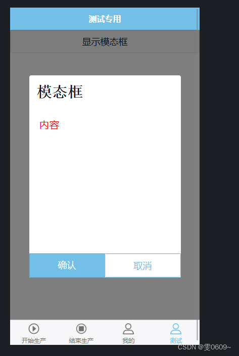
效果图
代码
标签
<template>
	<view>
		<!-- 按钮用于触发模态框的显示 -->
		<button @click="showModal = true">显示模态框</button>
		<!-- 模态框组件 -->
		<view class="modal" v-if="showModal">
			<view class="modal-content">
				<view>{{ modalTitle }}</view>
				<view>{{ modalContent }}</view>
				<view class="modal-buttons">
					<button @click="handleConfirm">确认</button>
					<button @click="handleCancel">取消</button>
				</view>
			</view>
		</view>
	</view>
</template>
注:
@click="showModal = true"
这段代码的意思是在按钮被点击时,通过将
showModal的值设置为true来显示模态框。在上面的代码示例中,我们使用了 Vue.js 的事件绑定语法
@click来监听按钮的点击事件。showModal = true是在按钮点击时执行的操作,它将showModal的值设为true,从而触发显示模态框。这样,当用户点击按钮时,模态框将会显示出来。
样式
<style scoped lang="scss">
	/* 遮罩层 */
	.modal {
		position: fixed;
		top: 0;
		left: 0;
		width: 100%;
		height: 100%;
		background-color: rgba(0, 0, 0, 0.5);
		display: flex;
		justify-content: center;
		align-items: center;
	}
	/* 窗口 */
	.modal-content {
		background-color: white;
		/* padding: 20px; */
		width: 600rpx;
		height: 800rpx;
		border-radius: 8rpx;
		position: relative;
		//modal-content下的第一个view
		view:first-child{
			padding:30rpx;
			font-size:60rpx;
			font-weight:bold;
			font-family:'宋体';
		}
		//modal-content下的第二个view
		view:nth-child(2){
			padding:40rpx;
			font-size:40rpx;
			color:red
		}
	}
	/* 按钮 */
	.modal-buttons {
		width: 100%;
		display: flex;
		bottom: 0;
		position: absolute;
	}
	.modal-buttons button {
		width: 100%;
		border: none;
	}
	.modal-buttons button:first-child {
		background-color: #74bfe7;
		color: #fff;
		border-radius: 0;
	}
	.modal-buttons button:last-child {
		width: 100%;
		border: 2rpx solid #74bfe7;
		border-radius: 0px;
		background-color: #fff;
		color: #74bfe7;
	}
</style>
js
<script>
	export default {
		data() {
			return {
				showModal: false,
				modalTitle: '模态框',
				modalContent: '内容'
			};
		},
		methods: {
			//确认
			handleConfirm() {
				// 处理模态框确认按钮点击事件
				// 可以在这个方法中执行你需要的操作
				this.showModal = false; // 关闭模态框
			},
			//取消
			handleCancel() {
				// 处理模态框取消按钮点击事件
				// 可以在这个方法中执行你需要的操作
				this.showModal = false; // 关闭模态框
			}
		}
	};
</script>
解析
在 HTML 部分:
- 使用
button元素作为触发显示模态框的按钮。 - 使用
v-if指令来决定是否显示模态框。 - 模态框组件使用
view元素包裹,并设置相应的样式。
在 JavaScript 部分:
data函数返回了组件的初始状态,其中包括一个控制是否显示模态框的变量showModal,以及模态框的标题和内容。handleConfirm和handleCancel方法分别用于处理确认按钮和取消按钮的点击事件,在这些方法中可以执行需要的操作。- 在这个例子中,点击确认或取消按钮后,通过将
showModal设置为false来关闭模态框。
在样式部分:
- 使用
scoped关键字将样式限定在组件范围内。 .modal类设置遮罩层的样式,使其覆盖整个页面,并使用 Flex 布局将内容垂直居中。.modal-content类设置模态框的样式,包括背景颜色、宽度和高度等。.modal-buttons类设置按钮的样式,包括使其位于模态框底部,并使用 Flex 布局将按钮撑满整个宽度- 第一个按钮使用
#74bfe7背景色和白色文字,表示确认操作 - 第二个按钮使用
#74bfe7边框和白色背景色,表示取消操作。
完整代码
<template>
	<view>
		<!-- 按钮用于触发模态框的显示 -->
		<button @click="showModal = true">显示模态框</button>
		<!-- 模态框组件 -->
		<view class="modal" v-if="showModal">
			<view class="modal-content">
				<view>{{ modalTitle }}</view>
				<view>{{ modalContent }}</view>
				<view class="modal-buttons">
					<button @click="handleConfirm">确认</button>
					<button @click="handleCancel">取消</button>
				</view>
			</view>
		</view>
	</view>
</template>
<script>
	export default {
		data() {
			return {
				showModal: false,
				modalTitle: '模态框',
				modalContent: '内容'
			};
		},
		methods: {
			//确认
			handleConfirm() {
				// 处理模态框确认按钮点击事件
				// 可以在这个方法中执行你需要的操作
				this.showModal = false; // 关闭模态框
			},
			//取消
			handleCancel() {
				// 处理模态框取消按钮点击事件
				// 可以在这个方法中执行你需要的操作
				this.showModal = false; // 关闭模态框
			}
		}
	};
</script>

<style scoped lang="scss">
	/* 遮罩层 */
	.modal {
		position: fixed;
		top: 0;
		left: 0;
		width: 100%;
		height: 100%;
		background-color: rgba(0, 0, 0, 0.5);
		display: flex;
		justify-content: center;
		align-items: center;
	}

	/* 窗口 */
	.modal-content {
		background-color: white;
		/* padding: 20px; */
		width: 600rpx;
		height: 800rpx;
		border-radius: 8rpx;
		position: relative;
		//modal-content下的第一个view
		view:first-child{
			padding:30rpx;
			font-size:60rpx;
			font-weight:bold;
			font-family:'宋体';
		}
		//modal-content下的第二个view
		view:nth-child(2){
			padding:40rpx;
			font-size:40rpx;
			color:red
		}
	}
	/* 按钮 */
	.modal-buttons {
		width: 100%;
		display: flex;
		bottom: 0;
		position: absolute;
	}
	.modal-buttons button {
		width: 100%;
		border: none;
	}
	.modal-buttons button:first-child {
		background-color: #74bfe7;
		color: #fff;
		border-radius: 0;
	}
	.modal-buttons button:last-child {
		width: 100%;
		border: 2rpx solid #74bfe7;
		border-radius: 0px;
		background-color: #fff;
		color: #74bfe7;
	}
</style>