1、水平垂直居中
div {
    width: 100px;
    height: 100px;
    position: absolute;
    top: 0;
    right: 0;
    bottom: 0;
    left: 0;
    margin: auto;
}
父级控制子集居中
.parent {
    display: flex;
    justify-content: center;
    align-items: center;
}
伪元素和 inline-block / vertical-align(兼容 IE8)
.box-wrap:before {
      content: '';
      display: inline-block;
      height: 100%;
      vertical-align: middle;
      margin-right: -0.25em; //微调整空格
}
.box {
     display: inline-block;
     vertical-align: middle;
}
transform(不兼容 ie8 以下)
 .box-wrap {
     width:100%;
     height:300px;
     background:rgba(0,0,0,0.7);
     position:relative;
}
.box{
    position:absolute;
    left:50%;
    top:50%;
    transform:translateX(-50%) translateY(-50%);
    -webkit-transform:translateX(-50%) translateY(-50%);
}
设置 margin:auto(该方法得严格意义上的非固定宽高,而是 50%的父级的宽高。)
.box-wrap {
    position: relative;
    width:100%;
    height:300px;
    background-color:#f00;
}
.box-content{
    position: absolute;
    top:0;
    left:0;
    bottom:0;
    right:0;
    width:50%;
    height:50%;
    margin:auto;
    background-color:#ff0;
}
2、单行文本的溢出显示省略号(一定要有宽度)
 p{
    width:200rpx;
    overflow: hidden;
    text-overflow:ellipsis;
    white-space: nowrap;
 }
3、多行文本溢出显示省略号
p {
    display: -webkit-box;
    -webkit-box-orient: vertical;
    -webkit-line-clamp: 3;
    overflow: hidden;
 }
兼容式:
p {
    position: relative;
    line-height: 1.4em;
    /* 3 times the line-height to show 3 lines */
    height: 4.2em;
    overflow: hidden;
}
p::after {
    content: "...";
    font-weight: bold;
    position: absolute;
    bottom: 0;
    right: 0;
    padding: 0 20px 1px 45px;
}
4、IOS手机容器滚动条滑动不流畅
overflow: auto;
-webkit-overflow-scrolling: touch;
5、修改滚动条样式
.test::-webkit-scrollbar{
  /*滚动条整体样式*/
  width : 10px;  /*高宽分别对应横竖滚动条的尺寸*/
  height: 1px;
}
.test::-webkit-scrollbar-thumb {
  /*滚动条里面小方块*/
  border-radius   : 10px;
  background-color: skyblue;
  background-image: -webkit-linear-gradient(
      45deg,
      rgba(255, 255, 255, 0.2) 25%,
      transparent 25%,
      transparent 50%,
      rgba(255, 255, 255, 0.2) 50%,
      rgba(255, 255, 255, 0.2) 75%,
      transparent 75%,
      transparent
  );
}
.test::-webkit-scrollbar-track {
  /*滚动条里面轨道*/
  box-shadow   : inset 0 0 5px rgba(0, 0, 0, 0.2);
  background   : #ededed;
  border-radius: 10px;
}
6、calc
div {
    width: calc(25% - 20px);
}
7、scss定义变量
$subjectColor: var(--menuActiveText,#4387F6);


background: $subjectColor;
8、flex 不生效问题
 .notice_list{
    .notice_item{
      display: flex;
      align-items: center;
      margin-bottom: 15px;
      .item_icon{
        width: 40px;
        margin-right: 10px;
        height: 40px;
        border-radius: 50%;
        background: #FE5D58;
        color: #fff;
        display: flex;
        flex-shrink: 0;//这行是阻止元素变形
        align-items: center;
        text-align: center;
        justify-content: center;
        i{
          font-size: 25px;

        }
      }
      .item_info{
        flex:1;
        flex-shrink: 1;
        width:0;//这行是阻止元素超出
        .item_title{
          width: 100%;
          overflow: hidden;
          text-overflow:ellipsis;
          white-space: nowrap;
        }
      }
    }
  }
9、CSS3 filter(滤镜) 属性filter:blur(px)
filter:blur(15)10、CSS上划线、下划线、删除线
  text-decoration:underline;     下划线

  text-decoration:overline;    顶划线

  text-decoration:line-through;  删除线
11、文本两端对齐、水平居中
text-align: justify;

text-align:center;

div{
    text-align: justify;
    text-justify: distribute-all-lines;  //ie6-8
    text-align-last: justify;  //一个块或行的最后一行对齐方式
    -moz-text-align-last: justify;
    -webkit-text-align-last: justify;
}
12、实现不换行、自动换行、强制换行
//不换行white-space:nowrap;

//自动换行word-wrap: break-word;

word-break: normal;

//强制换行word-break:break-all;
13、清除手机tap事件后element 时候出现的一个高亮
* {

-webkit-tap-highlight-color: rgba(0,0,0,0);

}
14、禁止点击事件/鼠标事件“穿透”
div * {
    pointer-events: none;   /*链接啊,点击事件啊,都没有效果了*/
 cursor: default;
}
15、 IOS键盘字母输入,默认首字母大写,解决方案
<input type="text" autocapitalize="off" />16、去除 iOS移动端 input,textarea输入框上方内阴影样式
input, textarea, select{
   appearance: none;
   -moz-appearance: none;   /*Firefox */
   -webkit-appearance: none;   /*Safari 和 Chrome*/
}
17、文字竖向排版
div{
    margin: 0 auto;
    height: 140px;
    writing-mode: vertical-lr;/*从左向右 从右向左是 writing-mode: vertical-rl;*/
    writing-mode: tb-lr;/*IE浏览器的从左向右 从右向左是 writing-mode: tb-rl;*/
}
18、 CSS3 Gradient 渐变
background: #e6e6e6;   //当浏览器不支持背景渐变时该语句将会被执行
background: -o-linear-gradient(top, #fdfdfd,  #e6e6e6);
background: -moz-linear-gradient(top, #fdfdfd, #e6e6e6);
background: -webkit-linear-gradient(top, #fdfdfd, #e6e6e6);   //最新发布语法
background: -webkit-gradient(linear, 0% 0%, 0% 100%, from(#fdfdfd), #e6e6e6);   //老式语法

.text_signature {
    -webkit-background-clip: text;
    -webkit-text-fill-color: transparent;
    background-image: linear-gradient(to right, #ec2239, #40a4e2,#ea96f5);
    width: 320px;
}
19、修改input 输入框中 placeholder 默认字体样式
//webkit内核的浏览器
input::-webkit-input-placeholder {
    color: red;
}
//Firefox版本4-18
input:-moz-placeholder {
    color: red;
}
//Firefox版本19+
input::-moz-placeholder {
    color: red;
}
//IE浏览器
input:-ms-input-placeholder {
    color: red;
}
20、透明度
filter:alpha(opacity=100);opacity:1;21、长字符串强制换行
word-break:break-all22、文字阴影
text-shadow 为网页字体添加阴影,通过对text-shadow属性设置相关的属性值。属性与值的说明如下:text-shadow: [X-offset,Y-offset,Blur,Color];
X-offset:指阴影居于字体水平偏移的位置。
Y-offset:指阴影居于字体垂直偏移的位置。
Blur:指阴影的模糊值。
color:指阴影的颜色;
h1{
text-shadow: 5px 5px 5px #FF0000;
}

box-shadow: 0px 0px 13px 1px rgba(51, 51, 51, 0.1);23、实现隐藏滚动条同时又可以滚动
.demo::-webkit-scrollbar {
display: none; /* Chrome Safari */
}
.demo {
scrollbar-width: none; /* firefox */
-ms-overflow-style: none; /* IE 10+ */
overflow-x: hidden;
overflow-y: auto;
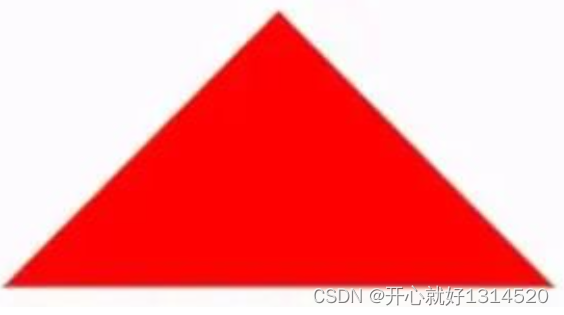
}24、css 绘制三角形
div {
    width: 0;
    height: 0;
    border-width: 0 40px 40px;
    border-style: solid;
    border-color: transparent transparent red;
}
实现带边框的三角形:
<div id="blue"><div>

#blue {
    position:relative;
    width: 0;
    height: 0;
    border-width: 0 40px 40px;
    border-style: solid;
    border-color: transparent transparent blue;
}
#blue:after {
    content: "";
    position: absolute;
    top: 1px;
    left: -38px;
    border-width: 0 38px 38px;
    border-style: solid;
    border-color: transparent transparent yellow;
}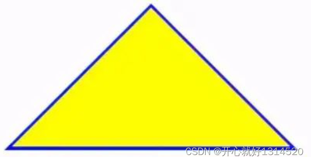
注: 如果想绘制右直角三角,则将左 border 设置为 0;如果想绘制左直角三角,将右 border 设置为 0 即可(其它情况同理)。
25、Table表格边框合并
table,tr,td{
  border: 1px solid #666;
}
table{
  border-collapse: collapse;
}26、css 选取第 n 个标签元素
first-child first-child 表示选择列表中的第一个标签。
last-child last-child 表示选择列表中的最后一个标签
nth-child(3) 表示选择列表中的第 3 个标签
nth-child(2n) 这个表示选择列表中的偶数标签
nth-child(2n-1) 这个表示选择列表中的奇数标签
nth-child(n+3) 这个表示选择列表中的标签从第 3 个开始到最后。
nth-child(-n+3) 这个表示选择列表中的标签从 0 到 3,即小于 3 的标签。
nth-last-child(3) 这个表示选择列表中的倒数第 3 个标签。
27、移动端软键盘变为搜索方式
默认情况下软键盘上该键位为前往或者确认等文字,要使其变为搜索文字,需要在 input 上加上 type 声明:
<form action="#">
    <input type="search" placeholder="请输入..." name="search" />
</form>
需要一个 form 标签套起来,并且设置 action 属性,这样写完之后输入法的右下角就会自动变成搜索,同时,使用了 search 类型后,搜索框上会默认自带删除按钮。
28、背景图片的大小
.bg-img{
    background:url(../img/find_pw_on_2.png)  no-repeat center center !important;
    background-size: 27px auto !important;
    /*background-size: 100% 100%;*/
    /*background-size: 50px 100px*/
}29、文字之间的间距
p{
  text-indent:10px;//单词抬头距离
  letter-spacing:10px;//间距
}30、禁止用户选择
.wrap {
  -webkit-touch-callout: none;
  -webkit-user-select: none;
  -khtml-user-select: none;
  -moz-user-select: none;
  -ms-user-select: none;
  user-select: none;
}31、页面动画出现闪烁问题
在 Chrome and Safari中,当我们使用CSS transforms 或者 animations时可能会有页面闪烁的效果,下面的代码可以修复此情况:
.cube {
   -webkit-backface-visibility: hidden;
   backface-visibility: hidden;

   -webkit-perspective: 1000;
   perspective: 1000;
   /* Other transform properties here */
}
在webkit内核的浏览器中,另一个行之有效的方法是
.cube {
   -webkit-transform: translate3d(0, 0, 0);
   transform: translate3d(0, 0, 0);
  /* Other transform properties here */
}32、字母大小写转换
p {text-transform: uppercase}  // 将所有字母变成大写字母
p {text-transform: lowercase}  // 将所有字母变成小写字母
p {text-transform: capitalize} // 首字母大写
p {font-variant: small-caps} // 将字体变成小型的大写字母33、消除transition闪屏
.wrap {
    -webkit-transform-style: preserve-3d;
    -webkit-backface-visibility: hidden;
    -webkit-perspective: 1000;
}34、识别字符串里的 '\n' 并换行
一般在富文本中返回换行符不是<br>的标签,而且\n。不使用正则转换的情况下,可通过下面样式实现换行
body {
   white-space: pre-line;
}35、移除a标签被点链接的边框
a {
  outline: none;//或者outline: 0
  text-decoration:none; //取消默认下划线
}36、select内容居中显示、下拉内容右对齐
select{
    text-align: center;
    text-align-last: center;
}
select option {
    direction: rtl;
}37、修改input输入框中光标的颜色不改变字体的颜色
input{
    color:  #fff;
    caret-color: red;
}38、transfrom的rotate属性在span标签下失效
span {
  display: inline-block
}39、CSS加载动画
.dom{
  -webkit-animation:circle 1s infinite linear;
}
@keyframes circle{
  0%{ transform: rotate(0deg); }
  100%{ transform: rotate(360deg); }
}
<div class="loader"></div>
<style>
.loader {
border: 16px solid #f3f3f3;
border-radius: 50%;
border-top: 16px solid #3498db;
width: 80px;
height: 80px;
-webkit-animation: spin 2s linear infinite;
animation: spin 2s linear infinite;
}
@-webkit-keyframes spin {
0% { -webkit-transform: rotate(0deg); }
100% { -webkit-transform: rotate(360deg); }
}
@keyframes spin {
0% { transform: rotate(0deg); }
100% { transform: rotate(360deg); }
}
</style>40、文字渐变效果实现
<div class="text_signature " >fly63前端网,一个免费学习前端知识的网站</div>
<style>
.text_signature {
    -webkit-background-clip: text;
    -webkit-text-fill-color: transparent;
    background-image: linear-gradient(to right, #ec2239, #40a4e2,#ea96f5);
    width: 320px;
}
</style>41、实现立体字的效果
<div class="text_solid">有课前端网-web前端技术学习平台</div>
<style>
.text_solid{
    font-size: 32px;
    text-align: center;
    font-weight: bold;
    line-height:100px;
    text-transform:uppercase;
    position: relative;
  background-color: #333;
    color:#fff;
    text-shadow:
    0px 1px 0px #c0c0c0,
    0px 2px 0px #b0b0b0,
    0px 3px 0px #a0a0a0,
    0px 4px 0px #909090,
    0px 5px 10px rgba(0, 0, 0, 0.6);
}
</style>42、解决1px边框变粗问题
.dom{
  height: 1px;
  background: #dbdbdb;
  transform:scaleY(0.5);
}43、CSS实现文字模糊效果
.vague_text{
  color: transparent;
  text-shadow: #111 0 0 5px;
}44、通过滤镜让图标变灰
一张彩色的图片就能实现鼠标移入变彩色,移出变灰的效果。
<a href='' class='icon'><img src='01.jpg' /></a>
<style>
.icon{
  -webkit-filter: grayscale(100%);
  -moz-filter: grayscale(100%);
  -ms-filter: grayscale(100%);
  -o-filter: grayscale(100%);
  filter: grayscale(100%);
  filter: gray;
}
.icon:hover{
  filter: none;
  -webkit-filter: grayscale(0%);
}
</style>45、图片自适应object-fit
当图片比例不固定时,想要让图片自适应,一般都会用background-size:cover/contain,但是这个只适用于背景图。css3中可使用object-fit属性来解决图片被拉伸或是被缩放的问题。使用的提前条件:图片的父级容器要有宽高。
img{
    width: 100%;
    height: 100%;
    object-fit: cover;
}
fill: 默认值。内容拉伸填满整个content box, 不保证保持原有的比例。contain: 保持原有尺寸比例。长度和高度中长的那条边跟容器大小一致,短的那条等比缩放,可能会有留白。cover: 保持原有尺寸比例。宽度和高度中短的那条边跟容器大小一致,长的那条等比缩放。可能会有部分区域不可见。(常用)none: 保持原有尺寸比例。同时保持替换内容原始尺寸大小。scale-down:保持原有尺寸比例,如果容器尺寸大于图片内容尺寸,保持图片的原有尺寸,不会放大失真;容器尺寸小于图片内容尺寸,用法跟contain一样。
46、行内标签元素出现间隙问题
方式一:父级font-size设置为0
.father{
 font-size:0;
}
方式二:父元素上设置word-spacing的值为合适的负值
.father{
   word-spacing:-2px
}47、解决vertical-align属性不生效
在使用vertical-align:middle实现垂直居中的时候,经常会发现不生效的情况。这里需要注意它生效需要满足的条件:
**作用环境:**父元素设置line-height。需要和height一致。或者将display属性设置为table-cell,将块元素转化为单元格。
**作用对象:**子元素中的inline-block和inline元素。
<div class="box">
  <img src=".\test.jpg"/>
  <span>内部文字</span>
</div>
<style>
.box{
  width:300px;
  line-height: 300px;
  font-size: 16px;
}
.box img{
  width: 30px;
  height:30px;
  vertical-align:middle
}
.box span{
  vertical-align:middle
}
</style>
PS:vertical-align不可继承,必须对子元素单独设置。同时需要注意的是line-height的高度基于font-size(即字体的高度),如果文字要转行会出现异常
48、置灰
filter:grayscale(1); /* Chrome, Safari, Opera */
-webkit-filter:grayscale(1)


