HTML部分代码
<div class="header_wrap">
	<ul>
		<li><a href="#">首页</a></li>
		<li>新闻</li>
		<li>角色</li>
		<li>世界</li>
		<li>漫画</li>
		<li>漫画</li>
		<li>赛事</li>
	</ul>
</div>
CSS代码
	.header_wrap ul {
		/* 元素空隙 的解决方案: 设置父元素, */
		display: table;
		word-spacing:-1em;
		/* 和word-spacing */
		margin: 0;
		padding: 0%;
	}
	.header_wrap ul li {
		/* 布局错位 */
		display: inline-block;
		/* 解决方案 */
		vertical-align: top;
		/* float: left; */
		width: 14%;
		height: 60px;
		line-height: 60px;
	}
	.header_wrap ul li a {
		display: block;
	}
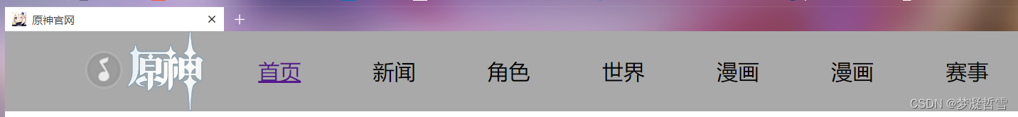
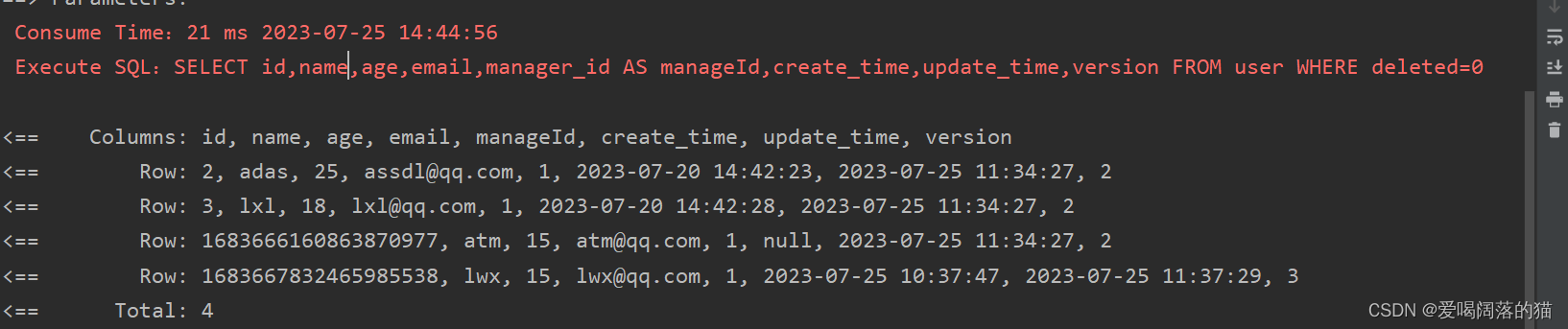
不理想的效果 发现还原不回来现场 尴尬 大概样式
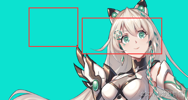
发现核心问题是 inline-block 默认的对齐方式
vertical-align: baseline;
只需要设计
vertical-align: top;
当然也可以是使用浮动float 或者 弹性盒子flex 完成上述需求
QQ浏览器
Firefox浏览器
设置行内块级元素之后,细心的人就会发现盒子间有空隙
检查元素发现li标签之间又显示空白 布局裂缝
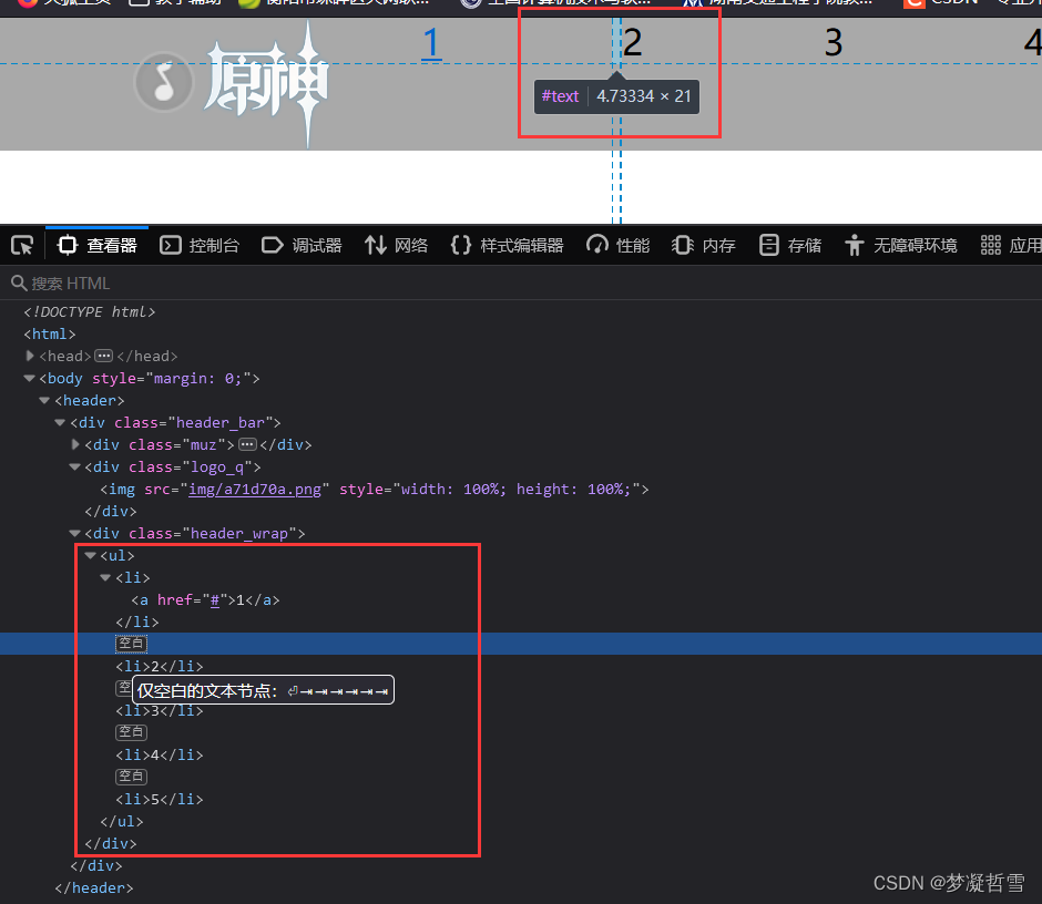
盒子模型 检查 也没有影响的元素

原因是换行符空格间隙引起的问题
解决方案
ul{
	/* 元素空隙 的解决方案: 设置父元素, */
	display: table;
	word-spacing:-1em;
}
最终效果
更多解决方案请参考
先给出一段关于行内块级元素(inline-block)中基线(baseline)的定义:
The baseline of an ‘inline-block’ is the baseline of its last line box in the normal flow, unless it has either no in-flow line boxes or if its ‘overflow’ property has a computed value other than ‘visible’, in which case the baseline is the bottom margin edge.
翻译一下:
对于一个 inline-block 元素,如果它内部没有内联元素,或者它的overflow属性不是visible,那么它的linr-height就是元素margin的底端。否则,就是它内部最后一个元素的基线。
css 使用display:inline-block的问题求解?
一、移除空格虽然可以解决,代码可读性大大降低。
	<div class="wrapper">
    	<div class="child1">child1</div><div class="child2">child2</div>
	</div>
二、使用 margin 负值.child2 {
    margin-left: -5px;
}
三、使用 font-size: 0.wrapper {
    font-size: 0;
}
.child1, .child2 {
    font-size: 14px;
}
四、letter-spacing.wrapper {
    letter-spacing: -5px;
}
.child1, .child2 {
    letter-spacing: 0;
}
五、word-spacing.wrapper {
    word-spacing: -5px;
}
.child1, .child2 {
    word-spacing: 0;
}
css div等块元素设置display:inline-block存在间隙问题


