1写在前面
今天不想废话了,直接看图吧。👇

复现代码step by step,自己看吧。🤪
2用到的包
rm(list = ls())
library(tidyverse)
library(ggtext)
library(patchwork)
3示例数据
df_pw <- read.csv("./passwords.csv",row.names = 1)

DT::datatable(df_pw)
4整理数据
4.1 统一时间单位
由于时间单位不统一,这里我们转化一下,把单位都统一起来,都转成seconds。🥳
df_pw_time <-
  df_pw %>%
  mutate(
    time = case_when(
      time_unit == "seconds" ~ value,
      time_unit == "minutes" ~ value * 60,
      time_unit == "hours" ~ value * 60 * 60,
      time_unit == "days" ~ value * 60 * 24,
      time_unit == "weeks" ~ value * 60 * 24 * 7,
      time_unit == "months" ~ value * 60 * 24 * 30,
      time_unit == "years" ~ value * 60 * 24 * 365,
      TRUE ~ NA_real_
    )
  )
4.2 增加画图空间
接下来,将固定值1000添加到所有时间,为圆圈内的标签留下所需的额外空间。
plus <- 1000
df_pw_plot <-
  df_pw_time %>%
  mutate(time = time + plus) %>%
  add_row(rank = 501, time = 1)
4.3 提取难以破解的密码
创建一个data frame,包含为确实难以破解的密码放置标签所需的所有信息。🥰
后面会用到的。🤒
labels <-
  df_pw_plot %>%
  filter(value > 90) %>%
  mutate(label = glue::glue("<b>{password}</b><br><span style='font-size:18pt'>Rank: {rank}</span>")) %>%
  add_column(
    x = c(33, 332, 401, 492),
    y = c(75000000, 90000000, 45000000, 48498112)
  )
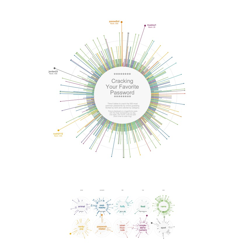
5开始绘图
5.1 基础绘图
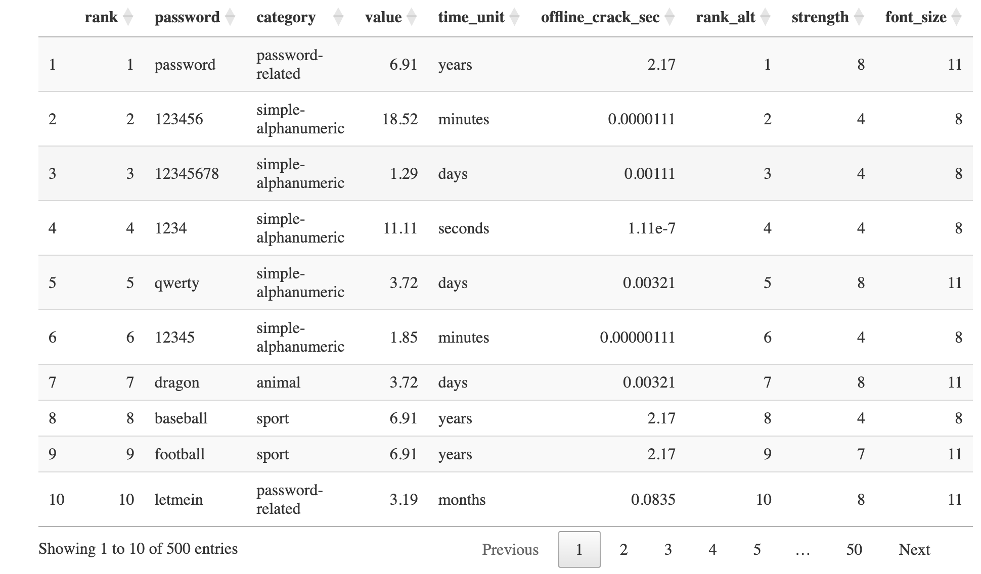
p <- ggplot(df_pw_plot, aes(rank, time, color = category)) +
  # 垂直线
  geom_segment(
    aes(x = rank, xend = rank, y = 0, yend = time),
    size = 1.2
  ) +
  # 放置文本处
  geom_rect(
    aes(xmin = 1, xmax = 501, ymin = 0, ymax = plus),
    fill = "grey97", color = "grey97"
  ) +

  # 圈内线,分别为1天,1周,1月,1年。
  geom_hline(aes(yintercept = (1 * 24 * 60 + plus)), color = "grey88") +
  geom_hline(aes(yintercept = (7 * 24 * 60 + plus)), color = "grey85") +
  geom_hline(aes(yintercept = (30 * 24 * 60 + plus)), color = "grey82") +
  geom_hline(aes(yintercept = (365 * 24 * 60 + plus)), color = "grey79") +

  # 为每条线终点添加棒棒糖头!~
  geom_point(aes(size = time)) +

  # log10 scale
  scale_y_log10(expand = c(0, 0)) +

  # Prism color
  rcartocolor::scale_color_carto_d(palette = "Prism", guide = "none") +

  # dots大小范围
  scale_size(
    range = c(1, 8),
    limits = c(plus, max(df_pw_plot$time)),
    guide = "none"
  ) +

  # 坐标转成圆圈
  coord_polar()

p
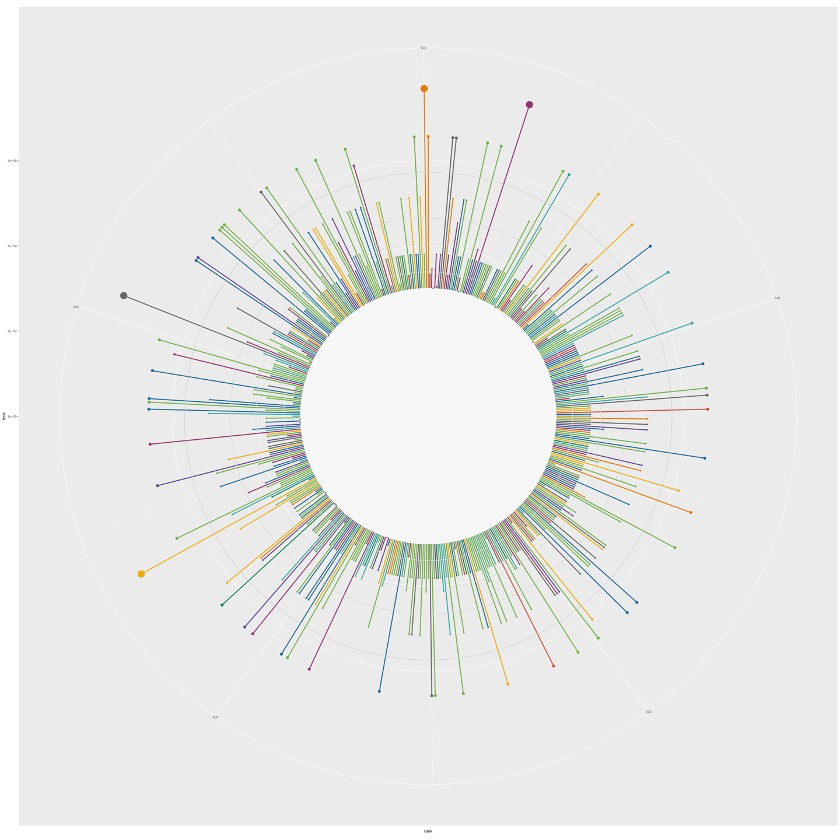
5.2 添加文本注释
p <- p +
  # 用`geom_richtext()`添加之前准备好的label
  geom_richtext(
    data = labels,
    aes(x = x, y = y, label = label, color = category),
    lineheight = 0.8,
    size = 8,
    label.color = NA
  ) +
  # 用`geom_text()`添加普通文本,放置在圈圈的中心
  geom_text(
    x = 500, y = 1.2,
    label = "********\nCracking\nYour Favorite\nPassword",
    size = 20,
    lineheight = 0.87,
    color = "grey60"
  ) +
  geom_text(
    x = 250, y = 0.25,
    label = "********",
    size = 20,
    lineheight = 0.87,
    color = "grey60"
  ) +
  geom_text(
    x = 250, y = 1.1,
    label = "Time it takes to crack the 500 most\ncommon passwords by online guessing.\nSorted by rank and colored by category.",
    size = 7,
    lineheight = 0.87,
    color = "grey73"
  ) +
  geom_text(
    x = 250, y = 1.95,
    label = "Time is displayed on a logarithmic scale\nwith the rings representing one day,\none week, one month, and one year\n(from inner to outer ring).",
    size = 6,
    lineheight = 0.87,
    color = "grey73"
  )

p
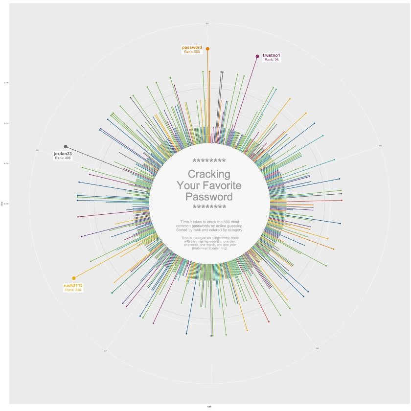
6分面视图
6.1 数据整理
首先,我们要为一些category添加换行符,适合内圈的大小。😏
facet_data <-
  df_pw_plot %>%
  add_row(rank = 501, time = 1, category = unique(df_pw_plot$category)) %>%
  # This is where we add line breaks
  mutate(
    cat_label = case_when(
      category == "cool-macho" ~ "cool-\nmacho",
      category == "nerdy-pop" ~ "nerdy-\npop",
      category == "password-related" ~ "password-\nrelated",
      category == "rebellious-rude" ~ "rebel-\nlious-\nrude",
      category == "simple-alphanumeric" ~ "simple-\nalpha-\nnumeric",
      TRUE ~ category
    )
  ) %>%
  filter(!is.na(category))
6.2 开始绘图
facet <- ggplot(facet_data, aes(rank, time, color = category)) +
  geom_segment(
    aes(x = rank, xend = rank, y = 0, yend = time),
    size = 0.6
  ) +
  geom_rect(
    aes(xmin = 1, xmax = 501, ymin = 0, ymax = plus),
    fill = "grey97", color = "grey97"
  ) +
  geom_hline(aes(yintercept = (1 * 24 * 60 + plus)), color = "grey82", size = 0.2) +
  geom_hline(aes(yintercept = (7 * 24 * 60 + plus)), color = "grey79", size = 0.2) +
  geom_hline(aes(yintercept = (30 * 24 * 60 + plus)), color = "grey76", size = 0.2) +
  geom_hline(aes(yintercept = (365 * 24 * 60 + plus)), color = "grey73", size = 0.2) +
  geom_point(aes(size = time)) +

  # 添加每个圈内的laebl
  geom_text(
    aes(label = cat_label, color = category),
    x = 500, y = 0,
    size = 8,
    lineheight = 0.87
  ) +
  # 分面并分为2行
  facet_wrap(~ category, nrow = 2) +
  coord_polar() +
  scale_y_log10(expand = c(0, 0)) +
  rcartocolor::scale_color_carto_d(palette = "Prism", guide = "none") +
  scale_size(
    range = c(0.5, 7),
    limits = c(plus, max(df_pw_plot$time)),
    guide = "none"
  ) +
  theme(
    strip.text = element_blank(),
  )

facet
7最终绘图
p <- p +
  theme_void() +
  theme(
    plot.margin = margin(-50, -180, -70, -180, "lines"),
  )

facet <- facet +
  theme_void() +
  theme(
    panel.spacing = unit(-8, "lines"),
    plot.margin = margin(-40, 50, 10, 50)
  ) +
  # caption的主题
  theme(
    plot.caption = element_text(
      size = 20,
      color = "grey60",
      hjust = 0.5,
      margin = margin(-50, 10, 30, 10)
    )
  ) +
  # 添加caption
  labs(caption = "")


# 拼图
p_final <- (p + facet) +
  plot_layout(
    ncol = 1,
    heights = c(1, 0.28)
  )

p_final

点个在看吧各位~ ✐.ɴɪᴄᴇ ᴅᴀʏ 〰
📍 🤩 LASSO | 不来看看怎么美化你的LASSO结果吗!?
📍 🤣 chatPDF | 别再自己读文献了!让chatGPT来帮你读吧!~
📍 🤩 WGCNA | 值得你深入学习的生信分析方法!~
📍 🤩 ComplexHeatmap | 颜狗写的高颜值热图代码!
📍 🤥 ComplexHeatmap | 你的热图注释还挤在一起看不清吗!?
📍 🤨 Google | 谷歌翻译崩了我们怎么办!?(附完美解决方案)
📍 🤩 scRNA-seq | 吐血整理的单细胞入门教程
📍 🤣 NetworkD3 | 让我们一起画个动态的桑基图吧~
📍 🤩 RColorBrewer | 再多的配色也能轻松搞定!~
📍 🧐 rms | 批量完成你的线性回归
📍 🤩 CMplot | 完美复刻Nature上的曼哈顿图
📍 🤠 Network | 高颜值动态网络可视化工具
📍 🤗 boxjitter | 完美复刻Nature上的高颜值统计图
📍 🤫 linkET | 完美解决ggcor安装失败方案(附教程)
📍 ......
本文由 mdnice 多平台发布