自定义tabBar就是不用官方提供的tabBar了,而是自己搞
目录
1 配置
2 使用vant组件库做TabBar
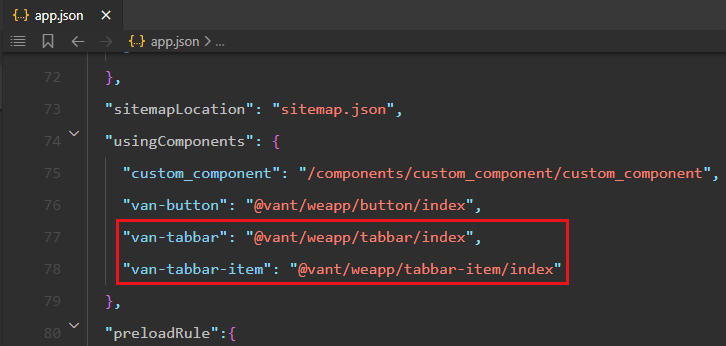
2.1 引入组件
2.2 使用组件
2.3 自定义图标
2.4 把info与store进行绑定
2.5 tab页面的切换
2.6 改变激活状态下的文本颜色
1 配置
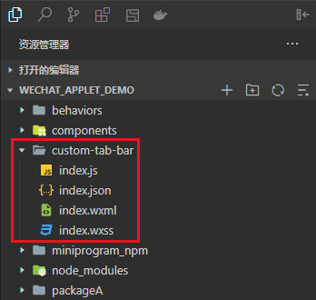
首先你需要在项目根目录中创建名为 custom-tab-bar 的文件夹,然后在其中创建名为 index 的组件
- custom-tab-bar名称固定
- index名称固定
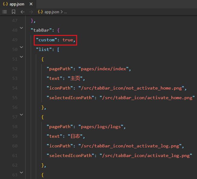
之后你需要在app.json节点下,加入custom:true
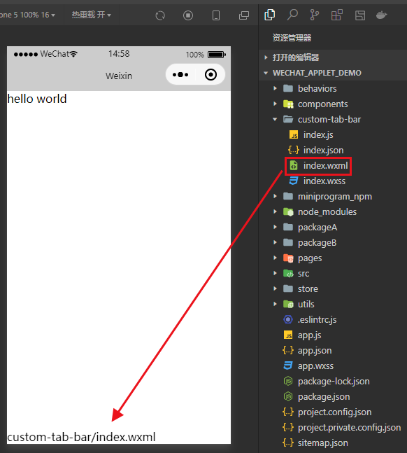
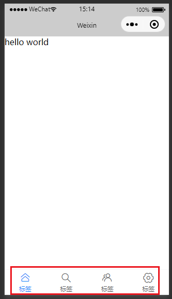
然后你进入到list包含的页面中,就可以看到自定义tabBar了
这里的内容是与index.wxml一样的
2 使用vant组件库做TabBar
2.1 引入组件
2.2 使用组件
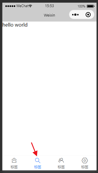
比如我们想用基础用法的这个tabbar,那就把这段代码复制下来
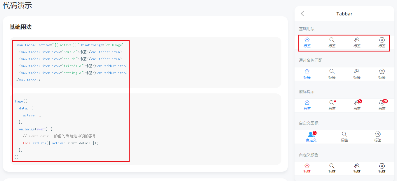
然后将他们搞到 custom-tab-bar/index中
然后就看到了自定义的tabbar了
当你点击第二个tabbar的时候,第二个tabbar就会高亮显示
2.3 自定义图标
自定义图标就要用这个东西
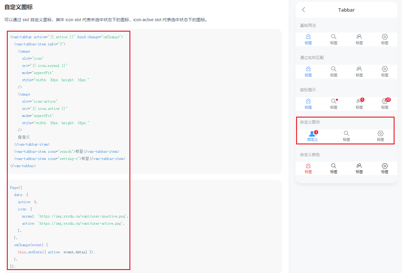
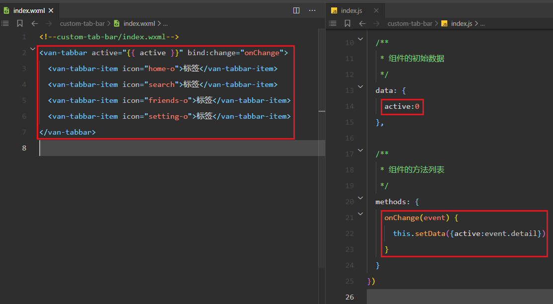
首先搞wxml,我当前的index.wxml是这样的
<!--custom-tab-bar/index.wxml-->
<!-- <van-tabbar active="{{ active }}" bind:change="onChange">
<van-tabbar-item icon="home-o">标签</van-tabbar-item>
<van-tabbar-item icon="search">标签</van-tabbar-item>
<van-tabbar-item icon="friends-o">标签</van-tabbar-item>
<van-tabbar-item icon="setting-o">标签</van-tabbar-item>
</van-tabbar> -->
<van-tabbar active="{{ active }}" bind:change="onChange">
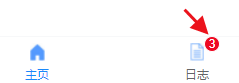
<van-tabbar-item info="3">
<image
slot="icon"
src="{{ icon.index_normal }}"
mode="aspectFit"
style="width: 30px; height: 18px;"
/>
<image
slot="icon-active"
src="{{ icon.index_activate }}"
mode="aspectFit"
style="width: 30px; height: 18px;"
/>
主页
</van-tabbar-item>
<van-tabbar-item info="3">
<image
slot="icon"
src="{{ icon.logs_normal }}"
mode="aspectFit"
style="width: 30px; height: 18px;"
/>
<image
slot="icon-active"
src="{{ icon.log_activate }}"
mode="aspectFit"
style="width: 30px; height: 18px;"
/>
日志
</van-tabbar-item>
</van-tabbar>
然后搞index.js,我当前的index.js是这样的
// custom-tab-bar/index.js
Component({
/**
* 组件的属性列表
*/
properties: {
},
/**
* 组件的初始数据
*/
data: {
active:0,
icon:{
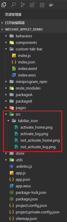
index_normal:"/src/tabBar_icon/not_activate_home.png",
index_activate:"/src/tabBar_icon/activate_home.png",
logs_normal:"/src/tabBar_icon/not_activate_log.png",
log_activate:"/src/tabBar_icon/activate_log.png",
}
},
/**
* 组件的方法列表
*/
methods: {
onChange(event) {
this.setData({active:event.detail})
}
}
})
src/tabBar_icon是我之前就放好的图像
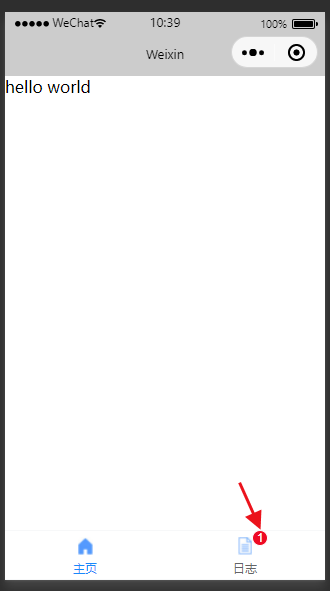
搞完就有自定义的tabbar了
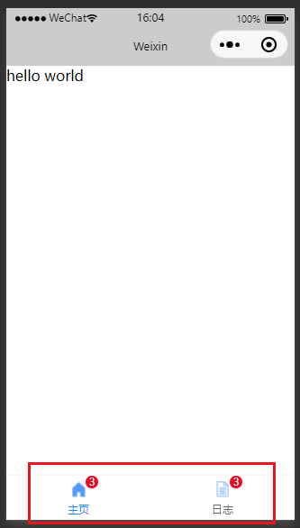
点击也是有用的
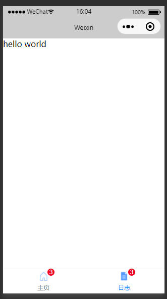
- 视频中对文字与图标的距离不满意,他进行了调整,我觉得还行就不写了,感兴趣可以看一下P91 15.渲染tabBar上的数字徽标_哔哩哔哩_bilibili
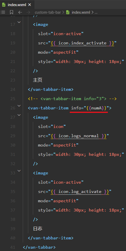
2.4 把info与store进行绑定
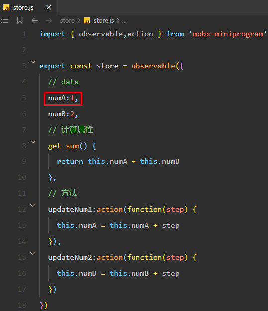
我现在像将这里的3搞成一个变量放在store中
你那这个自定义tabBar当组件用就行了,我当前的store中有numA
- 详细使用store的方式可以看一下这个 18.全局数据共享_Suyuoa的博客-CSDN博客
把变量numA引入到 custom-tab-bar/index.js 中
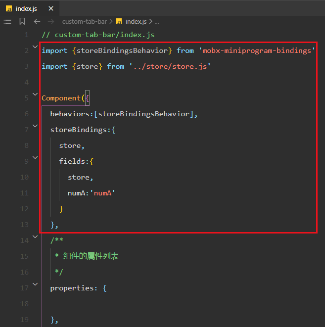
然后就能在wxml上用了
2.5 tab页面的切换
现在你点这个tabBar是不能页面切换的
我们可以利用onChange事件来搞一下
之前我们使用event.detail拿到了tabBar的索引,现在我们也可以用索引配合wx.switchTab()来切换tab页
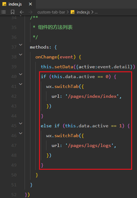
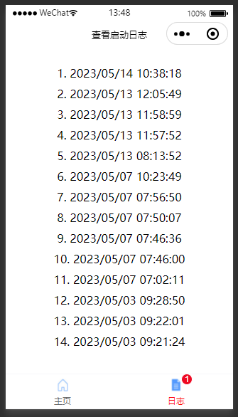
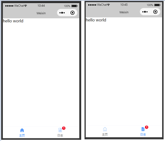
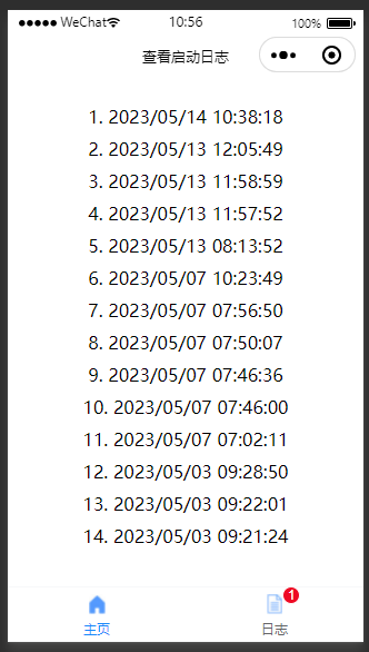
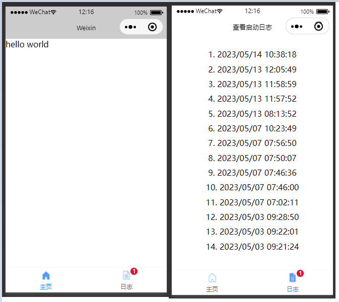
这样搞完之后点击指定的tab确实可以切换tab页,但是在激活tab状态会出问题。比如下面我点击的是日志,也切换到日志页面了,但是激活状态在主页上
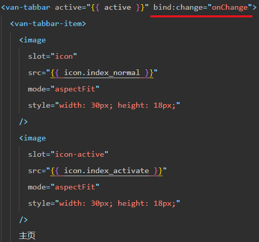
这个时候我们需要将active这个变量放在store中
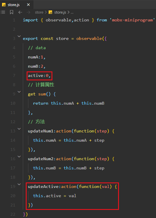
然后引入到 custom-tab-bar/index.js 中

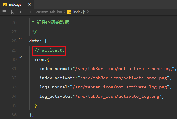
注释掉之前的active
然后改变一下onChange的内容
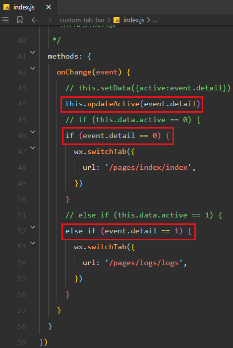
然后就行了
2.6 改变激活状态下的文本颜色
图标的激活状态与未激活状态的图像都是我们自定义的,但是文本我们没有特意去搞,默认状态下激活状态的文本是蓝色
只需要给van-tabbar这个标签加上active-color属性就可以了
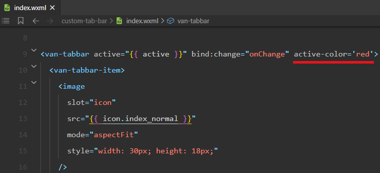
这样激活状态的文字就变为你想要的颜色了