简介
Jetpack Compose 是一个现代化的、声明式的 UI 工具包,它使我们能够更方便地构建 Android 的用户界面。本篇文章将介绍如何在 Jetpack Compose 中使用 BottomAppBar 来创建底部应用栏。
什么是 BottomAppBar?
BottomAppBar 是一个在屏幕底部的应用栏,提供了在 Material Design 风格的应用中实现导航和执行操作的一种方式。在 BottomAppBar 中,我们通常会放置一些操作按钮,如 FloatingActionButton、菜单项、以及其他可交互的图标。
如何使用 BottomAppBar
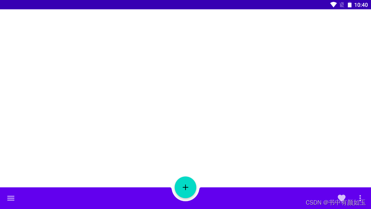
为了使用 BottomAppBar,我们需要将它作为 Scaffold 函数的 bottomBar 参数。这里有一个简单的示例:
@Preview
@Composable
fun BottomAppBar(){
    Scaffold(floatingActionButton = {
     //   Icon(Icons.Default.Home, contentDescription = "Add")
        FloatingActionButton(onClick = { }) {
            Icon(Icons.Default.Add, contentDescription = "Add")
        }
    }, floatingActionButtonPosition = FabPosition.Center, isFloatingActionButtonDocked = true, bottomBar = {
        BottomAppBar(cutoutShape = CircleShape) {
            IconButton(onClick = { /*TODO*/ }) {
                Icon(Icons.Filled.Menu,contentDescription = null)
            }
            Spacer(modifier = Modifier.weight(1f,true))
            IconButton(onClick = { /*TODO*/ }) {
                Icon(imageVector = Icons.Filled.Favorite, contentDescription = "Favorite")
            }
            IconButton(onClick = { /*TODO*/ }) {
                Icon(imageVector = Icons.Filled.MoreVert , contentDescription ="More options" )
            }
        }
    }){ innerPadding ->
        BodyContent(Modifier.padding(innerPadding))

    }
}

@Composable
fun BodyContent(padding: Modifier=Modifier) {

}
在上面的代码中,Scaffold 组件是一个实现基本的 Material Design 布局结构的 Composable 函数。它有一些参数可以配置,比如:floatingActionButton、floatingActionButtonPosition、isFloatingActionButtonDocked 和 bottomBar。
在 BottomAppBar 中,我们添加了一个导航按钮和两个操作按钮。所有的按钮都使用 IconButton 实现,里面包含一个 Icon。我们还用 Spacer 将操作按钮挤到右侧。
同时,我们在 Scaffold 中添加了一个 FloatingActionButton,并将其位置设置在 BottomAppBar 的中间。这时,我们需要通过 cutoutShape 参数为 BottomAppBar 设置一个适当的形状以适应 FloatingActionButton。在这个例子中,我们使用了 CircleShape。
结论
BottomAppBar 提供了在 Jetpack Compose 中实现底部应用栏的方法。我们可以通过配置 Scaffold 中的 bottomBar 参数以及添加相关的操作按钮,来创建一个符合 Material Design 规范的底部应用栏。
这只是一个简单的例子,实际上,Jetpack Compose 提供了很多灵活的方式来实现你的设计。你可以根据需求,添加更多的操作按钮,或者自定义 FloatingActionButton 的形状和位置等。在探索的过程中,你可能会发现更多有趣和强大的功能。


