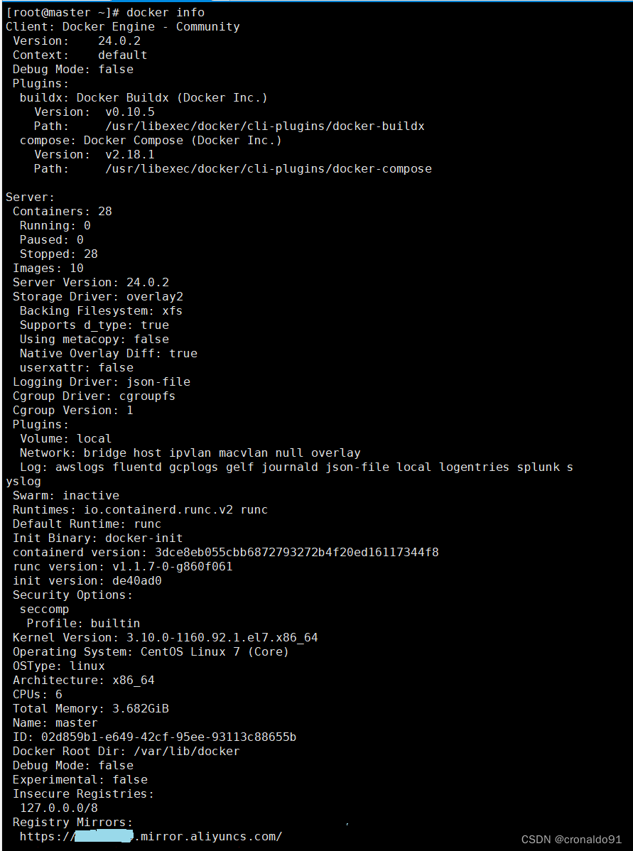
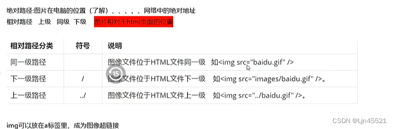
创建方式一:
///用于文本输入框
TextEditingController controller = new TextEditingController();

/// 设置TextField中显示的内容
  void setEditeInputTextFunction(String flagText) {
    controller .text = flagText;
  }

  /// 清除TextField中显示的内容
  void clearEditeInputTextFunction() {
    controller .text = "";

    ///或者使用clear方法
    controller .clear();
  }

  TextField(
    controller: controller,
    ///当TextField中输入的内容发生改变时回调
    onChanged: (value) {
      print("TextField 中输入的内容 $value");
    },
    decoration: InputDecoration(
      hintText: "提示的内容",
      helperStyle:TextStyle(
        color: Colors.red,
      ),
    ),
  ),
创建方式二:
///初始化控制器
TextEditingController controller = new TextEditingController(text: "初始化的内容");


 ///预设输入框的内容
String preText = "";


///控制 初始化的时候光标保持在文字最后
    controller = TextEditingController.fromValue(
      ///用来设置初始化时显示
      TextEditingValue(
        ///用来设置文本 controller.text = "0000"
        text: preText,

        ///设置光标的位置
        selection: TextSelection.fromPosition(
          ///用来设置文本的位置
          TextPosition(
              affinity: TextAffinity.downstream,
              /// 光标向后移动的长度
              offset: preText.length),
        ),
      ),
    );


///文本输入框
  child: TextField(
    controller: controller,
    ///当TextField中输入的内容发生改变时回调
    onChanged: (value) {
      print("TextField 中输入的内容 $value");
    },

    decoration: InputDecoration(
      hintText: "提示的内容",
      helperStyle:TextStyle(
        color: Colors.red,
      ),
    ),
  ),
TextFiel属性详解:
TextField是一个material design风格的输入框,本身有多种属性,除此之外装饰器InputDecoration也有多种属性,但都比较简单,所以不必担心,且听我娓娓道来。

const TextField({
    Key key,
    this.controller,//控制器 跟文本交互一般通过该属性
    this.focusNode,//焦点
    this.decoration = const InputDecoration(),//装饰 用来装饰外观
    TextInputType keyboardType,//键盘类型,即输入类型
    this.textInputAction,//键盘按钮
    this.textCapitalization = TextCapitalization.none,//大小写
    this.style,//样式
    this.strutStyle,
    this.textAlign = TextAlign.start,//对齐方式
    this.textDirection,
    this.autofocus = false,//自动聚焦
    this.obscureText = false,//是否隐藏文本,即显示密码类型
    this.autocorrect = true,//自动更正
    this.maxLines = 1,//最多行数,高度与行数同步
    this.minLines,//最小行数
    this.expands = false,
    this.maxLength,//最多输入数,有值后右下角就会有一个计数器
    this.maxLengthEnforced = true,
    this.onChanged,//输入改变回调
    this.onEditingComplete,//输入完成时,配合TextInputAction.done使用
    this.onSubmitted,//提交时,配合TextInputAction
    this.inputFormatters,//输入校验
    this.enabled,//是否可用
    this.cursorWidth = 2.0,//光标宽度
    this.cursorRadius,//光标圆角
    this.cursorColor,//光标颜色
    this.keyboardAppearance,
    this.scrollPadding = const EdgeInsets.all(20.0),
    this.dragStartBehavior = DragStartBehavior.start,
    this.enableInteractiveSelection,
    this.onTap,//点击事件
    this.buildCounter,
    this.scrollPhysics,
  })
InputDecoration 属性
const InputDecoration({
    this.icon,//左侧外的图标
    this.labelText,//悬浮提示,可代替hintText
    this.labelStyle,//悬浮提示文字的样式
    this.helperText,//帮助文字
    this.helperStyle,
    this.hintText,//输入提示
    this.hintStyle,
    this.hintMaxLines,
    this.errorText,//错误提示
    this.errorStyle,
    this.errorMaxLines,
    this.hasFloatingPlaceholder = true,//是否显示悬浮提示文字
    this.isDense,
    this.contentPadding,//内填充
    this.prefixIcon,//左侧内的图标
    this.prefix,
    this.prefixText,//左侧内的文字
    this.prefixStyle,
    this.suffixIcon,//右侧内图标
    this.suffix,
    this.suffixText,
    this.suffixStyle,
    this.counter,//自定义计数器
    this.counterText,//计数文字
    this.counterStyle,//计数样式
    this.filled,//是否填充
    this.fillColor,//填充颜色
    this.errorBorder,
    this.focusedBorder,
    this.focusedErrorBorder,
    this.disabledBorder,
    this.enabledBorder,
    this.border,//边框
    this.enabled = true,
    this.semanticCounterText,
    this.alignLabelWithHint,
  })。
图标
图标有3种:
- 左侧外的图标
              TextField(
                decoration: InputDecoration(
                  icon: Icon(Icons.person),
                ),
              ),
- 左侧内图标
            TextField(
                decoration: InputDecoration(
                  prefixIcon: Icon(Icons.phone_android),
                ),
              ),
- 右侧内图标
             TextField(
                decoration: InputDecoration(
                  suffixIcon: IconButton(
                    icon: Icon(Icons.close),
                    onPressed: () {
                      controller.clear();
                    },
                  ),
                ),
              ),
在右侧图标加了一个IconButton,因为带有点击事件,我们可以在点击的时候清除TextField中的内容。
以上就是图标的介绍,其实除了图标之外,对应的位置也可以显示文字或者自定义显示其他widget 比如出了prefixIcon之外还有其他3个属性,用法跟上面介绍到的自定义计数器是一样的。
   this.prefix,
   this.prefixText,
   this.prefixStyle,
提示文字
提示文字有4种:
- 输入提示文字
            TextField(
                controller: controller,
                decoration: InputDecoration(
                  hintText: '提示内容(请输入....)',
                ),
              ),
- 悬浮提示文字
            TextField(
                controller: controller,
                decoration: InputDecoration(
                  hintText: '请输入...',
                ),
              ),
可以看到,默认显示labelText,聚焦之后才显示hintText,所以labelText是可以取代hintText的。
- 帮助提示文字
   TextField(
    controller: controller,
    decoration: InputDecoration(
    helperText: "帮助文字",
    helperStyle: TextStyle(color: Colors.blue),
    ),
),
一直显示在左下方
- 错误提示文字
            TextField(
                decoration: InputDecoration.collapsed(hintText: "无下划线的输入框"),
              ),
去除下划线
            TextField(
                decoration: InputDecoration.collapsed(hintText: "无下划线的输入框"),
              ),
也可以decoration: null, 差别就是没有hintText了
边框:
               TextField(
                decoration: InputDecoration(
                  border: OutlineInputBorder(
                    borderRadius: BorderRadius.all(Radius.circular(30)),
                  ),
                ),
              ),

圆角:
               TextField(
                decoration: InputDecoration(
                  border: OutlineInputBorder(
                    borderRadius: BorderRadius.all(Radius.circular(30)),
                  ),
                ),
              ),