以下记录的是,我在学习中的一些学习笔记,这篇笔记是自己学习的学习大杂烩,主要用于记录,方便查找,如需转载请著名原文作者和地址
一、echarts 相关
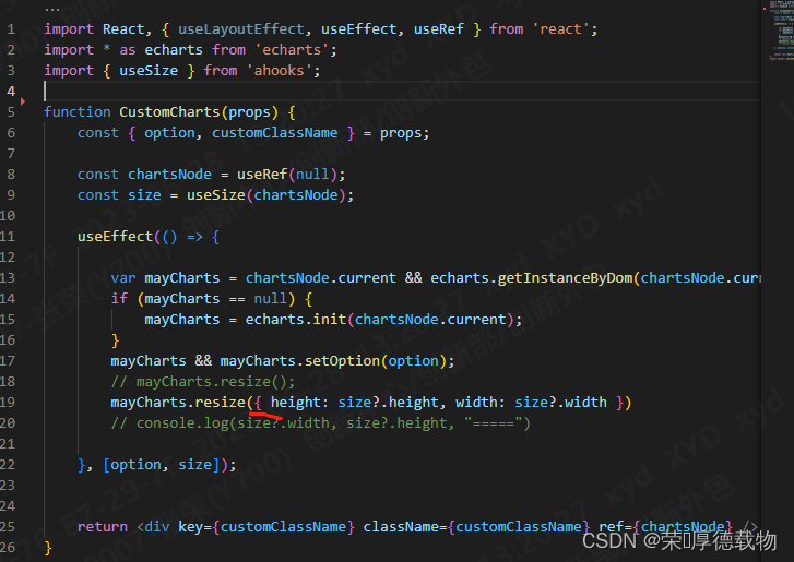
##1、echarts 在react的使用
npm install echarts --save 
 //初始化【getInstanceByDom看是否重复初始化,没有则echarts.init】
 import * as echarts from 'echarts';
 var mayCharts = chartsNode.current && echarts.getInstanceByDom(chartsNode.current)
 //chartsNode.current为加载统计图容器

 if (mayCharts == null) {
      mayCharts = echarts.init(chartsNode.current);
 }

 mayCharts && mayCharts.setOption(option);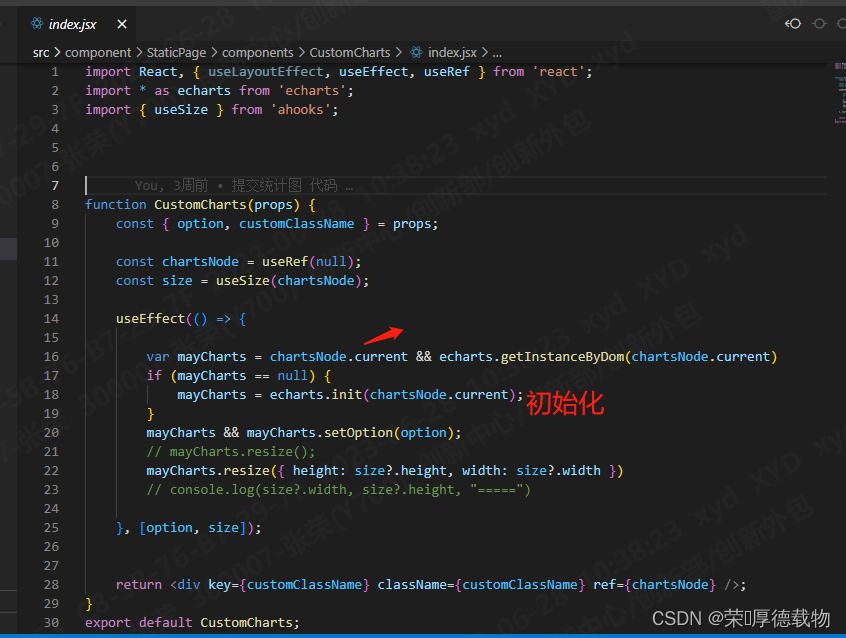
##2、echarts 在 vue的使用
详细使用文章:vue中使用echarts_vue echarts_又年~的博客-CSDN博客
##3、echarts文档
帮助文档:快速上手 - Handbook - Apache ECharts
实例入口:Examples - Apache ECharts
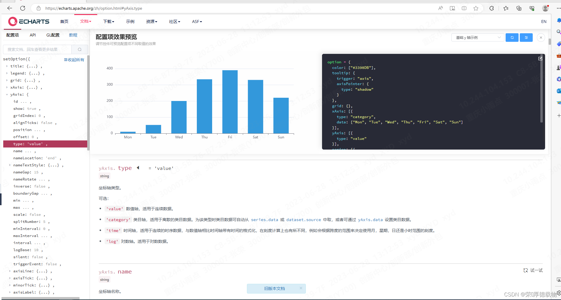
绘图属性api:
Documentation - Apache ECharts
https://echarts.apache.org/zh/option.html#radar.splitLine.lineStyle.dashOffset
##4、echarts的那些图
1、复杂的3d柱形图

在线运行:Examples - Apache ECharts
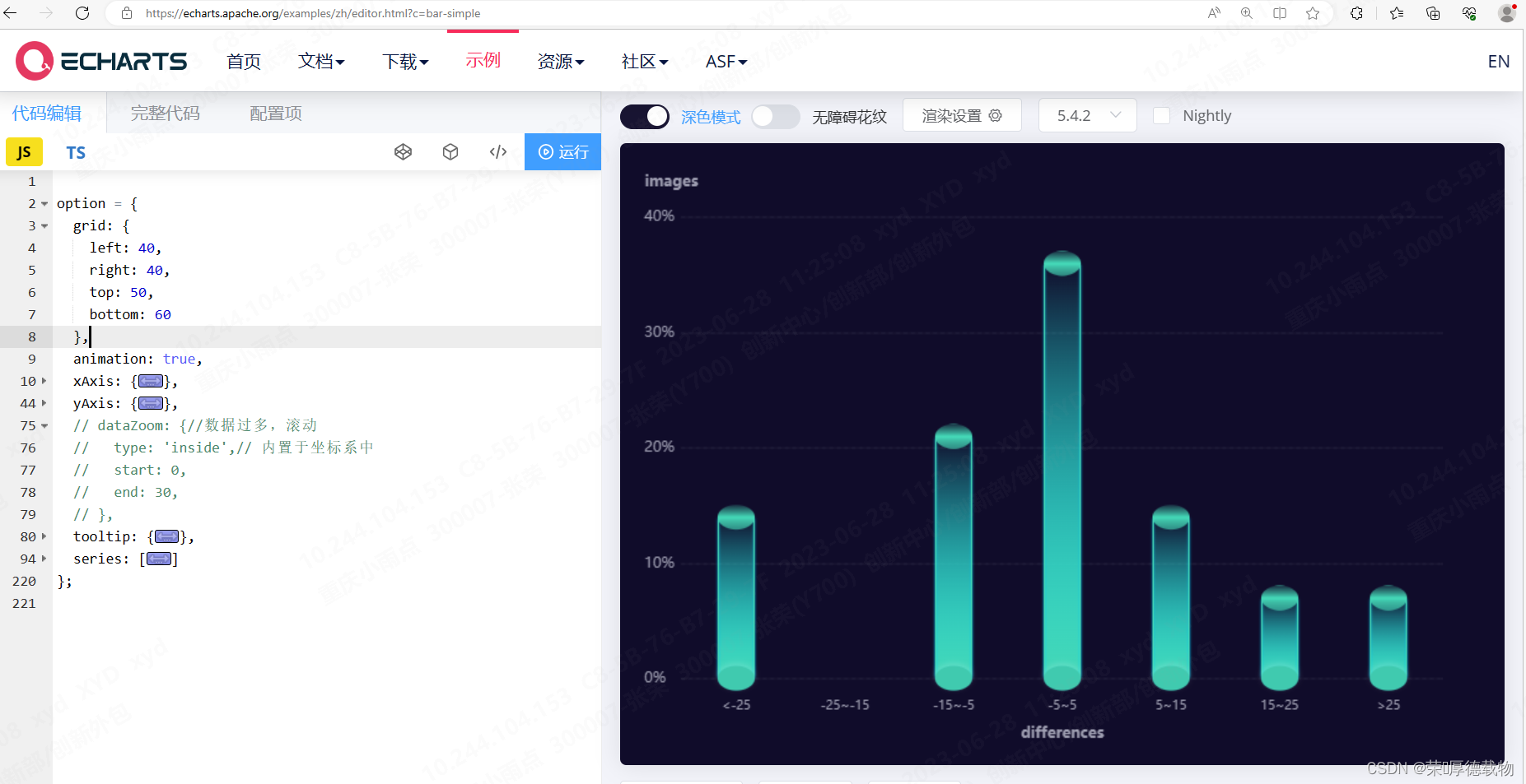
option = {
  grid: {
    left: 40,
    right: 40,
    top: 50,
    bottom: 60
  },
  animation: true,
  xAxis: {
    name: 'differences', //底部横轴 名称
    nameTextStyle: {
      color: '#9E9EB1',
      lineHeight: 50,
      fontWeight: 'bold'
    },
    offset: 5, //横轴 数字和 虚线边界
    nameLocation: 'middle', //底部横轴名称 位置

    data: [
  '<-25',
  '-25~-15',
  '-15~-5',
  '-5~5',
  '5~15',
  '15~25',
  '>25'
], // 底部 横轴名称 数据源

    axisLabel: {
      // 底部 横轴字体颜色
      color: '#9E9EB1',
      margin: 12,
      fontSize: 10,
      interval: 0
    },
    axisTick: {
      show: false
    },
    axisLine: {
      show: false
    }
  },
  yAxis: {
    name: "images", //纵轴 名称
    nameTextStyle: {
      color: '#9E9EB1',
      padding: [0, 0, 7, 0],
      fontWeight: 'bold',
    },
    offset: 8.5, //纵轴 数字和 虚线边界
    type: 'value',
    splitLine: {
      // 纵轴 虚横线
      show: true,
      lineStyle: {
        type: 'dashed',
        color: '#9E9EB1',
        width: 0.2
      }
    },
    axisLabel: {
      //纵轴 坐标
      color: '#9E9EB1',
      margin: 22,
      textStyle: {
        align: 'left'
      },
      formatter: (v) => `${v}%`
    },
    min: 0,
    splitNumber: 3,
    scale: true //自适应
  },
  // dataZoom: {//数据过多,滚动
  //   type: 'inside',// 内置于坐标系中
  //   start: 0,
  //   end: 30,
  // },
  tooltip: {
    //鼠标选择弹窗
    trigger: 'axis',
    axisPointer: {
      type: 'shadow'
    },
    formatter(params) {
      // console.log("输出的数据:",params)
      if (params[0].data === '-') {
        return `${params[0].axisValue} : 0`;
      }
      return `${params[0].axisValue} : ${params[0].data.toFixed(0)}%`;
    }
  },
  series: [
    // 底部的椭圆形(象形柱图):pictorialBar
    {
      type: 'pictorialBar', // pictorialBar(象形柱图)
      label: {
        // 图形上的文本标签,可用于说明图像的一些数据信息,比如值,名称等
        show: false, //是否显示标签
        position: ['17', '-30'], // 标签的位置(可以是绝对的像素值或者百分比['50%','50%',也可以是top,left等])
        color: '#01E4FF',
        fontSize:14
      },
      symbolSize: [30, 20], // 图形的大小用数组分别比表示宽和高,也乐意设置成10相当于[10,10]
      symbolOffset: [0, 10], // 图形相对于原本位置的偏移
      z: 300, // 象形柱状图组件的所有图形的 z 值.控制图形的前后顺序.z 值小的图形会被 z 值大的图形覆盖.
      itemStyle: {
        // 图形样式
        // echarts.graphic.LinearGradient(echarts内置的渐变色生成器)
        // 4个参数用于配置渐变色的起止位置,这4个参数依次对应右 下 左 上
        color: new echarts.graphic.LinearGradient(0, 0, 0, 1, [
          // 这里 offset: 0 1 ,表示从下往上的渐变色
          {
            offset: 0, // 0%处的颜色
            color: 'rgba(64, 202, 175, 1)' //rgba(68,215,182,0)
          },
          {
            offset: 1, // 98%处的颜色
            color: 'rgba(64, 202, 175, 1)' //#44D7B6
          }
        ]),

        //画圆 border
        borderWidth: 1,
        borderColor: '#18CEE2',
        shadowBlur: 5,

        //投影 box-shadow
        shadowColor: 'rgba(255,255,255,0.18000000715255737)',
        shadowOffsetX: 0,
        shadowOffsetY: -2
      },
      data: [14, '-', 21, 36, 14, 7, 7]
    },

    // 中间的长方形柱状图(柱状图):bar
    {
      type: 'bar', // 柱状图
      barWidth: 30, // 柱条的宽度,不设时自适应
      barGap: '0%', // 柱子与柱子之间的距离
      itemStyle: {
        // 图形样式
        // color支持(rgb(255,255,255)、rgba(255,255,255,1)、#fff,也支持渐变色和纹理填充)
        // 下面就是使用线性渐变
        color: new echarts.graphic.LinearGradient(
          0,
          0,
          0,
          1,
          [
            {
              offset: 0,
              color: 'rgba(68,215,182,0)'
            },
            {
              offset: 1,
              color: '#44D7B6'
            }
          ],
          false
        ),

        //圆柱  border
        borderWidth: 1,
        barBorderRadius: [2, 2, 2, 2],
        borderType: 'solid',
        borderColor: '#44D7B6',

        //圆柱投影 box-shadow
        shadowBlur: 2,
        shadowColor: '#00DBFF',
        shadowOffsetX: 0,
        shadowOffsetY: 0
      },
      data: [14, '-', 21, 36, 14, 7, 7]
    },

    // 顶部的椭圆形(象形柱图):pictorialBar
    {
      type: 'pictorialBar',
      symbolSize: [30, 20],
      symbolOffset: [0, -10],
      z: 300,
      symbolPosition: 'end',
      itemStyle: {
        color: new echarts.graphic.LinearGradient(
          0,
          0,
          0,
          1,
          [
            {
              offset: 0,
              color: '#44D7B6' //0%处的颜色
            },
            {
              offset: 0.02,
              color: 'rgba(68,215,182,0.2)' //%处的颜色
            },
            {
              offset: 0.5,
              color: '#44D7B6' //50%处的颜色
            },
            {
              offset: 0.98,
              color: 'rgba(68,215,182,0.6)' //%处的颜色
            },
            {
              offset: 1,
              color: '#44D7B6' //100%处的颜色
            }
          ],
          false
        )
      },
      data: [14, '-', 21, 36, 14, 7, 7]
    }
  ]
};
比较好的学习文章:vue3+echarts 绘制3d圆柱形图_echarts里3d圆柱状图_lbchenxy的博客-CSDN博客
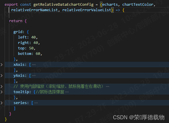
2、复杂的三角锥形柱形图
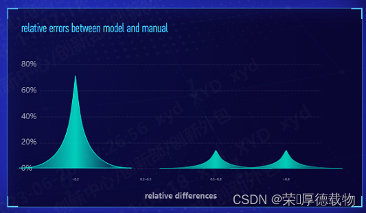
在线运行:Examples - Apache ECharts
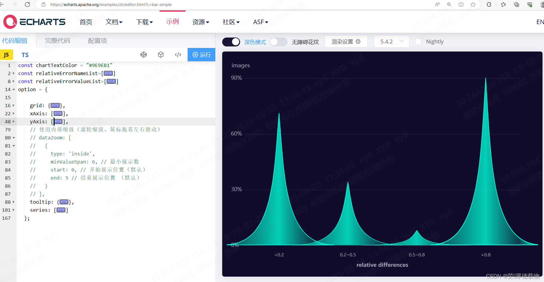
const chartTextColor = "#9E9EB1"
const relativeErrorNameList=[
    "<0.2",
    "0.2~0.5",
    "0.5~0.8",
    ">0.8"
]
const relativeErrorValueList=[
    71,
    34,
    8,
    90
]
option = {

    grid: {
      left: 40,
      right: 40,
      top: 50,
      bottom: 60,
    },
    xAxis: [
      {
        name: 'relative differences', //横轴 名称
        nameTextStyle: {
          color: chartTextColor,
          lineHeight: 50,
          fontWeight: 'bold',
          interval:0,
        },
        offset: 5,//横轴 数字和 虚线边界
        nameLocation: "middle", //横轴名称 位置
        data: relativeErrorNameList,// 底部 横轴数据源
        axisLabel: {
          // 底部 横轴字体颜色
          color: chartTextColor,
          margin:12,
          fontSize: 10
        },
        axisTick: {
          show: false
        },
        axisLine: {
          show: false
        }
      }
    ],
    yAxis: [
      {
        name: 'images', //纵轴 名称
        nameTextStyle: {
          color: chartTextColor,
          padding: [0, 0, 7, 0]
        },
        offset: 8.5,//纵轴 数字和 虚线边界
        splitLine: {
          // 纵轴 虚横线
          show: true,
          lineStyle: {
            type: 'dashed',
            color: chartTextColor,
            width: 0.2
          }
        },
        axisLabel: {
          //纵轴 坐标
          color: chartTextColor,
          margin: 22,
          textStyle: {
            align: 'left'
          },
          formatter: (v) => `${v}%`
        },
        min: 0,
        splitNumber:3,
        scale: true, //自适应
      }
    ],
    // 使用内部缩放(滚轮缩放、鼠标拖着左右滑动)
    // dataZoom: [
    //   {
    //     type: 'inside',
    //     minValueSpan: 6, // 最小展示数
    //     start: 0, // 开始展示位置(默认)
    //     end: 5 // 结束展示位置 (默认)
    //   }
    // ],
    tooltip: {//鼠标选择弹窗
      trigger: "axis",
      axisPointer: {
        type: "shadow"
      },
      formatter(params) {
        // console.log("输出的数据:",params)
        if (params[0].data === '-') {
          return `${params[0].axisValue} : 0`;
        }
        return `${params[0].axisValue} : ${params[0].data.toFixed(0)}%`
      }
    },
    series: [
      {
        name: 'hill',
        // 象柱形图
        type: 'pictorialBar',
        // 同一系列的柱间距离
        barCategoryGap: '-60%',
        // 自定义svg 图标 (三角锥形的关键)
        symbol: 'path://M0,10 L10,10 C5.5,10 5.5,5 5,0 C4.5,5 4.5,10 0,10 z',
        // 默认样式
        itemStyle: {
          label: {
            show: false
          },
          borderColor: '#00FFDB',
          borderWidth: 2,
          color: {
            colorStops: [
              {
                offset: 0,
                color: 'rgba(0, 255, 219, 0.2)'
              },
              {
                offset: 0.5,
                color: 'rgba(0, 255, 219, 0.8)'
              },
              {
                offset: 0.8,
                color: 'rgba(0, 255, 219, 0.2)'
              },
              {
                offset: 1,
                color: 'rgba(0, 255, 219, 1)'
              }
            ]
          }
        },
        // 鼠标滑过样式
        // emphasis: {
        //   label: {
        //     show: false,
        //     position: 'top',
        //     color: '#12DCFF'
        //   },
        //   itemStyle: {
        //     borderColor: '#03B4AA',
        //     borderWidth: 2,
        //     color: {
        //       colorStops: [
        //         {
        //           offset: 0,
        //           color: 'rgba(1,233,204,1)'
        //         },
        //         {
        //           offset: 1,
        //           color: 'rgba(5,119,128, 1)'
        //         }
        //       ]
        //     }
        //   }
        // },

        data: relativeErrorValueList,
        z: 10
      }
    ]
  };
相关学习文章:Vue 中 Echarts实现三角锥形柱形图_森海か的博客-CSDN博客
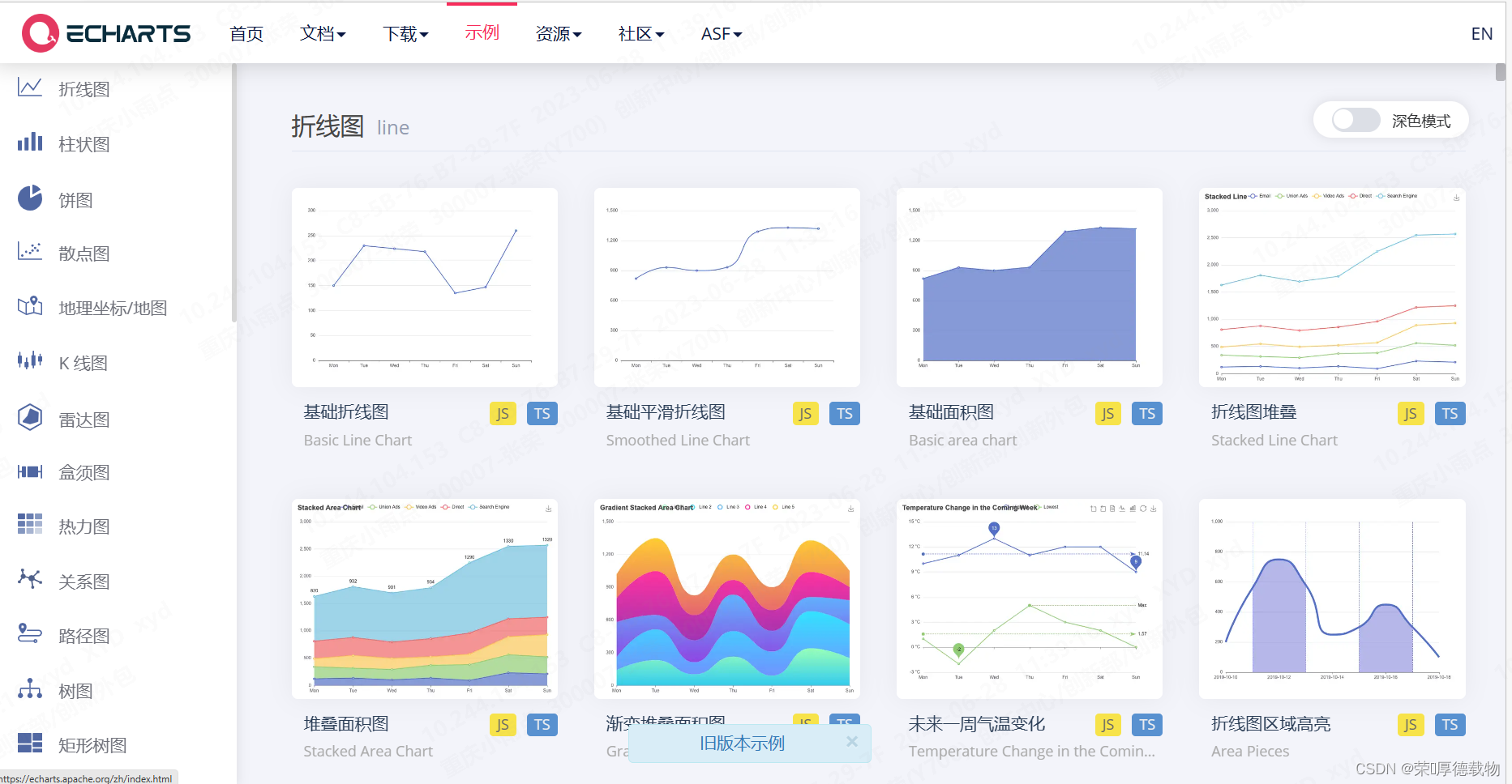
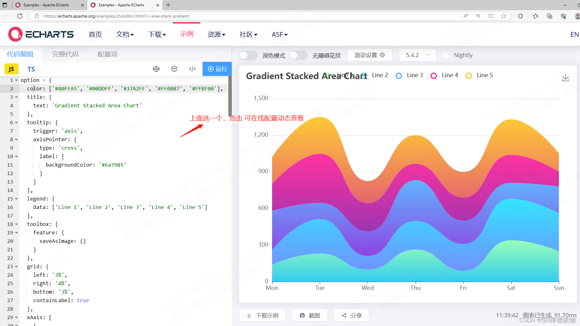
3、简单的图 可按照实例
Examples - Apache ECharts
##5、echarts相关定制
1、Y轴的刻度优化,X轴同理
yAxis: {
          min:0,  //取0为最小刻度
          max: 100, //取100为最大刻度

          min:'dataMin', //取最小值为最小刻度
          max: 'dataMax', //取最大值为最大刻度

          min: function(value) {//取最小值向下取整为最小刻度
            return Math.floor(value.min)
          },
          max: function(value) {//取最大值向上取整为最大刻度
            return  Math.ceil(value.max)
          },
          min: (value) => { // 百位起最小值向下取整
            return Math.floor(value.min / 100) * 100;
          },
          max: (value) => {  // 百位起最大值向上取整
            return Math.ceil(value.max / 100) * 100;
          }
          min: (value) => { //当数据位数不固定时,最小值向下取整
            let num = 10 ** (value.min.toString().length - 2)
            return Math.floor(value.min / num) * num;
          },
          max: (value) => { //当数据位数不固定时,最大值向上取整
            let num = 10 ** (value.max.toString().length - 2)
            return Math.ceil(value.max / num) * num;
            }
          scale: true, //自适应
}
2、让每一个刻度都显示: interval:0

3、适配屏幕变换
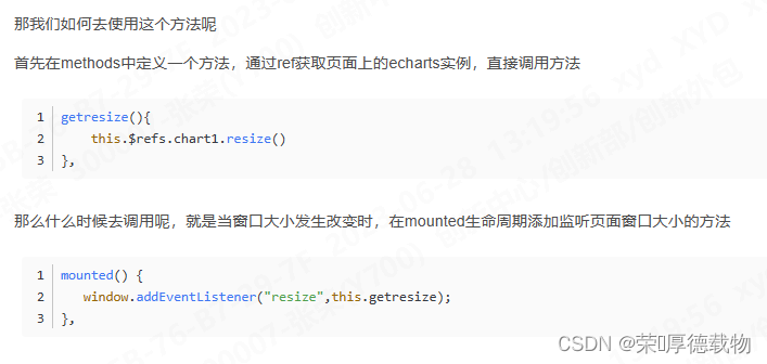
##6、react解决组件重复刷新渲染
使用 useMemo,在数据变更时,在渲染
import React, { useEffect, useState, useLayoutEffect, useRef, useMemo, useCallback } from 'react'
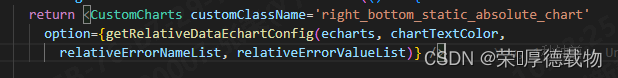
const rightTopStaticAbsoluteMemo = useMemo(() => {
return <CustomCharts customClassName='right_top_static_absolute_chart'
option={getAbsoluteDataEchartConfig(echarts, chartTextColor,
absoluteErrorNameList, absoluteErrorValueList)} />
}, [absoluteErrorNameList, absoluteErrorValueList])
//布局中 使用 {rightTopStaticAbsoluteMemo}
{/* 右边柱形图:绝对误差数量分布图 */}
<div className='right_top_static_absolute mb10'>
<div className='static_title'>
distribution of differences between model prediction and manual
labeling</div>
{absoluteErrorList.length > 0 &&
<div className='right_top_static_absolute_chart'>
{rightTopStaticAbsoluteMemo}
</div>
}
</div>二、antd charts相关
##1、antd charts在react的使用
npm install @ant-design/charts --save
import { Column } from '@ant-design/charts'
import React, { useEffect, useState, useLayoutEffect, useRef, useMemo, useCallback } from 'react'
const leftTopStaticAbsoluteMemo = useMemo(() => {
return <Column {...getManualNumConfig(numPercentList)} />
}, [numPercentList])
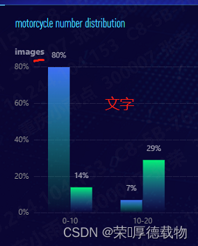
//布局中使用 {leftTopStaticAbsoluteMemo}
<div className='left_top_static_absolute'>
<div className='static_title'>motorcycle number distribution</div>
{numPercentList.length > 0 &&
<div className='left_top_static_absolute_chart'>
{leftTopStaticAbsoluteMemo}
</div>
}
</div>
学习使用篇:React使用Echarts/Ant-design-charts_@ant-design/charts_风雨兼程^_^的博客-CSDN博客
##2、antd charts文档
charts官网:https://charts.ant.design/
帮助文档:简介 | Ant Design Charts
使用实例:charts.ant.design/examples/
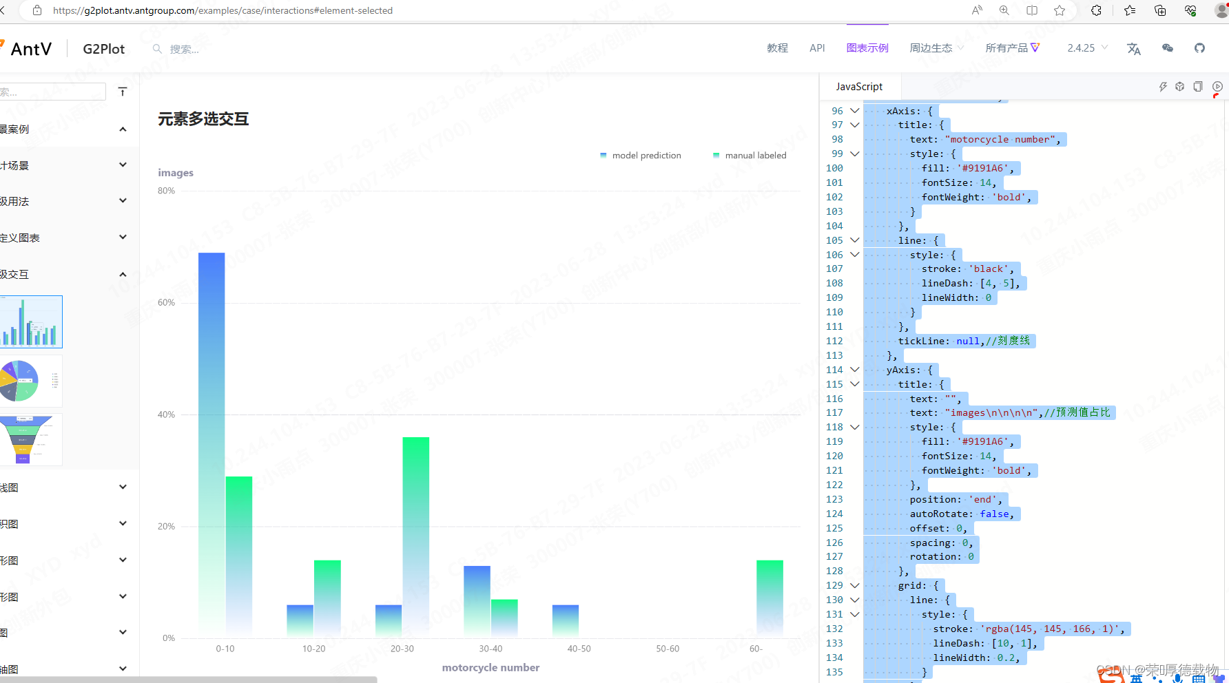
在线运行:高级交互 | G2Plot (antgroup.com)

##3、antd charts的那些图
1、复杂渐变柱形图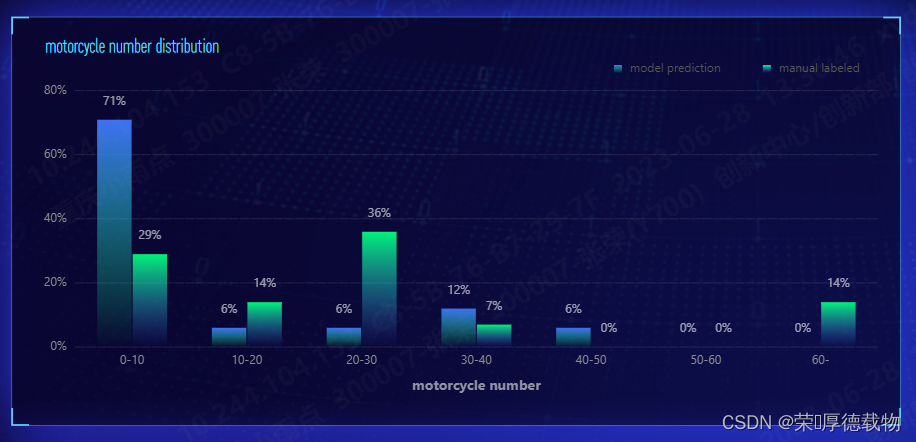
import { Column } from '@ant-design/charts'
import React, { useEffect, useState, useLayoutEffect, useRef, useMemo, useCallback } from 'react'

const leftTopStaticAbsoluteMemo = useMemo(() => {
    return <Column {...getManualNumConfig(numPercentList)} />
}, [numPercentList])


//布局中使用  {leftTopStaticAbsoluteMemo}
<div className='left_top_static_absolute'>

   <div className='static_title'>motorcycle number distribution</div>

        {numPercentList.length > 0 &&
             <div className='left_top_static_absolute_chart'>
                  {leftTopStaticAbsoluteMemo}
             </div>

        }
</div>
export const getManualNumConfig = (data) => {
return {
data,
animationOption: {
update: null,
},
title: {
text: "",
},
legend: {
data: ["model prediction", "manual labeled"],
position: "top-right",
},
color: [
"l(270) 0:RGBA(0, 255, 123, 0) 1:RGBA(65, 118, 255, 1)",
"l(270) 0:RGBA(65, 118, 255, 0) 1:RGBA(0, 255, 123, 1)",
],
isGroup: true,
xField: "分割段",
yField: "预测值占比",
seriesField: "name",
xAxis: {
title: {
text: "motorcycle number",
style: {
fill: '#9191A6',
fontSize: 14,
fontWeight: 'bold',
}
},
line: {
style: {
stroke: 'black',
lineDash: [4, 5],
lineWidth: 0
}
},
tickLine: null,//刻度线
},
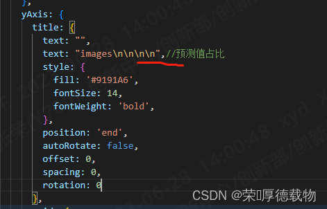
yAxis: {
// title: {
// text: "",
// text: "images\n\n\n\n",//预测值占比
// style: {
// fill: '#9191A6',
// fontSize: 14,
// fontWeight: 'bold',
// },
// position: 'end',
// autoRotate: false,
// offset: 0,
// spacing: 0,
// rotation: 0
// },
grid: {
line: {
style: {
stroke: 'rgba(145, 145, 166, 1)',
lineDash: [10, 1],
lineWidth: 0.2,
}
}
},
line: {
style: {
stroke: 'rgba(145, 145, 166, 1)',
lineDash: [4, 5],
lineWidth: 0
}
},
label: {
formatter: (v) => `${(v * 100).toFixed(0)}%`,
},
},
label: {
formatter: (v) => `${(Number(v["预测值占比"]) * 100).toFixed(0) || 0}%`,
// 可手动配置 label 数据标签位置
position: "top", //middle
style: {
fill: "#FFFFFF",
opacity: 0.6,
},
},
tooltip: {
formatter: (datum) => {
return {
name: datum.name,
value: `${(Number(datum["预测值占比"]) * 100).toFixed(0) || 0}%`,
};
},
},
};
};在线运行:高级交互 | G2Plot (antgroup.com)
import { Column } from '@antv/g2plot';

const data = [
    {
        "name": "model prediction",
        "分割段": "0-10",
        "预测值占比": 0.69
    },
    {
        "name": "model prediction",
        "分割段": "10-20",
        "预测值占比": 0.06
    },
    {
        "name": "model prediction",
        "分割段": "20-30",
        "预测值占比": 0.06
    },
    {
        "name": "model prediction",
        "分割段": "30-40",
        "预测值占比": 0.13
    },
    {
        "name": "model prediction",
        "分割段": "40-50",
        "预测值占比": 0.06
    },
    {
        "name": "model prediction",
        "分割段": "50-60",
        "预测值占比": 0
    },
    {
        "name": "model prediction",
        "分割段": "60-",
        "预测值占比": 0
    },
    {
        "name": "manual labeled",
        "分割段": "0-10",
        "预测值占比": 0.29
    },
    {
        "name": "manual labeled",
        "分割段": "10-20",
        "预测值占比": 0.14
    },
    {
        "name": "manual labeled",
        "分割段": "20-30",
        "预测值占比": 0.36
    },
    {
        "name": "manual labeled",
        "分割段": "30-40",
        "预测值占比": 0.07
    },
    {
        "name": "manual labeled",
        "分割段": "40-50",
        "预测值占比": 0
    },
    {
        "name": "manual labeled",
        "分割段": "50-60",
        "预测值占比": 0
    },
    {
        "name": "manual labeled",
        "分割段": "60-",
        "预测值占比": 0.14
    }
];

const plot = new Column('container', {
    data,
    animationOption: {
      update: null,
    },
    title: {
      text: "人工预测值 vs 模型预测值",
    },
    legend: {
      data: ["model prediction", "manual labeled"],
      position: "top-right",
    },
    color: [
      "l(270) 0:RGBA(0, 255, 123, 0) 1:RGBA(65, 118, 255, 1)",
      "l(270) 0:RGBA(65, 118, 255, 0) 1:RGBA(0, 255, 123, 1)",
    ],
    isGroup: true,
    xField: "分割段",
    yField: "预测值占比",
    seriesField: "name",
    xAxis: {
      title: {
        text: "motorcycle number",
        style: {
          fill: '#9191A6',
          fontSize: 14,
          fontWeight: 'bold',
        }
      },
      line: {
        style: {
          stroke: 'black',
          lineDash: [4, 5],
          lineWidth: 0
        }
      },
      tickLine: null,//刻度线
    },
    yAxis: {
      title: {
        text: "",
        text: "images\n\n\n\n",//预测值占比
        style: {
          fill: '#9191A6',
          fontSize: 14,
          fontWeight: 'bold',
        },
        position: 'end',
        autoRotate: false,
        offset: 0,
        spacing: 0,
        rotation: 0
      },
      grid: {
        line: {
          style: {
            stroke: 'rgba(145, 145, 166, 1)',
            lineDash: [10, 1],
            lineWidth: 0.2,
          }
        }
      },
      line: {
        style: {
          stroke: 'rgba(145, 145, 166, 1)',
          lineDash: [4, 5],
          lineWidth: 0
        }
      },
      label: {
        formatter: (v) => `${(v * 100).toFixed(0)}%`,
      },
    },
    label: {
      formatter: (v) => `${(Number(v["预测值占比"]) * 100).toFixed(0) || 0}%`,
      // 可手动配置 label 数据标签位置
      position: "top", //middle
      style: {
        fill: "#FFFFFF",
        opacity: 0.6,
      },
    },
    tooltip: {
      formatter: (datum) => {
        return {
          name: datum.name,
          value: `${(Number(datum["预测值占比"]) * 100).toFixed(0) || 0}%`,
        };
      },
    },
  });

plot.render();
// 如果业务中还有单选联动,可以考虑使用按住某个键来区分交互 (或者多选之后,让用户自己去触发查询)
document.addEventListener('keyup', (evt) => {
  if (evt.key === 'Shift') {
    const states = plot.getStates();
    // 获取选中元素
    // states.filter(d => d.state === 'selected')
  }
});
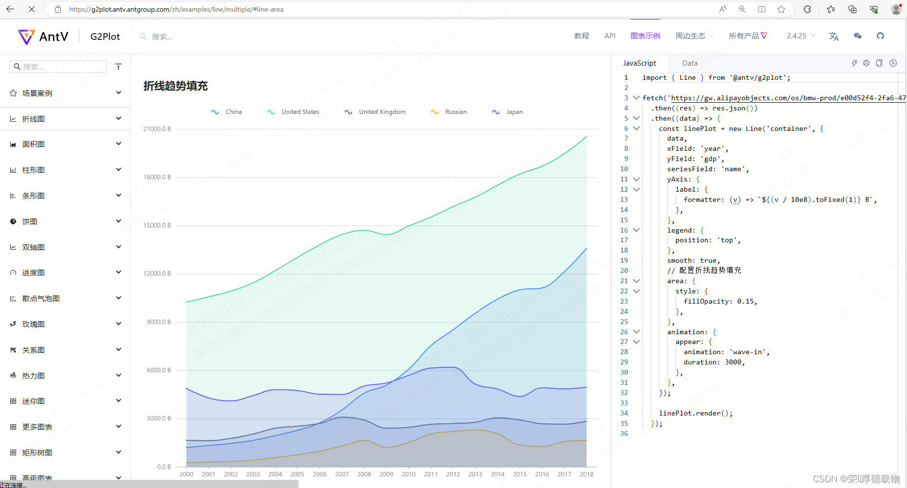
2、其他图 可按照实例
多折线图 | G2Plot (antgroup.com)
##5、antd charts相关定制
相关绘制 api:绘图属性 | G2Plot (antgroup.com)
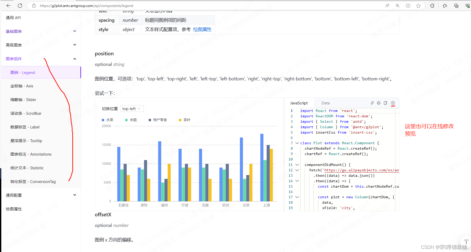
1、去掉刻度线 tickLine: null,//刻度线
xAxis: {

      title: {

        text: "motorcycle number",

        style: {

          fill: '#9191A6',

          fontSize: 14,

          fontWeight: 'bold',

        }

      },

      line: {

        style: {

          stroke: 'black',

          lineDash: [4, 5],

          lineWidth: 0

        }

      },

      tickLine: null,//刻度线

    },
2、定义 y轴文字
3、自定义 x 和 y轴 yanse 和分割线
在线运行:高级交互 | G2Plot (antgroup.com)
import { Column } from '@antv/g2plot';
const data = [
{
name: 'London',
月份: 'Jan.',
月均降雨量: 18.9,
},
{
name: 'London',
月份: 'Feb.',
月均降雨量: 28.8,
},
{
name: 'London',
月份: 'Mar.',
月均降雨量: 39.3,
},
{
name: 'London',
月份: 'Apr.',
月均降雨量: 81.4,
},
{
name: 'London',
月份: 'May',
月均降雨量: 47,
},
{
name: 'London',
月份: 'Jun.',
月均降雨量: 20.3,
},
{
name: 'London',
月份: 'Jul.',
月均降雨量: 24,
},
{
name: 'London',
月份: 'Aug.',
月均降雨量: 35.6,
},
{
name: 'Berlin',
月份: 'Jan.',
月均降雨量: 12.4,
},
{
name: 'Berlin',
月份: 'Feb.',
月均降雨量: 23.2,
},
{
name: 'Berlin',
月份: 'Mar.',
月均降雨量: 34.5,
},
{
name: 'Berlin',
月份: 'Apr.',
月均降雨量: 99.7,
},
{
name: 'Berlin',
月份: 'May',
月均降雨量: 52.6,
},
{
name: 'Berlin',
月份: 'Jun.',
月均降雨量: 35.5,
},
{
name: 'Berlin',
月份: 'Jul.',
月均降雨量: 37.4,
},
{
name: 'Berlin',
月份: 'Aug.',
月均降雨量: 42.4,
},
];
const plot = new Column('container', {
data,
isGroup: true,
xField: '月份',
yField: '月均降雨量',
seriesField: 'name',
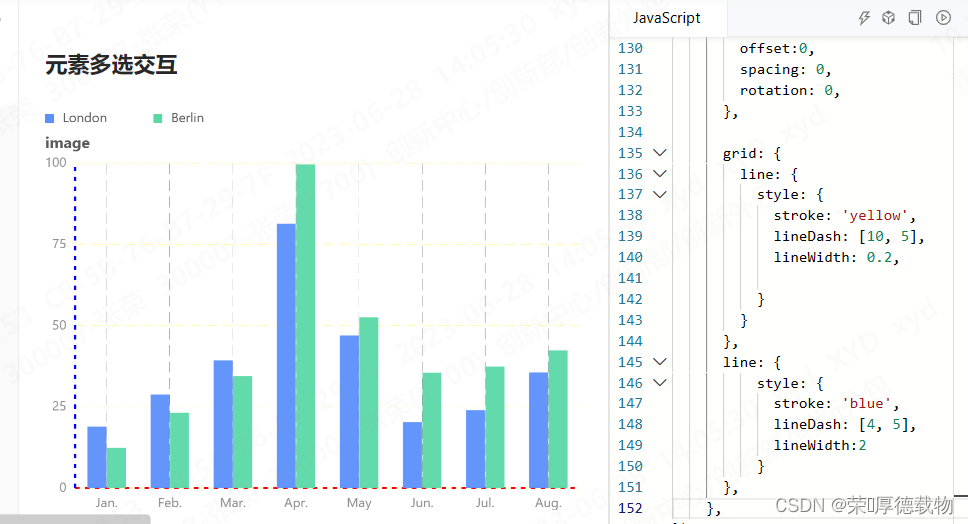
interactions: [{ type: 'element-selected' }],
xAxis:{
line: {
style: {
stroke: 'red',
lineDash: [4, 5],
lineWidth:2
}
},
grid: {
line:
{
style: {
stroke: 'black',
lineDash: [10, 5],
lineWidth: 0.2,
}
}
},
shapeStyle:{
stroke: 'red',
lineDash: [4, 5],
lineWidth:0,
},
position:'bottom',
tickLine:null,
},
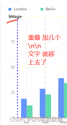
yAxis: {
title: {
text: "image\n\n\n",//预测值占比
style:{
color: '#9E9EB1',
fontSize:14,
fontWeight: 'bold',
},
position:'end',
autoRotate:false,
offset:0,
spacing: 0,
rotation: 0,
},
grid: {
line: {
style: {
stroke: 'yellow',
lineDash: [10, 5],
lineWidth: 0.2,
}
}
},
line: {
style: {
stroke: 'blue',
lineDash: [4, 5],
lineWidth:2
}
},
},
});
plot.render();
// 如果业务中还有单选联动,可以考虑使用按住某个键来区分交互 (或者多选之后,让用户自己去触发查询)
document.addEventListener('keyup', (evt) => {
if (evt.key === 'Shift') {
const states = plot.getStates();
// 获取选中元素
// states.filter(d => d.state === 'selected')
}
});![[web]前端富文本编辑器](https://img-blog.csdnimg.cn/475e13aa5b12402db291c96163359a2c.png)