提示:这章比较重要,做复杂页面时经常会用到!会不断更新❗
文章目录
- 前言
- 主轴和侧轴
- flex-direction 主轴方向
- flex-wrap 折行
- justify-content 主轴排列方式
- flex-start:默认左对齐
- flex-end:右对齐
- center:居中
- space-between:两端对齐
- space-around:子标记之间的间距是子标记与父标记边框之间的间距2倍
- space-evenly:间距平均
- justify-content 侧轴排列方式
- align-items与align-content 侧轴排列方式
- flex 子标记样式
前言
提示:这里可以添加本文要记录的大概内容:
弹性布局的总体思想是把布局不写在标记上,而是把布局的样式代码写在最大的父标记上
让布局实现自适应和自动调整,可以在不同屏幕大小和设备上保持一定的布局效果,同时也可以方便地进行响应式设计
示例代码:
    /* 弹性布局 */
    display: flex;
    /* 主轴水平居中 */
    justify-content: center;
    /* 侧轴垂直居中 */
    align-items: center;
提示:以下是本篇文章正文内容,下面案例可供参考
主轴和侧轴
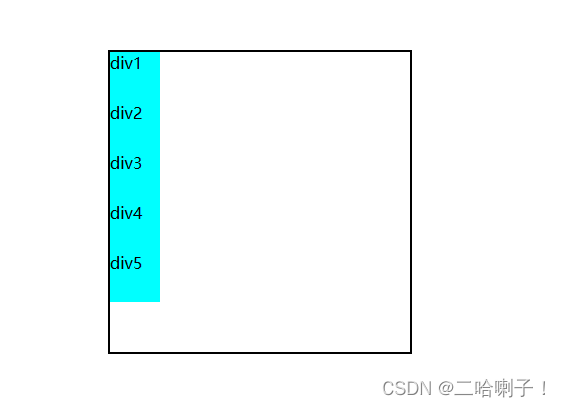
盒子变成弹性盒子后标记怎么排列?它是按照两个轴为方向进行排列显示(主轴和侧轴)
默认主轴是水平的,默认侧轴是垂直的
先设置一个大div,里面放五个小div,并分别控制他们的样式
<!DOCTYPE html>
<html lang="en">
<head>
    <meta charset="UTF-8">
    <title>Document</title>
    <style>
        .p{
            width: 300px;
            height: 300px;
            border: 2px solid black;
            margin-top: 50px;
            margin-left: 100px;
        }
        .s{
            width: 50px;
            height: 50px;
            background-color: aqua;
        }
    </style>
</head>
<body>
    <!-- div.p>div{div$}.s*5 公式生成-->
    <div class="p">
        <div class="s">div1</div>
        <div class="s">div2</div>
        <div class="s">div3</div>
        <div class="s">div4</div>
        <div class="s">div5</div>
    </div>

</body>
</html>
输出效果:从上到下,五个小div默认排列
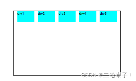
在父标记内加上弹性布局 display: flex;,
输出显示:
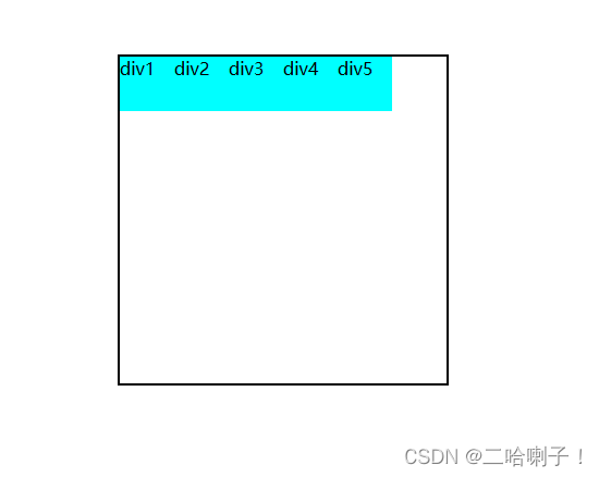
弹性盒子中的子标记,是先按照主轴排列,再按照侧轴排列
主轴侧轴彼此垂直交叉
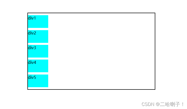
flex-direction 主轴方向
flex-direction:row      /*子元素沿主轴方向排列,也就是水平方向 row为默认值*/
flex-direction:column   /*子元素沿侧轴方向排列,也就是垂直方向 */
主轴默认是水平方向,【flex-direction: column; 垂直排列】
column主轴方向是垂直的(列)
row主轴方向是水平的(行)
弹性盒子中的子标记都会变成:行内块类型
接下来看一下
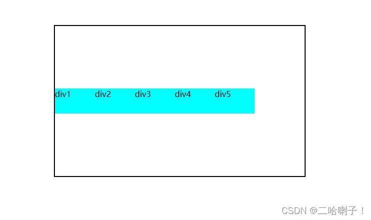
子标记里的5个div宽都是50px,总宽度是250px,接下来看一下他在整个大div宽300px内的显示

如果把5个小div的宽度改成80px,那总宽是400px,而大div总宽是300px,那会不会主轴不满然后侧轴排列?
输出结果:
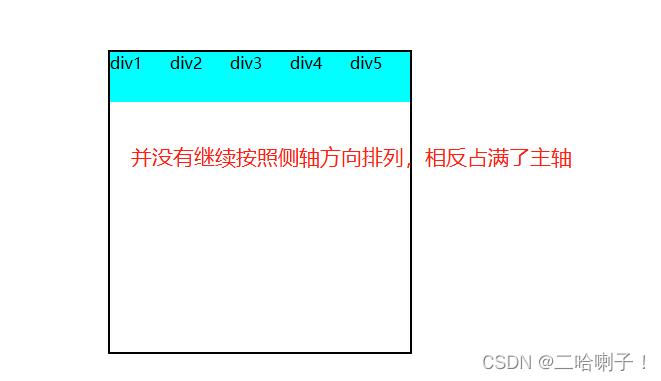
这就是弹性盒子的特点:等比例压缩了
弹性盒子中的子标记占据的总尺寸超过弹性盒子的尺寸,默认弹性盒子会讲子标记等比例的压缩
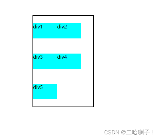
flex-wrap 折行
如果说不想让他等比例压缩,要他折行显示侧轴排列时用到
在父标记中加入flex-wrap: wrap;
输出显示:
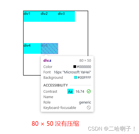
弹性盒子对于一些简单的样式声明,他会完成一些复杂的计算和排列
弹性盒子尺寸小于子标记的总尺寸时,会在侧轴排列(折行显示)
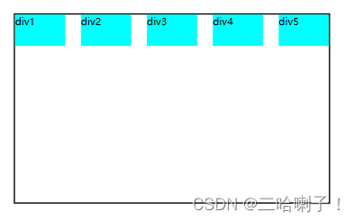
justify-content 主轴排列方式
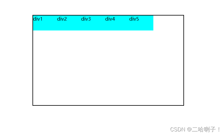
flex-start:默认左对齐
主轴水平→左对齐,主轴垂直→上对齐
justify-content: flex-start;
总代码:
<!DOCTYPE html>
<html lang="en">
<head>
    <meta charset="UTF-8">
    <title>Document</title>
    <style>
        .p{
            width: 500px;
            height: 300px;
            border: 2px solid black;
            margin-top: 50px;
            margin-left: 100px;
            /* 弹性布局 */
            display: flex;
            /* 水平向右排列(默认值) */
            flex-direction: row;
            flex-wrap: wrap;

            justify-content: space-evenly;
        }
        .s{
            width: 80px;
            height: 50px;
            background-color: aqua;
        }
    </style>
</head>
<body>
    <!-- div.p>div{div$}.s*5 公式生成-->
    <div class="p">
        <div class="s">div1</div>
        <div class="s">div2</div>
        <div class="s">div3</div>
        <div class="s">div4</div>
        <div class="s">div5</div>
    </div>

</body>
</html>
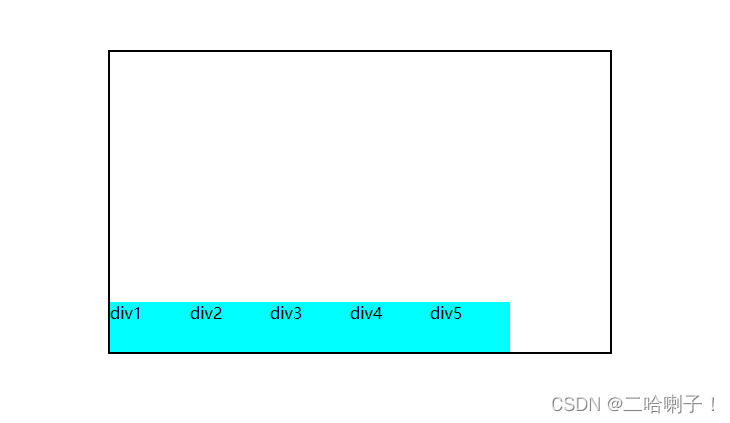
flex-end:右对齐
主轴水平右对齐,主轴是垂直下对齐
justify-content: flex-start;
center:居中
主轴水平整体水平居中,主轴是垂直整体垂直居中
justify-content: center;
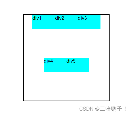
space-between:两端对齐
主轴水平,左右两端的子标记紧挨着父标记的边框,
主轴垂直,上下两端子标记紧挨着父标记的边框,子标记之间间距相等
justify-content: space-between;
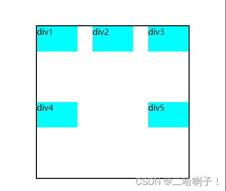
space-around:子标记之间的间距是子标记与父标记边框之间的间距2倍
子标记之间的间距是子标记与父标记边框之间的间距2倍
justify-content: space-around;
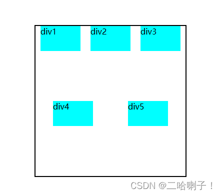
space-evenly:间距平均
子标记之间的间距和子标记与父标记边框之间的间距相等
justify-content: space-evenly;
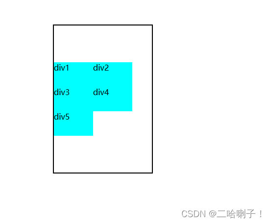
justify-content 侧轴排列方式
只需要在父标记中加上下面代码
根据上面主轴的显示效果,可以理解成把它们逆时针旋转90°
/* 侧轴排列 */
flex-direction: column;
比如说space-evenly:间距平均
子标记之间的间距和子标记与父标记边框之间的间距相等
justify-content: space-evenly;
align-items与align-content 侧轴排列方式
align-items侧轴排列方式:
lign-items:侧轴排列方式
flex-start:侧轴垂直上对齐,侧轴水平左对齐
flex-end:侧轴垂直下对齐,侧轴水平右对齐
center:侧轴垂直居中,侧轴水平居中
align-items: flex-start;垂直方向上这几个标记靠上方
【案例代码】
<!DOCTYPE html>
<html lang="en">
<head>
    <meta charset="UTF-8">
    <title>Document</title>
    <style>
        .p{
            width: 500px;
            height: 300px;
            border: 2px solid black;
            margin-top: 50px;
            margin-left: 100px;
            /* 弹性布局 */
            display: flex;
            /* 主轴方向 column主轴方向是垂直的,row主轴方向是水平的(行)*/
            flex-direction: row;
            flex-wrap: wrap;

            justify-content: flex-start;
            /* align-items,侧轴排列方式 */
            align-items: flex-start;
        }
        .s{
            width: 80px;
            height: 50px;
            background-color: aqua;
        }
    </style>
</head>
<body>
    <!-- div.p>div{div$}.s*5 公式生成-->
    <div class="p">
        <div class="s">div1</div>
        <div class="s">div2</div>
        <div class="s">div3</div>
        <div class="s">div4</div>
        <div class="s">div5</div>
    </div>

</body>
</html>
align-items: flex-end;垂直方向侧轴靠下排列
align-items: center;垂直方向侧轴中间排列
align-content侧轴排列方式与align-items侧轴排列方式区别在于:多行显示时会看出效果
首先看一下
align-items: center;
/* align-content: center; */
【案例代码】
<!DOCTYPE html>
<html lang="en">
<head>
    <meta charset="UTF-8">
    <title>Document</title>
    <style>
        .p{
         /* 此处把宽度改小,使其多行显示 */
            width: 200px;
            height: 300px;
            border: 2px solid black;
            margin-top: 50px;
            margin-left: 100px;
            /* 弹性布局 */
            display: flex;
            flex-direction: row;
            flex-wrap: wrap;

            justify-content: flex-start;

            align-items: center;
            /* align-content: center; */
        }
        .s{
            width: 80px;
            height: 50px;
            background-color: aqua;
        }
    </style>
</head>
<body>
    <!-- div.p>div{div$}.s*5 公式生成-->
    <div class="p">
        <div class="s">div1</div>
        <div class="s">div2</div>
        <div class="s">div3</div>
        <div class="s">div4</div>
        <div class="s">div5</div>
    </div>

</body>
</html>
每一行中都在中间
 /* align-items: center;  */
 align-content: center;
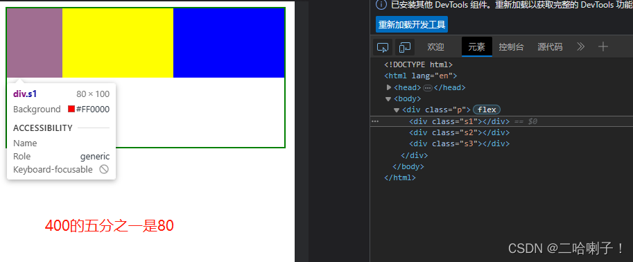
flex 子标记样式
前面的标记都放在了父标记中,只有flex是唯一一个安排在子标记中的样式
flex是弹性布局中唯一一个设置在子标记中的样式
flex:整数;子标记占据父标记尺寸空间的比例
flex: 0 0 整数px; 代表子标记固定的尺寸,【0 0】:不压缩不扩大,固定
第一种写法:子标记中写数字
<!DOCTYPE html>
<html lang="en">
<head>
    <meta charset="UTF-8">
    <title>Document</title>
    <style>
        .p{
            width: 400px;
            height: 200px;
            border: 2px green solid;
            /* 变弹性盒子 */
            display: flex;
        }
        .p>div{
            height: 100px;
        }

        .s1{
            background-color: red;
            flex: 1;
        }
        .s2{
            background-color: yellow;
            flex: 2;
        }
        .s3{
            background-color: blue;
            flex: 2;
        }
    </style>
</head>
<body>
    <div class="p">
        <div class="s1"></div>
        <div class="s2"></div>
        <div class="s3"></div>
    </div>
</body>
</html>
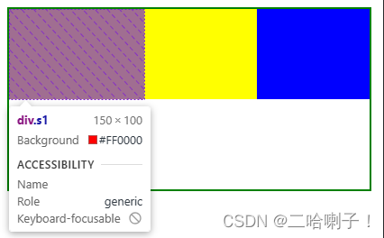
第二种写法:固定样式写法
这里以s1举例
        .s1{
            background-color: red;
            /* s1,固定150px */
            flex: 0 0 150px;
        }
flex: 0 0 整数px; 代表子标记固定的尺寸,【0 0】:不压缩不扩大,固定
输出效果:
s2和s3是125×100