文章目录
- 前言
- 效果图
- 说明
前言
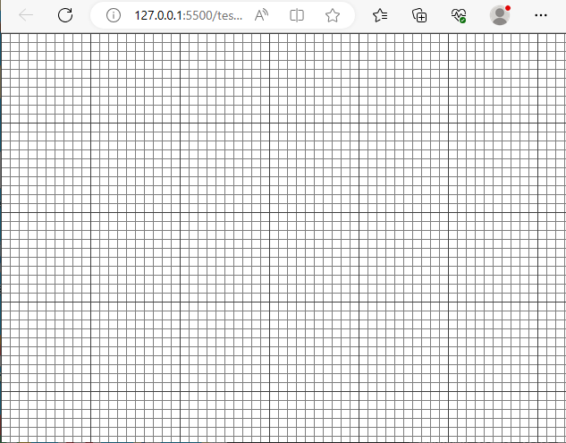
本篇文章主要简单扼要的去实现css网格背景,并进一步探求其应用原理
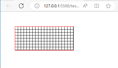
效果图
css代码
body::before, body::after {
            position: fixed;
            top: 0;
            left: 0;
            right: 0;
            bottom: 0;
            content: '';
            background-repeat: repeat;
            pointer-events: none;
            opacity: 0.5;
            /* background-color: red; */
        }

        body::before {
            background-image: linear-gradient(to right,
                    black 1px,
                    transparent 1px,
                    transparent 10px),
                linear-gradient(to bottom,
                    black 1px,
                    transparent 1px,
                    transparent 10px);
            background-size: 10px 10px;
        }

        body::after {
            background-image: linear-gradient(to right,
                    black 1px,
                    transparent 1px,
                    transparent 100px),
                linear-gradient(to bottom,
                    black 1px,
                    transparent 1px,
                    transparent 100px);
            background-size: 100px 100px;
        }
说明
实现网格背景利用的是background-image属性
background-image 属性设置一个元素的背景图像。
元素的背景是元素的总大小,包括填充和边界(但不包括边距)。
默认情况下,background-image放置在元素的左上角,并重复垂直和水平方向。
提示:请设置一种可用的背景颜色,这样的话,假如背景图像不可用,可以使用背景色带代替。
看一下它的属性
| 名称 | 说明 |
|---|---|
| url(‘URL’) | 图像的URL |
| none | 无图像背景会显示。这是默认 |
| linear-gradient() | 用径向渐变创建 “图像”。 (center to edges) |
| repeating-linear-gradient() | 创建重复的线性渐变 “图像”。 |
| repeating-radial-gradient() | 创建重复的径向渐变 “图像” |
| inherit | 指定背景图像应该从父元素继承 |
其中用到的就是 linear-gradient()
background-image: linear-gradient(direction, color-stop1, color-stop2, ...);
例子:
background-image: linear-gradient(to right, rgba(255,0,0,0), rgba(255,0,0,1));
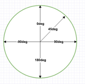
这里说明下,to right就是往右进行渐变,to bottom就是往下进行渐变,当然,你也可以自己设置渐变角度 xdeg
具体例子:
1 从左往右的黑红渐变
 div{
            position: absolute;
            left:50px;
            top:50px;
            width: 200px;
            height: 80px;
            border:solid 1px red;
            background-image: linear-gradient(to right,rgba(2,2,2,1),rgb(209, 21, 21));
        }

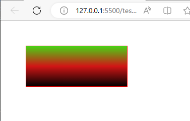
2 0角度的黑、红、绿渐变
 div{
            position: absolute;
            left:50px;
            top:50px;
            width: 200px;
            height: 80px;
            border:solid 1px red;
            background-image: linear-gradient(0deg,rgba(2,2,2,1),rgb(209, 21, 21),rgb(74, 209, 21));
        }
那么我们思考下,如何绘制网格。
网格分为左右和上下。渐变线说白了就是一条条不同色域的线堆叠而成。
我们先来绘制横向的渐变线。
1 横向渐变是从上到下的横线条组成的,就是to bottom,或者是0deg
div{
            position: absolute;
            left:50px;
            top:50px;
            width: 200px;
            height: 80px;
            border:solid 1px red;
            background-image: linear-gradient(to bottom,transparent 9px,black 1px) ;
            background-size: 100% 10px;
            background-repeat: repeat;
        }

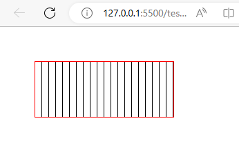
同样的道理,画竖着的线
div{
            position: absolute;
            left:50px;
            top:50px;
            width: 200px;
            height: 80px;
            border:solid 1px red;
            /* background-image: linear-gradient(to bottom,transparent 9px,black 1px) ;
            background-size: 100% 10px;
            background-repeat: repeat; */
            background-image: linear-gradient(to right,transparent 9px,black 1px) ;
            background-size: 10px 100%;
            background-repeat: repeat;
        }
两个合到一起:
div{
            position: absolute;
            left:50px;
            top:50px;
            width: 200px;
            height: 80px;
            border:solid 1px red;
            background-image: linear-gradient(to bottom,transparent 9px,black 1px),linear-gradient(to right,transparent 9px,black 1px) ;
            background-size: 10px 10px;
            background-repeat: repeat;
        }
到此,基本就推导出来了。


![NSSCTF MOBILE [SWPU 2019]easyapp 详细题解](https://img-blog.csdnimg.cn/b0a20cb2d66840eab40f720d333a3afe.png)