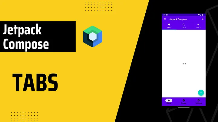
Android Jetpack Compose 中的Tabs(TabLayout)
添加依赖
我们需要依赖于2个 accompanist组件,你可以从下面链接中获取最新版本https://github.com/google/accompanist/tree/main/pager#pager-composable-for-jetpack-compose
def accompanist_version = "0.28.0"
implementation "com.google.accompanist:accompanist-pager:$accompanist_version" // Pager
implementation "com.google.accompanist:accompanist-pager-indicators:$accompanist_version" // Pager Indicators
准备
在实现Tabs之前,我们将创建data类和Screen类。
data class TabRowItem(
    val title: String,
    val icon: ImageVector,
    val screen: @Composable () -> Unit,
)
这个数据类可以根据要求更改。您可以删除title或icon,但其中至少一个必须保留。
@Composable
fun TabScreen(
    text: String,
) {
    Box(
        modifier = Modifier
            .fillMaxSize(),
        contentAlignment = Alignment.Center,
    ) {
        Text(
            text = text,
            style = MaterialTheme.typography.body1,
        )
    }
}
这将用于我们的示例。您可以并应该稍后更改它。
最后,让我们创建选项卡列表。
val tabRowItems = listOf(
    TabRowItem(
        title = "Tab 1",
        screen = { TabScreen(text = "Tab 1") },
        icon = Icons.Rounded.Place,
    ),
    TabRowItem(
        title = "Tab 2",
        screen = { TabScreen(text = "Tab 2") },
        icon = Icons.Rounded.Search,
    ),
    TabRowItem(
        title = "Tab 3",
        screen = { TabScreen(text = "Tab 3") },
        icon = Icons.Rounded.Star,
    )
)
实现
val pagerState = rememberPagerState()
val coroutineScope = rememberCoroutineScope()
pagerState将需要记住和保持页面器的状态。
coroutineScope将用于pagerState滚动。
Column(
    modifier = Modifier
        .padding(contentPadding)
) {
    TabRow(
        selectedTabIndex = pagerState.currentPage,
        indicator = { tabPositions ->
            TabRowDefaults.Indicator(
                Modifier.pagerTabIndicatorOffset(pagerState, tabPositions),
                color = MaterialTheme.colors.secondary
            )
        },
    ) {
        // Will be added later
    }
}
我们首先添加TabRow,这将是Tab的容器。
selectedTabIndex是当前选定选项卡的索引。
indicator表示当前选定的选项卡。
Column(
    modifier = Modifier
        .padding(contentPadding)
) {
    TabRow(
        //..
    ) {
        tabRowItems.forEachIndexed { index, item ->
            Tab(
                selected = pagerState.currentPage == index,
                onClick = { coroutineScope.launch { pagerState.animateScrollToPage(index) } },
                icon = {
                   Icon(imageVector = item.icon, contentDescription = "")
                },
                text = {
                    Text(
                        text = item.title,
                        maxLines = 2,
                        overflow = TextOverflow.Ellipsis,
                    )
                }
            )
        }
    }
在TabRow里,我们将创建Tab。由于我们已经创建了tabs列表,因此我们将简单地调用tabRowItems.forEachIndex并设置Tabs。
选择selected属性,即此选项卡是否被选中。
icon和text是可选的。您可以选择其中一个或两者,就像我们的示例一样。
在onClick方法中,我们启动coroutineScope并调用animateScrollToPage函数。它简单地将给定页面动画滚动到视图的中心。
Column(
    modifier = Modifier
        .padding(contentPadding)
) {
    TabRow(
        //...
    ) {
        //...
    }
    HorizontalPager(
        count = tabRowItems.size,
        state = pagerState,
    ) {
        tabRowItems[pagerState.currentPage].screen()
    }
}
HorizontalPager是一种水平滚动布局,允许用户在左右两侧之间翻转项目。
最后,我们将添加HorizontalPager。count是页面数量,state是用于控制或观察分页器状态的对象,我们已经在上面创建了它。
在HorizontalPager中,我们将获取当前页面并调用Screen,这也是我们在自定义数据类中已经创建的。

完整代码如下:
val pagerState = rememberPagerState()
val coroutineScope = rememberCoroutineScope()

Column(
    modifier = Modifier
        .padding(contentPadding)
) {
    TabRow(
        selectedTabIndex = pagerState.currentPage,
        indicator = { tabPositions ->
            TabRowDefaults.Indicator(
                Modifier.pagerTabIndicatorOffset(pagerState, tabPositions),
                color = MaterialTheme.colors.secondary
            )
        },
    ) {
        tabRowItems.forEachIndexed { index, item ->
            Tab(
                selected = pagerState.currentPage == index,
                onClick = { coroutineScope.launch { pagerState.animateScrollToPage(index) } },
                icon = {
                   Icon(imageVector = item.icon, contentDescription = "")
                },
                text = {
                    Text(
                        text = item.title,
                        maxLines = 2,
                        overflow = TextOverflow.Ellipsis,
                    )
                }
            )
        }
    }
    HorizontalPager(
        count = tabRowItems.size,
        state = pagerState,
    ) {
        tabRowItems[pagerState.currentPage].screen()
    }
}
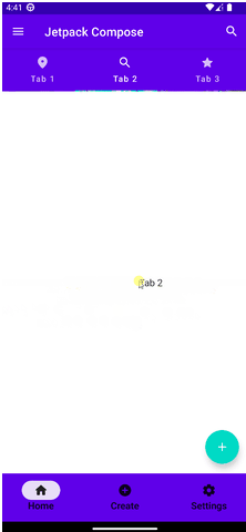
效果动画如下:
源码地址
https://johncodeos.com/how-to-create-tabs-with-jetpack-compose/


