本文介绍常用的css布局:
- 三栏布局
- 两列自适应布局
- 元素居中
盒模型简介:

三栏布局
中间列自适应宽度,两边宽度固定
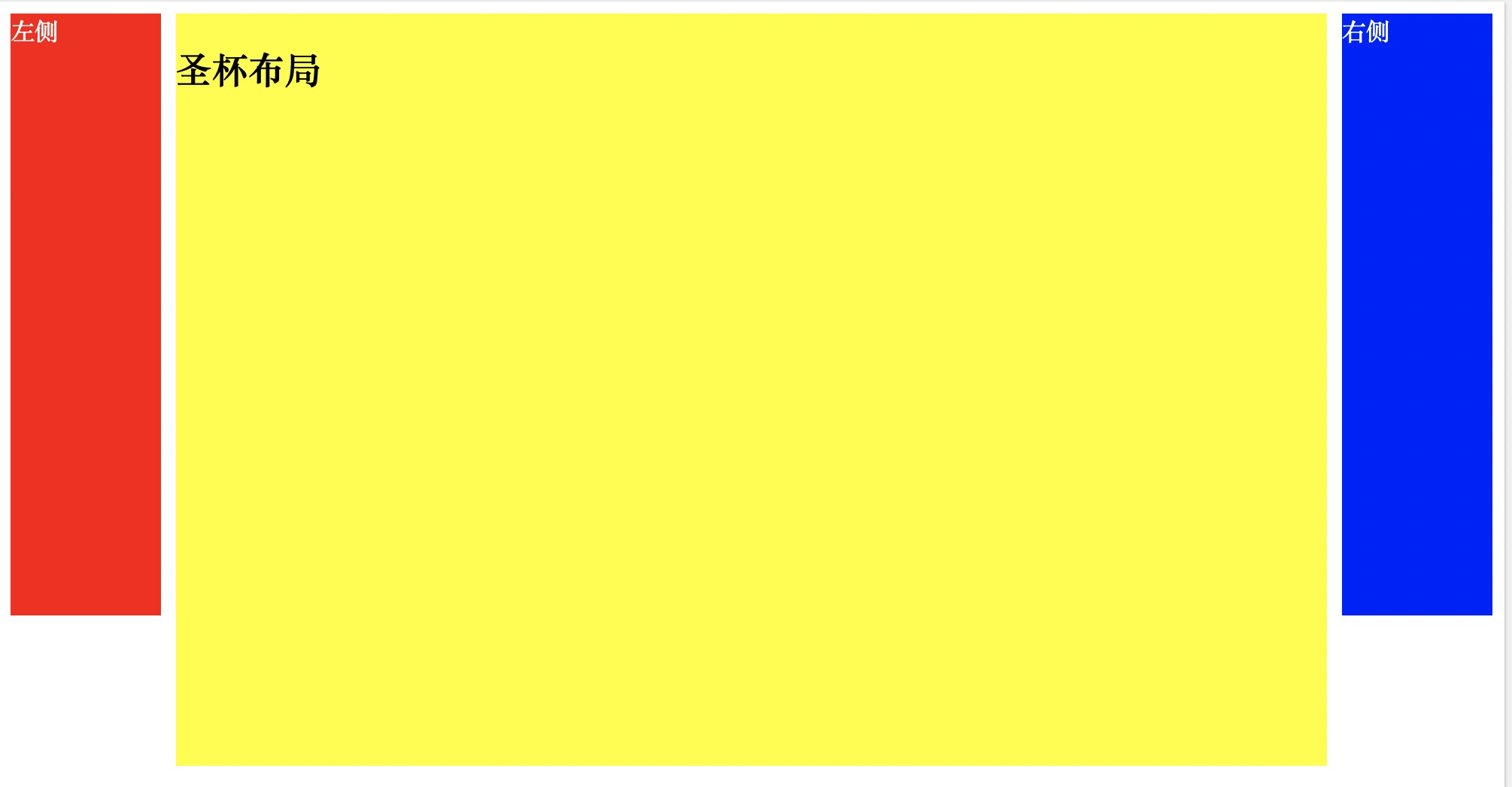
1. 圣杯布局
<!DOCTYPE html>
<html>
<head>
<style>
/* This is a single-line comment */
  .container {
    margin-left: 110px;
    margin-right: 110px;
  }
  .left {
    float: left;
    width: 100px;
    height: 400px;
    background: red;
    margin-left: -100%;
    position: relative;
    left: -110px;
    color:#fff
  }
  .center {
    float: left;
    width:100%;
    height: 500px;
    background: yellow;
  }
  .right {
    float: left;
    width: 100px;
    height: 400px;
    background: blue;
    margin-left: -100px;
    position: relative;
    right: -110px;
    color:#fff
  }
</style>
</head>
<body>

  <article class="container">
    <div class="center">
      <h2>圣杯布局</h2>
    </div>
    <div class="left">左侧</div>
    <div class="right">右侧</div>
  </article>

</body>
</html>
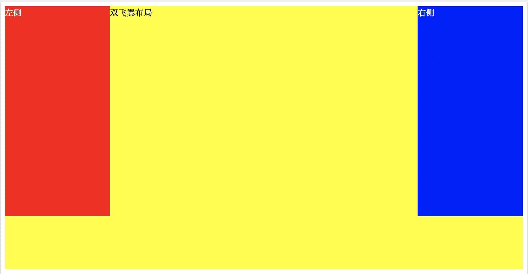
双飞翼布局
<!DOCTYPE html>
<html>
<head>
<style>
/* This is a single-line comment */
      .container {
        min-width: 600px;
    }
    .left {
        float: left;
        width: 200px;
        height: 400px;
        background: red;
        margin-left: -100%;
    }
    .center {
        float: left;
        width: 100%;
        height: 500px;
        background: yellow;
    }
    .center .inner {
        margin: 0 200px; //新增部分
    }
    .right {
        float: left;
        width: 200px;
        height: 400px;
        background: blue;
        margin-left: -200px;
    }
</style>
</head>
<body>
    <article class="container">
        <div class="center">
            <div class="inner">双飞翼布局</div>
        </div>
        <div class="left"></div>
        <div class="right"></div>
    </article>
</body>
</html>
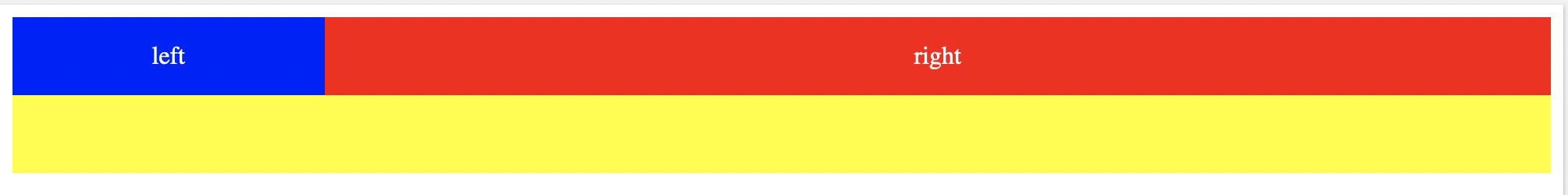
两列自适应布局
两列自适应布局是指一列由内容撑开,另一列撑满剩余宽度的布局方式
float+overflow
<!DOCTYPE html>
<html>
<head>
<style>
/* This is a single-line comment */
.parent {
  overflow: hidden;
  background:yellow;
  height:100px;
}
.left {
  float: left;
  background:blue;
  width:200px;
  color:#fff;
}
.right {
  overflow: hidden;
  background:red;
  color:#fff
}
</style>
</head>
<body>

<div class="parent">
    <div class="left" >
        <p>left</p>
    </div>
    <div class="right">
        <p>right</p>
    </div>
</div>

</body>
</html>
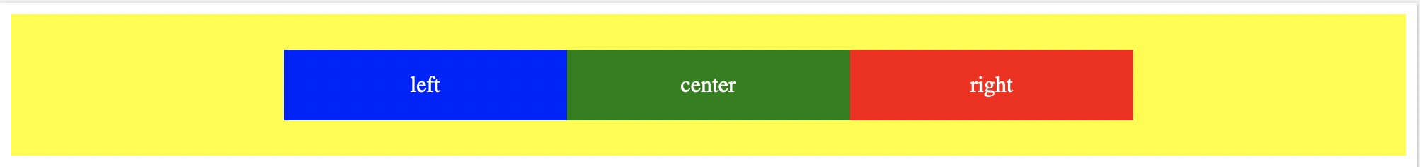
Flex布局
垂直居中
<!DOCTYPE html>
<html>
<head>
<style>
/* This is a single-line comment */
.parent {
  background:yellow;
  height:100px;
  display:flex;
  justify-content:center;
  align-items:center
}
.left {
  flex:0 1 200px;
  background:blue;
  text-align:center;
  color:#fff;
}
.center {
  flex:0 1 200px;
  background:green;
  text-align:center;
  color:#fff;
}
.right {
  flex:0 1 200px;
  background:red;
  color:#fff;
  text-align:center;
}
</style>
</head>
<body>

<div class="parent">
    <div class="left" >
        <p>left</p>
    </div>
    <div class="center">
        <p>center</p>
    </div>
    <div class="right">
        <p>right</p>
    </div>
</div>

</body>
</html>
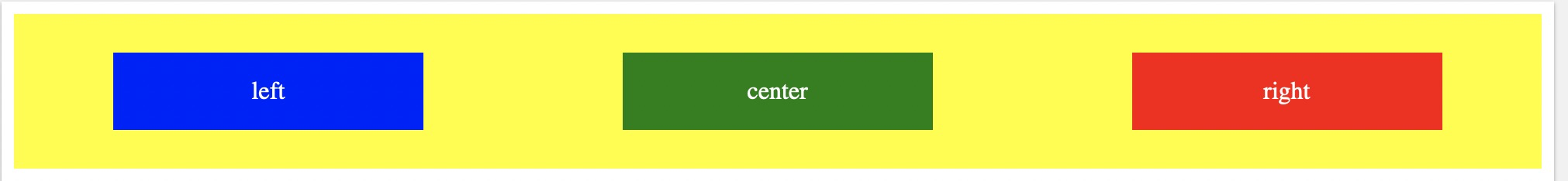
居中分散
<!DOCTYPE html>
<html>
<head>
<style>
/* This is a single-line comment */
.parent {
  background:yellow;
  height:100px;
  display:flex;
  justify-content:space-around;
  align-items:center
}
.left {
  flex:0 1 200px;
  background:blue;
  text-align:center;
  color:#fff;
}
.center {
  flex:0 1 200px;
  background:green;
  text-align:center;
  color:#fff;
}
.right {
  flex:0 1 200px;
  background:red;
  color:#fff;
  text-align:center;
}
</style>
</head>
<body>

<div class="parent">
    <div class="left" >
        <p>left</p>
    </div>
    <div class="center">
        <p>center</p>
    </div>
    <div class="right">
        <p>right</p>
    </div>
</div>

</body>
</html>
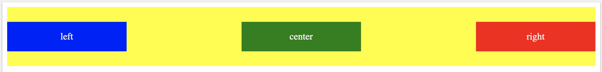
两边对齐
<!DOCTYPE html>
<html>
<head>
<style>
/* This is a single-line comment */
.parent {
  background:yellow;
  height:100px;
  display:flex;
  justify-content:space-between;
  align-items:center
}
.left {
  flex:0 1 200px;
  background:blue;
  text-align:center;
  color:#fff;
}
.center {
  flex:0 1 200px;
  background:green;
  text-align:center;
  color:#fff;
}
.right {
  flex:0 1 200px;
  background:red;
  color:#fff;
  text-align:center;
}
</style>
</head>
<body>

<div class="parent">
    <div class="left" >
        <p>left</p>
    </div>
    <div class="center">
        <p>center</p>
    </div>
    <div class="right">
        <p>right</p>
    </div>
</div>

</body>
</html>
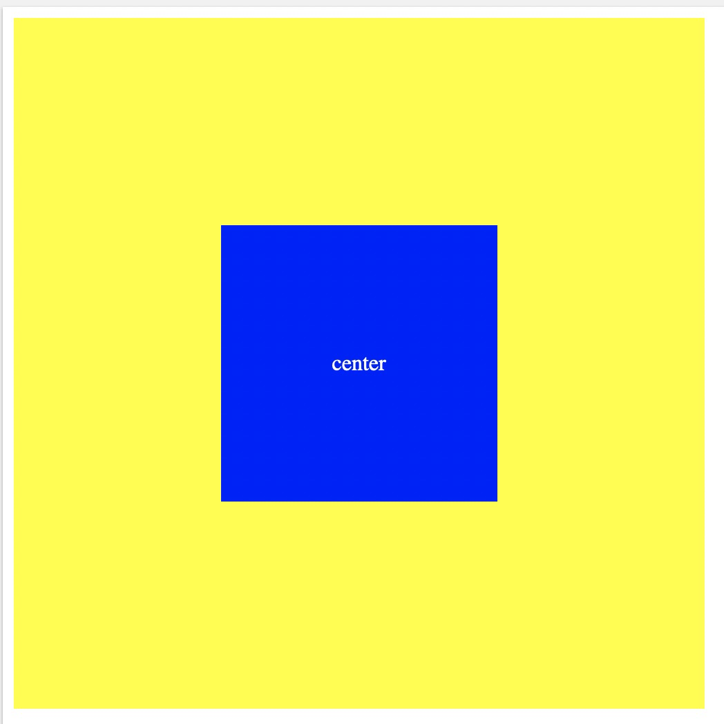
元素居中
绝对定位
<!DOCTYPE html>
<html>
<head>
<style>
  .parent{
  	width: 500px;
    height: 500px;
    position:relative;
    background:yellow
  }
  .center {
  	position: absolute;
    left:0;
    right:0;
    top:0;
    bottom:0;
    margin:auto;
    background:blue;
    width:200px;
    height:200px;
    color:#fff;
    text-align:center;
    line-height:200px
  }
</style>
</head>
<body>
	<div class="parent">
    	<div class="center">center</div>
    </div>
</body>
</html>
Flex居中
<!DOCTYPE html>
<html>
<head>
<style>
  .parent{
  	width: 500px;
    height: 500px;
    background:yellow;
    display:flex;
    justify-content:center;
    align-items:center;
  }
  .center {
    background:blue;
    width:200px;
    height:200px;
    color:#fff;
    text-align:center;
    line-height:200px;
    flex: 0 1 200px;

  }
</style>
</head>
<body>
	<div class="parent">
    	<div class="center">center</div>
    </div>
</body>
</html>