一、Flutter布局之Row&Column
1.1 Container的center属性: 让子控件在父控件的中间显示
Container(
     color: Colors.yellow,
     //1.Center让子部件在父控件中间
     child: Center(
       child: Text('Layout Center')),
 );
1.2 alignment让子控件相对父控件位置,取值范围在-1~1,(0,0)位于中心,(-1.0,-1.0)位于左上角
alignment: Alignment(0.0, 0.0)1.3三种主要的布局方式
- Row横向布局:从左往右 X轴
- Column纵向布局:从上往下 Y轴
- Stack栈布局:依次层叠
1.4 Row布局总结
- mainAxisAlignment主轴方向:start居左、center居中、end居右,
- spaceAround:主轴方向剩下的空间平均分配在周围。
- spaceBetween: 主轴方向剩下的空间平均分布到小部件中间,
- spaceEvenly: 主轴方向剩下的空间平均分配
- crossAxisAlignment交叉轴方向
- 当设置CrossAxisAlignment.baseline时,需要再设置textBaseline属性,设置相对文本控件的基线
textBaseline: TextBaseline.alphabetic,- Expanded是一种填充布局,其中的child可以设置Text,或者Container去做UI
- 使用案例如下
class RowDemo extends StatelessWidget {
  @override
  Widget build(BuildContext context) {
    return Row(
      //主轴方向:start居左、center居中、end居右,
      // spaceAround:主轴方向剩下的空间平均分配在周围。
      // spaceBetween: 主轴方向剩下的空间平均分布到小部件中间,
      // spaceEvenly: 主轴方向剩下的空间平均分配
      mainAxisAlignment: MainAxisAlignment.spaceEvenly,
      // 交叉轴方向:
      // crossAxisAlignment: CrossAxisAlignment.end,
      crossAxisAlignment: CrossAxisAlignment.baseline,
      // 相对于文本控件,作为基线
      textBaseline: TextBaseline.alphabetic,
      children: <Widget>[
        // 填充布局
        Expanded(child:
        Container(
          child: Text('Hello1212',style: TextStyle(fontSize: 15),),
          color: Colors.pink,
          height: 60,
        ),
        ),
        Container(
          child: Text('Hello',style: TextStyle(fontSize: 15),),
          color: Colors.purple,
          height: 60,
        ),
        Container(child: Icon(Icons.add,size: 60),color: Colors.red,),
        Container(child: Icon(Icons.ac_unit,size: 40),color: Colors.green,),
        Container(child: Icon(Icons.access_alarm,size: 20),color: Colors.blue,),
      ],
    );
  }
}
二、Flutter布局之Stack
2.1 Stack层叠式布局使用总结
- Stack层叠式布局
- 当在Stack中使用时,Alignment 属性会取最大的Container的area,取相对位置
- Positioned位置组件
class StackDemo extends StatelessWidget {
  @override
  Widget build(BuildContext context) {
    // 1.Stack 层叠式布局
    return Stack(
      // 2.取最大的Container的area,取相对位置
      // alignment: Alignment(0.0, -1.0),
      children: <Widget>[
        //3.位置组件
        Positioned(
          child: Container(
            color: Colors.red,
            width: 200,
            height: 200,
          ),
        ),
        Positioned(
          right: 0,
          child: Container(
            color: Colors.green,
            width: 100,
           height: 100,
          ),
        ),
        Positioned(
          left: 10,//相对于Stack的距离
          top: 20,//相对于Stack的top、向下20px
          child: Container(
            color: Colors.blue,
            width: 50,
           height: 50,
          ),
        ),
      ],
    );
  }
}
2.2 宽高约束比 AspectRatio
- 使用AspectRatio 来设置宽高约束比例
class LayoutStack extends StatelessWidget {
  @override
  Widget build(BuildContext context) {
    return Container(
      color: Colors.white,
      alignment: Alignment(0.0, 0.0),
      child: Container(
        color: Colors.blue,
        width: 300,
        // AspectRatio用来设置宽高比例
        child: AspectRatio(
          aspectRatio: 2/1,
          child: Icon(Icons.add, size: 30,),
        ),
      ),
      // child: StackDemo(),
    );
  }
}
三、Flutter的状态管理
3.1 状态管理使用总结
- 当定义一个StatefulWidget状态部件时,需要重写createState方法,
- floatingActionButton悬浮按钮 onPressed 为响应事件
- 当操作按钮时、UI上数据没有刷新、
- 点击调试控制台上的 hot reload就会更新数据
- 也可调用setState 方法,从新调用createState渲染方法,来刷新数据
import 'package:flutter/material.dart';
class StateManagerDemo extends StatefulWidget {
  @override
  State<StatefulWidget> createState() {
    return _StateManager();
  }
}- 创建_StateManager子类继承于State状态管理类,并通过范型约束当前State为StateManageDemo类.
//1.StateManagerDemo这个类的状态管理者
class _StateManager extends State<StateManagerDemo> {
  int count = 0;
  //重写build渲染方法
  @override
  Widget build(BuildContext context) {
    return Scaffold(
      appBar: AppBar(
        title: Text('StateManagerDemo'),
      ),
      body: Center(
          child: Chip(label: Text('$count'),)
      ),
      // 2.悬浮按钮: 当操作按钮时、UI上数据没有刷新、点击 hot reload就会更新数据。
      floatingActionButton: FloatingActionButton(
        child: Icon(Icons.add),
        //3.按钮的响应方法
        onPressed: () {
          count += 1;
          // 4.调用该方法、就会重新调用渲染方法、刷新UI数据
          setState(() {});
          print('count = $count');
        },
      ),
    );
  }
}- StateManagerDemo这个类的状态管理者
- 悬浮按钮: 当操作按钮时、UI上数据没有刷新、点击 hot reload就会更新数据
- 按钮的响应方法onPressed
- 调用该方法、就会重新调用渲染方法、刷新UI数据; setState(() {});
四、项目搭建之底部TabBar
1.首先创建一个wechat_demo的Flutter项目
- 将要设置的TabBar根页面抽离成为一个模块叫做 rootpage
- 因此main主程序入口调用如下:
import 'package:flutter/material.dart';
import 'rootpage.dart';

void main() => runApp(MyApp());
class MyApp extends StatelessWidget {
  const MyApp({super.key});
  @override
  Widget build(BuildContext context) {
    return MaterialApp(
      title: "Flutter Demo",//1.针对Android的title,可以设置后台显示的应用名称和主界面不一致
      theme: ThemeData(primarySwatch: Colors.blue),
      home: RootPage(),
    );}
}- 在rootpage中的实现为
import 'package:flutter/material.dart';
class RootPage extends StatefulWidget {
const RootPage({Key? key}) : super(key: key);
@override
State<RootPage> createState() => _RootPageState();
}
class _RootPageState extends State<RootPage> {
//6.设置当前BarItems的默认选中Item, 当某一个被选中的时候,这个index值会发生变化.
int _currentIndex = 0;
@override
Widget build(BuildContext context) {
return Container(
child: Scaffold(
//2.bottomNavigationBar相当于iOS中的TabBar
bottomNavigationBar: BottomNavigationBar(
//4.如果没有设置相应的type、那么默认情况下BarItem设置的都为白色.设置BarType之后默认为蓝色
type: BottomNavigationBarType.fixed,
//5.设置fixed类型后,需要添加一个填充色.这样一个TabBar就设置完毕了.
fixedColor: Colors.green,
//6.设置当前选中的值
currentIndex: _currentIndex,
//7.当前点击BarItem的响应事件, index为当前选中的Item
onTap: (int index){
//8.设置当前的索引为选中的Item索引
_currentIndex = index;
//9.刷新数据
setState(() {});
},
//3. 这里相当于tabbarItem
items: const <BottomNavigationBarItem>[
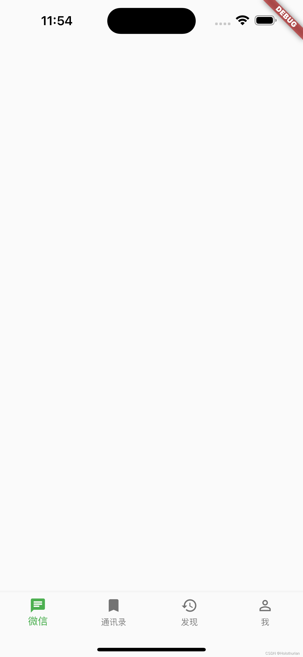
BottomNavigationBarItem(icon: Icon(Icons.chat), label: "微信",),
BottomNavigationBarItem(icon: Icon(Icons.bookmark), label: "通讯录",),
BottomNavigationBarItem(icon: Icon(Icons.history), label: "发现",),
BottomNavigationBarItem(icon: Icon(Icons.person_outline), label: "我",),
],
),),);
}
}- 在MaterialApp属性中,针对Android的title,可以设置后台显示的应用名称和主界面不一致
- Scaffold中的bottomNavigationBar相当于iOS中的TabBar
- Scaffold中的items需要设置BottomNavigationBarItem相当于TabBarItem.
- bottomNavigationBar中如果没有设置相应的type、那么默认情况下BarItem设置的都为白色.设置BottomNavigationBarType之后默认为蓝色
- bottomNavigationBar中设置fixed类型后,需要添加一个填充色.这样一个TabBar就设置完毕了.
- bottomNavigationBar中的currentIndex设置当前选中的值
- bottomNavigationBar中的onTap: 当前点击BarItem的响应事件, index参数为当前选中的Item
- onTap中设置当前的索引为选中的Item索引
- onTap响应事件中设置setState刷新UI数据
展示效果如下
五、总结
- 布局方面有三种布局方式
- Row横向
- Column纵向
- Stack层级
- 在横向和纵向布局中有主轴和交叉轴的概念
- Positioned 位置小部件,可以在布局的Children中使用,设置相对布局.
- Alignment(x,y) 取值范围为 -1.0 ~ 1.0
- 宽高比 AspectRatio
- 状态管理: 所有的界面都是不可变的(无状态的);
-
- State是一个状态管理者,可以用来刷新界面,继承于StatefulWidget(描述外观的).当数据发生变化时,通过setState将界面重新渲染.
- 搭建项目
- Scaffold中的bottomNavigationBar相当于iOS中的TabBar
- Scaffold中的items需要设置BottomNavigationBarItem相当于TabBarItem.
- bottomNavigationBar中如果没有设置相应的type、那么默认情况下BarItem设置的都为白色.设置BottomNavigationBarType之后默认为蓝色
- bottomNavigationBar中设置fixed类型后,需要添加一个填充色.这样一个TabBar就设置完毕了.
- bottomNavigationBar中的currentIndex设置当前选中的值
- bottomNavigationBar中的onTap: 当前点击BarItem的响应事件, index参数为当前选中的Item
- onTap中设置当前的索引为选中的Item索引
- onTap响应事件中设置setState刷新UI数据