背景
👏👏通过给出的宽/高+个数,用css3的transform以及transform-style快速的实现一个3d楼梯,速速来Get吧~
🥇文末分享源代码。记得点赞+关注+收藏!
1.实现效果
![[外链图片转存失败,源站可能有防盗链机制,建议将图片保存下来直接上传(img-8HrUkV1e-1669741574799)(https://p9-juejin.byteimg.com/tos-cn-i-k3u1fbpfcp/2f2e8db6e64249a1be8b6c673b08f3aa~tplv-k3u1fbpfcp-watermark.image?)]](https://img-blog.csdnimg.cn/b6b8635a367545b09855e340c0945d2c.gif)
2.实现步骤
- 定义css变量:宽w、高h、个数count
/* 楼梯高度 */
--h: 40px;
/* 楼梯宽度 */
--w: 50px;
/* 楼梯节数 */
--count: 5;
- 写一个容器,宽为count * w; 高为count * h;设置transform-style: preserve-3d,让转换的子元素保留3D转换。
.container {
    position: relative;
    width: calc(var(--count) * var(--w));
    height: calc(var(--count) * var(--h));
    transform-style: preserve-3d;
  }
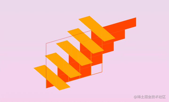
- 在容器内写count个div,给每个div标签定义css变量c,表示当前位置,从1~count,设置width为w,高为h * c,transform-style为preserve-3d;基于父容器absolute定位,bottom都为0,left从0开始,为w*(c-1);实现效果如下:
![[外链图片转存失败,源站可能有防盗链机制,建议将图片保存下来直接上传(img-0ETj4Frj-1669741574800)(https://p3-juejin.byteimg.com/tos-cn-i-k3u1fbpfcp/69fa85ea62de4537b971bb8aed3add2c~tplv-k3u1fbpfcp-watermark.image?)]](https://img-blog.csdnimg.cn/fd77d625c340491db37b3eeafe9d399e.png)
注意:以下圈出来的即为定义的w和h
![[外链图片转存失败,源站可能有防盗链机制,建议将图片保存下来直接上传(img-ntHzke6a-1669741574801)(https://p3-juejin.byteimg.com/tos-cn-i-k3u1fbpfcp/a0145bed8725419aa348054a7502158a~tplv-k3u1fbpfcp-watermark.image?)]](https://img-blog.csdnimg.cn/1d7a634d05a0461aa40f79655530b4f9.png)
<div class="container">
    <div class="step" style="--c: 1">
    </div>
    <div class="step" style="--c: 2">
    </div>
    <div class="step" style="--c: 3">
    </div>
    <div class="step" style="--c: 4">
    </div>
    <div class="step" style="--c: 5">
    </div>
</div>
.container .step {
    position: absolute;
    --i: calc(var(--c) - 1);
    left: calc(var(--w) * var(--i));
    bottom: 0;
    width: var(--w);
    height: calc(var(--h) * var(--c));
    border: 1px solid orange;
  }
- 对父容器进行transform偏移,看看效果
![[外链图片转存失败,源站可能有防盗链机制,建议将图片保存下来直接上传(img-QBiAh3sl-1669741574801)(https://p6-juejin.byteimg.com/tos-cn-i-k3u1fbpfcp/cc5d39834dad475bae554dbb3c533869~tplv-k3u1fbpfcp-watermark.image?)]](https://img-blog.csdnimg.cn/9b5e5968f29b4280b35ae634e325e9e5.png)
.container{
 + transform: rotateX(-30deg) rotateY(30deg);
}
- 为每个div设置前伪元素,宽度为w,高度为count * h,设置X轴方向旋转从0-90deg,效果如下:

.container .step::before {
    content: "";
    position: absolute;
    top: 0;
    left: 0;
    width: var(--w);
    height: calc(var(--count) * var(--h));
    background: orange;
    transform: rotateX(90deg);
  }
- 前伪元素设置z轴方向的偏移,偏移量为总高度(count * h)的正一半
![[外链图片转存失败,源站可能有防盗链机制,建议将图片保存下来直接上传(img-PxB3ozZK-1669741574802)(https://p1-juejin.byteimg.com/tos-cn-i-k3u1fbpfcp/cf00f9db459343ebb7e0e7c0314bb562~tplv-k3u1fbpfcp-watermark.image?)]](https://img-blog.csdnimg.cn/48c1a4a5bd3546b59e36cb5f65c106d1.png)
.container .step::before {
    /* z轴偏移为高度的2分之一 */
    --z: calc(var(--count) * var(--h) / 2);
    transform: rotateX(90deg) translateZ(var(--z));
 }
![[外链图片转存失败,源站可能有防盗链机制,建议将图片保存下来直接上传(img-pThI4Sgv-1669741574803)(https://p9-juejin.byteimg.com/tos-cn-i-k3u1fbpfcp/d386df4cb4024740a940c41b6c13b067~tplv-k3u1fbpfcp-watermark.image?)]](https://img-blog.csdnimg.cn/10e5ee70b431494ea488dee3648605bc.png)
- 为每个div设置后伪元素,高度为h,宽度为count* h(这个值与前伪元素的高度对应),设置Y轴方向旋转从0-90deg,效果如下:
.container .step::after {
  content: "";
  position: absolute;
  top: 0;
  left: 0;
  width: calc(var(--count) * var(--h));
  height: var(--h);
  background: orangered;
  transform: rotateY(90deg);
}
- 后伪元素设置z轴方向的偏移,偏移量为总高度(count * h)的负一半
.container .step::after {
    /* z轴偏移为高度的2分之一 */
    --z: calc(var(--count) * var(--h) / 2);
    transform: rotateY(90deg) translateZ(calc(-1 * var(--z)));
 }
![[外链图片转存失败,源站可能有防盗链机制,建议将图片保存下来直接上传(img-LF6Oy9ga-1669741574803)(https://p9-juejin.byteimg.com/tos-cn-i-k3u1fbpfcp/f326df5c49e04505b91cd316e4f13ae7~tplv-k3u1fbpfcp-watermark.image?)]](https://img-blog.csdnimg.cn/ebcb2622c17e48d3864cd69af80d3392.png)
- 为前伪元素添加hover效果
![[外链图片转存失败,源站可能有防盗链机制,建议将图片保存下来直接上传(img-YHZGvzSE-1669741574804)(https://p6-juejin.byteimg.com/tos-cn-i-k3u1fbpfcp/e5b841c792a04e81b120e6ee76320e92~tplv-k3u1fbpfcp-watermark.image?)]](https://img-blog.csdnimg.cn/2e28b38d90cd4772bc36e6e75c029777.gif)
.container .step:hover::before {
  cursor: pointer;
  filter: brightness(1.1);
}
- 将父容器进行旋转,可以看到已经有大概的轮廓了
![[外链图片转存失败,源站可能有防盗链机制,建议将图片保存下来直接上传(img-XEDgD4sO-1669741574804)(https://p9-juejin.byteimg.com/tos-cn-i-k3u1fbpfcp/059ea8e878134bda9429c2b474469857~tplv-k3u1fbpfcp-watermark.image?)]](https://img-blog.csdnimg.cn/1a74459df8934e639a6a7c235d17c5c3.gif)
- 在每个div下添加两个span标签,宽度为w,高度为父元素step的高度,做为梯形的左右两侧
![[外链图片转存失败,源站可能有防盗链机制,建议将图片保存下来直接上传(img-iSbNYExq-1669741574804)(https://p6-juejin.byteimg.com/tos-cn-i-k3u1fbpfcp/97b3e09d7ffc455bb5187743e04cda83~tplv-k3u1fbpfcp-watermark.image?)]](https://img-blog.csdnimg.cn/0e5ed605b67b4a6189be9d0f73304405.png)
<div class="container">
  <div class="step" style="--c: 1">
    <span></span>
    <span></span>
  </div>
 ... //4个相同的标签
</div>
.container .step span {
    position: absolute;
    display: block;
    width: var(--w);
    height: 100%;
    background: orchid;
    transform-style: preserve-3d;
}
- 设置第一个span的位置,z轴方向的偏移,偏移量为总高度(count * h)正的一半
![[外链图片转存失败,源站可能有防盗链机制,建议将图片保存下来直接上传(img-7pSWZxVg-1669741574805)(https://p3-juejin.byteimg.com/tos-cn-i-k3u1fbpfcp/8c16ac5d11c34005b4eb2d066857af74~tplv-k3u1fbpfcp-watermark.image?)]](https://img-blog.csdnimg.cn/fedb431424d84d09a4cb85f2d1d919e5.gif)
.container .step span:nth-child(1) {
  /* z轴偏移为高度的2分之一 */
  --z: calc(var(--count) * var(--h) / 2);
  transform: translateZ(var(--z));
}
- 设置第二个span的位置,z轴方向的偏移,偏移量为总高度(count * h)负的一半
![[外链图片转存失败,源站可能有防盗链机制,建议将图片保存下来直接上传(img-mu8gUJCD-1669741574805)(https://p3-juejin.byteimg.com/tos-cn-i-k3u1fbpfcp/112ca2e24fb547ceb1fd1ba424fe3da4~tplv-k3u1fbpfcp-watermark.image?)]](https://img-blog.csdnimg.cn/8faa596868d84663b81100c7d75b5e32.gif)
.container .step span:nth-child(2) {
  /* z轴偏移为高度的2分之一 */
  --z: calc(var(--count) * var(--h) / 2);
  transform: translateZ(calc(-1 * var(--z)));
}
- 可以看到,现在还剩两处需要填充
![[外链图片转存失败,源站可能有防盗链机制,建议将图片保存下来直接上传(img-ujWUuOQJ-1669741574805)(https://p6-juejin.byteimg.com/tos-cn-i-k3u1fbpfcp/ab9cfcde86c248a89e66faa646ede934~tplv-k3u1fbpfcp-watermark.image?)]](https://img-blog.csdnimg.cn/3becde3b8a4c49d998d4163ae02e245d.png)
- 填补第一处内容,将最后一个div标签中的最后一个span为容器,添加一个伪元素,高度100%,宽度为counut * h
![[外链图片转存失败,源站可能有防盗链机制,建议将图片保存下来直接上传(img-kuohIa8z-1669741574806)(https://p3-juejin.byteimg.com/tos-cn-i-k3u1fbpfcp/f92d35e0086f4053a1ebf799ebe906d1~tplv-k3u1fbpfcp-watermark.image?)]](https://img-blog.csdnimg.cn/df6edc36f80744388d5c0f0e6a71a34f.png)
.container .step:last-child span:nth-child(2)::before {
  content: "";
  position: absolute;
  top: 0;
  left: 0;
  width: calc(var(--counut) * var(--h));
  height: 100%;
  background: #222;
}
- 将该伪元素y轴方向旋转90deg
![[外链图片转存失败,源站可能有防盗链机制,建议将图片保存下来直接上传(img-w3EyYjZ5-1669741574806)(https://p3-juejin.byteimg.com/tos-cn-i-k3u1fbpfcp/7b076bbfa5d44ce5a3ef9702b371df98~tplv-k3u1fbpfcp-watermark.image?)]](https://img-blog.csdnimg.cn/061ec9d520684e56b170d391951b4cab.gif)
- 调整其在x,y,z轴各个方向的偏移量,x轴方向为总高度的负一半 即 -1 * (count * h) /2,y轴方向为0,z轴方向为-1 * ((count * h) /2 - w)
![[外链图片转存失败,源站可能有防盗链机制,建议将图片保存下来直接上传(img-4NfeKF8Z-1669741574806)(https://p3-juejin.byteimg.com/tos-cn-i-k3u1fbpfcp/48fbe2e2cad64cdca43285e217b6bec3~tplv-k3u1fbpfcp-watermark.image?)]](https://img-blog.csdnimg.cn/611ded4d5415492680827a028d51fe87.png)
.container .step:last-child span:nth-child(2)::before {
  /* z轴偏移为总高度的2分之一 */
  --z: calc(var(--count) * var(--h) / 2);
  /*  总高度的2分之一 - 宽度*/
  --k: calc(var(--z) - var(--w));
  transform: rotateY(90deg)
    translate3d(calc(-1 * var(--z)), 0, calc(-1 * var(--k)));
}
- 填补第二处内容,将第一个div标签中的第二个span为容器,添加一个伪元素,高度counut * h,宽度为span元素的高度* count
.container .step:first-child span:nth-child(2)::after {
  content: "";
  position: absolute;
  left: 0;
  top: 0;
  background: #222;
  width: calc(100% * var(--count));
  height: calc(calc(var(--count) * var(--h)));
  transform: rotateX(90deg);
}
- 将该伪元素X轴方向旋转90deg
![[外链图片转存失败,源站可能有防盗链机制,建议将图片保存下来直接上传(img-mnGh4tXX-1669741574807)(https://p9-juejin.byteimg.com/tos-cn-i-k3u1fbpfcp/c70a6c455e52481683c480a67a13797d~tplv-k3u1fbpfcp-watermark.image?)]](https://img-blog.csdnimg.cn/617605fd9d214cfe89b365ebe477a965.gif)
- 调整其在x,y,z轴各个方向的偏移量,x轴方向为0,y轴为总高度的正一半 即 (count * h) /2,z轴方向为 ((count * h) /2 - h)
![[外链图片转存失败,源站可能有防盗链机制,建议将图片保存下来直接上传(img-v2HvZUPU-1669741574807)(https://p3-juejin.byteimg.com/tos-cn-i-k3u1fbpfcp/8ecf10fee9a246b58968956478d7bfd7~tplv-k3u1fbpfcp-watermark.image?)]](https://img-blog.csdnimg.cn/daf1745f8095476fadb85458786ca983.png)
.container .step:first-child span:nth-child(2)::after {
  /* z轴偏移为总高度的2分之一 */
  --z: calc(var(--count) * var(--h) / 2);
  /*  总高度的2分之一 - 高度*/
  --k: calc(var(--z) - var(--h));
  transform: rotateX(90deg) translate3d(0, var(--z), var(--k));
}
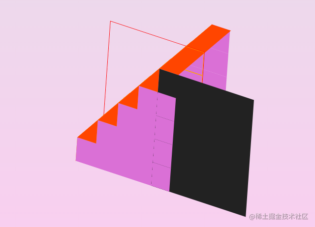
- 到此,我们就是写了一个完整的3d楼梯了,去掉辅助线,将各边的颜色风格统一一致
![[外链图片转存失败,源站可能有防盗链机制,建议将图片保存下来直接上传(img-WtIcIxNH-1669741574807)(https://p9-juejin.byteimg.com/tos-cn-i-k3u1fbpfcp/bbeb1937968d4cab875cc3b510a6ed49~tplv-k3u1fbpfcp-watermark.image?)]](https://img-blog.csdnimg.cn/7e3c072d58524b0897037c9226fb67fa.png)
- 为底部添加一个阴影效果,选择最底部的区域,设置scale
![[外链图片转存失败,源站可能有防盗链机制,建议将图片保存下来直接上传(img-lRHpxo2p-1669741574808)(https://p6-juejin.byteimg.com/tos-cn-i-k3u1fbpfcp/1d2f2ec6bce2404f81ebd848e6482ae5~tplv-k3u1fbpfcp-watermark.image?)]](https://img-blog.csdnimg.cn/e36231b663fa4afaad4e10fca43495c3.png)
.container .step:first-child span:nth-child(2)::after{
    + transform: rotateX(90deg) translate3d(0, var(--z), var(--k)) scale(1.25);
}
- 设置filter的blur滤镜
![[外链图片转存失败,源站可能有防盗链机制,建议将图片保存下来直接上传(img-Z8UnVb7L-1669741574808)(https://p6-juejin.byteimg.com/tos-cn-i-k3u1fbpfcp/b924431b90cb405b94a3ccff107146c8~tplv-k3u1fbpfcp-watermark.image?)]](https://img-blog.csdnimg.cn/21df638ea0f84fc3bac444bf0a23381f.png)
.container .step:first-child span:nth-child(2)::after{
    +filter: blur(20px);
}
- 父容器添加animation动画,改变rotateX, rotateY的位置
![[外链图片转存失败,源站可能有防盗链机制,建议将图片保存下来直接上传(img-gOiaPTcD-1669741574808)(https://p3-juejin.byteimg.com/tos-cn-i-k3u1fbpfcp/5f444825834e43c1b66d9910ca548092~tplv-k3u1fbpfcp-watermark.image?)]](https://img-blog.csdnimg.cn/d1c771e08a9f4400a8ef5023dd1d47b2.gif)
.container {
  + transform: rotateX(-30deg) rotateY(30deg);
  + animation: animate 10s linear infinite;
}

@keyframes animate {
    0% {
        transform: rotateX(-30deg) rotateY(0deg);
    }
    100% {
        transform: rotateX(-30deg) rotateY(1turn);
    }
}
- 修改w和h,设置不同的count,试试吧
![[外链图片转存失败,源站可能有防盗链机制,建议将图片保存下来直接上传(img-UoIIkZjn-1669741574808)(https://p9-juejin.byteimg.com/tos-cn-i-k3u1fbpfcp/3f4030e2d2c64313b5530f1890688a20~tplv-k3u1fbpfcp-watermark.image?)]](https://img-blog.csdnimg.cn/de495b080d3f45e88ef4a151ae9d1006.png)
 /* 楼梯高度 */
  --h: 10px;
  /* 楼梯宽度 */
  --w: 50px;
  /* 楼梯节数 */
  --count: 6;
3.实现代码
<style>
:root {
  --bg: linear-gradient(to top, #fdcbf1 0%, #fdcbf1 1%, #e6dee9 100%);
  --c1: #6ec5e7;
  --c3: #c2e9fb;
  --c2: skyblue;
  /* 楼梯高度 */
  --h: 10px;
  /* 楼梯宽度 */
  --w: 50px;
  /* 楼梯节数 */
  --count: 6;
}
body {
  background: var(--bg);
}
.container {
  position: relative;
  width: calc(var(--count) * var(--w));
  height: calc(var(--count) * var(--h));
  transform-style: preserve-3d;
  transform: rotateX(-30deg) rotateY(30deg);
  animation: animate 10s linear infinite;
}
@keyframes animate {
  0% {
    transform: rotateX(-30deg) rotateY(0deg);
  }

  100% {
    transform: rotateX(-30deg) rotateY(1turn);
  }
}
.container .step {
  position: absolute;
  --i: calc(var(--c) - 1);
  left: calc(var(--w) * var(--i));
  bottom: 0;
  width: var(--w);
  height: calc(var(--h) * var(--c));
  transform-style: preserve-3d;
}
.container .step::before {
  content: "";
  position: absolute;
  top: 0;
  left: 0;
  width: var(--w);
  height: calc(var(--count) * var(--h));
  background: var(--c3);
  /* z轴偏移为总高度的2分之一 */
  --z: calc(var(--count) * var(--h) / 2);
  transform: rotateX(90deg) translateZ(var(--z));
}
.container .step:hover::before {
  cursor: pointer;
  filter: brightness(1.1);
}
.container .step::after {
  content: "";
  position: absolute;
  top: 0;
  left: 0;
  width: calc(var(--count) * var(--h));
  height: var(--h);
  background: var(--c2);
  /* z轴偏移为总高度的2分之一 */
  --z: calc(var(--count) * var(--h) / 2);
  transform: rotateY(90deg) translateZ(calc(-1 * var(--z)));
}
.container .step span {
  position: absolute;
  display: block;
  width: var(--w);
  height: 100%;
  background: var(--c1);
  transform-style: preserve-3d;
}
.container .step span:nth-child(1) {
  /* z轴偏移为总高度的2分之一 */
  --z: calc(var(--count) * var(--h) / 2);
  transform: translateZ(var(--z));
}
.container .step span:nth-child(2) {
  /* z轴偏移为总高度的2分之一 */
  --z: calc(var(--count) * var(--h) / 2);
  transform: translateZ(calc(-1 * var(--z)));
}
.container .step:last-child span:nth-child(2)::before {
  content: "";
  position: absolute;
  top: 0;
  left: 0;
  width: calc(var(--count) * var(--h));
  height: 100%;
  background: var(--c2);
  /* z轴偏移为总高度的2分之一 */
  --z: calc(var(--count) * var(--h) / 2);
  /*  总高度的2分之一 - 宽度*/
  --k: calc(var(--z) - var(--w));
  transform: rotateY(90deg)
    translate3d(calc(-1 * var(--z)), 0, calc(-1 * var(--k)));
}
.container .step:first-child span:nth-child(2)::after {
  content: "";
  position: absolute;
  left: 0;
  top: 0;
  background: var(--c1);
  width: calc(100% * var(--count));
  height: calc(calc(var(--count) * var(--h)));
  /* z轴偏移为总高度的2分之一 */
  --z: calc(var(--count) * var(--h) / 2);
  /*  总高度的2分之一 - 高度*/
  --k: calc(var(--z) - var(--h));
  transform: rotateX(90deg) translate3d(0, var(--z), var(--k)) scale(1.25);
  filter: blur(20px);
}
</style>

<body>
    <div class="container">
      <div class="step" style="--c: 1">
        <span></span>
        <span></span>
      </div>
      <div class="step" style="--c: 2">
        <span></span>
        <span></span>
      </div>
      <div class="step" style="--c: 3">
        <span></span>
        <span></span>
      </div>
      <div class="step" style="--c: 4">
        <span></span>
        <span></span>
      </div>
      <div class="step" style="--c: 5">
        <span></span>
        <span></span>
      </div>
      <div class="step" style="--c: 6">
        <span></span>
        <span></span>
      </div>
    </div>
</body>


![[附源码]计算机毕业设计springboot高校后勤保障系统](https://img-blog.csdnimg.cn/8d98563acf254a23b984c55c23d8b7e2.png)
![[附源码]计算机毕业设计springboot个性化名片网站](https://img-blog.csdnimg.cn/17a78f98309940788adcd1b8668104dc.png)