Introduction
科研可视化是将数据和信息转化为可视化形式的过程,旨在通过图形化展示数据和信息,使得科研工作者能够更好地理解和分析数据,并从中发现新的知识和洞见。科研可视化可以应用于各种领域,如生物学、物理学、计算机科学等,帮助科研工作者更好地理解和解释数据。
科研可视化的目的是通过图形化展示数据和信息,使得科研工作者能够更好地理解和分析数据。科研可视化可以帮助科研工作者:
-
更好地理解数据:科研可视化可以帮助科研工作者更好地理解数据的结构、特征和关系,以及数据中存在的模式和趋势。
-
发现新的知识和洞见:科研可视化可以帮助科研工作者发现数据中存在的新的知识和洞见,以及数据中隐藏的关联性和规律。
-
交流和展示研究成果:科研可视化可以帮助科研工作者更好地向同行和公众展示和交流研究成果,以及向决策者提供决策支持。
博主之前分享的案例
博主之前已经分享了很多可视化的案例,见下:
数据可视化之美 – 以Matlab、Python为工具
python matplotlib 画图(柱状图)总结
数据可视化之美-动态图绘制(以Python为工具)
数据可视化之美+点、线、面组合(以Python为工具)
Python 科研绘图可视化(后处理)Matplotlib - RGBAxes
等等
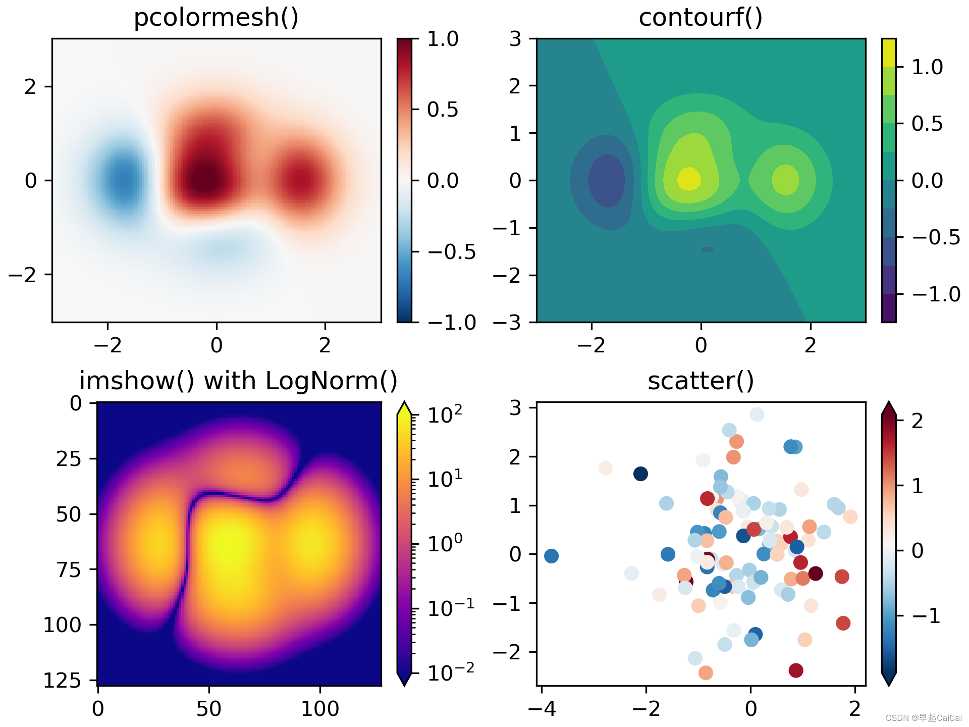
Color mapped data
通常我们希望在一个图中用颜色映射来表示第三个维度(第一个、第二个维度是xy轴)。Matplotlib 有许多绘图类型可以做到这一点:pcolormesh(); contourf(); imshow()
import matplotlib.pyplot as plt
import numpy as np
import matplotlib as mpl

data1, data2, data3, data4 = np.random.randn(4, 100)  # make 4 random data sets

X, Y = np.meshgrid(np.linspace(-3, 3, 128), np.linspace(-3, 3, 128))
Z = (1 - X/2 + X**5 + Y**3) * np.exp(-X**2 - Y**2)

fig, axs = plt.subplots(2, 2, layout='constrained')
pc = axs[0, 0].pcolormesh(X, Y, Z, vmin=-1, vmax=1, cmap='RdBu_r')
fig.colorbar(pc, ax=axs[0, 0])
axs[0, 0].set_title('pcolormesh()')

co = axs[0, 1].contourf(X, Y, Z, levels=np.linspace(-1.25, 1.25, 11))
fig.colorbar(co, ax=axs[0, 1])
axs[0, 1].set_title('contourf()')

pc = axs[1, 0].imshow(Z**2 * 100, cmap='plasma',
                          norm=mpl.colors.LogNorm(vmin=0.01, vmax=100))
fig.colorbar(pc, ax=axs[1, 0], extend='both')
axs[1, 0].set_title('imshow() with LogNorm()')

pc = axs[1, 1].scatter(data1, data2, c=data3, cmap='RdBu_r')
fig.colorbar(pc, ax=axs[1, 1], extend='both')
axs[1, 1].set_title('scatter()')
这段代码演示了如何使用 Matplotlib 绘制不同类型的二维图形,并添加 colorbar。
首先,导入了必要的模块和库,包括 matplotlib.pyplot、numpy 和 matplotlib。
然后,使用 numpy.random.randn 函数生成了 4 个包含 100 个随机数的数据集。接下来,使用 numpy.meshgrid 函数生成了 X 和 Y 坐标网格,并使用这些坐标生成了一个 Z 值的函数。这些数据将用于绘制不同类型的二维图形。
接下来,使用 plt.subplots 函数创建了一个大小为 2x2 的图像网格,并在每个子图中使用不同的函数绘制二维图形,并添加了 colorbar。
在第一个子图中,使用 ax.pcolormesh 函数绘制了一个二维网格,并使用 fig.colorbar 函数添加了一个 colorbar。在第二个子图中,使用 ax.contourf 函数绘制了一个等高线图,并添加了一个 colorbar。在第三个子图中,使用 ax.imshow 函数绘制了一个图像,并使用 mpl.colors.LogNorm 函数设置了颜色的标准化,然后添加了一个 colorbar。在第四个子图中,使用 ax.scatter 函数绘制了一个散点图,并使用 fig.colorbar 函数添加了一个 colorbar。
最后,使用 ax.set_title 函数为每个子图添加了标题。
Demo Axes Grid
每个简单的图像添加colorbar,可以根据这个算例复杂化。
主要基于matplotlib的mpl_toolkits.axes_grid1这个工具包做的,前面有篇博文也是专门用这个工具包。Python 科研绘图可视化(后处理)Matplotlib - RGBAxes
from matplotlib import cbook
import matplotlib.pyplot as plt
from mpl_toolkits.axes_grid1 import ImageGrid

Z = cbook.get_sample_data(  # (15, 15) array
    "axes_grid/bivariate_normal.npy", np_load=True)
extent = (-3, 4, -4, 3)

fig = plt.figure(figsize=(10.5, 2.5))
fig.subplots_adjust(left=0.05, right=0.95)

# A grid of 2x2 images with 0.05 inch pad between images and only the
# lower-left axes is labeled.
grid = ImageGrid(
    fig, 141,  # similar to fig.add_subplot(141).
     nrows_ncols=(2, 2), axes_pad=0.05, label_mode="1")
for ax in grid:
    ax.imshow(Z, extent=extent)
# This only affects axes in first column and second row as share_all=False.
grid.axes_llc.set_xticks([-2, 0, 2])
grid.axes_llc.set_yticks([-2, 0, 2])

# A grid of 2x2 images with a single colorbar
grid = ImageGrid(
    fig, 142,  # similar to fig.add_subplot(142).
    nrows_ncols=(2, 2), axes_pad=0.0, label_mode="L", share_all=True,
    cbar_location="top", cbar_mode="single")
for ax in grid:
    im = ax.imshow(Z, extent=extent)
grid.cbar_axes[0].colorbar(im)
for cax in grid.cbar_axes:
    cax.toggle_label(False)
# This affects all axes as share_all = True.
grid.axes_llc.set_xticks([-2, 0, 2])
grid.axes_llc.set_yticks([-2, 0, 2])

# A grid of 2x2 images. Each image has its own colorbar.
grid = ImageGrid(
    fig, 143,  # similar to fig.add_subplot(143).
    nrows_ncols=(2, 2), axes_pad=0.1, label_mode="1", share_all=True,
    cbar_location="top", cbar_mode="each", cbar_size="7%", cbar_pad="2%")
for ax, cax in zip(grid, grid.cbar_axes):
    im = ax.imshow(Z, extent=extent)
    cax.colorbar(im)
    cax.toggle_label(False)
# This affects all axes because we set share_all = True.
grid.axes_llc.set_xticks([-2, 0, 2])
grid.axes_llc.set_yticks([-2, 0, 2])

# A grid of 2x2 images. Each image has its own colorbar.
grid = ImageGrid(
    fig, 144,  # similar to fig.add_subplot(144).
    nrows_ncols=(2, 2), axes_pad=(0.45, 0.15), label_mode="1", share_all=True,
    cbar_location="right", cbar_mode="each", cbar_size="7%", cbar_pad="2%")
# Use a different colorbar range every time
limits = ((0, 1), (-2, 2), (-1.7, 1.4), (-1.5, 1))
for ax, cax, vlim in zip(grid, grid.cbar_axes, limits):
    im = ax.imshow(Z, extent=extent, vmin=vlim[0], vmax=vlim[1])
    cb = cax.colorbar(im)
    cb.set_ticks((vlim[0], vlim[1]))
# This affects all axes because we set share_all = True.
grid.axes_llc.set_xticks([-2, 0, 2])
grid.axes_llc.set_yticks([-2, 0, 2])

plt.show()
这段代码展示了如何使用 Matplotlib 的 ImageGrid 类来创建一个带有子图和颜色条的图像。首先,代码从 matplotlib 包中导入了 cbook 模块,从 matplotlib.pyplot 导入了 plt 模块,以及从 mpl_toolkits.axes_grid1 导入了 ImageGrid 类。
接下来,代码使用 cbook.get_sample_data 函数读取一个二维数组 Z,并定义了 extent 变量。然后,代码创建了一个 2x2 的子图布局,并在四个子图中分别绘制了 Z 的热图。第一个子图中使用 label_mode="1" 参数来只显示左下角的坐标轴。第二个子图中使用 cbar_mode="single" 参数来添加一个共享的颜色条,且颜色条位置在顶部。第三个子图中使用 cbar_mode="each" 参数来为每个子图都添加一个颜色条,颜色条位置仍在顶部。第四个子图中使用 cbar_location="right" 参数将颜色条位置放在右侧,同时使用 vmin 和 vmax 参数来设置不同的颜色条范围。
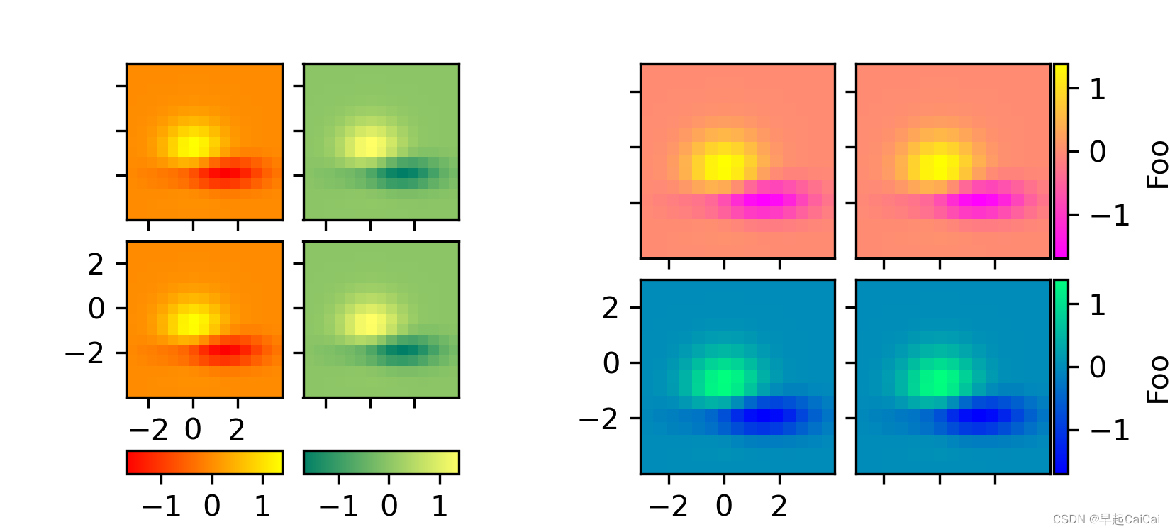
每行 or 每列 colorbars
这个例子显示了如何为图像网格的每一行或每一列使用一个colorbar。
from matplotlib import cbook
import matplotlib.pyplot as plt
from mpl_toolkits.axes_grid1 import AxesGrid


def get_demo_image():
    z = cbook.get_sample_data("axes_grid/bivariate_normal.npy", np_load=True)
    # z is a numpy array of 15x15
    return z, (-3, 4, -4, 3)


def demo_bottom_cbar(fig):
    """
    A grid of 2x2 images with a colorbar for each column.
    """
    grid = AxesGrid(fig, 121,  # similar to subplot(121)
                    nrows_ncols=(2, 2),
                    axes_pad=0.10,
                    share_all=True,
                    label_mode="1",
                    cbar_location="bottom",
                    cbar_mode="edge",
                    cbar_pad=0.25,
                    cbar_size="15%",
                    direction="column"
                    )

    Z, extent = get_demo_image()
    cmaps = ["autumn", "summer"]
    for i in range(4):
        im = grid[i].imshow(Z, extent=extent, cmap=cmaps[i//2])
        if i % 2:
            grid.cbar_axes[i//2].colorbar(im)

    for cax in grid.cbar_axes:
        cax.toggle_label(True)
        cax.axis[cax.orientation].set_label("Bar")

    # This affects all axes as share_all = True.
    grid.axes_llc.set_xticks([-2, 0, 2])
    grid.axes_llc.set_yticks([-2, 0, 2])


def demo_right_cbar(fig):
    """
    A grid of 2x2 images. Each row has its own colorbar.
    """
    grid = AxesGrid(fig, 122,  # similar to subplot(122)
                    nrows_ncols=(2, 2),
                    axes_pad=0.10,
                    label_mode="1",
                    share_all=True,
                    cbar_location="right",
                    cbar_mode="edge",
                    cbar_size="7%",
                    cbar_pad="2%",
                    )
    Z, extent = get_demo_image()
    cmaps = ["spring", "winter"]
    for i in range(4):
        im = grid[i].imshow(Z, extent=extent, cmap=cmaps[i//2])
        if i % 2:
            grid.cbar_axes[i//2].colorbar(im)

    for cax in grid.cbar_axes:
        cax.toggle_label(True)
        cax.axis[cax.orientation].set_label('Foo')

    # This affects all axes because we set share_all = True.
    grid.axes_llc.set_xticks([-2, 0, 2])
    grid.axes_llc.set_yticks([-2, 0, 2])


fig = plt.figure(figsize=(5.5, 2.5))
fig.subplots_adjust(left=0.05, right=0.93)

demo_bottom_cbar(fig)
demo_right_cbar(fig)

plt.show()
这段代码展示了如何使用 Matplotlib 的 AxesGrid 类来创建一个带有子图和颜色条的图像。首先,代码从 matplotlib 包中导入了 cbook 模块,从 matplotlib.pyplot 导入了 plt 模块,以及从 mpl_toolkits.axes_grid1 导入了 AxesGrid 类。
接下来,代码定义了一个函数 get_demo_image,用于获取示例图像数据和坐标范围。然后,代码定义了两个函数 demo_bottom_cbar 和 demo_right_cbar,分别演示了如何在网格布局中添加底部和右侧的颜色条。
在 demo_bottom_cbar 函数中,代码创建了一个 2x2 的子图布局,并在每一列中绘制了一个热图。使用 cbar_mode="edge" 参数来添加颜色条,使用 cbar_location="bottom" 参数将颜色条放在底部,且颜色条方向为纵向。使用 share_all=True 参数来共享所有子图的坐标轴。最后,代码添加了标签和刻度,并在底部的颜色条上添加了标签。
在 demo_right_cbar 函数中,代码创建了一个 2x2 的子图布局,并在每一行中绘制了一个热图。使用 cbar_mode="edge" 参数来添加颜色条,使用 cbar_location="right" 参数将颜色条放在右侧,且颜色条方向为横向。使用 share_all=True 参数来共享所有子图的坐标轴。最后,代码添加了标签和刻度,并在右侧的颜色条上添加了标签。
最后,代码创建了一个新的 Figure 对象,并调用 demo_bottom_cbar 和 demo_right_cbar 函数来绘制子图和颜色条。最后,代码调用 plt.show() 来显示图像。
Reference
Matplotlib 3.7.1 documentation