简言
最近工作编写页面时,需要有一个提示框从下到上弹出的效果。
冥想了一下,实现了出来。
记录下实现思路。
实现思路
实现步骤如下:
- 编写样式。
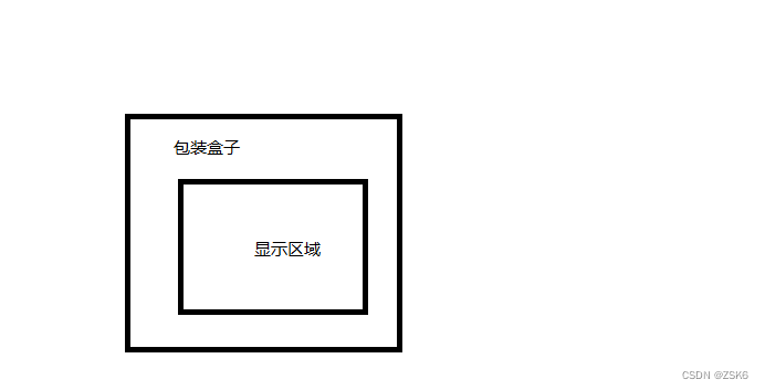
首页要有承载内容的容器(box)。外层在套一个包装盒子(用来进行定位和样式定义)。
- 触发弹出效果逻辑。
我这里是鼠标移上去,显示内容,触发弹出效果。实际应用时可能是其他触发方式。 - 弹出效果的实现。
利用css的transition和transform实现 - 封装成组件。
可以把相关属性或关键操作提出来,封装成可配置的组件。
编写样式 和触发逻辑
<!DOCTYPE html>
<html lang="en">
<head>
<meta charset="UTF-8">
<meta http-equiv="X-UA-Compatible" content="IE=edge">
<meta name="viewport" content="width=device-width, initial-scale=1.0">
<title>Document</title>
<style>
.wrapper {
position: relative;
min-width: 10px;
min-height: 10px;
width: 400px;
height: 200px;
min-height: 10px;
margin-left: calc(50% - 100px);
margin-top: 100px;
border-radius: 50px 20px 50px 20px;
background-color: skyblue;
}
.box {
position: absolute;
top: 0;
left: 0;
display: block;
width: 100%;
height: 100%;
cursor: pointer;
border-radius: inherit;
background-color: #666;
}
.wrapper:hover .box {
transform: translate(0, 0);
}
</style>
</head>
<body>
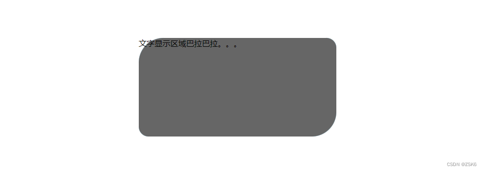
<div class="wrapper">
<div class="box">文字显示区域巴拉巴拉。。。</div>
</div>
</body>
</html>
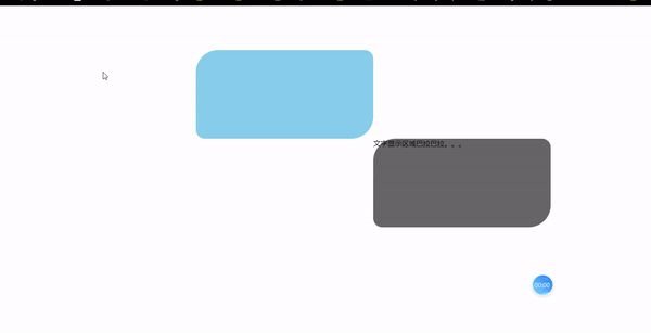
鼠标移上去触发弹出效果。
设计弹出效果
弹出效果利用css的transition和transform实现。
transform对显示内容盒子(box)进行变换。
transition 让变换呈现动画效果。
例如:
先默认让box往下移高100%和往右移宽100%;
鼠标移入时,再回到原位置。
.box{
transform: translate(100%, 100%);
transition: 0.5s ease all;
}
.wrapper:hover .box {
      transform: translate(0, 0);
    }
效果则是 显示内容区域从右下往右上弹出效果:
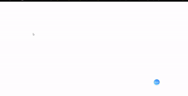
wrapper去掉背景色,并且添加overflow: hidden;后效果:
封装成组件
可以把触发方式、transform弹出效果、transition动画样式、时长等等关键属性提出来,封装成可配置的组件。
赶快试试吧。
结语
完整代码。
<!DOCTYPE html>
<html lang="en">

<head>
  <meta charset="UTF-8">
  <meta http-equiv="X-UA-Compatible" content="IE=edge">
  <meta name="viewport" content="width=device-width, initial-scale=1.0">
  <title>Document</title>
  <style>
    .wrapper {
      position: relative;
      min-width: 10px;
      min-height: 10px;
      width: 400px;
      height: 200px;
      min-height: 10px;
      margin-left: calc(50% - 100px);
      margin-top: 100px;
      border-radius: 50px 20px 50px 20px;
      /* background-color: skyblue; */
      overflow: hidden;
    }

    .box {
      position: absolute;
      top: 0;
      left: 0;
      display: block;
      width: 100%;
      height: 100%;
      transform: translate(100%, 100%);
      transition: 0.5s ease all;
      cursor: pointer;
      border-radius: inherit;
      background-color: #666;
    }

    .wrapper:hover .box {
      transform: translate(0, 0);
    }
  </style>
</head>

<body>
  <div class="wrapper">
    <div class="box">文字显示区域巴拉巴拉。。。</div>
  </div>
</body>

</html>


