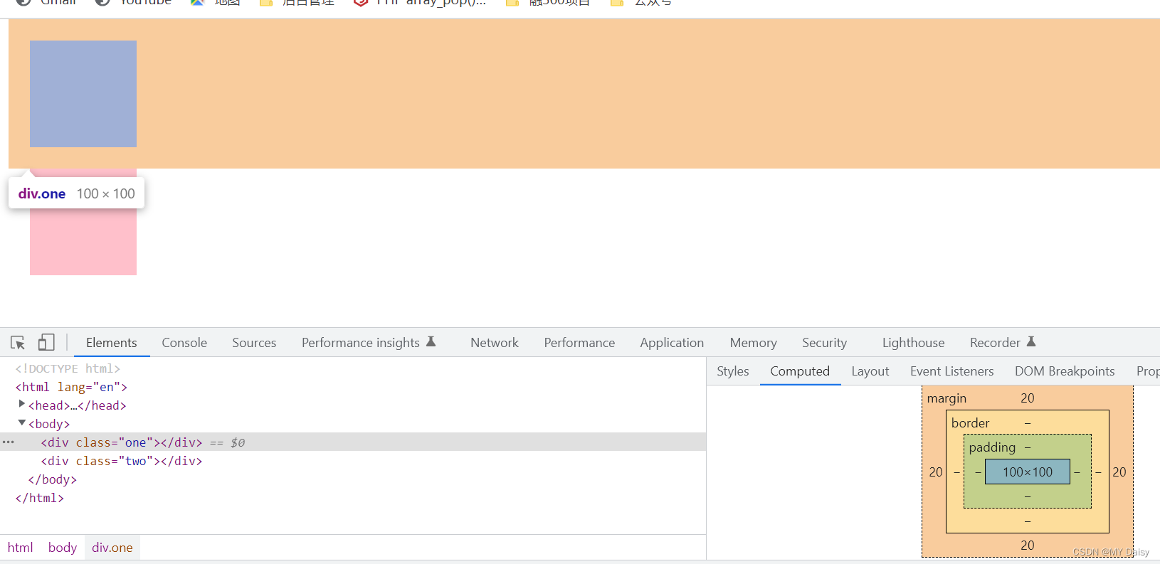
1、margin
1.1 margin的语法
盒子与盒子之间的距离
<!DOCTYPE html>
<html lang="en">
<head>
    <meta charset="UTF-8">
    <meta http-equiv="X-UA-Compatible" content="IE=edge">
    <meta name="viewport" content="width=device-width, initial-scale=1.0">
    <title>Document</title>
    <style>
        div{
            background-color: pink;
            width: 100px;
            height: 100px;
        }
        .one{
            margin-bottom: 20px;
        }
        .two{
            margin-top: 20px;
            margin-bottom: 20px;
            margin-left: 20px;
            margin-right: 20px;
        }
    </style>
</head>
<body>
    <div class="one"></div>
    <div class="two"></div>
</body>
</html>
1.2 margin复合写法
<!DOCTYPE html>
<html lang="en">
<head>
    <meta charset="UTF-8">
    <meta http-equiv="X-UA-Compatible" content="IE=edge">
    <meta name="viewport" content="width=device-width, initial-scale=1.0">
    <title>Document</title>
    <style>
        div{
            background-color: pink;
            width: 100px;
            height: 100px;
        }
        .one{
            margin: 20px;
        }
        .two{
            margin-top: 20px;
            margin-bottom: 20px;
            margin-left: 20px;
            margin-right: 20px;
        }
    </style>
</head>
<body>
    <div class="one"></div>
    <div class="two"></div>
</body>
</html>
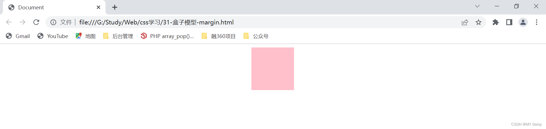
1.3 margin外边距典型应用
(1)使块级盒子水平居中
条件:
(1)盒子必须指定宽度(width)
(2)盒子左右外边距设置为auto
<!DOCTYPE html>
<html lang="en">
<head>
    <meta charset="UTF-8">
    <meta http-equiv="X-UA-Compatible" content="IE=edge">
    <meta name="viewport" content="width=device-width, initial-scale=1.0">
    <title>Document</title>
    <style>
        div{
            background-color: pink;
            width: 100px;
            height: 100px;
        }
        .one{
            margin: 0 auto;
        }
    </style>
</head>
<body>
    <div class="one"></div>
    <!-- <div class="two"></div> -->
</body>
</html>
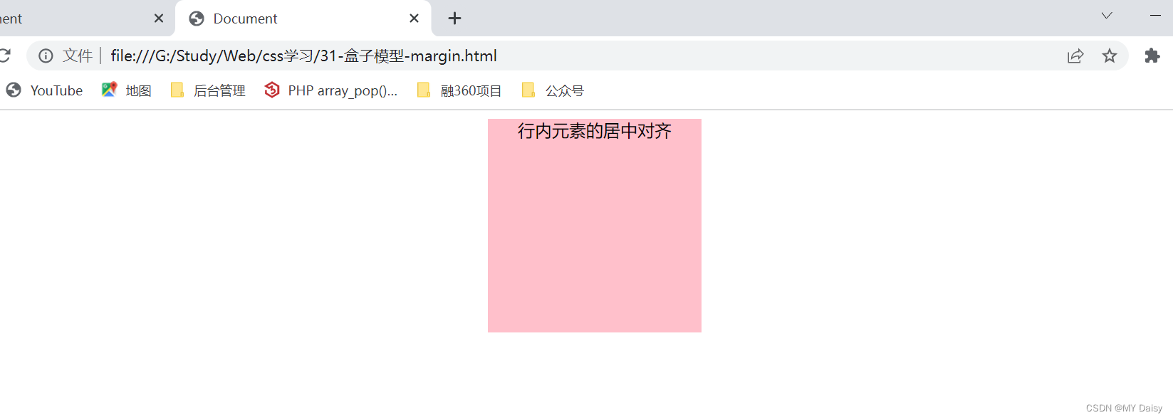
对行内元素和行内块元素无效,但要实现水平居中的效果,可以其父元素添加text-align:center属性
<!DOCTYPE html>
<html lang="en">
<head>
    <meta charset="UTF-8">
    <meta http-equiv="X-UA-Compatible" content="IE=edge">
    <meta name="viewport" content="width=device-width, initial-scale=1.0">
    <title>Document</title>
    <style>
        div{
            background-color: pink;
            width: 200px;
            height: 200px;
            text-align: center;
        }
        .one{
            margin: 0 auto;
        }
    </style>
</head>
<body>
    <div class="one">
        <span>行内元素的居中对齐</span>
    </div>
    <!-- <div class="two"></div> -->
</body>
</html>
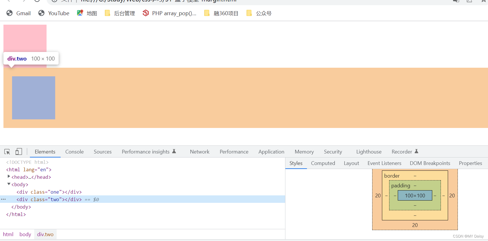
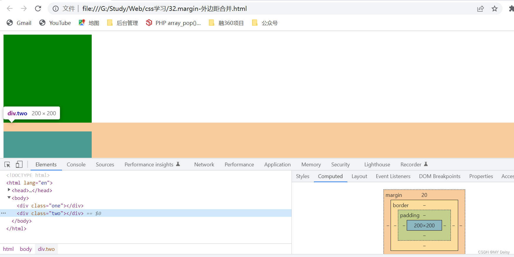
1.4 外边距合并和塌陷
使用margin定义块元素的垂直外边距(top和bottom)时,可能会出现外边距的合并和塌陷
主要有两种情况:
(1)相邻块元素垂直外边距的合并(兄弟关系的)
(2)嵌套块元素垂直外边距的塌陷(父子关系的)
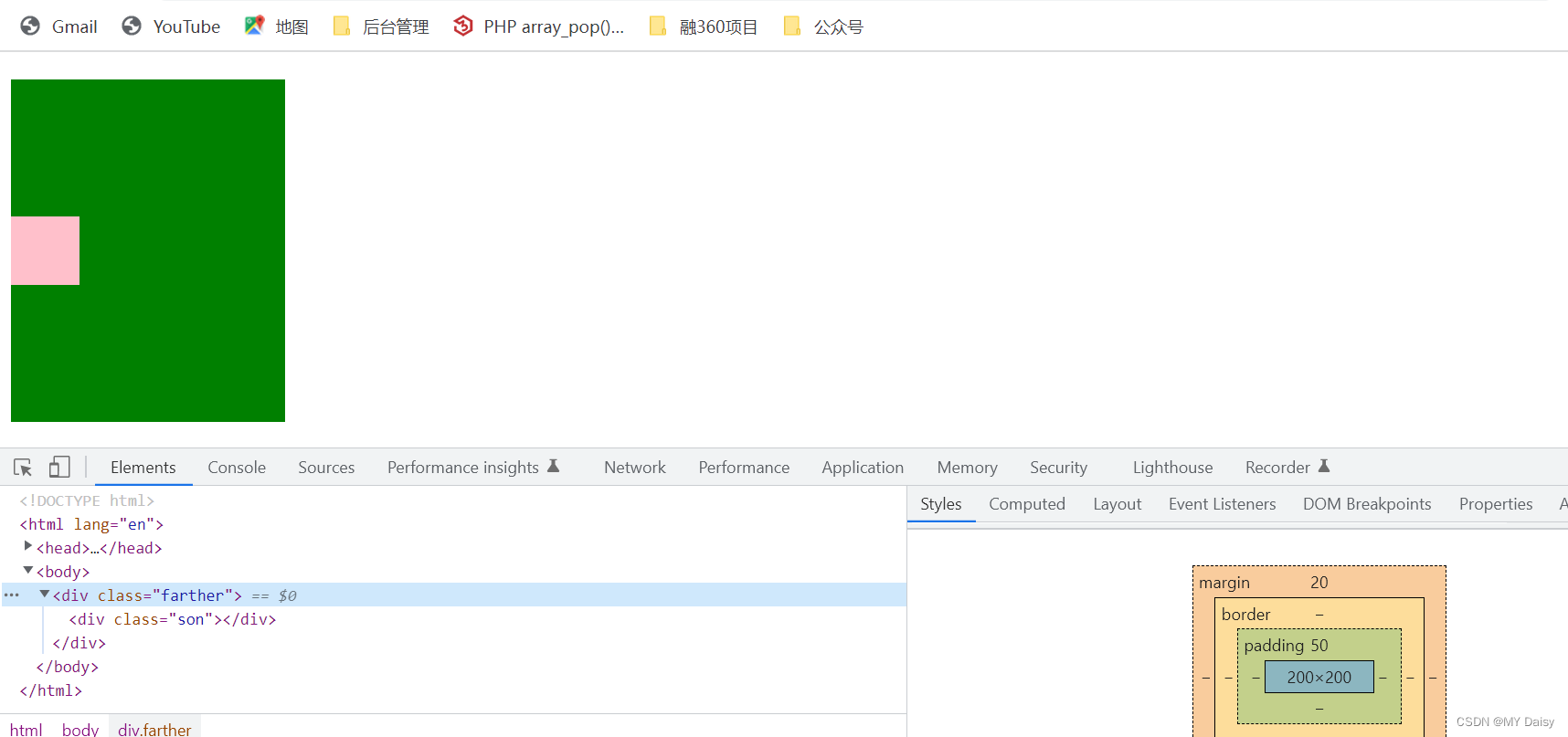
什么是外边距合并:
one盒子设置下边距为10,two盒子设置上边距为20.但实际两个盒子的距离不是10+20。而是取的两值间的较大值,这种现象就算相邻块元素垂直外边距的合并
<!DOCTYPE html>
<html lang="en">
<head>
    <meta charset="UTF-8">
    <meta http-equiv="X-UA-Compatible" content="IE=edge">
    <meta name="viewport" content="width=device-width, initial-scale=1.0">
    <title>Document</title>
    <style>
        div{
            width: 200px;
            height: 200px;
            background-color: green;
        }
        .one{
            margin-bottom: 10px;
        }
        .two{
            margin-top: 20px;
        }
    </style>
</head>
<body>
    <div class="one"></div>
    <div class="two"></div>
</body>
</html>
解决方案:
尽量只给一个盒子添加margin值
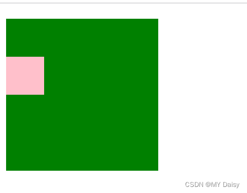
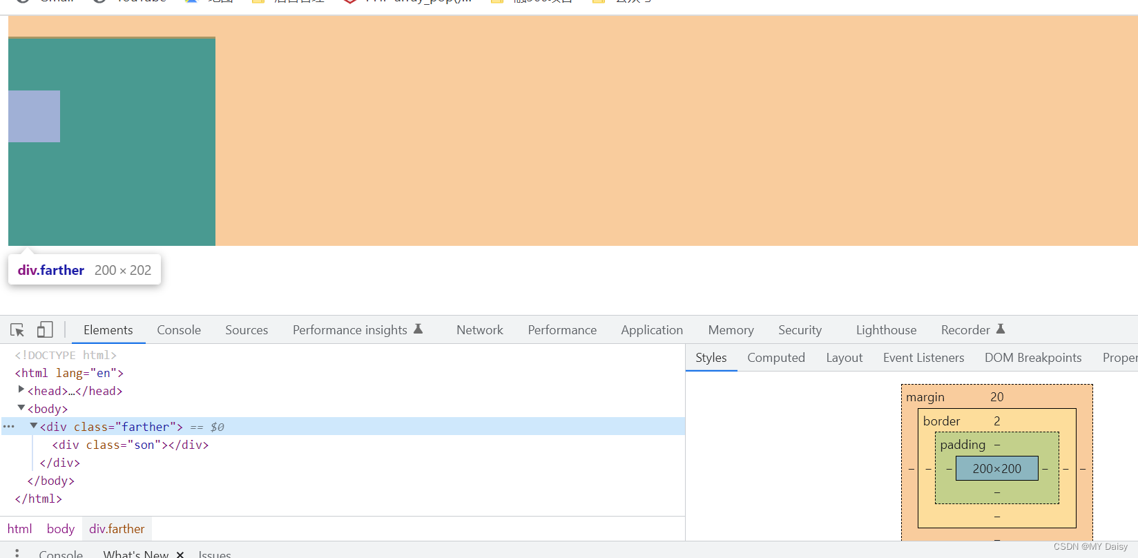
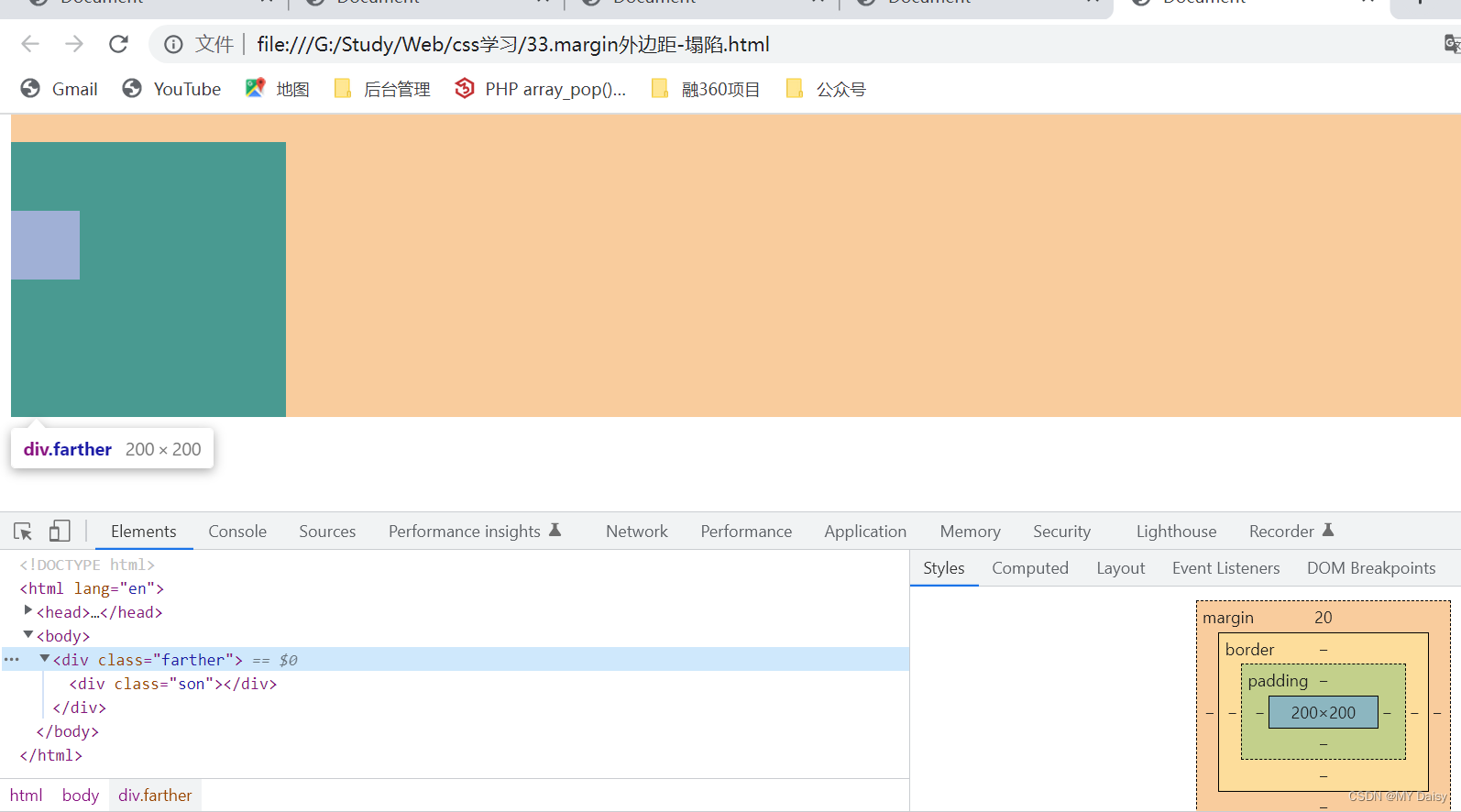
什么是外边距的塌陷
对于嵌套关系(父子关系)的块元素,父元素有margin-top的同时,子元素也有margin-top,此时父元素会塌陷两者中较大的margin-top值
期望的效果:
实际的效果:
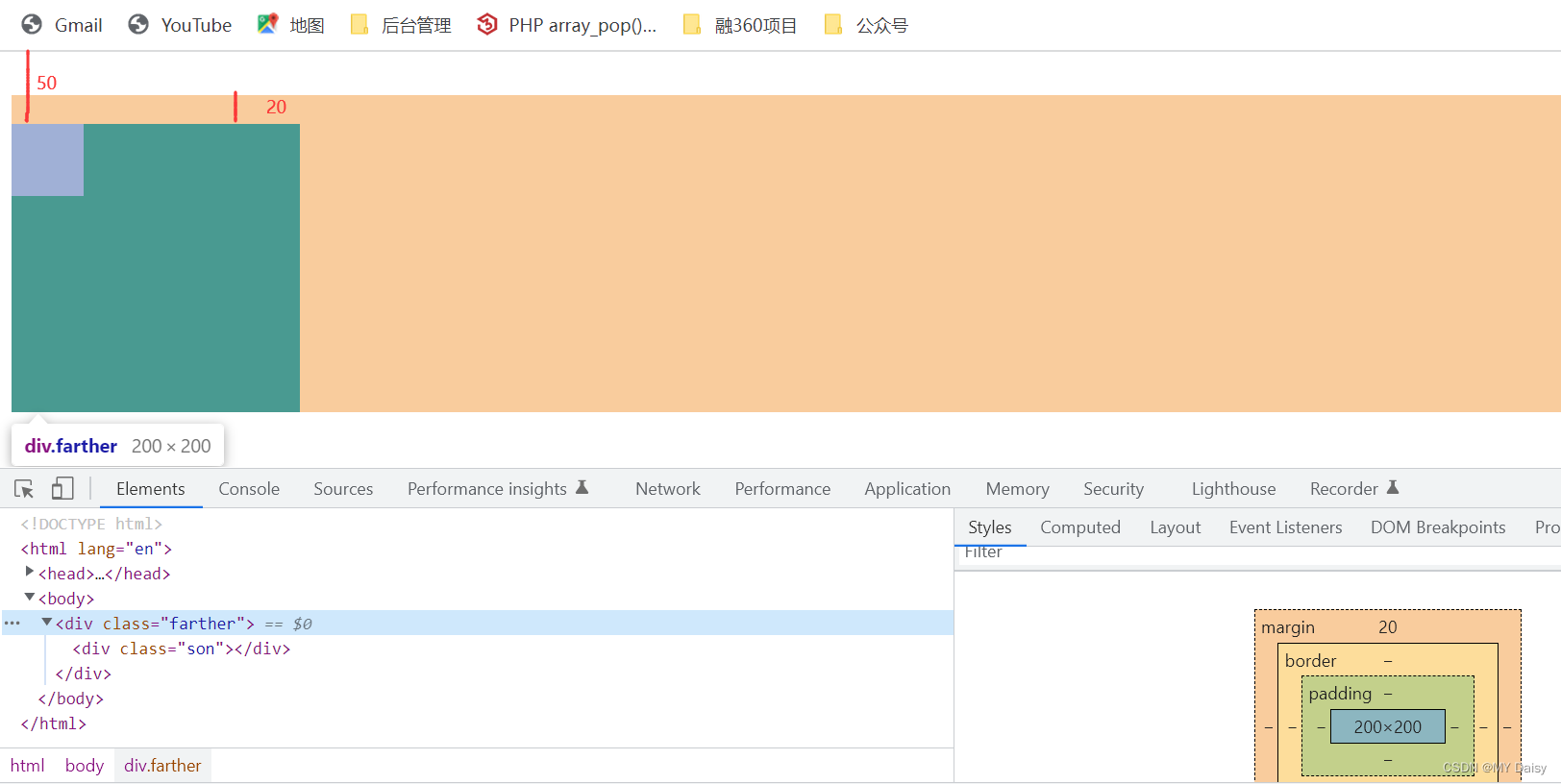
如何解决:
(1)父元素加上边框top(颜色可以设为transparent)–恩断义绝框,影响盒子大小
(2)父元素定义上内边距top。影响盒子大小
(3)给父元素加上overflow:hidden,不影响盒子大小
(4)其他方法:浮动、固定、绝对定位的盒子不会有塌陷问题
执行第(1)种:
<!DOCTYPE html>
<html lang="en">
<head>
    <meta charset="UTF-8">
    <meta http-equiv="X-UA-Compatible" content="IE=edge">
    <meta name="viewport" content="width=device-width, initial-scale=1.0">
    <title>Document</title>
    <style>
        .farther{
            width: 200px;
            height: 200px;
            margin-top: 20px;
            border-top:2px solid black;
            background-color: green;
        }
        .son{
            width: 50px;
            height: 50px;
            margin-top: 50px;
            background-color: pink;
        }
    </style>
</head>

<body>
    <div class="farther">
        <div class="son"></div>
    </div>
</body>
</html>
执行第(2)种:
<!DOCTYPE html>
<html lang="en">
<head>
    <meta charset="UTF-8">
    <meta http-equiv="X-UA-Compatible" content="IE=edge">
    <meta name="viewport" content="width=device-width, initial-scale=1.0">
    <title>Document</title>
    <style>
        .farther{
            width: 200px;
            height: 200px;
            margin-top: 20px;
            padding-top: 50px;
            background-color: green;
        }
        .son{
            width: 50px;
            height: 50px;
            margin-top:50px;
            background-color: pink;
        }
    </style>
</head>

<body>
    <div class="farther">
        <div class="son"></div>
    </div>
</body>
</html>
(3)执行第(3)种:
<!DOCTYPE html>
<html lang="en">
<head>
    <meta charset="UTF-8">
    <meta http-equiv="X-UA-Compatible" content="IE=edge">
    <meta name="viewport" content="width=device-width, initial-scale=1.0">
    <title>Document</title>
    <style>
        .farther{
            width: 200px;
            height: 200px;
            margin-top: 20px;
            background-color: green;
            overflow: hidden;
        }
        .son{
            width: 50px;
            height: 50px;
            margin-top: 50px;
            background-color: pink;
        }
    </style>
</head>

<body>
    <div class="farther">
        <div class="son"></div>
    </div>
</body>
</html>
1.5 清除内外边距
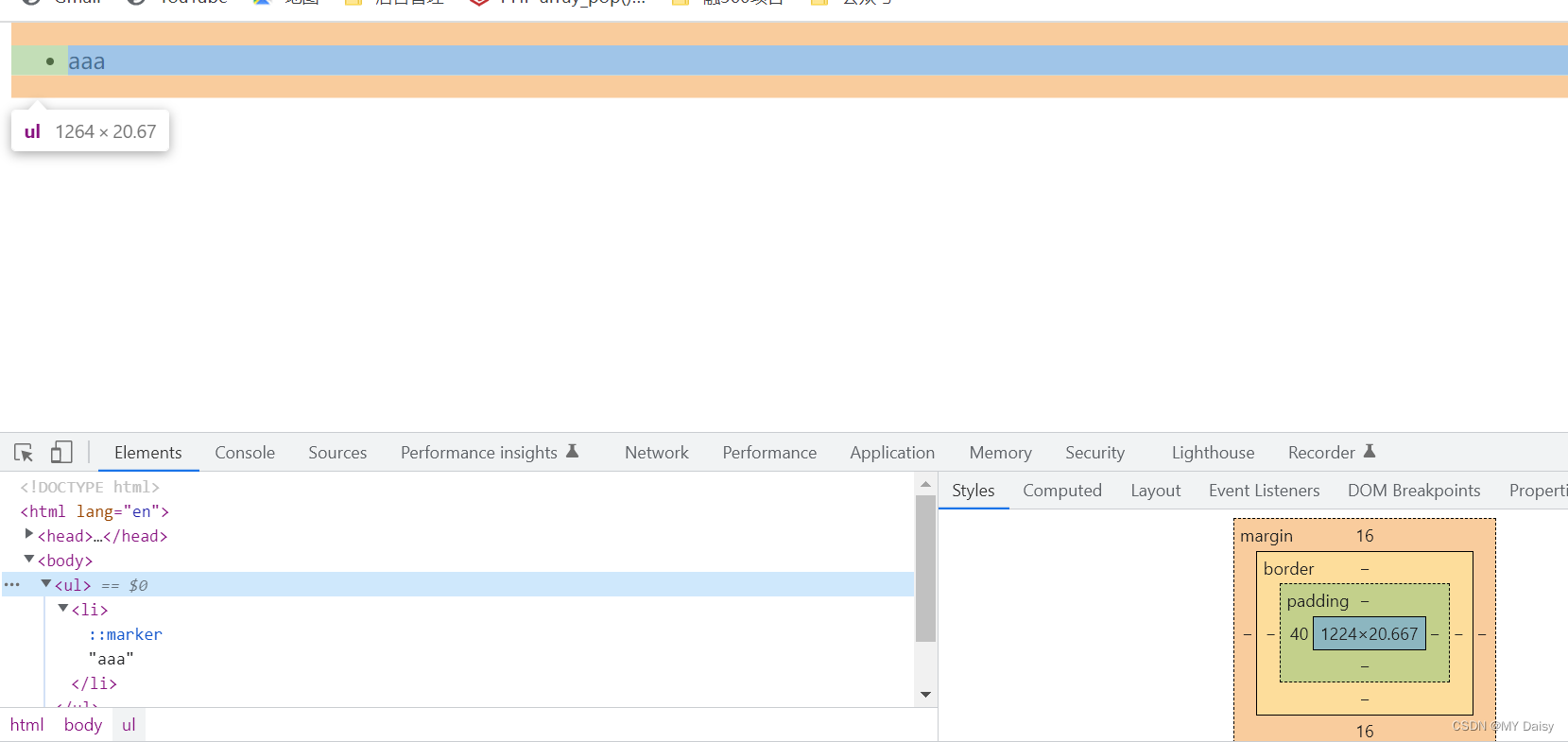
不同的网页元素(如ul),即使没有设置内外边距,但有的自身默认会有内外边距(不同浏览器默认的也不一致),因此在布局前,首先最好先清除网页元素的内外边距
//可以将这段代码放在css的首行去写
*{
	margin:0;
	padding:0;
}
注意:
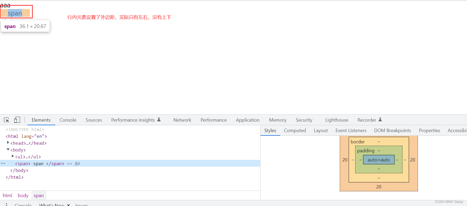
行内元素为了照顾兼容性,尽量只设置左右内外边距,不要设置上下内外边距,但是转换为块级和行内块元素就可以了
ul没有设置padding-left,但实际看浏览器是由一个40px的padding-left
<!DOCTYPE html>
<html lang="en">
<head>
    <meta charset="UTF-8">
    <meta http-equiv="X-UA-Compatible" content="IE=edge">
    <meta name="viewport" content="width=device-width, initial-scale=1.0">
    <title>Document</title>
</head>
<body>
    <ul>
        <li>aaa</li>
    </ul>
</body>
</html>
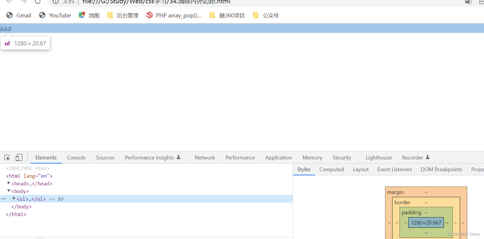
清除自带的内外边距:
<!DOCTYPE html>
<html lang="en">
<head>
    <meta charset="UTF-8">
    <meta http-equiv="X-UA-Compatible" content="IE=edge">
    <meta name="viewport" content="width=device-width, initial-scale=1.0">
    <title>Document</title>
    <style>
        *{
            margin: 0;
            padding: 0;
        }
    </style>
</head>
<body>
    <ul>
        <li>aaa</li>
    </ul>
</body>
</html>
行内元素设置上下边距:
<!DOCTYPE html>
<html lang="en">
<head>
    <meta charset="UTF-8">
    <meta http-equiv="X-UA-Compatible" content="IE=edge">
    <meta name="viewport" content="width=device-width, initial-scale=1.0">
    <title>Document</title>
    <style>
        *{
            margin: 0;
            padding: 0;
        }
        span{
            margin: 20px;
        }
    </style>
</head>
<body>
    <ul>
        <li>aaa</li>
    </ul>
    <span>
        span
    </span>
</body>
</html>